How to Design Great Blog Content
In this post, we will discuss all the different aspects of designing great blog content. We will look into the tips and tricks that will make it worthwhile for you.
Make your blog a learning center
If you have been creating content for years there’s a good probability you have created varying types of content on your site.
Content marketing trends tell us that videos and whitepapers are really popular these days.
Most company blogs would dedicate particular pages to particular content types. Videos might find a place in the B2B marketing video library, articles on blogs, whitepapers inside a resource center, and so on.
This organizes everything neatly for the user. But the user may not like the sectioning off of content.
If you’re the user who wants information on a certain topic how would you access the content on the site? Would you navigate to different areas on the site to check what’s available or would you want to see everything on the topic ranging from video to downloadable ebooks all in one particular section?
I suppose you would prefer the latter. That’s why you need content inside a learning center.
A learning center builds up the possibility that a user will spend more time on the site. Aside from the ease of finding everything in one place, cumulative learning will result in the user spending more time on your site. This will result in an increase in pages visited per session that Google uses to rank your site. The lower the bounce rate, the better your rankings.
Give options to readers to filter topics by personas, subjects, or content types. Have a search bar in place to do a keyword search of blog posts.
In addition to regular blog posts, create high-quality, in-depth pillar content that act as comprehensive information hot spots on particular topics.
With these strategies leading your content efforts, you’re getting your readers to access to the most relevant content and this approach may be better than most things you might do to get engagement from readers.
Add quick summary boxes
To rank for competitive keywords and get traffic to your site, most people create long-form content. I am one of them.
Make it an objective of workplace mentoring and drill it into your content team to add small summary boxes.
My articles are routinely 2000 words or longer. Creating content that long attracts search traffic. But, there are plenty of readers who may not want to stick around for that long. For them, you may want to offer answer boxes that supply them with brief information summarizing the content.
Most search results lead you to comprehensive guides that may be around 4000 words or longer. But plowing through the entire article is often tedious. That’s where summary boxes can be of great help.
The boxes provide short answers to questions the article explains in greater detail.
This makes it easier for users to find the information what they want, quickly. Plus it also magnifies your odds of appearing on featured snippets for the target terms.
This gives you additional clicks to your article. Such a box isn’t a necessary addition on blog articles and may not always result in featured snippets.
But you can see if your article starts ranking with this particular tactic or not. In addition, if you’re in the habit of listing FAQs do this- add small sections of value-packed information.
If yours is a SaaS business, there will be a section related to SaaS subscription management along with relevant information that customers find useful.
A blog card layout
Most businesses running a blog know that keeping their blogs fresh with lots of content is the key to traffic and conversions. Depending on how many posts you publish, you may accrue between 200 to 500 articles annually. With these many articles do you suspect your readers are being hit with too much information?
One of the best ways to solve this is through card design for the blog layout. You may have seen baseball cards. Turns out, a card-based display is one of the smartest ways to organize and display information.
Their architecture makes information recall and recognition easy.
Card design is seen everywhere now. Be it Pinterest, Twitter, or Google.
Similar to the examples from these sites, keep your blog cards simple. Simplicity wins.
Use a consistent, repeated structure. However vary images, and font sizes to present the information correctly to anyone who wants access.
Add the following elements:
- Featured image
- Blog title
- Post date
- Category
- Blog excerpt
- Social share links
For example, WPBeginner posts a featured image for each and every one of their 900 blog posts. It’s easy to get sidelined after some time.
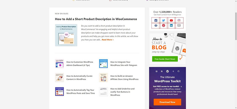
They didn’t. On top of adding featured images and other details add social proof with the help of a tool like TrustPulse that shows how many readers read a blog post or purchased a product.
The featured image and title are most prominent in card-based design. You can also include excerpts.
Use large, quality images
As blogging becomes a prominent vocation one of the chief differentiators you can have on your sites is making them more visual. Use non-stock photography.
Adding images and visual cues helps users easily recognize where the article begins and puts emphasis on the topic at hand.
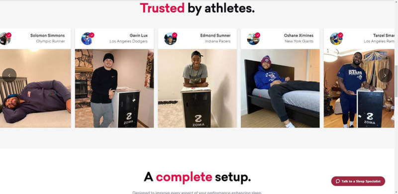
Zomasleep goes a step ahead and uses images of real people buying and using their products.
Play around with your layout. Sometimes you can include article titles inside featured images or use a hero image entirely above the fold. Or you can balance the hero image and the title making it easy for users to start reading and scrolling through.
Use legible typography
On the web when people want to read your content, don’t make readers strain. They don’t want to read a 12pt font. It causes eye strain, especially when accessing something online.
You want the font sizes to be apt and not something people have to complain about. Somewhere between 17 px to 20 px is the sweet spot.
For headings, the font sizes should be larger.
Make use of descriptive subheadings
When people come to a blog post they rarely want to read it all. Most people are skimmers and skip to sections that interest them. If you are writing an article about say spend management software, dedicate different sections of the article to different features of the software.
Your headings should support this goal. Make them specific and descriptive.
You need headings that talk to readers and explain to them succinctly what the next paragraph is about.
Make social sharing for all devices
Social sharing buttons allow people to easily repost your article to their social media profiles. You’re encouraging readers to distribute your content for free. But you must make sure that this experience is possible on tablets, phones and other devices.
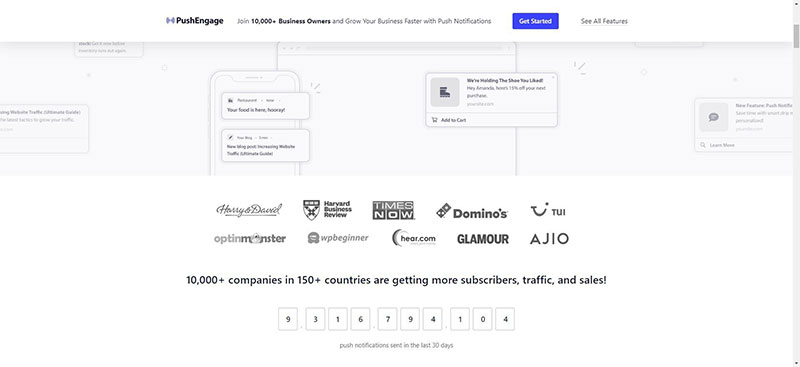
A Pew research discovered that 85% of adults in the U.S. get their news on mobile devices. Lastly, make it easy for readers to get updates on new blog posts by using Pushengage that updates readers whenever a new post goes live.
Conclusion
Designing great blog content often boils down to the tools you can use—both free and paid. You can find more such tools listed on this page at Awesomemotive.