3 Conversion Rate Optimization Tools Every Marketer Should Try
Transcript:
Hey guys, this is John. I’m an Internet marketing consultant with WebFX, and today we’re going to talk about the top three conversion rate optimization tools that I like to use, and some quick ways that you can apply them today.
https://youtu.be/2gqwXtdLGw4
Okay, so what we’re going to do is we’re going to look at three tools:
- Google Optimize
- Lucky Orange
- Userlytics
And we’re going to take a look at what the tool is, some things you can do with it, what I like about it, and something to try today for each tool. So let’s get started.
We’ll be talking about Google Optimize first.
So first, what Google Optimize is, whether it’s a custom-tailored message at your checkout or a completely revamped homepage, Google Optimize shows you which site experiences are engaging your users the most and gives you solutions you need to deliver those experiences across your site.
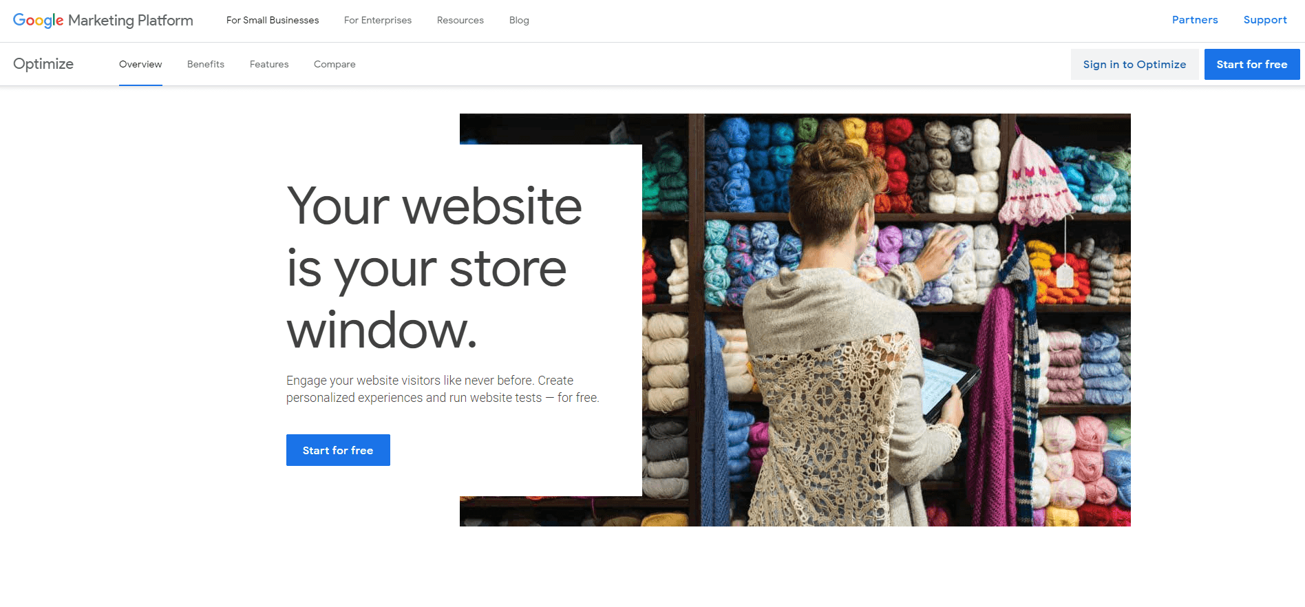
What you can do with it…so you can test variations of your web pages, landing pages, your content.
You can configure A/B and A/B neutral tests, as well as multi-variate tests and even configure personalization.
You can also create and test custom landing pages, although that functionality is a bit limited compared to what you might get with another tool.
Here’s what I like about it.
There’s a native integration with Google Analytics, and that makes it easy to see what’s going on and to see the impact of your optimizations.
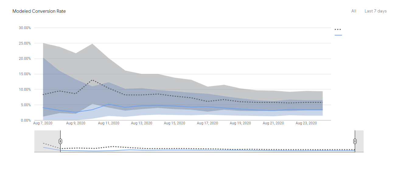
You can also use your existing Analytics data to identify areas of your site that can be improved with Google Optimize.
It’s also easy to get started with. You can set up your first test in just a few minutes, and there’s a whole suite of tools and testing options that are available for free.
Here’s something to try today.
- Test three different versions of your landing page, changing only the headline.
- One version should have a headline focusing on key features of the product or service.
- The second version should focus on the benefit you’re providing for your end-users, such as peace of mind, or more time to focus on what matters most.
- The third version should have a headline focusing on your credentials, something like industry-leading or trusted everywhere.
- Hold everything else the same on those landing pages and then see which page does the best.
The second tool we’re going to look at is called Lucky Orange.
So what is Lucky Orange?
Lucky Orange has the goal of helping you to see everything the user did before they left your site, with the idea that you’re trying to understand why people left without taking action…why they left without converting.
And so here’s what you can do with it.
You can get heat maps, visitor recordings, actually follow individual visits, clickstream data, to see where their eyes are on the screen and what they did first and second and last after reaching your landing page.
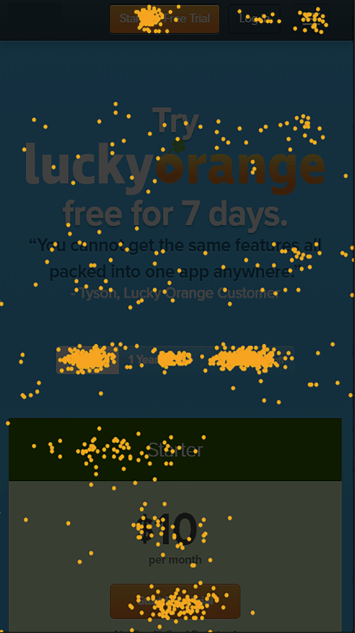
Here’s what I like about it.
These types of maps are super helpful in identifying where the roadblocks are and your user experience and learning what point do visitors lose interest.
How far do they scroll down your page? And is that witty catchphrase supportive of your main goals or does it distract from your main content?
Here’s something to try today with Lucky Orange.
- Set up a heat map test on your homepage.
- Come back a few weeks later to see what elements of the page users are paying the most attention to as well as how far they’re scrolling down the page.
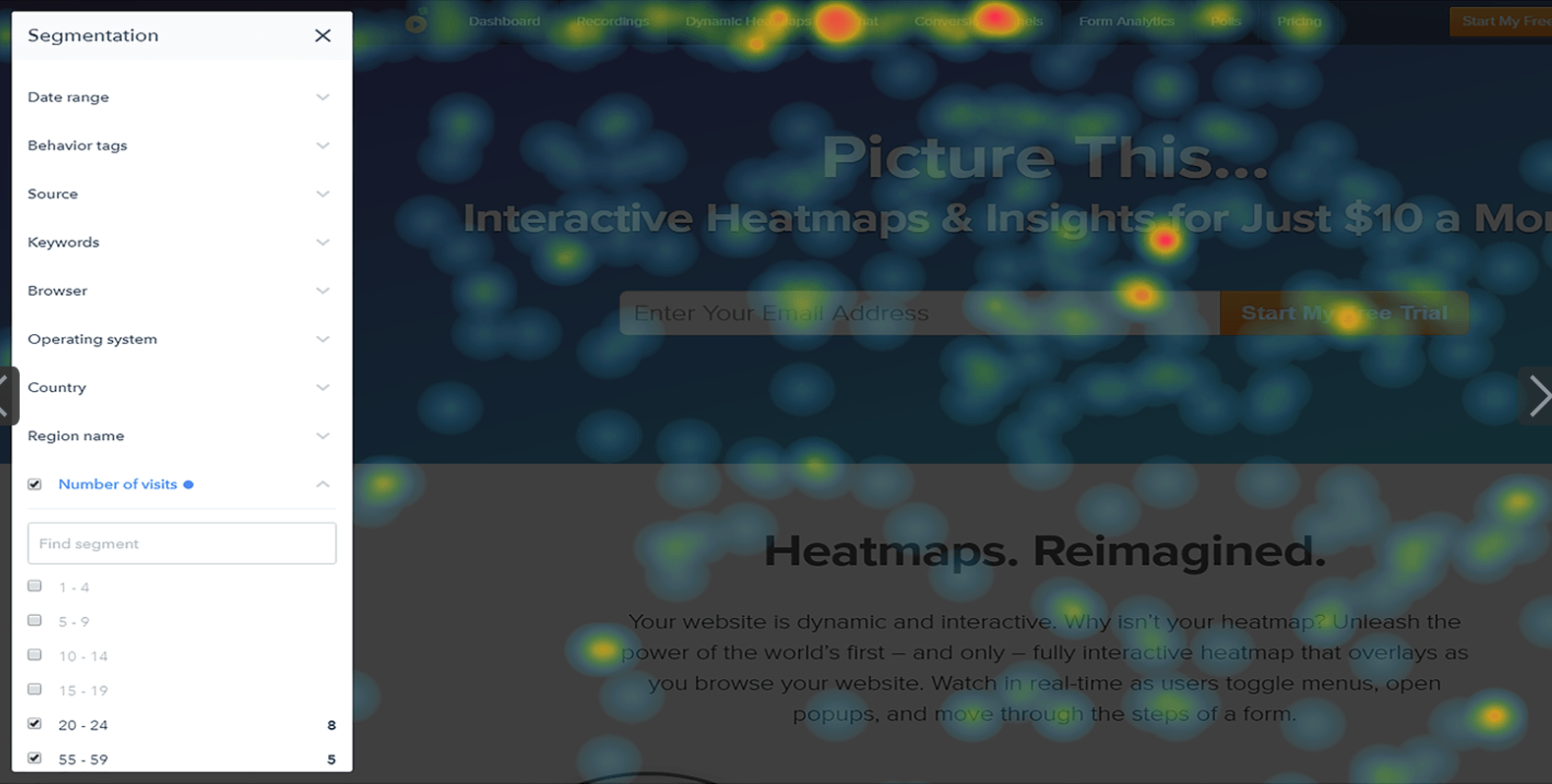
It could be that critical information is never being seen at all.
Userlytics is our third tool that we’ll take a look at.
So I like Userlytics a whole lot because I like to get really raw data.
Here’s what the tool does, right?
If Analytics tells you what happened on your website, Userlytics is going to help you understand why it happened by providing real-time feedback from real people.
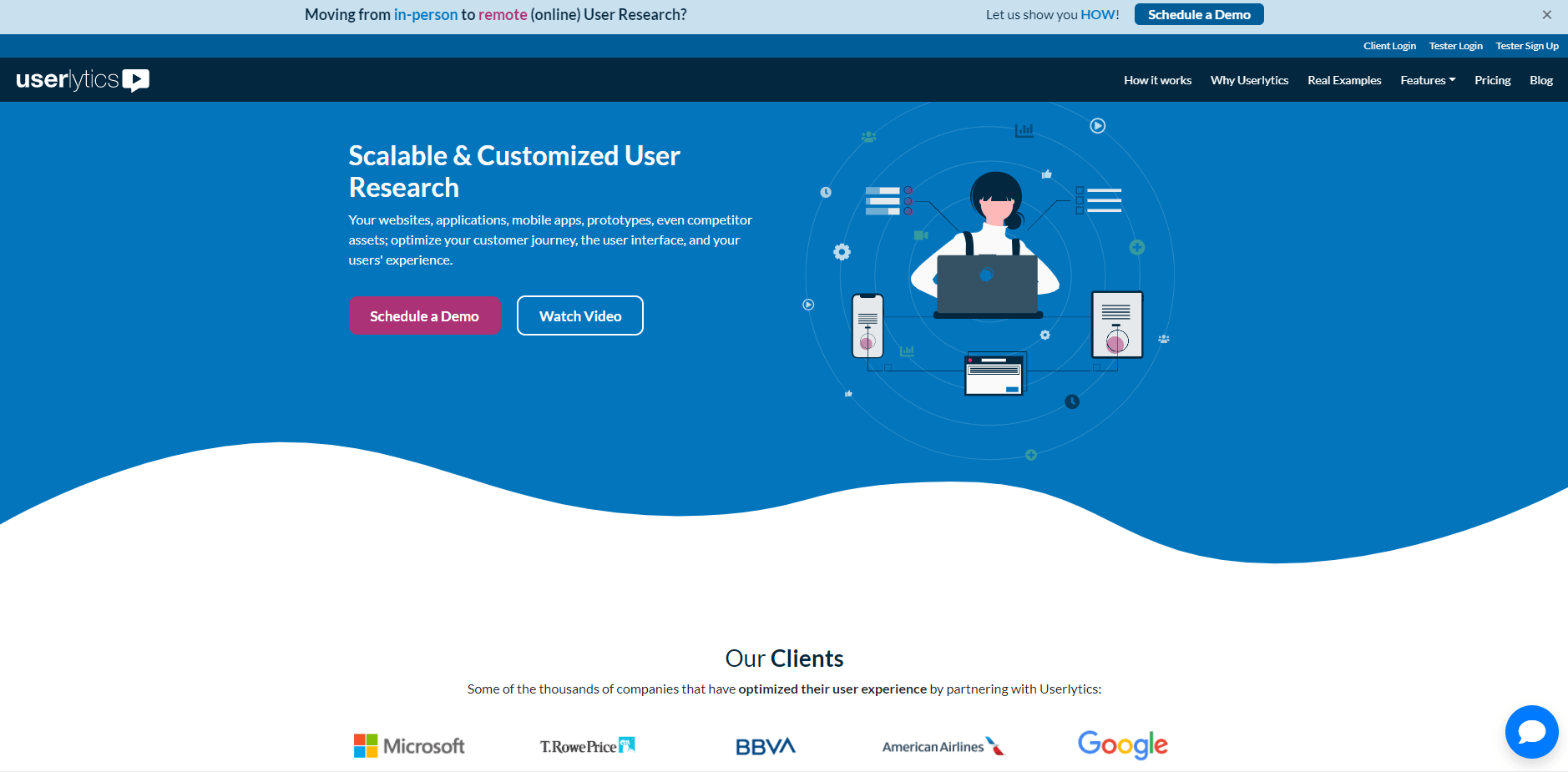
So the premise is that real people visit your website and provide their feedback in real time. The results are eye-opening and frequently surprising.
Both business insiders and marketers can easily miss how real people might perceive or respond to your website.
So it’s great for getting raw, real-time feedback.
It works best, I’ll say, for business to consumer websites where the users taking the test are a rough demographic match for your target audience.
For high capital expenditures and large business-to-business purchases and partnerships and things of that nature, it’s maybe a little bit less easy to use Userlytics for that.
Anyway, so here’s what you can do with Userlytics, though.
So with Userlytics you set up tests where you have users go through your website and complete a series of tasks or provide feedback on a series of elements, and you’ll actually be able to use screener questions to narrow your audience by age, gender, income level, geography, and more.
You can test a single landing page or an entire site. Set up whatever you want to see.
Maybe your entire conversion funnel or a given set of landing pages, then you can choose to have users’ tests where you not only hear the user, but also see them, adding greater depth to the analysis as you can pick up on things like nonverbal cues.

Now, what I like about Userlytics is that it demystifies your website data by adding the voices and faces of human beings.
It also surfaces concrete recommendations for your website that don’t follow the internal agenda of marketing teams or sales teams, and really puts the user at the center of your analysis.
One time I did a Userlytics test and we had maybe three out of five users who said, ‘I would not submit the contact form on this site based on everything I’ve seen. I just don’t trust them’.
That’s an important thing to know for your own site. And it’s great to actually hear that from real people.
So here’s something to try today.
- Take that new landing page that your CEO loves, but your marketing team says is underperforming, or vice versa…one that your marketing team says is awesome and the CEO doesn’t feel expresses your company brand.
- Set up a Userlytics test to get feedback from outsiders.
- Take the action you need to to improve results.
Okay, so those were the three tools that I like to use for conversion rate optimization.
That was again:
- Google Optimize
- Lucky Orange
- Userlytics
If you have any questions about conversion rate optimization, or you’d like to discuss conversion rate optimization more, feel free to reach out to us.
And of course, don’t forget to subscribe.
Thanks and happy tracking!