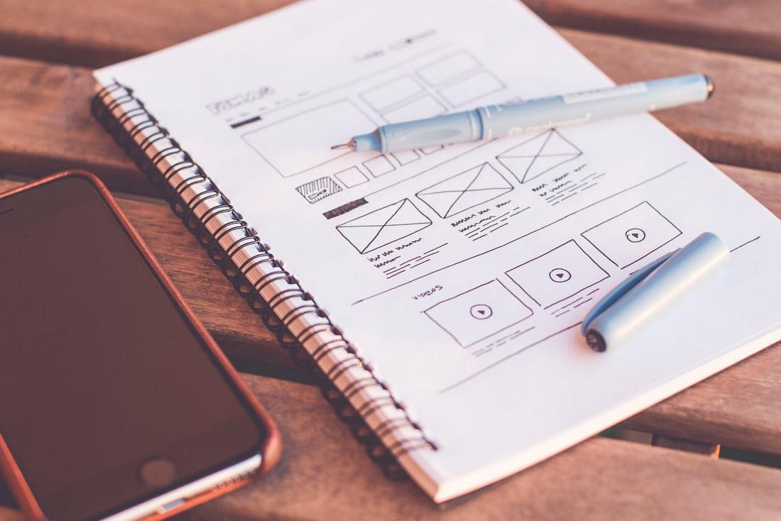
How to Conduct a Visual Design Audit (And Why You Should)
Over time, even the most thoughtfully designed brand or product can start to drift.
As new pages, features, and marketing materials are added, inconsistencies in colors, typography, imagery, and layout can sneak in.
What starts as a polished, cohesive system can slowly turn into a patchwork of mismatched styles.
That’s where a visual design audit comes in.
A visual design audit is a structured review of your product’s visual language, everything from your logo and typography to UI components, imagery, and spacing. It helps you spot inconsistencies, clean up your design system, and ensure your brand looks and feels unified across every touchpoint.
In this post, we’ll look at why conducting a visual design audit is valuable, what to include in your audit, and how to do one effectively.
Why Conduct a Visual Design Audit?
As products grow and teams change, visual inconsistencies naturally appear.
Conducting a visual design audit helps you identify and fix these issues before they impact your brand or user experience.
“Every dollar invested in UX brings 100 in return. That’s an ROI of 9,900%.” – Forbes
Here are a few key reasons to make it part of your process:
- Brand consistency: Inconsistent use of colors, fonts, or imagery can weaken your brand identity and confuse users. An audit helps realign your visual elements with your brand guidelines.
- Improved usability: Visual inconsistencies in UI components (like buttons, forms, or spacing) can make products harder to use. A visual audit ensures your design patterns stay clean and functional.
- Streamlined design process: When your design system is aligned and up to date, your team can work faster and more confidently, without reinventing the wheel every time.
- Better cross-team collaboration: A clean, well-documented visual system makes it easier for designers, developers, and marketers to stay on the same page.
When to Do a Visual Design Audit

Visual audits aren’t just for rebrands. They’re useful any time your product or team is evolving.
Consider doing one:
- Before a major redesign or UI refresh
- After a rapid period of product growth
- When launching new features or expanding to new platforms
- After significant team changes (new designers, developers, leadership)
- If you notice visual inconsistencies or user experience issues
Even if none of these triggers apply, it’s smart to run an audit at least once a year to keep your design system healthy.
What to Include in Your Visual Design Audit
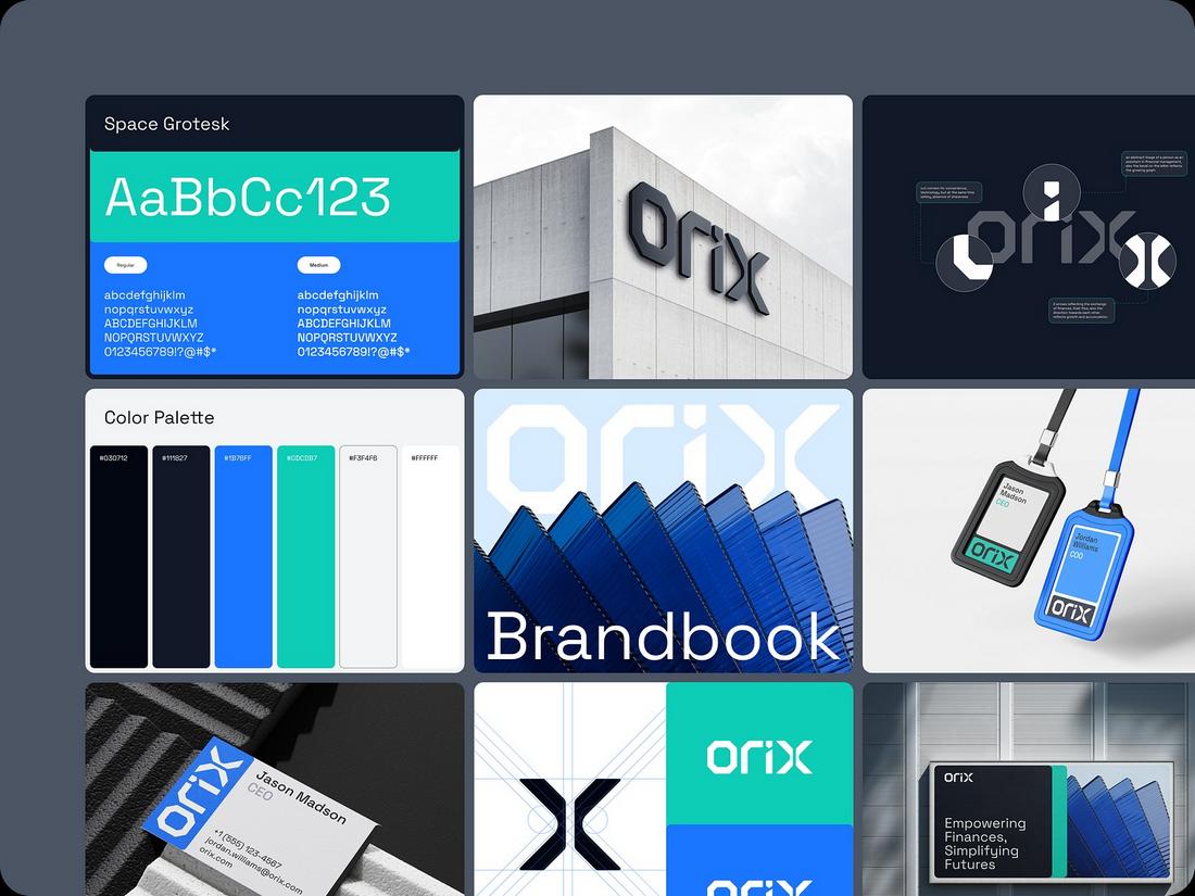
(Credit: Outcrowd)
A strong visual audit takes a deep look at the key elements that shape your brand’s appearance and user experience.
Logo Usage
Start with your logo, the face of your brand. Check every instance where it appears: websites, apps, social media, and internal documents.
Is the logo used correctly and consistently? Are outdated versions or incorrect color variations still in circulation?
Make sure the minimum size requirements and clear space rules are being followed across all platforms.
Color Palette
Audit the full range of colors being used in your designs. Compare them to your brand’s official palette and note any inconsistencies or new colors that have crept in.
Look for shades that are too similar, poorly contrasted, or not accessible.
Use tools like color contrast checkers to evaluate how well your palette works in real-life interfaces and to identify any combinations that might not meet accessibility guidelines.
Typography
Typography is one of the most visible indicators of design consistency. Check that your primary and secondary typefaces are being used properly.
Are heading sizes following a consistent hierarchy? Are line heights, spacing, and alignments uniform across designs?
Look out for mixed font families, overuse of bold or italics, and inconsistent letter spacing.
Imagery and Iconography
Scan the visuals being used throughout your product and marketing materials.
Are photos consistent in tone, color grading, and subject matter? Are the illustrations on-brand and stylistically unified?
Icons, especially, should be examined for clarity, consistency in line weight, size, and meaning.
UI Components
Review your design system’s reusable components, like buttons, forms, dropdowns, cards, modals, and more.
Are multiple variations of the same element being used across different screens? Are hover states and active styles consistent?
Look for alignment issues, sizing differences, and edge cases that might have led to visual variations.
Animations and Transitions
Motion plays an increasingly important role in modern UI. Review how and where animations are used, such as on buttons, modals, hover effects, or transitions between pages.
Are animation durations consistent? Are easing curves natural or jarring?
A consistent animation system contributes to a smoother, more polished experience and helps build user trust.
Print and Marketing Materials
Don’t forget offline design assets. Business cards, flyers, posters, and brochures should align with your digital style guide.
Check that your color palette translates well to print, your fonts are legible, and your logo looks sharp at various sizes.
If you run email campaigns, review templates for design consistency and mobile responsiveness.
How to Run a Visual Design Audit

Conducting a visual design audit may sound overwhelming, but breaking it into a step-by-step process makes it manageable and even rewarding.
Whether you’re working solo or with a team, here are the simple steps you can follow to carry out a thorough and effective audit.
1. Define the Scope
Start by deciding what you’re auditing. Are you reviewing just your website, or does the audit include mobile apps, marketing materials, and social media graphics?
Setting clear boundaries upfront will help you stay focused. If your brand has multiple sub-brands or platforms, consider tackling them in phases.
Prioritize based on user traffic or business goals, for example, start with your product UI before moving on to promotional assets.
2. Gather Visual Assets
This is your visual inventory phase. Collect screenshots, exported assets, and working files from across your platforms.
Organize them in a shared Figma file, Google Drive folder, or whatever tool works best for your team. It’s helpful to group them by category, such as typography, buttons, layouts, or illustrations.
You might also want to annotate examples as you collect them so you can easily reference them later in the audit process.
3. Review and Identify Inconsistencies
This is where the real work begins. Start comparing what you see against your brand guidelines or design system.
Look for duplicate styles, off-brand colors, inconsistent iconography, and anything that feels out of sync.
Use a checklist based on the categories you defined earlier, logo usage, typography, UI elements, spacing, and so on. Be thorough, but don’t sweat every pixel.
4. Document Your Findings
Create a detailed record of the issues you’ve uncovered. For each item, note what the problem is, where it appears, and why it needs attention.
Screenshots with annotations work well to show side-by-side comparisons or before-and-after suggestions.
Use tags or labels to sort issues by priority, such as high-impact problems that affect the user experience versus minor inconsistencies that can be resolved over time.
5. Propose Actionable Fixes
An audit is only useful if it leads to action. For each issue you documented, recommend a solution.
This might mean standardizing a button style, retiring an outdated color, or creating a new layout guideline. Be realistic about what can be fixed now and what might require longer-term work.
If multiple issues stem from the same root cause (like unclear brand guidelines), flag it as an area for improvement in your documentation.
6. Prioritize and Implement Changes
Once your team agrees on the recommendations, it’s time to prioritize them. Some fixes can be made immediately, like replacing old logos or correcting color codes in CSS.
Others may require design system updates or coordination with development. Break the work into stages, assign responsibilities, and set timelines.
Even a few improvements can have a noticeable impact if implemented well.
7. Maintain and Repeat
Treat your visual design audit as a living process, not a one-time cleanup. Schedule audits regularly, quarterly, or biannually works for most teams.
Keep track of recurring issues and adjust your style guide or component library as needed. The more proactive you are, the easier future audits will be.
Conclusion
A visual design audit isn’t just about polishing your product, it’s about improving usability, strengthening your brand, and making your design process more efficient.
By auditing your visual system regularly, you help ensure that every touchpoint of your product delivers a cohesive, professional experience that reflects your brand at its best.
It’s one of the simplest, most valuable investments you can make in your design practice, so don’t wait until your product feels broken to get started.
6 FAQs About Visual Design Audits
1. How often should I run a visual design audit?
It depends on how fast your product or brand evolves, but most teams benefit from running an audit at least once a year. If you’re going through a rapid growth phase, launching a new product, or after a major redesign, more frequent audits (every 3 to 6 months) can help keep things on track.
2. Who should be involved in a visual design audit?
At a minimum, include your core design team. It’s also helpful to involve front-end developers, brand managers, marketing designers, and product managers. Cross-functional input ensures that you catch inconsistencies not only in the product UI, but also across marketing materials and other user touchpoints.
3. What’s the difference between a visual design audit and a UX audit?
A visual design audit focuses on the visual elements of your product, color, typography, spacing, imagery, UI components, and brand consistency. A UX audit, on the other hand, looks at the entire user experience, including interaction flows, usability, accessibility, and content structure. Both are valuable and often complement each other.
4. Do I need to use special tools to run a visual design audit?
You don’t need expensive tools to run an effective audit. Figma or Sketch for organizing visuals, a collaborative doc or spreadsheet for tracking findings, and tools like a color contrast checker or typography inspector can go a long way. If you already use a design system platform, you can often use built-in audit tools to help identify inconsistencies.
5. How long does a typical visual design audit take?
It depends on the scope of your product. A simple website audit might take a few days, while a comprehensive audit of a large multi-platform product could take several weeks. The key is to balance thoroughness with practicality, focus on high-priority areas first, then expand as needed.
6. What’s the biggest mistake teams make with visual design audits?
One common mistake is treating an audit as a one-time cleanup rather than an ongoing process. Another is failing to follow through, documenting issues but not prioritizing or implementing the fixes. The goal of an audit isn’t just to spot inconsistencies, but to improve the design system and the user experience over time.