Designing Better Breadcrumbs
Nobody gets particularly excited about breadcrumbs navigation. You know, those tiny little crumbles of pathways that illustrate where a user currently is in the intricate hierarchy of the website. Their design is seemingly obvious, so is their position on the page, and it doesn’t seem like much innovation is required for breadcrumbs to shine.
As it turns out, there are plenty of fine little details that can either make breadcrumbs confusing, or infinitely more useful. In this article, we’ll take a closer look at some of them. We’ll explore when we actually need breadcrumbs, how people use them and how to design them better to speed up users’ navigation on our websites.
Let’s start by exploring how people navigate websites in the first place, and how exactly breadcrumbs assist us in our journeys.
How Do People Navigate Websites?Every usability test shows that there is no single, general and well-established way of exploring websites. Depending on the task at hand and the frequency of visits, users apply very different modes of navigation. It’s not uncommon to see that on some websites, search is barely used but main navigation gets a lot of attention. On others, categories hardly get any clicks but search queries go through the roof. And sometimes breadcrumbs happen to be the most popular navigation choice on the entire site.

On Australia Post, for example, various kinds of navigation need to work together. The global navigation bar, the primary navigation, the breadcrumbs, the sidebar and tabs. Users can jump between various levels, they can easily go backwards with breadcrumbs, move forward with horizontal navigation on the top, move sideways with the sidebar navigation and switch contexts within the sections of the page with tabs.
We rarely browse through every section one by one, and we rarely even notice all the navigation available on the site. For frequently visited websites, such as an news websites, we’ll be using a very limited set of pages and features. In fact, we probably won’t be able to remember what features and sections we are clicking, but we probably will remember where they are located in the interface.

When we land on a website we’ve never visited before, e.g. national opera website, we assess the breadth of options and features at first. This usually happens by scrolling up and down the page — first slowly, then faster — and getting familiar with the navigation menus. We click through sidebars, we switch between tabs, we open mega-drop-downs. We just wander around, trusting navigation signposts and our extremely unreliable hunches. We scan, identify patterns and trust our instincts.
And sometimes, if we don’t find what we are after, our journeys turn into wild explorations of pages and categories of all kinds — often intense, chaotic, time-consuming and frustrating. If anything doesn’t work as expected, we just don’t use it any more because we don’t trust it any more. And once we don’t really have any options left, we abandon altogether.
However, when navigation and search are barely used, it’s not necessarily because the website is poorly designed or built. On the contrary: the content might be so well-organized that people actually find what they need very quickly — perhaps even before visiting the website in the first place, just by exploring Google’s search results. And once they do, there isn’t really much reason to stay on the site.
While we often focus on exit rates and bounce rates and time spent on a page, these indicators rarely reveal the full story of what exactly users are doing on the site. The fact that somebody spends 4:30 minutes on a given page isn’t necessarily a good indicator; and the fact that somebody leaves within 30 seconds isn’t necessarily a bad thing.
To track how well users understand and use navigation (and search), we need to track how successful users are at a task at hand. You can think about it as design KPIs established and studies over a longer period of time. It’s worth gathering insights about user-focused metrics such as:
- task completion rates,
- task completion times,
- time to first share,
- customer support inquiries,
- ratio of negative reviews,
- accuracy of submitted data.
Our task, then, is to pave a path for users that’s obvious, clear and unambiguous to help them complete their tasks. And that usually means supporting three directions of navigation: forwards navigation, backwards navigation and sideways navigation.

Forwards Navigation
We come to websites for a reason, and on some websites, it can be as specific as checking a bank account or exploring a large data set. So once we end up on a homepage or on a dashboard, we move forwards in the hierarchy on the site, from very broad to very specific pages, in an attempt to complete that task that we’ve set out to achieve.

In navigation terms, we move from a homepage to a category to sub-categories to further in-page navigation to find that particular feature that we need to finally click on. And if we are lucky, we can skip the entire journey and reach that feature from a mega-drop-down or calls-to-action earlier. The better we, as designers, reduce the distance between the intent and action, the better user experience will be.
Backwards Navigation
It’s not always that we have exactly one particular task in mind though. More often than not, our goals are multi-faceted, and we change our minds, overlook things, make spontaneous decisions, and get distracted by blinking notifications. So our digital journeys are rarely strictly linear, and this holds true especially if the navigation on the site is somewhat convoluted.
In such cases, eventually, we end up moving backwards. In fact, we move back to reorient ourselves, pick a route to explore, and move forward in another direction. And then we do the same dance again, and yet again until we have fulfilled our intent. In many ways, this process is similar to writing an article like this one. There is a general idea that drives the article forward, but there are stumbling blocks and reconsiderations that pull you back.
On the web, this happens especially when we end up on a page that seems to be leading nowhere, has outdated content, doesn’t expose a much-needed feature, or when our search query is too ambiguous to provide accurate and relevant results.

One simple test that we frequently use is to give a user an URL, and ask them to explain in which section of the website they currently are, and also locate similar, or related sections. In the Deutsche Bank example above, it would be a little bit difficult since there are no highlights of the current page in navigation.

As it turns out, we are in the third level of navigation. Usually “Sparen and Anlegen” should be active and highlighted on the page, but it isn’t. It’s only when we open a hover menu that we can spot what the current page actually is (“Online Weltpapier Sparplan”). Navigating backwards is a little bit cumbersome on Deutsche Bank.
Sideways Navigation
As if it wasn’t enough with all the going back and forth, sometimes we also move sideways — fiercely jumping up and down between various levels and sections and pages and sub-categories. This usually happens when we want to explore similar topics or related pages, or explore more information that’s in some way connected with the current page.
This also happens when we are browsing through available options and haven’t made up our minds yet. Basically, we explore, browse and click around trying to create a comprehensive picture of what we have in front of us.

And as we do, we need signposts that guide us in the right direction. In fact, given how much movement is happening, having a consistent and predictable trace of how we navigate is surely helpful. In fact, that’s exactly what breadcrumbs provide.
At the first glance, it might seem that breadcrumbs are helpful only for backward navigation, but often we use them to move back, find a better route and move forward again. In that way, they serve all directions of navigation, and they do it well.
When Do We Need Breadcrumbs?One might wonder at first if breadcrumbs are actually still necessary these days. We surely must have learned a thing or two about designing navigation menus over the decades, and search has become incredibly precise in pointing users to the right direction. Indeed, smaller websites can be very effective without having to rely on breadcrumbs at all.
This also holds true if a website has quite a few sections, but doesn’t contain many nested levels. Then, indicating what category a given page belongs to, or the tags associated with the page, is perfectly sufficient.
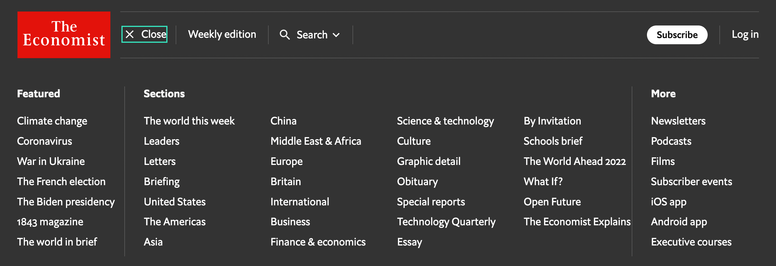
That’s the case on The Economist, for example. The website does contain a lot of topics to browse through, but it doesn’t contain multiple levels of navigation. In fact, the navigation structure is quite flat: much of the content comfortably sits on the same level. If we were to add breadcrumbs in this case, most breadcrumbs wouldn’t contain more than one section anyway. Instead, the designers of the site chose to display the section prominently next to the title. This is reasonable because it actually serves exactly the same purpose.

Not every website is like that though. As sites start to grow and gain more levels of navigation, eventually it becomes very difficult to gain a quick understanding of available options. For example, if a user has landed on the 4th level of navigation, but this isn’t clearly labeled on the page, they will have a quite hard time trying to explore similar items.
The bigger problem is that most complex sites have plenty of issues related to content as well. Often labels and headings are ambiguous. Or multiple sections have sub-sections with the same titles, so it’s not clear what exactly a particular page refers to. Or the content uses internal vocabulary that makes it difficult to understand if it’s intended for you. Or perhaps there are multiple points of entry to the website, but it’s impossible to find out easily at which you currently are, or which one is a better fit.

At the first glance, it’s difficult to say where exactly one is on the New England Journal of Medicine. There isn’t a clear label for the current category that one would immediately understand. If you’d like to explore more related articles, how would you navigate there? As it turns out, “Perspective” above the heading is actually a category and a link to that category, but because it’s appearing in light grey, it doesn’t look like an interactive element. To explore more, we’d need to click there, yet it’s not necessarily obvious to everyone.
Many complex projects will have some sort of breadcrumbs. They are often added to support users coming via search results, news feeds, or personal messages, who don’t have any prior knowledge of the website and how it’s organized. In such cases, breadcrumbs help users quickly understand where they have landed. In fact, on informational websites, users often heavily rely on them to explore the site.

In summary, as long as you have a relatively shallow navigation tree, you probably won’t need breadcrumbs. Neither will you need them when finding the right page on the site isn’t the priority for most users. If, for example, they explore data, filter tables, manage accounts or use search frequently, breadcrumbs won’t be of much help.
But if you have plenty of pages and sub-categories and nested navigation levels, or your navigation grows to three, four or even more levels, your users are likely to benefit from reliable signposts along their journey. That’s where breadcrumbs prove to be essential.
The question, then, is how to make them noticeable and helpful without being redundant and unnecessary? As it turns out, that’s an art and craft of its own.
A Short Story Of Confused BreadcrumbsThere doesn’t seem to be any other interface component that’s seemingly as consistent as breadcrumbs. After all, there are links to sections, and they are separated by some sort of a delimiter. And most of the time, that delimiter is an arrow or a chevron, which also indicates relationships.
But where should these icons actually point to? Should breadcrumbs indicate where each item lives (icon pointing to the left), or rather the path that a user has taken so far (icon pointing to the right)? After all, when using breadcrumbs, users will be navigating backward, not forward.

On the Stockholm University website, chevrons reluctantly point to the left. Since breadcrumbs are usually explored right to left, the icons indicate where a particular section or page lives.

On TVM, arrows indicate where a particular section or page belongs too. The last item in the breadcrumbs (Huidige pagina) means "Current page". It’s reasonable to assume that some users might think that the page it’s pointing towards is the current page.

On KBC, chevrons are pointing to the right are much more conventional and familiar to users. The delimiter could also be an arrow, and it’s only beneficial if all links in the breadcrumbs are actually underlined. This sets the right expectations early on.
It’s reasonable to assume that users will find their way with both directions — left and right — but historically in left-to-right interfaces relationships are indicated with icons pointing to the right. The direction indicates that a category contains another page or category; and because we usually consider browsing through pages as a horizontal experience projected onto a timeline, we are usually moving from left to right. So it’s definitely safe to stay true to this approach: it’s just more familiar to users this way.
Breadcrumbs Work Best Under Global NavigationTo help users understand where they are, breadcrumbs need to be visible to users. This seems to be quite obvious at first, yet in practice, breadcrumbs appear all over the map. Sometimes you can find them in under the main promo header, sometimes close to the top of the page, sometimes on images, and sometimes in the footer. So what’s the right position for breadcrumbs?

It’s common to see breadcrumbs appearing all the way on the top of the page, and it’s a perfectly reasonable option to choose. Deutsche Post, a German postal service (pictured above), is just an example of that. In fact, that’s where many users search for breadcrumbs first, because they associate them with navigation.

Not every website follows this pattern though. On many of its pages, Gothaer displays breadcrumbs just above the footer. It’s probably not the first spot where users would search for it though. The website does look wonderful, but the position of breadcrumbs might not be obvious and is probably suboptimal.

DHL displays the breadcrumbs under its primary header image. While it does fit the overall design of the page, users often dismiss banner-alike images instinctively, mostly because they don’t find anything useful there. “Standard shipping” does appear as some sort of title, yet it doesn’t show up in the breadcrumbs.
The text on the banner is actually the title of the page. “Standard shipping”, on the other hand, is one of the sub-sections on the current page. The breadcrumbs above “Standard shipping” seem to relate more to the banner, rather than to the sub-section displayed under it. This might be confusing to some users.

In contrast, on Allianz.de, breadcrumbs are positioned on top of the header image, easy to spot and easier to connect with that header. It appears to be just a bit more obvious this way. The only refinement could be subtle underlines to indicate that each breadcrumb is actually a link.

A similar website, a similar industry, but organized slightly differently: SwissLife. There are multiple levels of navigation on the top, with breadcrumbs above the heading and placed on top of the image. Unlike in previous example, here the header is more useful — just also unfortunately much more difficult to read. The text could live on a darker background, for example. The overall design pattern though seems to be quite right, now with useful content appearing right in the header area.

On SDU, breadcrumbs live under he main navigation and just above the title of the page, in a dedicated area, housing multiple levels of navigation if needed. All of them are links, except the last item which is a label, highlighted in bold.
When we land on an unknown page, we tend to first verify that they are on the right page. Obviously we seek confirmation that they are still on the right path towards their goal. Naturally, we focus on the main heading of the page, and sometimes on tags and sidebar links to get the confirmation that we need.
If at any point we need to move backwards or sideways, we need to be able to find breadcrumbs immediately. Displaying breadcrumbs just under the main navigation or just above the main heading is the most obvious and familiar way to achieve just that.
Breadcrumbs Should Be Visible Without ScrollingYet even if breadcrumbs live above the main heading, it doesn’t mean that they are easy to use. In fact, the further we move breadcrumbs away from the top of the page, the more difficult they are to spot. This might sound like quite an exaggeration, but if you look closely at the example below (LVK.fi), can you actually spot where the breadcrumbs are hiding?

Yes, it was indeed a bit of a tricky question. Of course, the breadcrumbs are hiding behind the sticky cookie consent prompt. With the global navigation and a sticky navigation bar, along with a large visual promo area on the top, we end up with almost 0% of the screen dedicated to the content that the user has come to explore on the site. In fact, much of the site is polluted with navigation, not content.
This alone is a bit suboptimal, but it also has a negative side effect. While the composition of the page might be beautiful and visually pleasing, now every time a user wants to explore any page, they need to scroll down one full page to get to the first sentence of the actual information on the page.

This problem is slightly more critical than it might appear at the first glance. Of course, users know how to scroll, and they do scroll vigorously. But if every time you move from one page to another, you need to scroll a full page to start reading that page, you might be less inclined to browse more, so we shouldn’t be expecting people browsing through a lot of pages and finding what they seek. And with people leaving the site, that extra scroll on every page can quickly become quite damaging and quite expensive.
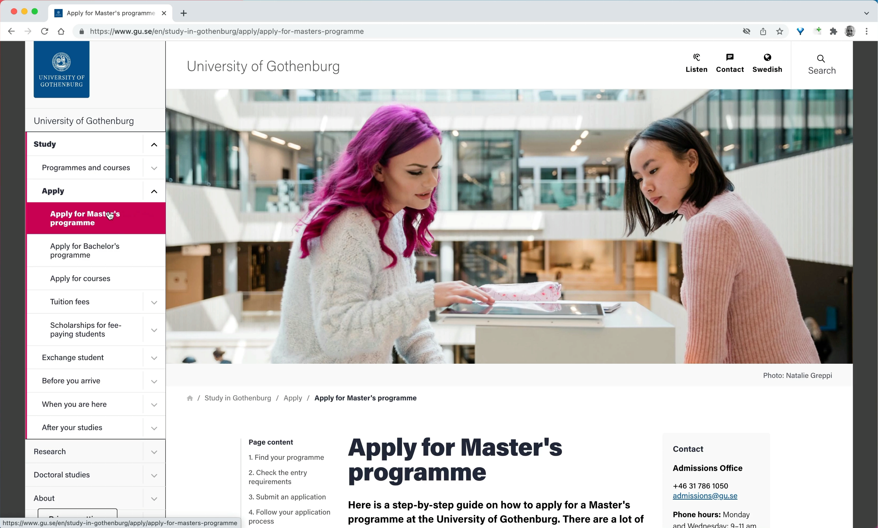
On the University of Gothenburg website, much of the screen space is used for navigation menus and visuals. Every time a user wants to explore a page's content, they need to scroll the entire screen first. It might help to change the aspect ratio a little to help users focus on the content of the page.

No need to scroll on UBS. The sidebar navigation is stable and consistent, and users can explore the content immediately across many sections in the left sidebar. No breadcrumbs are needed here either.
It’s worth testing if removing a promo banner has any impact on the design KPIs outlined earlier in the article. Of course sometimes we want to leave a lasting impression, but sometimes we want to communicate information, and a visual would just get in the way. Boring? Maybe. But effective.

Also a little bit less exciting, but a little bit more predictable and easier to spot. On Signal Iduna the breadcrumbs are displayed at the very top of the page, under the main navigation and above the call to action. A good reference example to keep in mind when designing breadcrumbs navigation for a corporate landing page.

One could of course go even further, and place the breadcrumbs all the way on the top of the page, above primary navigation, and above the logo — that’s exactly what the designers of Bundesrat Switzerland have chosen to do.
In this particular case, breadcrumbs act as global type of breadcrumbs navigation allowing for jumps between a larger family of websites, not sections on a given website. This goes very much in line with Erik D. Kennedy’s laws of locality. Indeed, that’s exactly what the navigation is, and it’s not to be mistaken for a more common breadcrumbs navigation we’ve explored earlier.
In summary, a simple way to ensure that breadcrumbs are found and understood easily is to always keep the breadcrumbs visible without scrolling, and preferably close to the main heading of the page. That’s where users expect to find a confirmation and some clues about where they currently are.
Avoid “Disabled” BreadcrumbsIf you take a closer look at the previous examples, do you see any inconsistencies in their designs? In some implementations breadcrumbs are merely a text label representing the structure of the site; in others, each breadcrumb is actually a link guiding to separate sections of a site.
And on some websites breadcrumbs are a sort of choose-your-own-adventure game. Some breadcrumbs are links, while others are disabled, merely representing the location of a given page in the overall hierarchy of the website.

In Sparkasse’s breadcrumbs, “Startseite” (Homepage) and “Karten” are actually links, but the sections in between are not. There might be very good reasons for this decision, but the general expectation is very clear: all breadcrumbs are links.
Removing some links from some breadcrumbs can be confusing, and is likely to cause a few hefty rage clicks. In fact, it wouldn’t be surprising to discover that these inaccessible breadcrumbs get quite a few rage clicks: even though they might look different, it doesn’t necessarily mean that they will not work. After all, they might appear different because these sections have been visited previously.

Do we know if the current page is a link or not? On Deutsche Bahn, the styles for text labels and links are identical — unless you start hovering or tabbing through the sections. Plain underlines would make it slightly more obvious.
In general, if a component in the interface behaves differently or serves an important or different purpose, we make it stand out by highlighting it in some way. In the case of breadcrumbs, there are two different types of crumbs: the current page (if we choose to display it), and the breadcrumbs on the path to that page.

Current page shows where a user currently is, and there is no need to navigate there because the user is there already. However, if that page looks exactly like the rest of the breadcrumb, it suggests that they all have a similar function, or that they all are links.
This brings another problem along: depending on the title of that last breadcrumb, you can observe users assuming that the last appearing item isn’t current page, but a parent of the page. Consequently, willing to move back, they click on that last item, but indeed nothing happens. That’s confusing, too.
To avoid that conundrum altogether, we can either display current page differently, or avoid it altogether.

In fact, it’s removing the current page altogether that Gov.uk has opted in. The current page isn’t displayed in the breadcrumbs. Every breadcrumb that is displayed is a link, with proper :active and :focus states for keyboard users. It seems to be working well though because the breadcrumbs are located right above the heading.
As we saw in the previous section, one fine little detail where breadcrumb designs often differ is the presence of the current page in the breadcrumbs. After all, the current page is indicated through the heading right under the breadcrumbs, so is it necessary to duplicate it? On the images below, one example includes the current page in breadcrumbs (DocuSign Developer), and on the other, it does not (Stripe Docs).
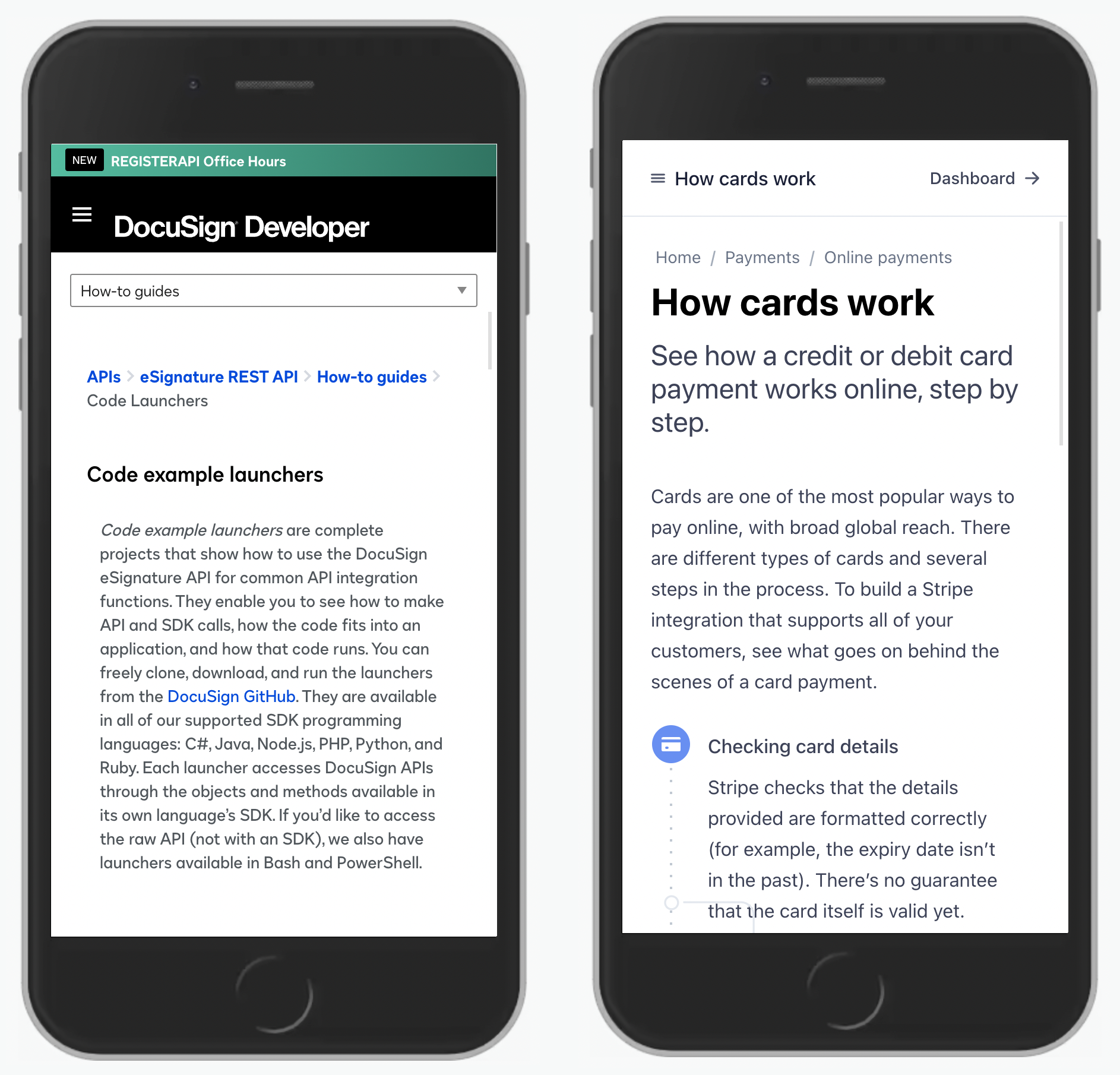
It appears that it doesn’t really matter that much as long as breadcrumbs appear straight above headings. In that case, the last item can be dismissed as long as proper semantics is used to announce the heading to the screen reader. The further away breadcrumbs are from the heading, however, the more likely we are to include the current page in the breadcrumbs as well — just to provide more clarity.

In the example above (KBC), the relationship between the heading and the breadcrumbs might not be as obvious as it is in the previous examples. Had we removed the current page from the breadcrumbs, users might be assuming that they are on a “Self Banking” page, which isn’t the case. Notice that the title appearing in breadcrumbs is the same as the heading of the page — this is helpful, but unfortunately isn’t always the case.
Another use case where keeping the current page in the breadcrumbs might make sense is if the breadcrumbs navigation is sticky. As users scroll down a potentially long page, they might be losing the context of what exactly they are looking at at this very moment. Keeping the current page in the breadcrumbs might serve as a good reference point in such a case.
Our ultimate goal with breadcrumbs is that users quickly understand what they are looking at and where they are. Both options provide that answer. As long as the breadcrumbs appear above headings, adding a current page to the breadcrumbs isn’t as necessary as one might think.
Avoid Truncations and Use Accordions InsteadWebsites with many levels of navigation often don’t have space to display the entire path with breadcrumbs. This is also true for pages that just happen to have very lengthy labels, especially in Finnish and German. One common way to deal with this problem is to truncate some intermediate steps in the breadcrumbs navigation.

Frontier Motor Insurance replaces some paths with an ellipsis; the title is removed but the link is still there and can be explored. With this approach, we are cutting the breadcrumbs, making it more difficult for users to explore the full path.

One option is to display the entire breadcrumbs, wrapped into multiple lines (pictured above). Admittedly, this would take quite a bit of horizontal and vertical space on screens that don’t have much space anyway. Hence this can be quite problematic, and is often advised against.

When there isn’t enough space to display full breadcrumbs, it’s common to see breadcrumbs displayed as only one item at a time. That’s reasonable but favors more jumps against faster interaction. The user has to go through multiple pages on mobile, and if they happen to be on a choppy connection, they might be better off using the navigation menu. Ideally, we could keep the breadcrumbs visible as much as necessary, without compromising the amount of displayed content on the page.

Other times breadcrumbs disappear entirely, like it currently is on Swisscom. Then, users have to rely on global navigation every time they want to navigate, and often the current page has to be discovered through tiring drill-down navigation on a small screen.

Another option is to add some sort of drop-down to allow people to move between levels. In the City of Düsseldorf and Federal Statistical Office Switzerland that might be a little bit difficult to understand with a few too many arrows pointing to different directions.
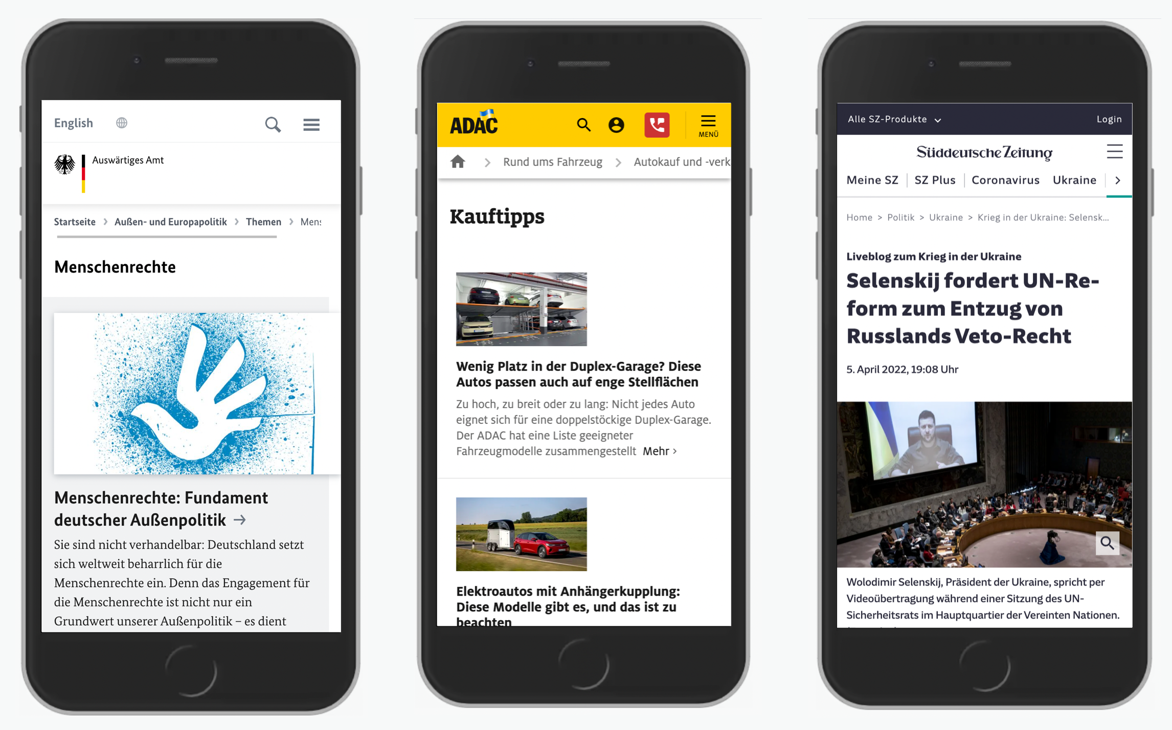
A good compromise is to keep all breadcrumbs on the same line but avoid multi-line wrapping. Deutschland Auswärtiges Amt displays the entire breadcrumb for lengthy titles, but if it doesn’t fit, it uses fade-out and encourages users to swipe left and right to explore the entire path. No breadcrumbs are truncated but require a bit of horizontal scrolling to be discovered.
The same pattern is being used on ADAC. An alternative option is to use a swiper assistant to move between levels predictably. Süddeutsche Zeitung is using it for primary navigation, but it could be helpful for breadcrumbs as well.
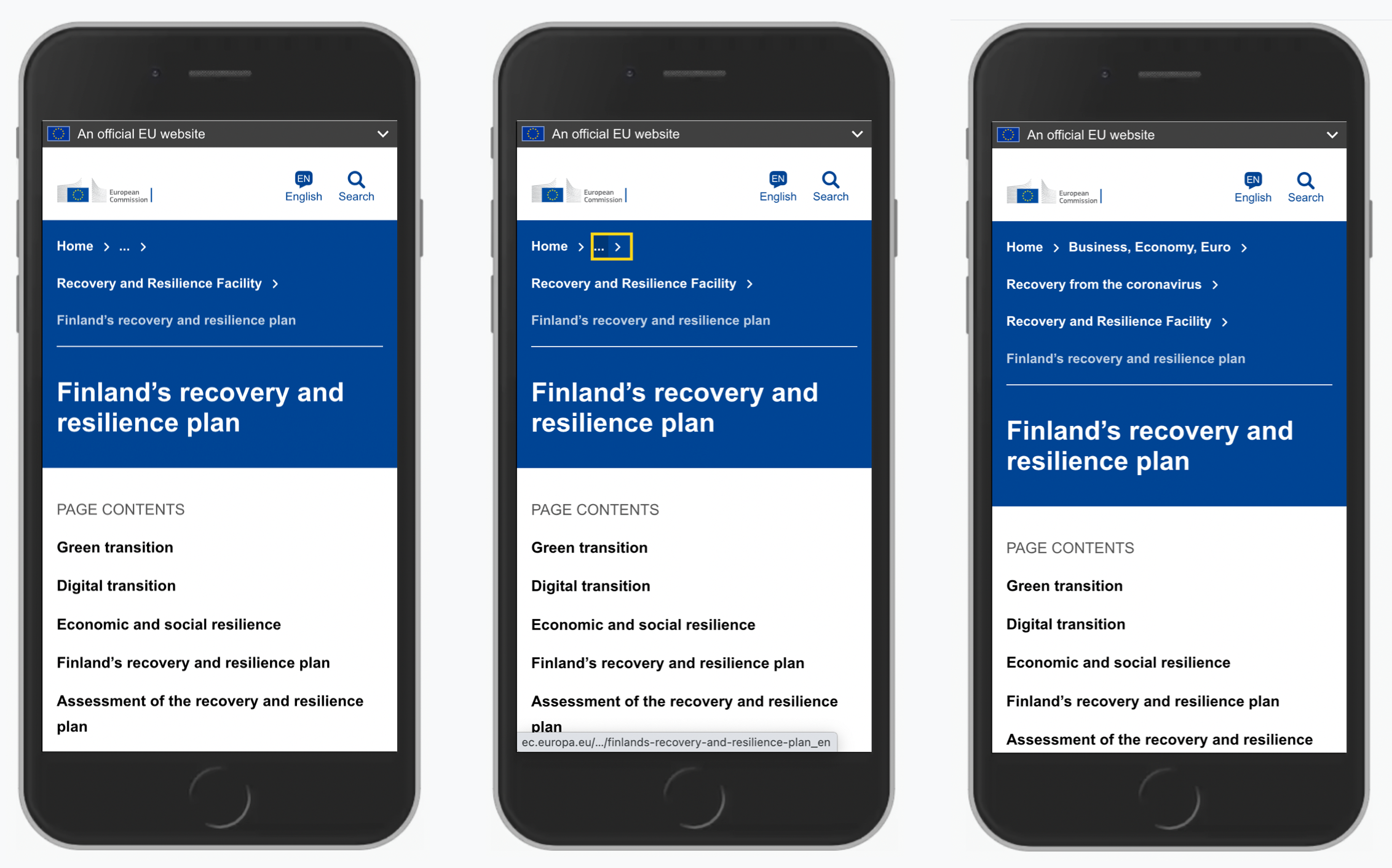
On the European Commission's website, the parent category of the current page is always displayed in full, but the parents of that section are truncated. However, when a user taps or activates the truncated area (which is a link), the entire breadcrumbs appear. Technically, it’s a breadcrumbs accordion. Also, notice the visual difference between the current page (text label) and breadcrumbs (links). That’s a great reference to keep in mind.
Sideways BreadcrumbsIn all the examples above, breadcrumbs were mostly a static representation of the information architecture on the site. They support navigation backwards, but moving forward or sideways always requires another click. There is an alternative way of helping users move forward faster. This requires a combination of breadcrumbs navigation and tap/click menus, also conveniently called sideways breadcrumbs.
At ADAC example below, breadcrumbs are sort of extended — with a drop-down that allows users to jump to other sections within the category quickly. That’s the notion of sideways breadcrumbs which provide quick access to the siblings of the current page.
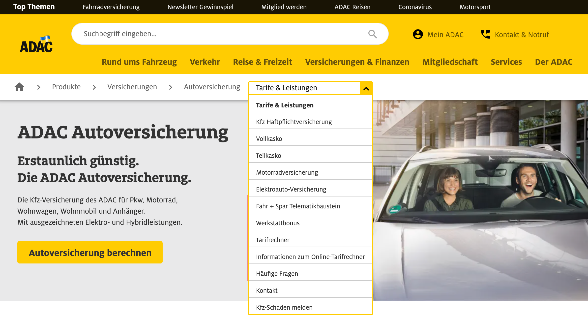
The chevron in breadcrumbs might be missing to make it perfectly clear, but the design pattern per se is useful since it significantly speeds up jumps between siblings. We can think about it as an alternative approach to sidebar navigation which requires less vertical space and appears on demand. On mobile, breadcrumbs turn into a horizontal swiper with a drop-down that reveals all available options on tap or on enter.
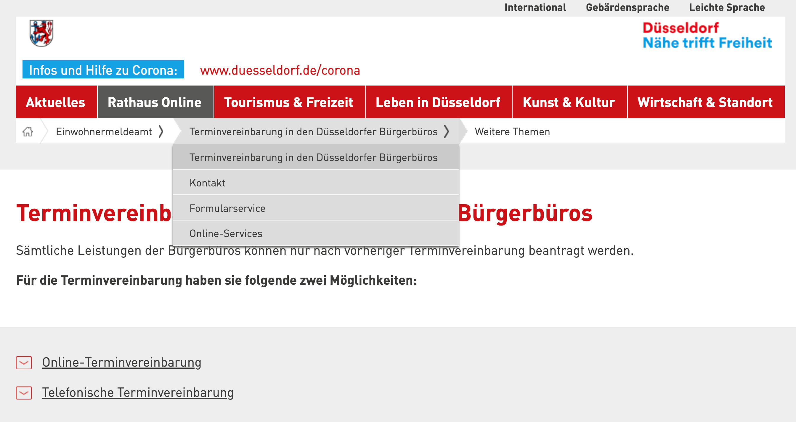
The City of Düsseldorf uses a similar pattern but rather than providing access to siblings of the current page, at first it seems to be providing quick jumps for siblings of the parent section. That’s not the case though. Surprisingly, the last item in the breadcrumb isn’t the current page but rather “other topics”, which also happens to be a drop-down. A bit surprising, but sideways breadcrumbs make their appearance here as well.

But of course, when we look into sideways breadcrumbs, we don’t have to use it only at the last level. Federal Administration of Statistics in Switzerland displays global sideways breadcrumbs that help users jump between different departments of the Federal Administration family of websites. The breadcrumbs are the first thing that users encounter on the site. Unfortunately, on mobile, breadcrumbs disappear entirely.
Like other navigation options, sideways breadcrumbs provide not only an overview of where a user currently is but also relationships between sections. Yet unlike other options, it doesn’t need much space to do that and often conveys a significant amount of information in a very small amount of space. As such, they can be very helpful and could be worth considering as a good extension of traditional breadcrumbs navigation.
Breadcrumbs Alone Aren’t EnoughWe’ve explored many examples of breadcrumbs so far, and in some way they all support the navigation patterns that we explored early in the article. Admittedly, there are plenty of other solutions worth considering as well, and they don’t necessarily have to involve breadcrumbs. In fact, breadcrumbs alone aren’t sufficient to navigate the site easily — they complement existing navigation patterns, but can’t really replace them.
Let’s briefly explore how a combination of various options can help us resolve common issues around navigation.
Horizontal Layering
One approach is to use horizontal layering — that is, displaying multiple navigation bars, one for each level of navigation. Thus, at any point, users can jump between levels, and they can see siblings of all sections in the hierarchy. BBC is a great example of a large website using this very pattern at large (see image below).

Sidebar Navigation
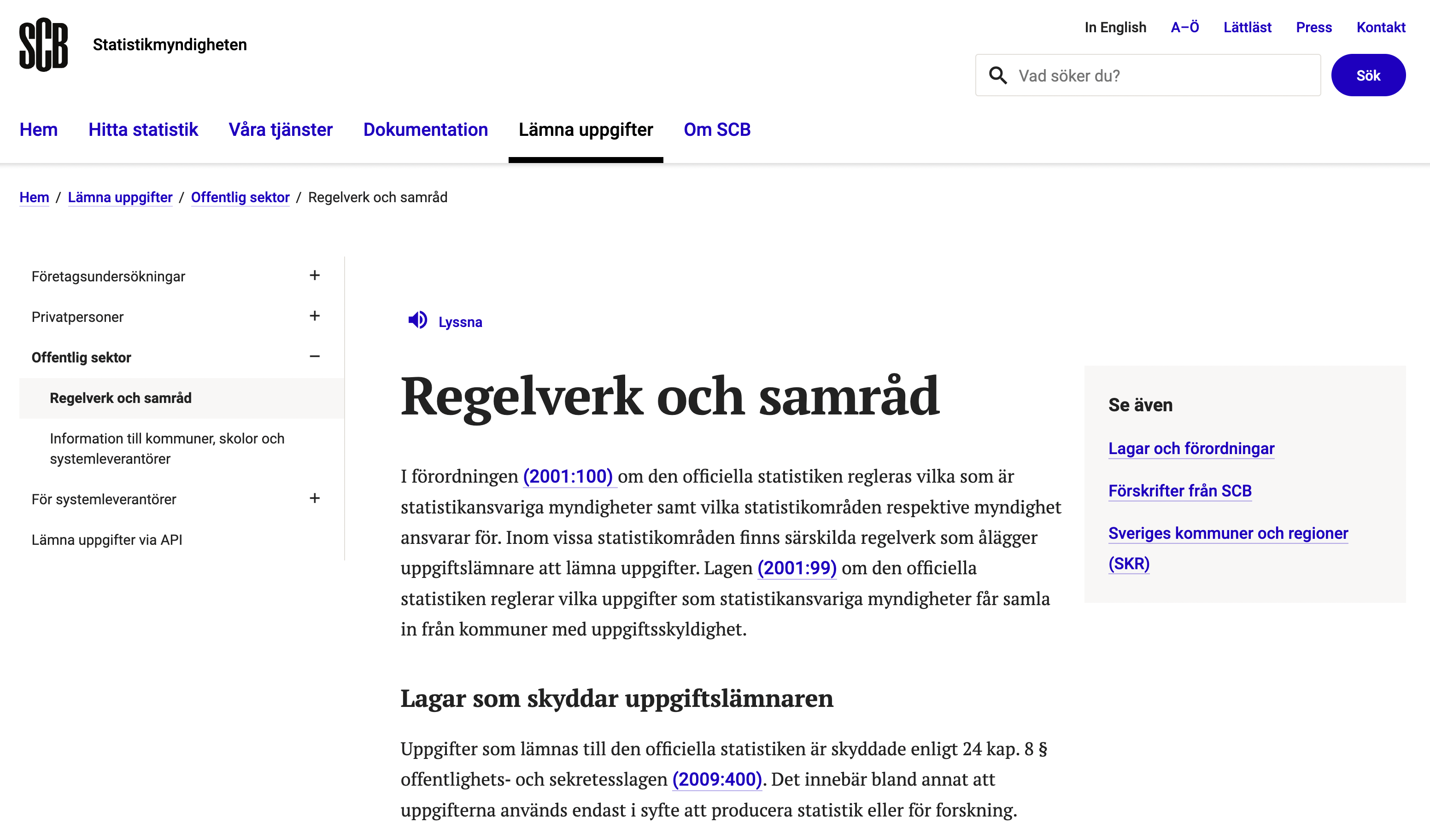
Another approach is to use a sidebar navigation. Rather than laying out navigation options horizontally, we can do so vertically. This gives us the flexibility to show more items on the page if needed, and easily open and close vertical accordions without ever covering some of the options (which would probably be the case with horizontal layering). That’s the pattern used consistently on Statistics Sweden.
Tags
With sidebar navigation, we indicate the relationships between subsections and allow users to jump between levels quickly. However, if we just want to indicate which category the page belongs to, we might be able to get away with using tags instead.
They don’t show the relationship of a current page within the hierarchy of the site, but it might be actually a better option if we have literally hundreds of “sections” on the page. Showing them in a horizontal or vertical bar just wouldn’t be possible.

Remember The New England Journal of Medicine? As it turns out, it does use both tags and a sidebar navigation. Related items appear in the sidebar below the job board area, and the tags are displayed at the end of the page. While this might be working absolutely fine for frequent users of the site, it might be not as obvious to occasional users.
Breadcrumbs
All the options listed above do provide a sense of orientation, but they also require quite a bit of horizontal or vertical space to do so. Throughout the entire user journey, they need to be visible to guide users moving from one page to the next. Should they disappear all of a sudden on one of the pages, users are very likely to get lost. Add to it a healthy dose of noise in search results and a slightly cumbersome navigation, and we shouldn’t be too surprised that users have issues finding what they are looking for.
In contrast, breadcrumbs are concise, compact, focused, and do their job well. Rather than showing all levels of navigation, they indicate just where the page lives, along with quick access to all its parents, all the way to the homepage. And sometimes it’s exactly what is needed: not more, and not less.
Breadcrumbs ChecklistNot every breadcrumb navigation appears and works similarly. We’ve seen a couple of very different patterns and fine little details in which breadcrumb design and implementation differ.
As usual, here’s a general checklist of a few important guidelines to consider when designing better breadcrumbs:
- Breadcrumbs always need to complement main navigation.
- Breadcrumbs fit best under global navigation.
- They could also appear above main headings.
- The delimeter should be pointing to the right (in RTL interfaces).
- Breadcrumbs should be visible without scrolling.
- Avoid “disabled” breadcrumbs and turn all breadcrumbs into links.
- The current page can be dropped if breadcrumbs live above headings.
- Otherwise, include the current page in breadcrumbs for clarity.
- On mobile, use accordions to display a full path if needed.
- The parent of the current page should be visible at all times.
- Sideways breadcrumbs might be a quite surprising and useful discovery for your users.
If you are interested in similar insights around UX, take a look at Smart Interface Design Patterns, our shiny new 6h-video course with 100s of practical examples from real-life projects. Plenty of design patterns and guidelines on everything from accordions and dropdowns to complex tables and intricate web forms — with 5 new segments added every year. Just sayin’! Check a free preview.
 Meet Smart Interface Design Patterns, our new video course on interface design & UX.
100 design patterns & real-life
examples.
6h-video course + live UX training. Free preview.
- “Breadcrumbs Guidelines for Mobile and Desktop,” Hoa Loranger, Nielsen Norman Group
- “Breadcrumbs in Web Design: Examples and Best Practices,” Jacob Gube, Smashing Magazine
- “Effective Guidelines For Breadcrumb Usability And SEO,” Justin Mifsud, Usability Geek
If you find this article useful, here’s an overview of similar articles we’ve published over the years — and a few more are coming your way.
Related Articles
- Designing A Perfect Accordion
- Designing A Better Infinite Scroll
- Designing A Perfect Responsive Configurator
- Designing A Perfect Birthday Picker
- Designing A Perfect Date and Time Picker
- Designing A Perfect Feature Comparison
- Designing A Perfect Slider