An Introduction to Horizontal Scrolling (+ Pros and Cons)
Horizontal scrolling has come a long way from hero sliders. It’s now simpler to implement, somewhat more acceptable from a UX point of view, and offers plenty of creative opportunity.
A horizontal scrolling technique can be engaging and visually interesting. Conversely, some elements can be missed by users and it can present some accessibility challenges.
Here, we’ll look at everything horizontal scrolling, including pros and cons to help you figure out if this technique is right for your website design projects.
Horizontal Scrolling 101
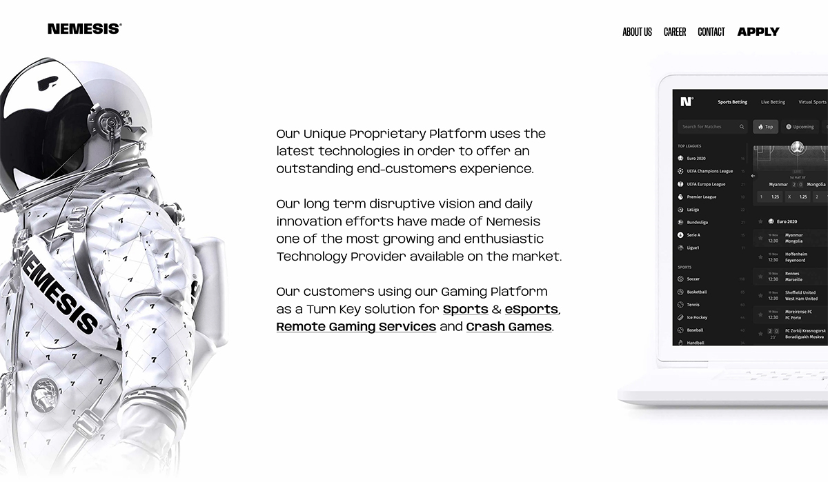
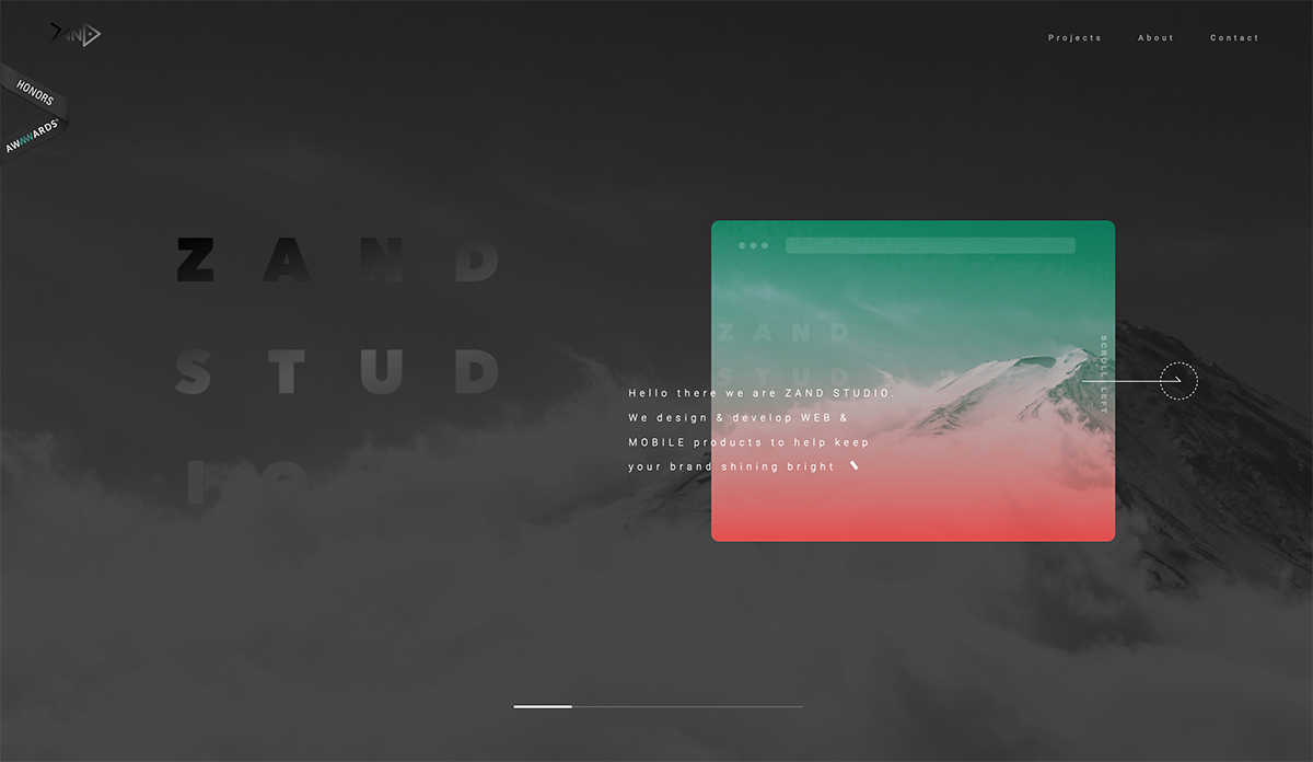
Identifying horizontal scrolling in website design is pretty simple. It refers to anything that moves from left to right or right to left when you move the mouse. The orientation of the scroll is untraditional in that elements on the screen don’t move up and down in concert with mouse movement.
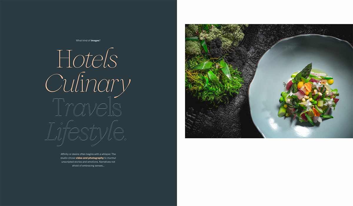
It can work with full images or elements that move in a side-by-side parallax style.
The first iterations of horizontal scrolling were sliders that advanced on their own from right to left off the screen. Generally, you could advance or pause the slides using on-screen arrow controls, a timeline element, or by scrolling.
Modern horizontal scrolling has come a long way, although sliders are still fairly popular.
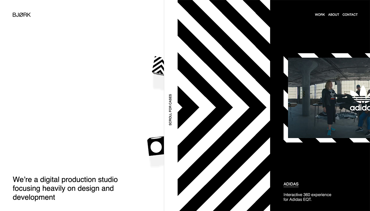
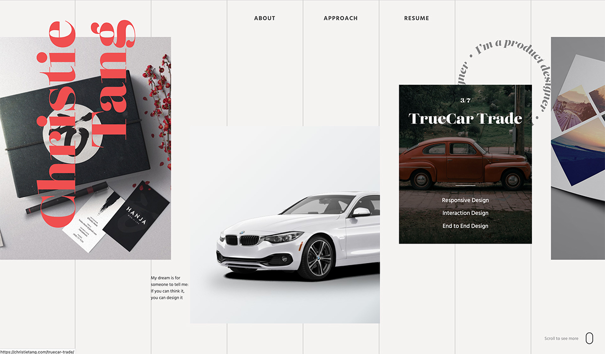
Now, horizontal scrolling often involved layered elements, such as images and text that move and overlap with animated elements. Often the scroll is obvious due to an object that’s partially on and partially off the viewable area of the screen.
Most designers also include some visual scrolling cues or instructions so that users know exactly how to engage with the design.
Generally, designers implement some type of element that tells users that horizontal scrolling is in effect using a drag bar or timeline that can be clicked (or tapped) and dragged to change position in the scroll, swiping or clicking from left to right or vice versa, with directional arrow keys, or simply using the scroll wheel on the mouse.
While horizontal scrolling can appear anywhere in a website design, it is almost always restricted to the home page hero area or navigation menu.
Because horizontal scrolling is such as distinct technique, it counts as a design trick in itself and works best with a design framework that isn’t relying on a lot of other tricks or decoration for success.
One of the things that may have contributed to the popularity of horizontal scrolling is Nexflix. The streaming video giant has been using this technique for quite some time to help you find something to watch online. (And as we know, once a major company adopts a technique, it begins to become mainstream quickly.)
Horizontal Scrolling Pros
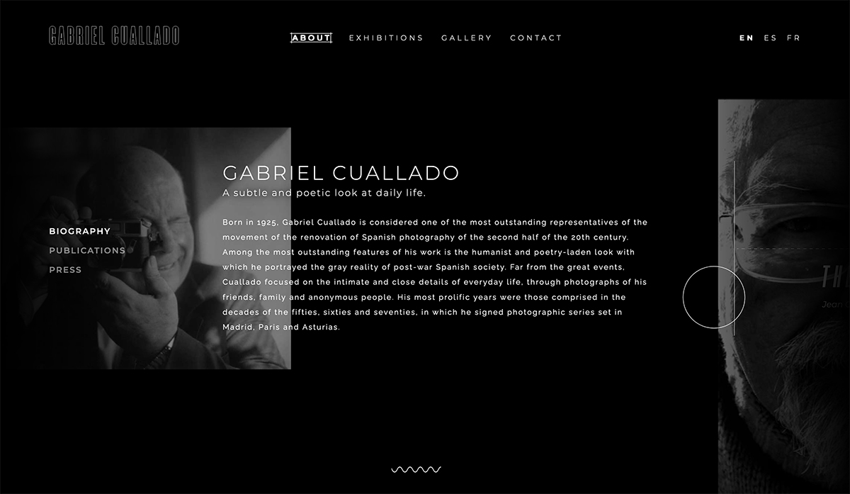
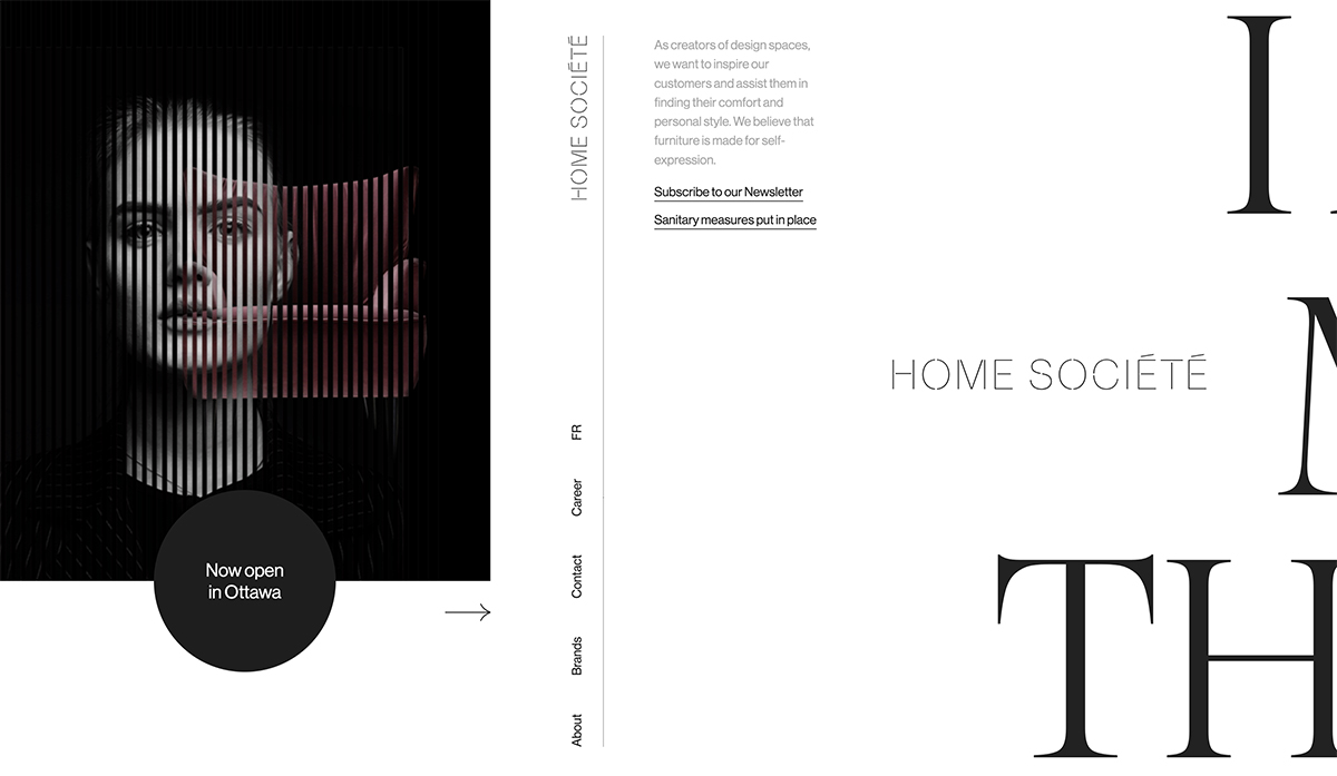
A lot of website designs are using this technique. The primary reason is that it allows for more content above the scroll while providing something for the user to do.
The theory here is that website visitors will engage with the horizontal scroll and stick with the website longer and engage with content.
Other pros of horizontal scrolling include:
- To conceal secondary content that is revealed later in the interaction process
- To show or separate different content elements or user choices
- To serve as strictly an engagement tool
- To show product options for ecommerce
- To provide an interactive element with a large or largely horizonal visual element that might be difficult to see otherwise
- To highlight multiple, but similar, elements (common for portfolio design)
Horizontal Scrolling Cons
Sometimes the interaction isn’t obvious, and that can be a real issue when it comes to a horizontal scrolling pattern. Users need to know and understand how to interact with your website to ensure a positive experience and the best potential for conversions.
Depending on the structure and nature of a horizontal scrolling option, there are some other cons to keep in mind, although you can combat some of them with proper coding and planning so that they aren’t a big deal.
Horizontal scrolling cons include:
- Lack of innate understanding for users of what to do or how to proceed
- Website interactions are different from common patters or user expectations
- Users that miss, ignore, or choose not to interact with the scroller and miss key information or content
- Accessibility concerns due to the nature of scrolling in an unusual manner
- Higher mental capacity cost from having users think about how to use the design (That’s thought they aren’t spending on the content itself)
Horizontal Scrolling Best Practices
To make the most of a horizontal scrolling website design pattern, focus on usability and function. Does horizontal scrolling actually contribute to the content or design? Does that outweigh potential user objections to the design pattern?
Consider these best practices:
- Avoid a full-screen horizontal scroll; ensure that users know there is also content that can be reached using a traditional method
- Make scroll interactions obvious and provide instruction
- To avoid accessibility issues, ensure that horizontal scrolling elements also work with keyboard navigation
- Design horizonal scrolling elements in containers using HTML and CSS
- Use visual cues, such as partial images, to show that there is a horizontal scroll action in effect
- Use partial horizontal scrolling with a static design element for stability
- Design horizontal scroll bars in the same manner as vertical scroll bars to create an element of familiarity for users
Horizontal Scrolling Tools and Resources
Here are a few tools and resources to help you plan – and code – a horizontal scrolling technique.
- Horizontal Scroll Snap by 30 Seconds of Code
- Creating Horizontal Scrolling Containers the Right Way [CSS Grid} by UX Collective
- How to Create a Horizonal Scroll Menu by W3Schools
- Pure CSS Horizontal Scrolling by CSS-Tricks
- How to Implement Horizontal Scrolling Using Flexbox by freeCodeCamp
- Introduction to Scroll Groups in Adobe XD
Conclusion
Horizontal scrolling can be an effective design technique when used well. You will engage longer with websites that do this well and enjoy the overall user experience. But it is not a particularly easy task or technique.
Horizontal scrolling requires the right content and visual elements with a solid design plan and execution. Put all this together and you can end up with a stunning and functional design.
Make sure to visit the links to the examples above to see how each implemented horizontal scrolling.