Building Cross-Platform UI Kits in Figma: A Practical Guide
Designing for multiple platforms, like iOS, Android, and web, can be challenging when each system has its own guidelines, user expectations, and interface patterns.
This is where cross-platform UI kits come in to help streamline the design process, create consistency, and speed up development.
Figma makes it easier than ever to build, maintain, and scale a UI kit that works across platforms.
In this guide, we will walk you through the process of creating a cross-platform UI kit in Figma, from setting up foundations to organizing components and working with teams.
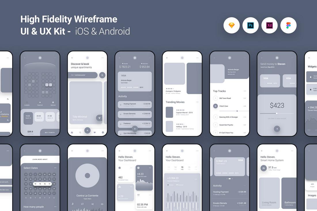
What Is a Cross-Platform UI Kit?
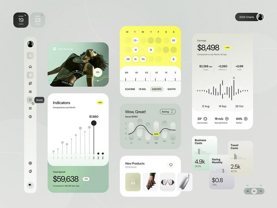
(Credit: Awsmd)
A cross-platform UI kit is a collection of reusable design components, styles, and patterns created to work seamlessly across multiple platforms, such as web, iOS, Android, or even desktop applications.
It serves as a design system that balances consistency with platform-specific needs.
Instead of designing individual assets from scratch for each platform, a cross-platform kit includes adaptable elements that respect the native design requirements of each environment.
For example, you might have one button component with variations that follow Material Design guidelines for Android and Human Interface Guidelines for iOS, all while maintaining the brand’s theme and style.
This kind of UI kit makes collaboration smoother between design and development teams, and speeds up the workflow when building or scaling multi-platform products.
In tools like Figma, these kits can be built using component variants, shared libraries, and style tokens to keep everything connected and manageable.
Why Build a Cross-Platform UI Kit?
When your product lives on multiple platforms, consistency is key. A well-built cross-platform UI kit ensures that your interfaces feel familiar no matter where users interact with them.
It reduces design debt, improves collaboration between teams, and makes onboarding new designers or developers easier.
Instead of rebuilding components for each platform from scratch, your kit should contain reusable elements adapted for specific platforms but built from a shared base.
This not only saves time but also helps keep your brand cohesive.
1. Start with Shared Foundations
Before jumping into platform-specific components, set up shared foundations that every version of your app will use.
This includes:
- Color styles
- Typography scales
- Spacing units
- Grids and layout guides
- Icon sets
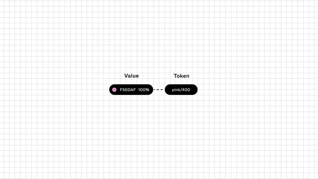
Establishing these core tokens in Figma allows you to apply consistent design values while giving each platform the flexibility it needs.
For example, iOS and Android might use different font weights, but they can still pull from the same typography scale.
Create a “Foundations” page in your Figma file and organize your tokens using Figma styles. This makes it easier to update your system later without breaking everything.
2. Adapt Components by Platform
Next, build platform-specific components based on your shared foundations.
For example, buttons on Android typically follow Material Design with more elevation and shadows, while iOS buttons are more subtle and flat. The structure is similar, but the execution varies.
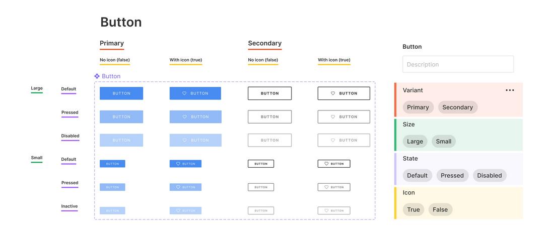
In Figma, you can create components with variants to handle these differences.
For example:
- Button / Platform: iOS
- Button / Platform: Android
- Button / Platform: Web
Use auto layout to make these components flexible and responsive. Label layers and components clearly so your team knows which version to use.
3. Organize Your UI Kit by Use Case
Rather than separating components only by platform, try organizing them by function.
Create categories like:
- Navigation
- Forms and inputs
- Modals and alerts
- Cards and containers
- Lists and tables
Within each category, include platform variants where needed.
This helps teams quickly find what they need while reinforcing the idea that each component serves a functional purpose, regardless of platform.
4. Use Figma’s Component Properties and Variants
Figma’s component properties allow you to build smarter, cleaner components.
With text, boolean, and instance swap properties, you can build highly flexible UI components without duplicating them unnecessarily.
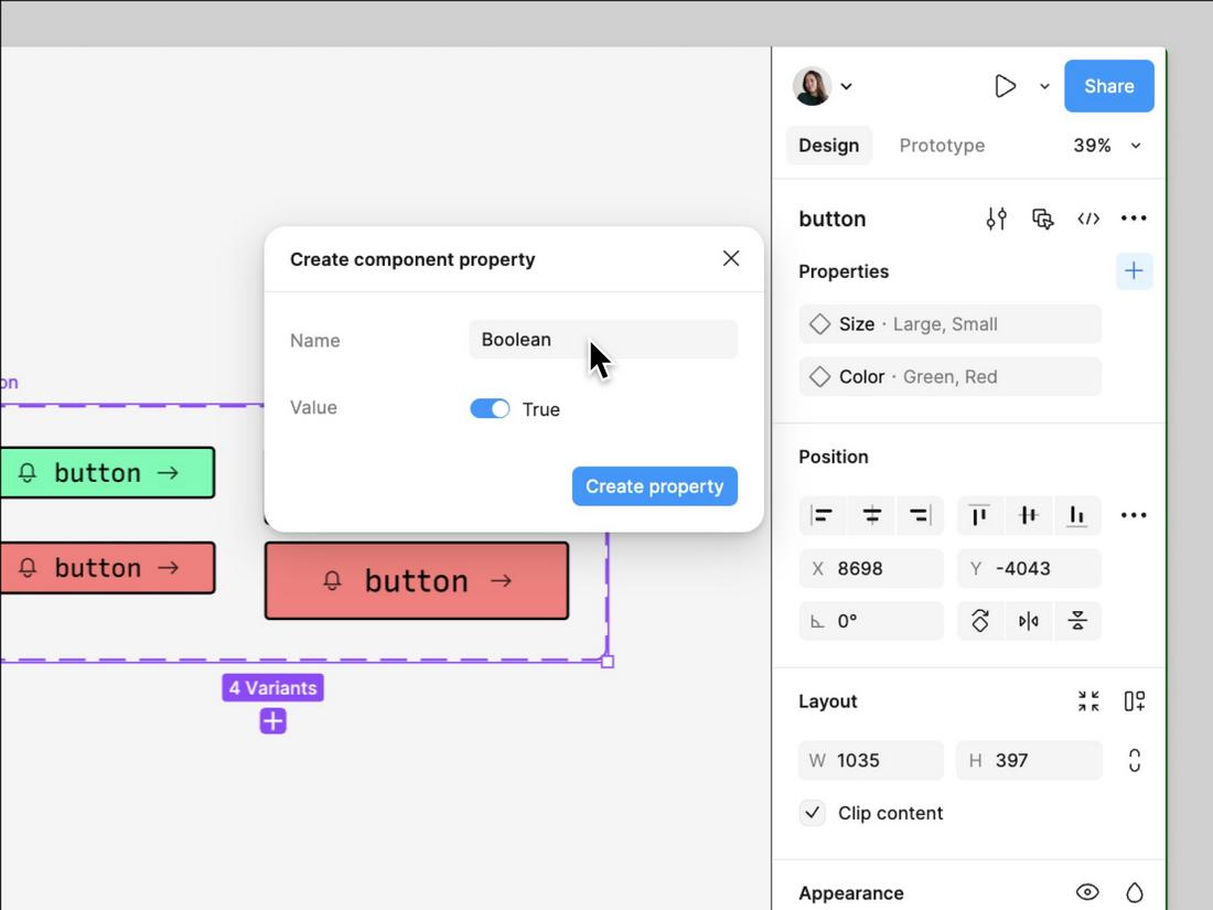
Variants are especially helpful for managing states (like default, hover, pressed, disabled) or platform differences.
Instead of creating multiple frames, use variants to consolidate and organize your design system.
5. Build a Platform Switcher or Documentation Page
If your team regularly designs for multiple platforms, consider adding a platform switcher section or documentation page to your UI kit.
This can include visual comparisons of components across platforms, usage guidelines, and links to native platform design systems like Apple’s Human Interface Guidelines or Material Design.
This helps reduce confusion and keeps everyone on the same page, especially for larger teams or products with complex interfaces.
6. Use Team Libraries and Design Tokens
Once your UI kit is in a good place, publish it as a team library so others can reuse components across files.
Libraries make your design system scalable and help prevent versioning issues.
If your development team uses design tokens, consider syncing Figma styles with a token management tool like Tokens Studio.
This helps bridge the gap between design and code and makes it easier to manage design updates programmatically.
7. Create Starter Layouts and Templates
In addition to components, offer pre-built layouts like headers, forms, dashboards, or app screens.
These templates help designers and stakeholders quickly visualize how elements come together and promote consistency across projects.
8. Document Interaction Patterns
Don’t just design how components look, but also document how they behave.
Include notes on interactions like hover states, tap feedback, animations, and platform-specific gestures.
Clear documentation helps developers and other team members understand how components should function, not just how they appear.
9. Audit Your Kit Regularly
Over time, design systems can get messy. Set a schedule to review your UI kit for duplicates, outdated components, or inconsistencies.
A quarterly audit can help ensure your system stays lean and usable, and prevents confusion as your product grows.
10 Test Across Platforms
Just because a component looks good in Figma doesn’t mean it’ll behave the same way on every device. Make sure to test your UI kit across actual devices and screen sizes.
This can help you identify inconsistencies, spot usability issues, and ensure your components scale and adapt as expected.
Consider creating sample screens for each platform using your kit to see how everything fits together in context.
Keep It Updated
Design systems are never really “done.” As your product evolves, your UI kit should evolve too. Set regular check-ins with your team to clean up unused components, add new ones, and retire outdated elements.
Encourage other team members to contribute to the kit with suggestions or improvements. Figma makes it easy to collaborate and propose changes, so treat your kit as a living system, not a static file.
Creating a cross-platform UI kit in Figma takes time, planning, and collaboration, but it pays off in speed, consistency, and better product experiences.
With a solid foundation and thoughtful organization, your team can design faster and more confidently across web, mobile, and beyond.