Futuristic CSS
I run the yearly State of CSS survey, asking developers about the CSS features and tools they use or want to learn. The survey is actually open right now, so go take it!
The goal of the survey is to help anticipate future CSS trends, and the data is also used by browser vendors to inform their roadmap.
This year, Lea Verou pitched in as lead survey designer to help select which CSS features to include. But even though we added many new and upcoming features (some of which, like CSS nesting, aren’t even supported yet), some features were so far off, far-fetched, and futuristic (or just plain made-up!) that we couldn’t in good conscience include them in the survey.
But it’s fun to speculate. So today, let’s take a look at some CSS features that might one day make their way to the browser… or not!
CSS TogglesThe CSS checkbox hack has been around for over ten years, and it still remains the only way to achieve any kind of “toggle effect” in pure CSS (I actually used it myself recently for the language switcher on this page).
But what if we had actual toggles, though? What if you could handle tabs, accordions, and more, all without writing a single line of JavaScript code?
That’s exactly what Tab Atkins and Miriam Suzanne’s CSS Toggles proposal wants to introduce. The proposal is quite complex, and the number of details and edge cases involved makes it clear that this will be far from trivial for browser vendors to implement. But hey, one can dream, and in fact, an experimental implementation recently appeared in Chrome Canary!

A major trend in recent years — not only in CSS but in society at large — has been recognizing that we’ve often done a poor job of serving the needs of a diverse population. In terms of web development, this translates into building websites that can adapt not only to different devices and contexts but also to different temporary or permanent disabilities such as color blindness or motion sickness.

The result is that we often need to target these different conditions in our code and react to them, and this is where Miriam Suzanne’s switch proposal comes in:
.foo {
  display: grid;
  grid-template-columns: switch(
    auto /
     (available-inline-size > 1000px) 1fr 2fr 1fr 2fr /
     (available-inline-size > 500px) auto 1fr /
   );
}
While the initial proposal focuses on testing available-inline-size as a way to set up grid layouts, one can imagine the same switch syntax being used for many other scenarios as well, as a complement to media and container queries.
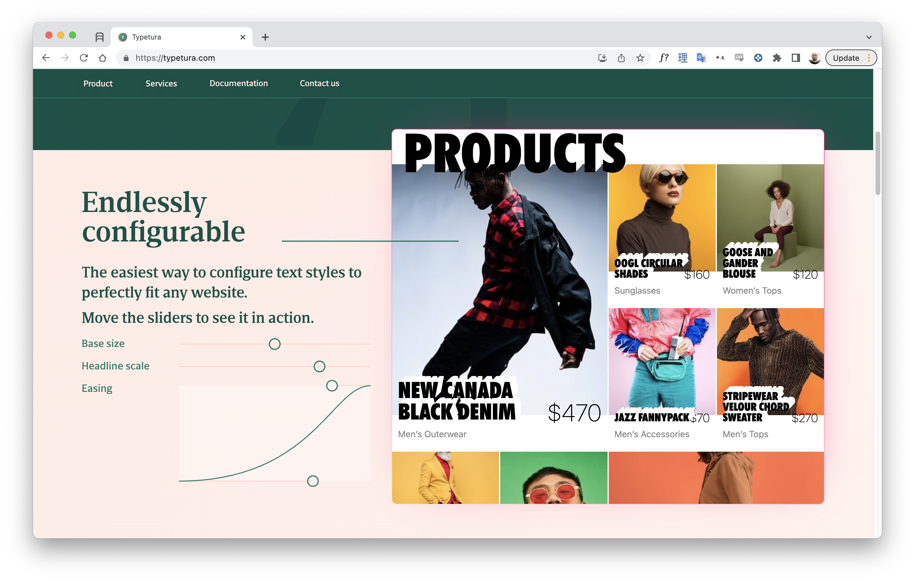
Intrinsic typography is a technique coined by Scott Kellum, who developed the type-setting tool Typetura. In a nutshell, it means that instead of giving the text a specific size, you let it set its own size based on the dimensions of the element containing it:
Instead of sizing and spacing text for each component at every breakpoint, the text is given instructions to respond to the areas it is placed in. As a result, intrinsic typography enables designs to be far more flexible, adapting to the area in which it is placed, with far less code.

This goes beyond what the already quite useful Utopia Type Scale Calculator can offer, as it only adapts based on viewport dimensions — not container dimensions.
The only problem with Typetura is that it currently requires a JavaScript library to work. As is often the case, though, one can imagine that if this approach proves popular, it’ll make its way to native CSS sooner or later.
We can already achieve a lot of this today (or pretty soon, at least) with container query units, which lets you reference a container’s size when defining units for anything inside it.
Sibling FunctionsIt’s common in Sass to write loops when you want to style a large number of items based on their position in the DOM. For example, to progressively indent each successive item in a list, you could do the following:
@for $i from 1 through 10 {
  ul:nth-child(#{$i}) {
    padding-left: #{$i * 5px}
  }
}
This would then generate the equivalent of 10 CSS declarations. The obvious downside here is that you end up with ten lines of code! Also, what if your list has more than ten elements?
An elegant solution currently in the works is the sibling-count() and sibling-index() functions. Using sibling-index(), the previous example would become:
ul > li {
  padding-left: calc(sibling-index() * 5px);
}
It’s an elegant solution to a common need!
CSS PatternsA long, long time ago, I made a little tool called Patternify that would let you draw patterns and export them to base64 code to be dropped inline in your CSS code. My concept was to let you use patterns inside CSS but with CSS Doodle. Yuan Chuan had the opposite idea: what if you used CSS to create the patterns?

Now pure-CSS pattern-making has been around for a while (and recently got more elaborate with the introduction of conic gradients), but Yuan Chuan definitely introduced some key new concepts, starting with the ability to randomize patterns or easily specify a grid.
Obviously, CSS Doodle is probably far more intricate than a native pattern API would ever need to be, but it’s still fun to imagine what we could do with just a few more pattern-focused properties. The @image proposal might be a step in that direction, as it gives you tools to define or modify images right inside your CSS code.
Now we’re really getting into wild speculation. In fact, as far as I know, no one else has ever submitted a proposal or even blogged about this. But as someone who spends a lot of their time working on data visualizations, I think native HTML/CSS charts would be amazing!
Now, most charts you’ll come across on the web will be rendered using SVG or sometimes Canvas. In fact, this is the approach we use for the surveys through the DataViz library Nivo.
The big problem with this, though, is that neither SVG nor Canvas are really responsive. You can scale them down proportionally, but you can’t have the same fine-grained control that something like CSS Grid offers.
That’s why some have tried to lay out charts using pure HTML and CSS, like charting library Charts.css.

The problem here becomes that once you go past simple blocky bar charts, you need to use a lot of hacks and complex CSS code to achieve what you want. It can work, and libraries like Charts.css do help a lot, but it’s not easy by any means.
That’s why I think having native chart elements in the browser could be amazing. Maybe something like:
<linechart>
  <series id=”series_a”>
    <point x=”0” y=”2”/>
    <point x=”1” y=”4”/>
    <point x=”2” y=”6”/>
  </series>
  <series id=”series_b”>
    <point x=”0” y=”6”/>
    <point x=”1” y=”4”/>
    <point x=”2” y=”2”/>
  </series>
</linechart>
You would then be able to control the chart’s spacing, layout, colors, and so on by using good old CSS — including media and container queries, to make your charts look good in every situation.
Of course, this is something that’s already possible through web components, and many are experimenting in this direction. But you can’t beat the simplicity of pure HTML/CSS.
And Also…Here are a couple more quick ones just to keep you on your toes:
Container Style Queries
You might already know that container queries let you define an element’s style based on the width or height of its containing element. Container style queries let you do the same, but based on that container’s — you guessed it — style, and there’s actually already an experimental implementation for it in Chrome Canary.
As Geoff Graham points out, this could take the form of something like:
.posts {
  container-name: posts;
}

@container posts (background-color: #f8a100) {
  /* Change styles when `posts` container has an orange background */
  .post {
    color: #fff;
  }
}
This is a bit like :has(), if :has() lets you select based on styles and not just DOM properties and attributes, which, now that I think about it, might be another cool feature too!
Random Numbers
People have tried to simulate a random number generator in CSS for a long time (using the “Cicada Principle” technique and other hacks), but having true built-in randomness would be great.

A CSS random number generator would be useful not just for pattern-making but for any time you need to make a design feel a little more organic. There is a fairly recent proposal that suggests a syntax for this, so it’ll be interesting to see if we ever get CSS randomness!
Grid Coordinates Selector
What if you could target grid items based on their position in a grid or flexbox layout, either by styling a specific row or column or even by targeting a specific item via its x and y coordinates?
It might seem like a niche use case at first, but as we use Grid and Subgrid more and more, we might also need new ways of targeting specific grid items.
Better Form Styling
Styling form inputs has traditionally been such a pain that many UI libraries decide to abstract away the native form input completely and recreate it from scratch using a bunch of divs. As you might imagine, while this might result in nicer-looking forms, it usually comes at the cost of accessibility.
And while things have been getting better, there’s certainly still a lot we could improve when it comes to forming input styling and styling native widgets in general. The new <selectmenu> element proposal is already a great start in that direction.
Animating To Auto
We’ve all run into this: you want to animate an element’s height from 0 to, well, however big it needs to be to show its contents, and that’s when you realize CSS doesn’t let you animate or transition to auto.
There are workarounds, but it would still be nice to have this fixed at the browser level. For this to happen, we’ll also need to be able to use auto inside calc, for example calc(auto / 2 + 200px / 2).
Now let’s be real for a second: the chances of any of these features being implemented (let alone supported in all major browsers) are slim, at least if we’re looking at the next couple of years.
But then again, people thought the same about :has() or native CSS nesting, and it does look like we’re well on our way to being able to use those two — and many more — in our code sooner than later.
So let’s touch base again five years from now and see how wrong I was. Until then, I’ll keep charting the course of CSS through our yearly surveys. And I hope you’ll help us by taking this year’s survey!
Thanks to Lea Verou and Bramus Van Damme for their help with this article.