7 Ways to Establish Trust on Your Product Pages and Boost Sales
In order to boost sales and grow your ecommerce business, you need to spend some time ensuring your website is seen as trustworthy.
Online shoppers are afraid of fraud and receiving low-quality products. Naturally, they worry about the safety of their personal information. They are not likely to do business with a brand that has little to no trust signals.
In order to make your customers feel safe, consider implementing the following seven tactics to establish yourself as a trustworthy, credible brand.
Feature Product Reviews
Product reviews are a major trust signal in the ecommerce space. They prove that others have already done business with you, and practically all of your customers will check them out.
A majority of shoppers also trust the product reviews they read online as much as they would trust friends or family for a recommendation.
By clearly displaying product reviews — and not just on individual product pages, but on product category pages as well — you will instantly signal to your website visitors that:
- You have been in business for a while.
- Your products are of a certain quality.
- You are not about to steal their personal information.
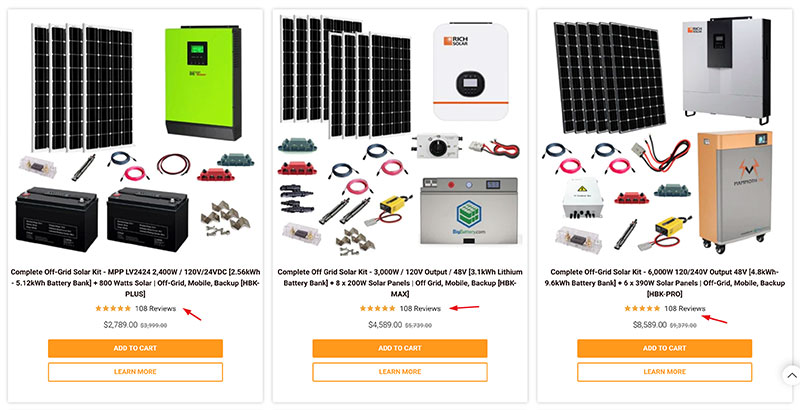
Check out this solar power systems product page. It not only displays the star rating of each product but also tells you how many people have reviewed it. This is an extra powerful trust signal. There’s a huge difference between one person finding a product to be great as opposed to hundreds of people liking it.
Source: shopsolarkits.com
Let Shoppers Filter Reviews
You can further enhance your product pages by letting customers filter through product reviews.
If they can only be sorted by date and star rating, people will need to read through quite a few of them to find what they really want to know: whether the product will work for them.
If you add a review filter that segments your audience based on certain needs and pain points, the entire review section will instantly become much more valuable.
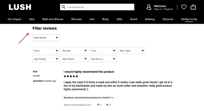
Check out this face mask product page. Lush has done a great job of adding a bunch of very relevant filters. You can choose your skin type, needs, and age, and you can also filter through the pros and cons of the product.
Source: lushusa.com
While you may not be able to provide as many filters, try to segment your audience in as many demographic and pain point groups as possible. You may need to create different filters for different product types, but the effort will be worth it.
Use Badges to Describe Products
When customers browse product category pages, they can quickly become overwhelmed by all the various items on display. If you draw their attention to specific items with the use of badges, you will help them choose and enhance the trust they have in your brand.
The two badges you should definitely consider are “best seller” and “sale.” They will show customers what your most popular products are (so they can check them out) and signal which items they can save on.
These simple design elements show that you care about your customers and that you want them to have a good experience while shopping.
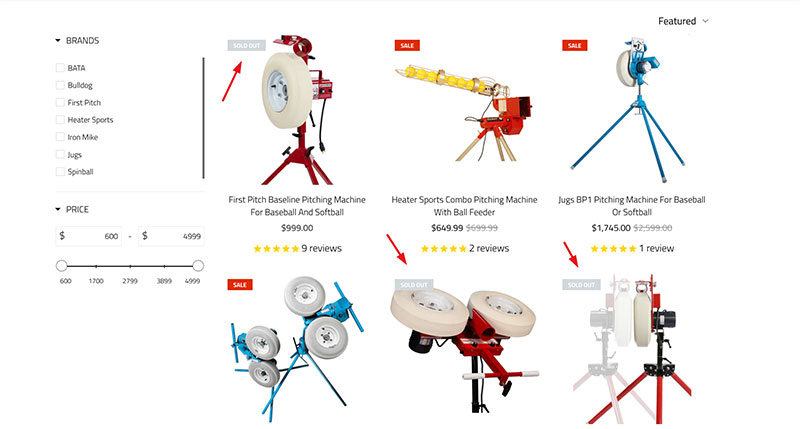
You can also consider adding a third badge, like this pitching machine product page has done. It features a “sold out” badge that cleverly plays with the fear of missing out and shows customers that some of their items are very popular.
Source: anytimebaseballsupply.com
Instead of removing products that are currently not in stock from the page, the brand capitalizes on their popularity and tells visitors that they are in demand.
Provide a Pay Later Option
Adding a buy now, pay later option to your store, like Klarna or Afterpay, can significantly boost customer trust.
Simply put, it means that you’ve gone through a vetting process and that you’re proven to be a legitimate business. Plus, customers will be much more inclined to get a product now when they can put off thinking about the payment.
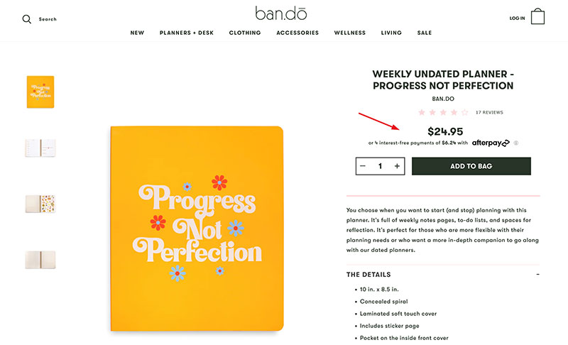
Whichever payment option you choose, make sure you clearly display it on your product pages, right next to the price of the item. Take a look at Bando’s planner, for example. They display the full price of the item and tell you how many smaller payments you can make with Afterpay.
Source: bando.com
This is a very simple but extremely effective way to boost conversions, much like adding a third-party reviews website badge like Trustpilot to your website.
Showcase Your Previous Clients
Showing your shoppers who you’ve worked with before is a great way to make them trust you. After all, product reviews, while not quite anonymous, can only do so much, as they usually provide limited information about the customer. Plus, no one will want to spend time figuring out what your customer base is like.
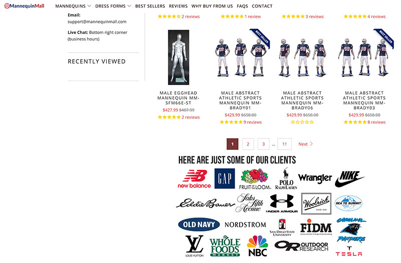
Instead, feature testimonials or just the logos of brands you’ve previously worked with. They don’t even need to be hugely popular or recognizable. The fact that they’ve trusted you already will make it much easier for new customers to do so as well.
Look at this male mannequins page. It features the logos of some of the major companies the brand has done business with before, and they instantly testify to the quality of both the product and the service.
Source: mannequinmall.com
Note that this tactic will work especially well in the B2B arena, but you can make it work in B2C too.
Add a Bit of User-Generated Visual Content
Incorporating user-generated images into your product pages can not only boost their visual appeal but also help you build trust.
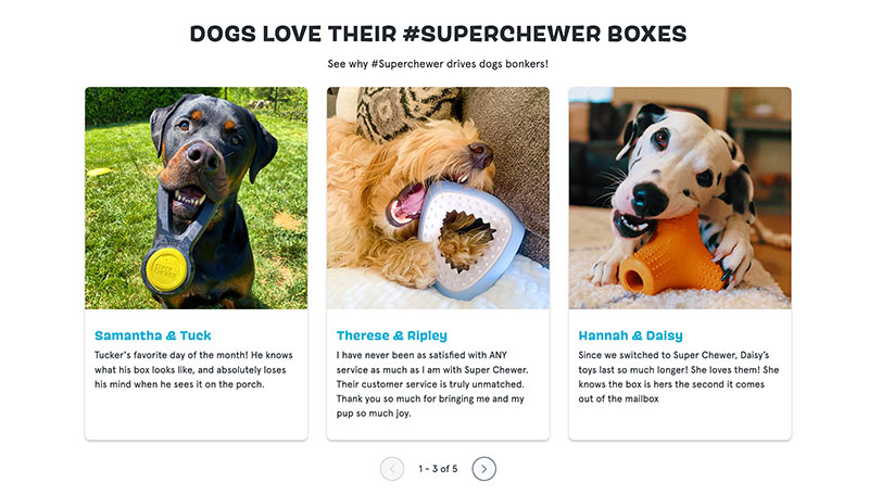
The beauty of UGC is that it’s completely original and organic, and it shows your product in real life. No matter how much you try to shoot a variety of images, you can never match those taken by your happy customers who want to show them off.
You can let customers upload their photos when they leave reviews, but you can also add some to a carousel. This will ensure that they are easily seen, as not all page visitors will take the time to read and look through product reviews.
Check out Barkbox and their Super Chewer product page. They feature customer testimonials plus an image of the actual customer using the dog toy in question. Of course, it helps that their customers are pups, so the images are extra cute and appealing. But you can apply the same tactic no matter what your products are.
Source: barkbox.com
Make It Easy to Contact You
Customers are not likely to trust a brand that they’ve never heard of before and that they’ve just found on the web if they can’t see that it’s legitimate.
Of course, you need to tick all the usual boxes — write a compelling About page and a detailed contact page, add your contact details to the footer, and so on. But on top of that, there’s an extra step you can take to further boost customer trust.
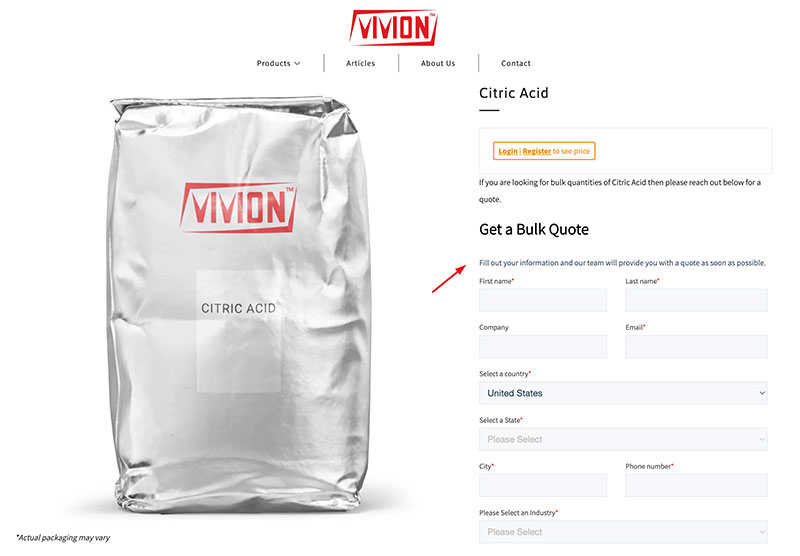
Simply add a contact option to the actual product page.
This bulk citric acid product page does it very well. The brand understands that you may have all kinds of questions about this product, so they’ve made it super easy to get in touch with them with any queries.
Source: vivion.com
This not only boosts UX but also makes them more real. Here’s a group of people who can give you advice, help you find the right product, and explain everything you need to know about its uses and benefits.
Wrapping Up
Consider these seven simple but effective ways to establish and enhance trust on your product pages. Note that all of them will work well together, but you may need to adjust your website’s design to accommodate them.