9 Elements of a Conversion Optimized Website
You can create a website any way you want it. But that doesn’t imply you’re going to get conversions off of it.
In this post, we’re going to look at design elements that you must include to have a great chance of optimizing your site for conversions.
Include Elements for Real-time Customer Support
Add options for customers to reach out to you in real-time. We love automation. Using chatbots and other customer support tools you can automate customer support on your site. Real-time live chat is useful because chatbots are equipped to handle a wide range of customer queries. Plus, they are trending and necessary for customer engagement. They also take up minimum space, occupying only a corner of the screen and popup only when it is necessary.
Almost all website builders offer you options to make this possible.
- You can customize the widget design to match the brand design of your site
- AI-powered bots look for keywords in every chat and generate a canned response that’s relevant to the query
- The backend teams can analyze and review the chat and initiate resolution, should live chat fail to reach a solution for the customer
- You can convert visitors to get more sales
- Answer up to 80% or more of customer queries with machine learning
Focusing on Landing Page Design Elements
When you redesign a website ensure that it is designed in a way to reduce bounce rate.
Images: Optimize the images on your site to improve conversions. Ditch stock images in favor of human faces. This imbues a sense of connection. Optimize images so that the website loads quickly with no issues with the quality. You may even reach out to customers of your product to share UGC content with you. This sort of UGC marketing helps you snag more conversions.
Typography: The letters should be readable and appealing to your audience.
A good typeface. Optimal point sizes. Optimized line lengths. Optimized line and letter spacing.
There should only be one primary CTA on a page, like Jobber’s “Apply Now” button on their Electrician Salary Guide
The CTAs should be relevant to the content on the page.
Need some inspiration? Use a graphic design platform such as Canva and incorporate design elements like posters.
Make it Easy for Visitors to Go Around the Site
Navigation is a huge factor in driving conversions and sales for both B2B markets and B2C markets.
The links on your menu bar can make a big difference in how someone perceives your website.
The simple reason is that links on the navigation menu make it easy for anyone to understand the way forward. Navigation is a design element that you can optimize to improve conversions for your business.
When building a website with a desire to get the most conversions, reduce the number of options on the top navigation. Don’t make it crowded by adding a number of different dropdown menus with too many links. This simple step has an immediate positive impact on the conversion rates.
Narrow down your navigation with the least number of options with one of them leading to a contact page, an about us page and a knowledgebase page. Your blog page, your about us page and any other important page should be easy to access.
Another popular feature I see on a lot of websites today is the— Let’s Talk button.
The Let’s Talk button can open up multiple options like the option to call your business, sending a message, scheduling a new meeting and a live chat option.
If a visitor makes contact using any of these ways that’s a conversion and they are in your sales funnel now, according to Systeme. If they’re busy they can choose the option of scheduling a meeting later on.
Website design should make it easy for people to contact you any time they want to. There must be several options to make this possible. But it should be presented in a manner that it doesn’t look cluttered.
Optimize the Design of your Content Layout
You need a good design for your content. The layout ensures that your headlines are clear and readable, that the important stuff is highlighted in bold. And that key points are illustrated with bullet points and highlighted with images, such as infographics.
The foundation of a good layout is in understanding that writing online is different. Your audience isn’t simply going to want to read a wall of text. Studies point out that the impact of headlines, headers and paragraphs—all of which work to get attention from the reader.
That’s not all. Beyond that, you need high-quality content.
Content layout isn’t something you can afford to overlook be it a SaaS software site, a review blog, or a business site selling services.
Well-designed sites often have great content but they are also aware that people aren’t going to read it all. So they do their best in leading with images, graphics and bullet points. When you get people to read the content for longer, you naturally improve conversions. Take Jobber’s Plumber Salary Guide as an example, which incorporates design elements like an interactive map, graphs, and bullet points to highlight their high-quality content.
Create a Brand that’s Well-Recognized
At times, people are not ready to convert yet because they aren’t sure of who you are. Once they develop awareness, it’s easy for them to trust you and they’re not going to be too worried about giving you their email address. Or buying your product. Why? Because of your brand power. Look at this Carribean vacation site that has built its brand over the years.
You do not get a brand in one day. But there are little things you can do to make that possible. You can match the design of the site with what you have elsewhere. If the kind of content, and the colors you use on social media are different to your site in real-life people are going to have a hard time recognizing your brand. Without brand recognition, there are very few conversions happening. Moreover, a well-recognized brand gives loyal customers a solid reason to recommend it to their friends and family which means more website traffic for your company.
How much you invest into web design makes a big difference. Starting from you how design your ads for different platforms, and the images and content you use to populate social media feeds on Twitter and Instagram is the key is to build a recognizable company in every instance you get.
Use a Great Color Palette
The color palette is an aspect that ensures trust and confidence in your business. It’s easy to notice if the color-palette is all wrong.
A well designed site does a great job of improving conversions.
Use colors that pop-out for calls to action and other buttons. The color palette should guide the user’s eyes.
Look at the main colors on this site. It’s mostly blue with the CTA highlighted with a contrasting color. This draws attention to the CTA.
The color palette must work similarly and should mirror your brand. The color palette’s primary job is to highlight information making visitors navigate easily where you can get a conversion from them.
If you look at Jobber’s HVAC Salary Guide, you’ll notice everything from the stats, map, graph, buttons and more follow their recognizable branding guidelines.
Make Use of White Space
Whitepsaces are also called negative spaces— reflecting the area on web pages that’s left blank. They can increase the focus of CTAs and result in better page design and higher conversions.
White space is one of the biggest design trends today.
But, whitespace is more than a trend. It works. It increases the time visitors spend on a page. Almost every marketer uses a lot of whitespace on their sites and especially throughout their blogs.
It works toward improving the aesthetics of your site. Increasingly, the more whitespace on your pages, the more content people are going to read. Higher the time on page, higher the conversions. Any good conversion software will suggest the same thing.
Most viewers read two to three lines of text a time. And whitespace is a shift in appreciating those reading habits. Whitespace in essence, helps readers go farther into your website.
An example of this is in Jobber’s Cleaner Salary Guide. Instead of a wall of text, they’ve incorporated graphic elements like a map, graphics, and bullet points so that there is plenty of whitespace to improve user experience.
Make Use of Responsive Design
With a non responsive website you’re missing out on conversions. Responsive design is critical to any business.
Here’s why. 50% or more traffic comes from mobile-based devices. If your site isn’t geared towards those visitors you’re going to lose all those conversions.
Imagine someone visiting your site looking for a critical piece of information on something they want to buy. You’re in luck. You sell the product and have the information they are looking for.
But the lead isn’t able to understand or access the content properly on his phone, especially video popups or video content. They’re not going to waste time. Instead they hit Google again and find out another site that offers the same content in a readable manner.
Screens come both tall and short and ensure that your site is designed to match those needs and increase conversions.
A clear digital marketing strategy and a website optimized for search engines and people bring conversions. You can hire a virtual assistant who can check the site on different screens and report back errors to you.
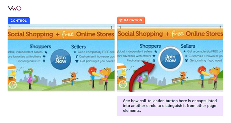
Put your Call-to-Action Inside a Container
The call-to-action buttons are easily the most important page element on your site. A great way to make them easily noticeable is by putting them in a container.
The heading, the supporting content are all supporting elements. The primary goal is to push the visitor to the conversion with a bold call-to-action button.
The visitor shouldn’t take long to identify the call to action button. This goes for almost any site you can imagine—Game sites, social shopping sites, affiliate marketing site and serious business sites.
One thing I recommend doing is the squint test to understand if the call to action button stands out from the rest of the page.
Use Color Theory and Contrast Psychology
Color is one of the most important visual cues there is.
An A/B testing tool helps you conduct a button color test. If you want the perfect color for your buttons test the emotion that each color conveys. And then use the color on your landing pages or call to action buttons.
The color that showcases the right emotion is important. There’s no doubt about that. But, when making a choice, pick one that contrasts with the background colors on the page.
There are plenty of tools that let you mix-and-match different color combinations to find colors that contrast well. See if your color choices stand out.
Most studies would have you believe that red converts better than blue.
The truth is the right combination of colors that brings out contrast is what you should choose for your site.
Place the conversion form or the call-to action button surrounded by whitespace so that it’s easy for your visitors to find it.
Whitespace is an important design element. But too much of it can cause a big siconnect from where the copy is and where the link is. If nothing, you can take inspiration from infographics. They’re full of colors, graphics and charts and use color theory well. If you have ever wondered how to create an infographic, head over to PiktoChart’s guide.
Establish a Clear Visual Hierarchy
A visual hierarchy helps visitors follow the information to decide their path to the call to action button. it’ s about designing a good layout that optimizes conversions. Communicate wth a visual hierarchy in mind.
35.6% increase in their online sales. You can see the comparison image of their homepage below.
Usability coupled with intuition are the hallmarks of great design and always drive sales. Always strive to go beyond the basics and use subtle design work to guide your visitors to a conversion.
Balance the site’s conversion goals by optimizing your site’s different elements and its usability to come up with a design that works.
Conclusion
What do you think of the tips and tricks I discussed above to help you create a conversion optimized website? Do let us know in the comments below. Ultimately use a content calendar to publish good posts frequently to continue attracting traffic to your site.
George is a blogger and writer at Kamayobloggers, a site he started to share cutting-edge insights online.