How to Make Your Google Slides Look Cool
Creating a visually appealing and engaging presentation is an art. With Google Slides, you have a range of tools at your disposal to transform a bland presentation into something cool, dynamic, and eye-catching.
Whether you’re presenting to a classroom, a boardroom, or at a conference, the visual appeal of your slides can make a significant difference.
Here, we’ll explore various techniques to elevate the aesthetics and engagement level of your Google Slides presentations.
Step 1: Choosing the Right Theme
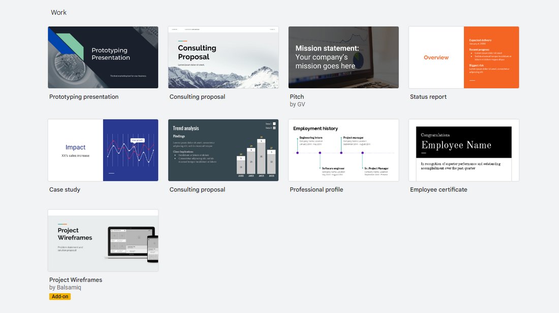
Using a great Google Slides theme is the key to making your presentation look more professional. Not only that, it will also allow you to get a head start on your design process.
Start with a Strong Foundation
Your choice of theme sets the stage for your entire presentation. Access the “Slide” menu, select “Change theme,” and peruse the available options. The theme should align with your presentation’s purpose and tone, as well as resonate with your audience.
Customize the Theme
Once you select a theme, don’t shy away from tweaking it. Adjust background colors, fonts, and layout elements to tailor the theme to your specific needs. Customization can make your presentation more unique, reflecting your personal or organizational style.
Step 2: Using High-Quality Images and Graphics

A picture is worth a thousand words! Always use images, graphics, icons, and charts whenever possible.
Incorporate Professional Images
Utilize high-resolution images to bring visual richness to your slides. Websites like Unsplash or Pixabay offer free, professional-grade images that can significantly enhance the impact of your presentation.
Smart Use of Graphics and Icons
Well-placed graphics and icons can make your slides more engaging and help break up text-heavy content. Use the “Insert” menu to add relevant shapes, diagrams, or icons. Be mindful to keep them complementary to your content and avoid overloading your slides.
Step 3: Playing with Colors and Fonts
Be careful when choosing colors. The presentation should represent your brand style as well as the topic you’re discussing.
Color Schemes
Colors can set the mood of your presentation and influence how your message is perceived. Choose a color scheme that is visually appealing yet maintains professionalism. Tools like Coolors or Adobe Color can assist in finding a harmonious and appealing palette.
Font Pairings
Fonts play a critical role in the legibility and aesthetics of your presentation. Pair a strong, distinctive font for headings with a more subdued, easily readable font for body text. Resources like Google Fonts can be invaluable for finding effective font pairings.
Step 4: Effective Use of Animations and Transitions
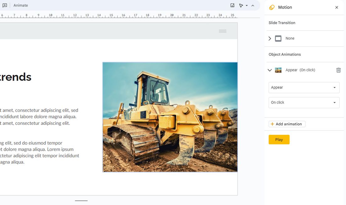
Animations in slideshows are important. But make sure not to go overboard with it.
Subtle Animations
Animations add dynamism to your presentation but should be used judiciously. Opt for simple, elegant animations like “Fade” or “Fly in” to introduce new elements or highlight key points, while avoiding overly complex or jarring animations that can distract from your message.
Thoughtful Transitions
Slide transitions should be smooth and consistent. Using the same transition style throughout your presentation can help maintain a professional and cohesive feel.
Step 5: Creating Custom Layouts
Don’t be afraid to customize the designs and create your own custom layouts.
Break the Mold
Standard layouts can be limiting. Experiment with custom layouts by creatively combining text, images, and graphics. This approach can make your slides more engaging and unique, helping to tell your story in an innovative way.
Balance Your Elements
While creativity is key, it’s important to keep your slides uncluttered. Strive for a balance between various elements, ensuring each has enough space and the slide doesn’t feel overcrowded.
Step 6: Adding Multimedia Elements
In addition to using images, try to add video and audio to your slideshow to make it more engaging.
Embed Videos and Audio
Including videos or audio clips can make your presentation more interactive and engaging. Use the “Insert” menu to embed multimedia elements that are relevant and add value to your content.
Interactive Elements
For a more engaging experience, consider adding interactive elements like hyperlinks, embedded surveys, or quizzes. These elements can be particularly effective in educational and corporate presentations.
Step 7: Utilizing Data Visualization
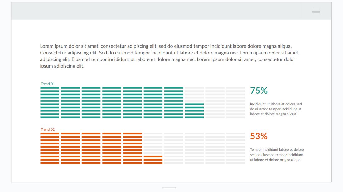
Numbers look great when they are accompanied by graphs and charts.
Include Charts and Graphs
Data visualization can help convey complex information in an easy-to-understand format. Use Google Slides’ built-in chart tools to incorporate graphs and charts that are visually appealing and relevant to your data.
Customizing Data Representation
Customize your charts and graphs to align with your presentation’s color scheme and style. This not only makes your data more coherent with the overall design but also enhances readability.
Best Practices for Cool Google Slides
Follow these best practices to make even cooler and professional slideshows.
1. Consistency is Key
Maintain a consistent use of colors, fonts, and design elements throughout your presentation. This consistency creates a professional and cohesive look.
2. Less is More
Adopt a minimalistic approach. Overuse of colors, fonts, or animations can be overwhelming. Less clutter means your content can shine more brightly.
3. Focus on Readability
Ensure your text is easy to read. Pay attention to font sizes, and ensure there’s a strong contrast between text and background colors.
4. Quality Over Quantity
Prioritize high-quality images and graphics. Low-resolution images can diminish the professional look of your slides.
5. Test Your Slides
Always preview your slides on different screens and in various lighting conditions to ensure they look good universally.
6. Keep Up with Trends
Stay updated on the latest design trends, but make sure your presentation style is appropriate for your message and audience.
7. Tailor for Your Audience
Customize your presentation to resonate with your specific audience. This might mean using industry-specific terminology, relevant cultural references, or appropriate humor.
8. Seek Feedback
Get feedback on your presentation from peers or colleagues. Fresh eyes can offer valuable insights and help identify areas that need improvement.
Conclusion
By incorporating these techniques and best practices, your Google Slides presentations will not only look cool but also be more engaging and effective. Remember, the key is to balance creativity with clarity and professionalism.
Whether you’re presenting complex data or a simple narrative, these tips will help you deliver your message in a visually compelling way.