Exquisite Luxury Brand Fonts Used by Top Brands
I’ve been on a fantastic voyage lately, exploring the fabulous world of luxury brands fonts. You know how high-end fashion and products have that special touch of elegance and sophistication, right? Well, it turns out there’s a whole collection of fonts inspired by those prestigious brands!
So, consider this:
- You’re working on a project that needs a refined, classy vibe. What’s your move?
- Or perhaps you’re designing a logo for an upscale boutique, and you want to exude luxury. Where do you find the perfect font?
Worry not, my friend! In this article, we’re going to indulge in the extravagant realm of luxury brands fonts.
Luxury brands fonts to check out
Myriad
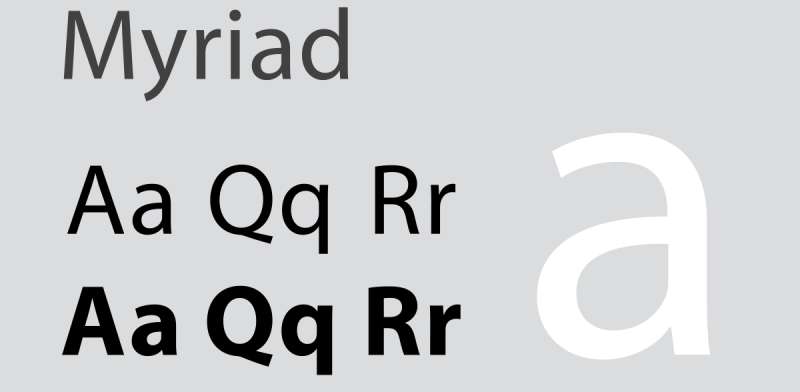
Robert Slimbach and Carol Twombly created a new typeface for Adobe in 1992. It was readable and accessible due to the absence of serifs, clear forms, and well-drawn letter proportions. There are numerous examples of this in the branding of Wells Fargo, Modern Telegraph, Nippon Airlines, LinkedIn, Rolls-Royce, and Walmart up until 2017. If you want to portray laconicism and simplicity, use this.
Numerous brands favour Myriad since it has a reputation for being heartfelt and enthused. It’s written in a sans serif font. Myriad was chosen by Walmart because of its creative quality and emotion. The motif is most importantly booted by Myriad.
Optima
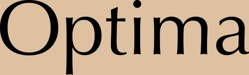
The lengthy, curved lines of the Optima typeface (Hermann Zapf, 1955) were influenced by the age-old practise of stone cutting. Due to the sans-serif font, it is also very legible. In contrast to other types with varying line width, Optima has a fluidity that makes it both lovely and readable. The Optima typeface is used by Yves Saint Laurent and Estee Lauder.
Futura
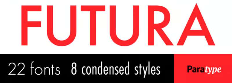
Some well-known typefaces in the sans serif genre are in high demand among logo designers. Famous fashion companies like Nike and Cisco have intriguing designs for their company logos using the Futura font. Redbull has used the same typeface in Futura BQ with black and bold characters, which is as amazing-sounding as it is.
Helvetica® Now
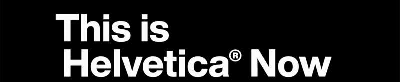
The original version of Helvetica is arguably the most widely used font ever, especially in branding. Every single glyph of Helvetica has been rebuilt and revised for clarity, simplicity, and neutrality in this vast new edition. There are 48 weights in the Helvetica Now family, ranging from Light Micro to Extremely Black Display, each with a corresponding italic. Helvetica is used by several well-known companies, including the NYC Subway and multinational corporations. American Airlines, Jeep, and Panasonic are three well-known companies that employ Helvetica in their logos. Helvetica Today was created by Max Miedinger, Charles Nix, Jan Hendrik Weber, Monotype Studio, and was released by Monotype.
Univers

Adrian Frutiger, a Swiss designer, created it in the 1950s. He maintained “visual awareness between broad and thin lines” while avoiding precise geometry. A huge and widely-liked serifless font family, the modern Univers is utilised by well-known companies including eBay, Swiss International Airlines, BP, Unicef, and Western Union, as well as municipal and transportation organisations (street navigation in London, Toronto Metro, Frankfurt Airport). Brands searching for straightforward, adaptable, and accessible typography may consider Univers.
Officina Sans

Officina sans has developed into a desirable privilege for users as a result of its fascinating and attention-grabbing approach to the audience. The font sights discuss the concept they are attempting to push as well as the particular characters that have developed vividness at first glance. The sans serif font used in the design of the Amazon logo is an excellent example.
Frutiger
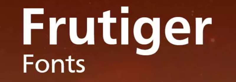
Adrian Frutiger created the Frutiger typeface in 1975, and it is straightforward, professional, and enjoyable. Its accessibility and fluidity make it the perfect sans serif typeface for a logo that exists online. It was initially intended for use as signage at the French airport of Charles de Gaulle. It continues to be one of the most readable fonts in print and on the web because the goal when designing it was to create a font that could be viewed well from a distance. Frutiger is the typeface used by Flickr and Shutterfly.
Didot
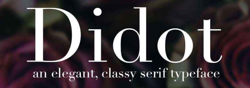
Didot enjoys enormous fame in the fashion world. Largest clothing retailers like Zara, Giorgio Armani, and CBS all use Didot into their logos. Didot gives off a more opulent, fashionable, and mature vibe because to its exquisite circline lines, petite serifs, and contrast. Didot was found to be the most expensive font in a survey.
Proxima Nova
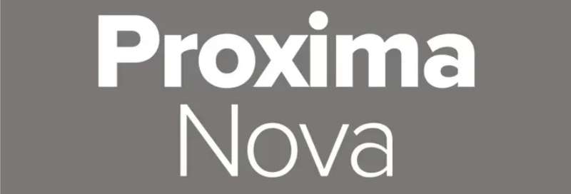
Proxima Nova’s adaptability and contemporary appearance have led to comparisons to the new Helvetica. The 48-font family’s use on tens of thousands of websites, including BuzzFeed, Mashable, and NBC News, has made it one of the most well-liked due to its unique combination of traditional geometry and contemporary proportions.
Gotham
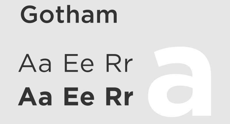
Gotham is an expensive sans serif font. Similar to Spotify, numerous well-known music launchers have adopted this font in their logos to give them a unique yet alluring bold appearance. Similar to how the characters were bravely crafted by Discovery Channel in medium style for an ambitious approach.
Garamond
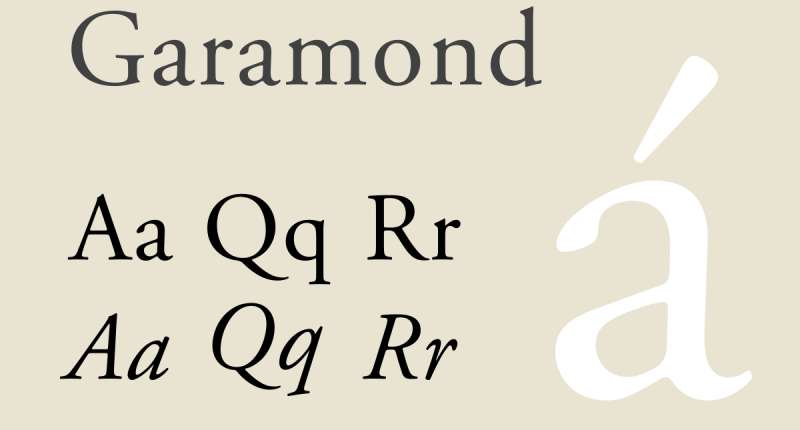
The entire European typography was influenced by one of the earliest fonts, which Claude Garamond created in France in the 16th century. Small serifs, moderate contrast, and rounded forms are characteristics of the several types that make up the Garamond family today. For periodicals like magazines, newspapers, and books like “Harry Potter” published in the United States, Garamond is frequently used. For a while, Apple exploited it for marketing purposes (a version called Apple Garamond). The logos of American Eagle and Abercrombie & Fitch also display it.
FF Dax
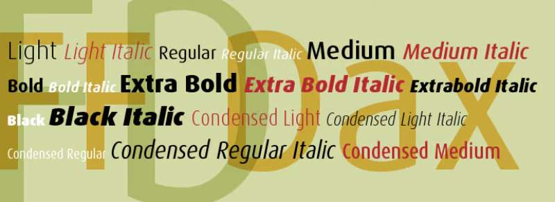
Hans Reichel created the contemporary sans serif typeface FF Dax in 1995. Although maintaining a strong focus on character, its light, streamlined style creates the idea of mobility, accessibility, and motivation for action. Political parties, banks, embassies, airlines, and communication and delivery services have all employed the FF Dax logotype in their marketing and communications efforts. FF Dax appears in the logos of UPS and The British Embassy.
Avant Garde
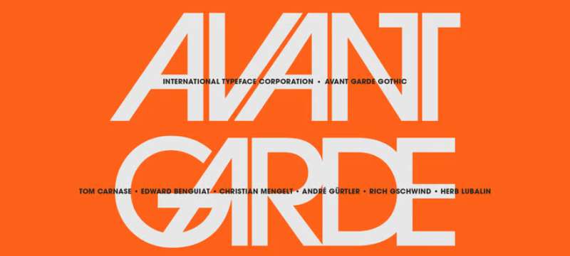
Shortline texts and headlines are the most common places where avant-garde font design may be seen. It is a sans-serif typeface that is well renowned for being distinctive and appealing. Reputable clothing companies like Calvin Klein and Adidas utilise the word avant-garde in their logos. It was decided to go with Avant Garde because of the fantastically intimidating glare it gives the emblem.
Freight Sans
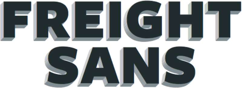
Freight Sans is well known for its adaptable black and bold, brave gape as well as the seductive characters utilised in the Reed & Mackey for an alluring appearance. The text line of StarBucks also uses a sans serif font family.
Clarendon
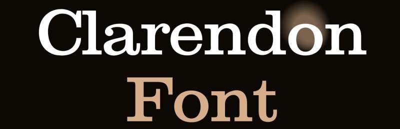
A classic slab-serif font from a time when all media was print is called Clarendon (Robert Besley, 1845). It was first created for a letter foundry in London and has been applied to print displays with three-dimensional type and posters (think WANTED… DEAD OR ALIVE). The strong form of the serifs and the variable width of its curving lines is well-tolerated in print and large point sizes. Consider Clarendon for a wordmark that only employs a few letters in large font or for a logo that is mostly used in print, on signage, clothing, or textiles. Clarendon is the typeface used by People magazine, Sony, and Well-Fargo.
Bodoni
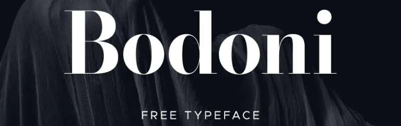
Giambattista Bodoni, a well-known Italian publisher and type designer, created the Bodoni font. Vogue and Nirvana both picked the Bodoni font for their logos. Because of the combination of thick and thin lines, the logo has a very striking and contrasted appearance. The Mamma Mia musical album posters also featured Bodoni.
Bebas Neue
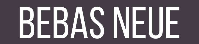
According to demand, the well-known online destination for watching movies and television shows, Netflix, offers this typeface in an attractive and inviting red hue. This combination offers a passionate, appealing, and cutting-edge vision. The top logo design company recommends Bebas Nene as a typeface to utilise for a stylish appearance.
FAQ about luxury brands fonts
What makes luxury brand fonts unique?
Because they are meticulously designed to reflect the company’s values, personality, and target market, luxury brand fonts are distinctive. They frequently exude sophisticated, exclusive, and exquisite qualities that express quality, refinement, and exclusivity.
Luxury brands frequently employ typography as a visual element to set themselves apart from competing products and develop a distinctive brand identity that appeals to consumers.
How do luxury brands choose their fonts?
Font selection for luxury brands often takes into account audience, brand identity, and brand strategy.
Companies frequently collaborate with qualified designers or design firms to create custom fonts or choose typefaces that are distinctive, excellent, and representative of their brand values. When choosing fonts, other aspects including readability, emotion-evoking potential, and legibility are also taken into account.
What are some examples of popular luxury brand fonts?
Baskerville, Bodoni, Didot, and Garamond are a few instances of well-known luxury brand typefaces. These fonts exude elegance, grace, and refinement with their timeless and traditional appeal. Serif typefaces, which include tiny flourishes at the end of strokes, are frequently used by luxury firms to evoke a sense of tradition and heritage.
How do luxury brand fonts contribute to brand identity?
Luxurious brand typefaces are essential for developing a unique brand identity. They elicit feelings of exclusivity and elegance, and they aid in expressing the brand’s identity, values, and style to the target market. The choice of typeface also aids in setting the business apart from its rivals and making an impression on customers.
Can a font alone make a brand look luxurious?
While a font can support a brand’s impression of luxury, it cannot create that image on its own. The effectiveness of the brand’s marketing plan, the calibre of its products, and the satisfaction of its customers all play important roles. Nonetheless, a carefully chosen typeface can improve the entire company image and add to the impression of exclusivity and luxury.
Why do luxury brands often use serif fonts?
Serif typefaces are frequently used by luxury brands because they evoke a sense of tradition, history, and sophistication. Serifs are viewed as being more formal, sophisticated, and authoritative because of their subtle flourishes.
The brand’s reputation for exclusivity, quality, and refinement is consistent with this look. Serif fonts also tend to be simpler to read and more legible, which is crucial for luxury firms that depend on communicating specific details about their products.
Are luxury brand fonts always bold and thick?
It’s possible for luxury brand fonts to be thick and aggressive, although this isn’t always the case. When designing, luxury brands frequently utilise a range of font weights, from light to bold, to establish contrast and hierarchy. The message of the brand and the visual impact it wishes to make will choose the font weight to use. In order to portray a feeling of refinement and elegance, luxury businesses can also use thin, delicate fonts.
How do luxury brands use typography to communicate their brand values?
By choosing fonts that are a reflection of their personality, style, and values, luxury firms employ typography to communicate their brand values.
Typography is frequently used by them to develop a visual language that connects with their target market and strengthens their brand identity. Also, luxury firms utilise typography to set themselves apart from their rivals and express feelings like refinement, exclusivity, and quality.
Can a luxury brand change its font without losing its identity?
Luxury brands can alter their font without losing their distinctiveness, but they must do it with caution. The new font must still convey the brand’s personality and provoke the same feelings as the old typeface while also being in line with the brand’s values, style, and target demographic.
Before fully implementing the change, luxury businesses may also gradually introduce new fonts and test them with their audience to make sure that the new font is well-liked and complements the brand identity.
How do luxury brands use font pairing to create a cohesive visual identity?
By choosing typefaces that work well together and have complementary styles, luxury brands may employ font pairing to establish a unified visual identity. Designers frequently combine several weights of the same typeface to establish hierarchy and visual intrigue, or they match serif and sans-serif fonts together to generate contrast and balance.
Combining several fonts can also serve to express the business’s character and values and develop a distinctive and memorable brand identity. The brand’s message and the visual impact it wishes to make will determine the font pairing.
Ending thoughts on luxury brands fonts
The most well-known and significant firms frequently favour fonts that stand out in terms of style and design. Because of this, these brands occasionally make minor changes to the font’s initial design. Brands continue to be distinctive and customised as a result. Brands selected the font style in accordance with their character to be valued by the target market.
These fonts will appeal to certain individuals greatly while alienating others. Nonetheless, it has a very basic, very straightforward appearance when you want minimalism. But, by picking the appropriate typeface, you should make an effort to make it distinctive and recognisable.
If you enjoyed reading this article about luxury brand fonts, you should read these as well:
- Choosing The Right Colors And Fonts For Your Brand
- What font does Chanel use for its logo and promo materials?
- What font does Gucci use? Check it out