Download The Captain Marvel Font For Your Designs
You know, after all these years of writing about fonts, I still get excited when I discover one with a superheroic vibe. Today, we’re going to explore a font that’s truly out of this world: the Captain Marvel font. Strap in, folks, because we’re about to soar through the cosmos!
Here’s the scoop:
- This font has been making waves in comics, movies, and more.
- It’s got that unmistakable, intergalactic touch.
In this article, we’re going to delve into the Captain Marvel font by discussing:
- The Origins: When and where did this cosmic font first emerge?
- The Design: What gives it that powerful, otherworldly look?
- The Impact: How has it shaped the typography landscape?
So put on your space suit, and let’s blast off into the marvelous universe of the Captain Marvel font! We’re about to explore the design, history, and influence of this stellar typeface.
About Captain Marvel

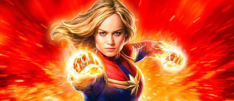
Captain Marvel is a made-up superhero that belongs to Marvel. The most well-known iteration of this character is a female superhero with superhuman strength, flight, and other abilities. After the debut of the “Captain Marvel” film in 2019, the character gained notoriety.
A fictional Marvel Comics heroine named Carol Danvers serves as the inspiration for the superhero movie Captain Marvel. Ryan Fleck and Anna Boden co-wrote the screenplay for Captain Marvel, while Geneva Robertson-Dworet also contributed to the writing. The writing team took inspiration from Roy Thomas’ comic book “Kree-Skrull War” for some of its ideas.
Numerous critics thought that the film had plenty of humor and action. The plot of this movie concerns Carol Danvers, an air force pilot who develops into Captain Marvel, one of the most powerful superheroes. She is caught up in a conflict between two extraterrestrial civilizations.
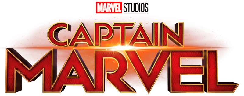
The Captain Marvel Logo

The three-dimensional lettering from the Captain Marvel logo is set in a clean and unique geometric sans-serif typeface, which is quite close to such fonts as Town 20 Bold and Baro Bold, but with certain variations, such as, for example, the diagonal cut of the horizontal bar in the “L”. The color scheme of the Captain Marvel visual identity is made up of tiny yellow-gold lines that lend sheen and gloss to the composition, as well as gold and dark-red gradients that seem slick and dazzling on a white background.
The Spartan or Futura, Century Gothic, and ITC Avant Garde typefaces are among the Geometric Sans-Serif fonts. Sans-Serif typefaces have geometric shapes, as their name suggests, and they also give the letters a stylish and contemporary appearance. These typefaces are frequently used for headlines in modern design projects, however, they are rarely utilized for body text.

This typeface, Town 20 Inline Bold, is ideal for all of your creative designs. Bold is a typeface subfamily. The font is free for personal use and was created by Jason Vandenberg. The Town 20 Inline Bold can be used to make intriguing covers, names for shops and stores, and logos.
There are seven sans serif typefaces in the Baro family. It has all-caps lettering and a geometric aesthetic. For chromatic typesetting, some of the Baro fonts can be layered on top of one another. The Baro Plain typeface serves as the family’s foundational style; each of its characters is made out of thick, monolinear strokes.
Captain Marvel Font
Captain Marvel Font by Fontstudio LAB

The premium, well-kept sans-serif Captain Marvel typeface was created and released by FontStudio LAB. It is used to create the letters on the Captain Marvel logo’s title. A modern and elegant sans-serif typeface is used for this logo. It can quickly become your preferred choice when it comes to more delicate crafts and creations because of its balanced letters and friendly & beautiful design.
Captain Marvel Font by Ray Larabie

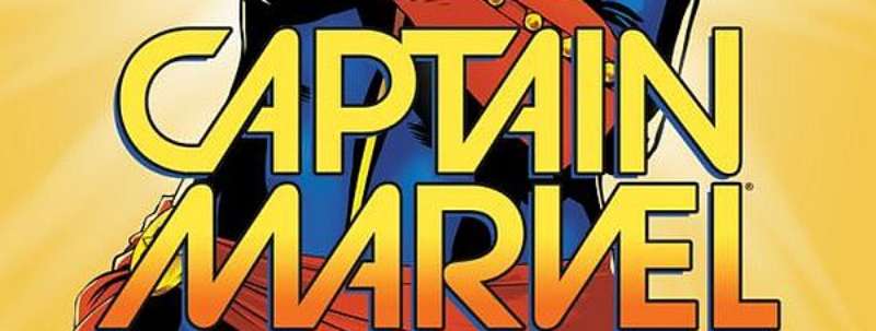
The CAPTAIN MARVEL (2014) #1 movie poster was made by David Lopez and Kelly Sue DeConnick. The geometric headline font Strasua, created by Ray Larabie, is remarkably similar to the font used for the Captain Marvel emblem on the cover.
Captain Marvel Font by NubeFonts

A font called Captain Marvel by NubeFonts is based on the Captain Marvel movie’s title logo. It’s a no-cost font.
Similar and Alternative Fonts To Captain Marvel Font
Pipetton Script Font

This typeface consists of two perfectly matched fonts: the primary script font and the complimentary sans font. This font is appropriate for usage as a wordmark, logotype, label, etc. It stands out from the crowd thanks to its distinctive and bold characters. This typeface is available in uppercase, lowercase, punctuation, symbols, and numerals. It also has ligatures, swashes, and style set alternates.
Core Sans Font

Hyun-Seung Lee, Dae-Hoon Hahm, and Minjoo Ham created the contemporary and modern sans serif typeface known as Core Sans Font, which was released by S-Core in 2013 and has a strong reputation in the font industry. It is ideal for typesetting because of its adaptable letterforms and character spacing options. There are three weights in this font family: regular, bold, and light. It will work best for the web, and screens, and much better for printed materials.
Rails Font

Superfried is the publisher of the Rails Font Family. There are 4 styles and family package possibilities in Rails. Superfried created the experimental, vintage, outline display typeface known as Rails. There are four variations of Rails: display, broken, solid, and solid broken. They are made of parallel tracks, as their name would imply, with the broken versions having noticeable breaks for added effect. When the two are combined, the text is clear and fluid with brief, unanticipated interruptions. In the latest issue of Computer Arts, Rails was highlighted.
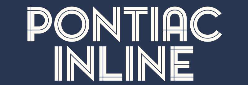
Pontiac Inline Font

Fanny Coulez and Julien Saurin created the Pontiac Inline Font Family, which was released by S&C Type. There are four styles and family package options for the Pontiac Inline. This well-balanced inline font can be improved to make your projects better and provide a unique, contemporary vibe. Then you may create a 3D or shadow effect after changing the inside color.
Gravesend Sans Bold Font

Rian Hughes created the Gravesend Sans Font Family, which Device then made available. There are 10 designs and family bundle options in Gravesend Sans. Gravesend Sans is based on the distinctive typeface used for the renowned grass-green signs for the Southern Railway and is smart, legible, and attractive. Has a variety of genuine arrows and manicules in addition to shorter ligatures like “St.” (Saint or Street), “Rd.” (Road,” and “Jn” (Junction). Many interchangeable graphic banner elements are present in the Cameo version.
Irma Font

With nine weights, the capital-only display typeface Irma is straightforward and attractive. Many contextual letterforms are provided by the typeface system, enabling the development of typographic patterns. Using these functionalities is now simpler than ever because to the powerful contextual substitution provided by OpenType technology.
Geometos Neue Bold Font

A geometric sans-serif font family with seven weights is called Geometos Neue. Geometos Neue is a collection of all-caps display fonts with a crisp, assertive shape that is particularly suited for headlines, headers, branding, posters, packaging, titles, and logos.
Brushability Sans Bold Font

There are nine typefaces in the Brushability family, all of which have a brush-written appearance. Each font pairs beautifully with the others and can be used alone or in combination with a variety of other brush-like fonts available on the market.
The Extras font incorporates several design elements with the same brush style, such as arrows, frames, and swashes, to bring more individuality to the design, in contrast to the script’s abundance of alternates, swashes, ligatures, and arrows.
Usage Of Captain Marvel Font
It has novel features and can be applied to many design projects such as logos, branding, titles, headers, product packaging, card printing, bold headings, watermarks, cartoons, movie posters, and so forth.
FAQ about the Captain Marvel font
What is the name of the font used in the Captain Marvel logo?
The Captain Marvel logo was designed using the “Burbank Large Condensed Black” font. Tal Leming designed this font, which House Industries published in 2016. Titles and headlines frequently employ this strong, condensed sans-serif typeface.
Where can I download the Captain Marvel font?
On the website of House Industries, you can buy and download the Burbank Large Condensed Black typeface used in the Captain Marvel logo. The typeface may be be downloaded for free from a lot of places, though. The licence agreement should always be checked before downloading because some of these free downloads might not be appropriate.
Is the Captain Marvel font free to use?
The Captain Marvel logo uses the Burbank Large Condensed Black typeface, which is not available for non-commercial use. On their website, House Industries sells licences for the font that can be used in commercial projects. For personal and non-commercial projects, there are numerous free alternatives that are similar in appearance.
Can I use the Captain Marvel font for commercial purposes?
The Burbank Large Condensed Black typeface requires a licence from House Industries in order to be used for business purposes. The licence fee is determined by the number of users and the planned use. It is crucial to remember that using the font without the appropriate licence may have legal repercussions.
What is the closest font to the Captain Marvel font?
Bebas Neue is the font that most closely resembles the Burbank Large Condensed Black font used in the Captain Marvel logo. This typeface is a free alternative with a comparable style that can be used for non-commercial and personal projects. It is crucial to remember that it is not a perfect match and could not be appropriate for commercial use.
How do I install the Captain Marvel font on my computer?
Download the Burbank Large Condensed Black font file from an authorised source before you can install it on your computer. Once the file has been unzipped, double-click the font file to launch it. To add the font to your system, click the “Install” button after that. Your design software should now include the font.
What is the history behind the Captain Marvel font?
The Captain Marvel logo was designed in 2016 by Tal Leming and published by House Industries using the Burbank Large Condensed Black typeface.
It was created especially for the entertainment sector and is frequently seen in video game titles, album covers, and movie posters. Because of its aggressive and compact form, the typeface is ideal for attention-grabbing headlines.
Is the Captain Marvel font available in different languages?
There are numerous languages supported by the Burbank Large Condensed Black typeface used in the Captain Marvel logo, including English, French, German, Italian, Spanish, and many more. It is crucial to remember that not all languages may support all characters, so it is best to check before using the font.
How do I use the Captain Marvel font in my designs?
If you intend to use the Burbank Large Condensed Black font for commercial endeavours, make sure you obtain the appropriate permission before incorporating it into your work. Open your design programme after that, and choose the font from the list of options. To fit your design, you can change the font’s size, colour, and spacing.
Are there any guidelines for using the Captain Marvel font?
The Burbank Large Condensed Black font used in the Captain Marvel logo is not subject to any official usage rules. If you intend to use the font for business reasons, you must abide by any licence terms. It’s also advised to use the typeface in a readable and appropriate manner for the context of your design.
Whilst it might not work as well for body text or smaller sizes due to the font’s bold and condensed design, it works well for headlines and headers. To make sure that the font is readable, it’s also crucial to take the colour and background of your design into account.
Ending thoughts on the Captain Marvel font
The most absurd aspect of user experience is certainly appearance. Customers become puzzled when designs depart from this style of layout. A perplexed customer won’t remain a customer for very long. Make sure your writing is clear and consistent. This involves selecting a font that is simple to read. Make sure the content stands out from the background and that the font size is appropriate for easy reading.
If you enjoyed reading this article about the Captain Marvel font, you should read these as well:
- What font does Slack use in its interface and website?
- These are the coolest superhero fonts out there
- How To Make Great Poster Designs (156 Examples)