What font does McDonald’s use on their website and logo?
McDonald’s is a company that hardly needs any introduction. This renowned fast-food chain has a presence in 120 countries, at more than 35,000 locations.
To this day, it remains the most successful fast-food franchise in the world. Even better, it is the ninth richest corporation in the world, enjoying a net value of almost 40 billion dollars.
The odds are you’ve graced McDonald’s at least once in your life. If so, you’ll know what makes it so successful. McDonald’s offers food that is not only delicious but also affordable. And while it may not be the healthiest, who can resist a good meal?
When you hear McDonald’s, the famous golden arches logo emerges from your mind along with its red-and-yellow color palette. But graphic design is just one aspect of building your brand identity. Another just as important aspect is the font. Choosing the correct one can help your company gain a solid footing in the industry, bringing you one step closer to your dream.
In this article, we’re going to examine the font McDonald’s uses in its logo and website. We’ll also show you some of the best alternatives that will take your projects to the next level.
A brief description of McDonald’s
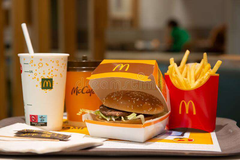
McDonald’s is the world’s largest fast-food chain. Its story began in the 1940s when Richard and Maurice McDonald started it. At the time, it was just one restaurant. As its popularity grew, the two brothers decided to make it into a franchise. Today, the company enjoys a worldwide presence. It’s most famous for selling burgers, French fries, wraps, and milkshakes.
The evolution of the McDonald’s logo
In the 1940s, McDonald’s was a single restaurant selling burgers in California. It wasn’t until the 1950s that Richard and Maurice McDonald decided to expand their business.
Even then, they understood the power of easy recognition. Wishing to create an outstanding design for their hamburger stands, they reached out to the architect Stanley Clark Meston.
Though he designed the look, it was Richard’s idea to add the iconic golden arches. Ironically, the architect didn’t like them until McDonald’s became famous across the US.
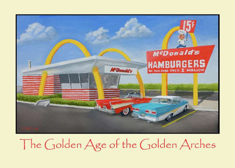
The first building bearing the new design arose in 1953, in Phoenix, Arizona. Some buildings also relied on the golden arch to support their signs. Before long, people across the entire America began associating the arches with McDonald’s itself.
At the time, the McDonald’s logo looked very different from the one we know today. It featured a cartoon chef known as Speedee.
While the design wasn’t bad, people found the arches much more memorable than the mascot. Thus, the company removed it from the logo in 1962.
And in 1967, Ronald McDonald’s removed Speedee as a mascot as well.
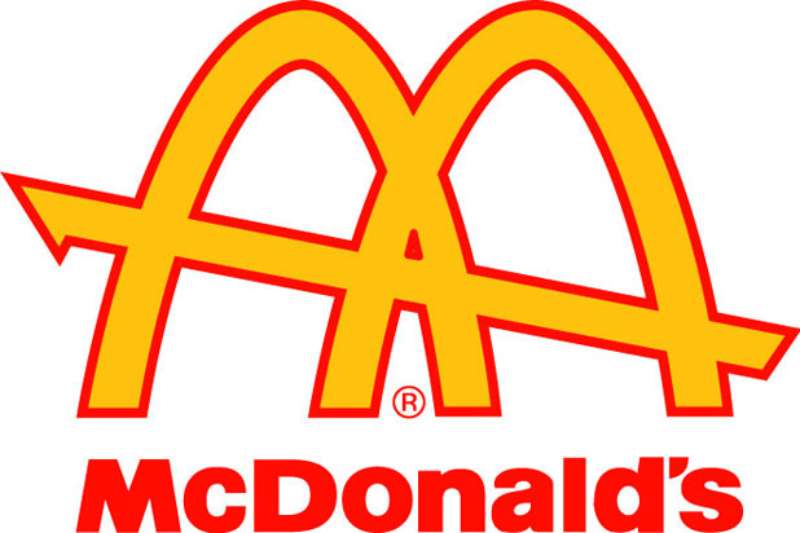
The one who came up with the replacement for Speedee was Jim Schindler, The company’s head of engineering and design.
He sketched a logo that featured both the arches and the iconic slanted roof. This logo achieved two things.
Not only did it pay a tribute to the arches, but it also resembled the letter ‘M’. In 1968, the company trademarked this logo. It’s been in use ever since.
What font does McDonald’s use in its logo?
When Jim Schindler designed McDonald’s logo, he didn’t use any particular font. After all, the ‘M’ was a tribute to the iconic golden arches.
However, the company later created a font in the image of the ‘M’ found in its logo.
The McDonald’s font that resembles the letter ‘M’ the closest is McLawsuit. The company uses Helvetica Black for most of its other characters.

The McLawsuit font family has roots in Majora Arca, a geometric sans-serif font. The font is unique because it comes in only uppercase. This makes it an excellent pick for logos, headlines, and posters.
The man behind this font is Jesse Burgheimer. The typeface features over 100 unique uppercase characters and 100 glyphs. The font is unlike any other you’ve ever seen, creating an inimitable look for your design. Because it’s all uppercase, it makes the text stand out. Thus, people can see it even from far away.
The font is available in many languages, including English, Greek, Japanese, and Latin. The typeface resembles some of the Speedee fonts.
While it may be called McLawsuit, most people refer to it simply as the McDonald’s font. Many people covet it for its great readability and unique style. However, the rights belong to the company.
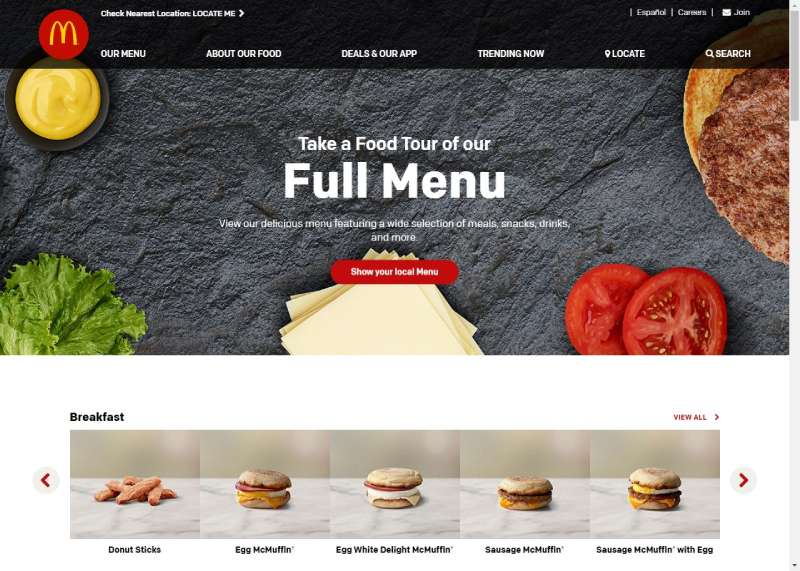
The McDonald’s website doesn’t use the iconic McLawsuit, obviously. When you open it, you will be greeted by the Lovin’ Sans font.
This is a modified version of Colfax designed by Process Type Foundry. The people who helped adapt it were Leo Burnett and Brian Loehr.
What fonts resemble the one used by McDonald’s?
A company as large as McDonald’s has the luxury of owning its own font. Due to copyright laws, you can’t use it without their permission.
Luckily, you can use the following alternatives that look just close enough.
Helvetica Black
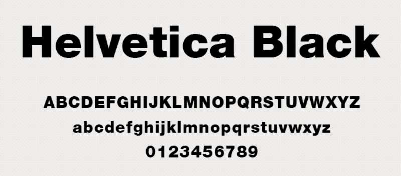
This sans-serif font belongs to the Helvetica font family. Since McDonald’s uses it for some of its typography, it’s one of the most similar fonts you’ll ever find.
Arial
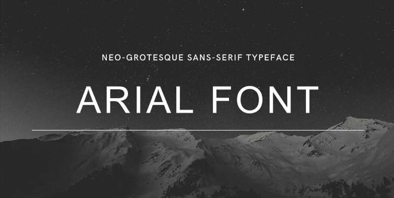
Arial is a sans-serif font with roots in the neo-grotesque style. It was created by the accomplished font designers Robin Nicholas and Patricia Saunders. The font bears some similarities to the Helvetica font family.
Futura

Paul Renner was a German font designer who created Futura in 1927. It belongs to the sans-serif font family.
Twentieth Century
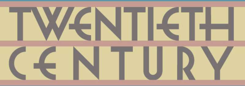
The Twentieth Century font was created by Sol Hess. It was published by Monotype and features 19 unique styles.
Speedee
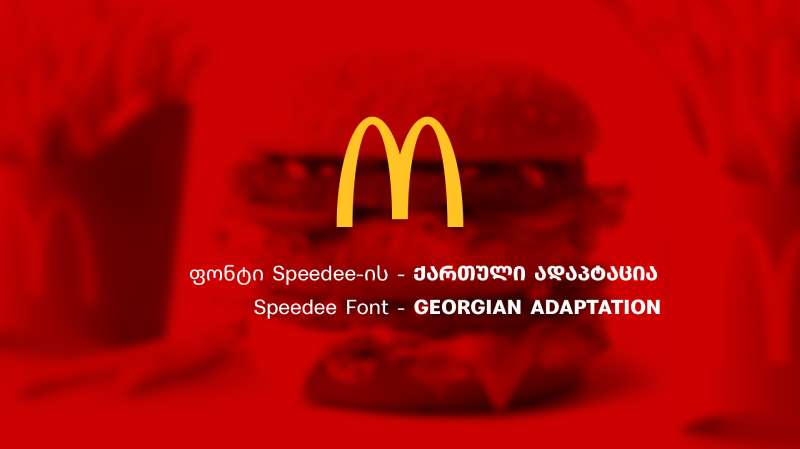
You can use this sans-serif font on most operating systems, including Windows, Mac, Linux, iOS, and Android. It was designed by Dalton Maag Ltd.
Exodus
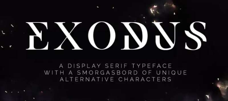
Exodus is a unique sans-serif font featuring elegant lines and countless alternative characters. We recommend using either Exodus Standard or Exodus Display. Both options come in several different weights.
Hero

This is a geometric sans-serif font with a laidback, smooth appearance. It comes in three different weights and several alternative styles.
Quentin Pro
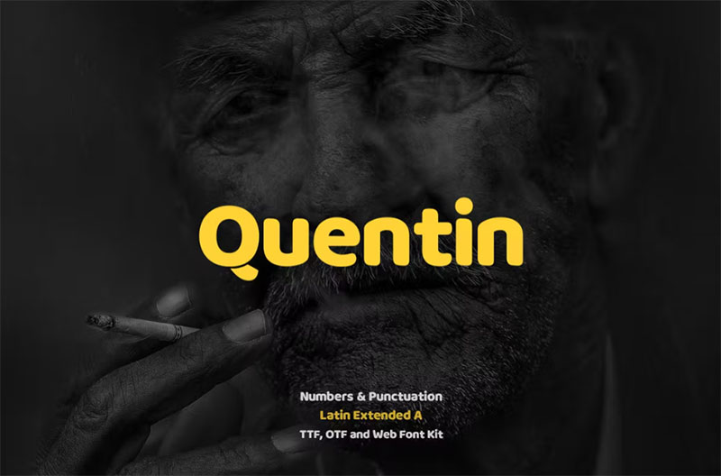
This is an excellent sans-serif font for posters, headlines, logos, banners, and websites.
Noir
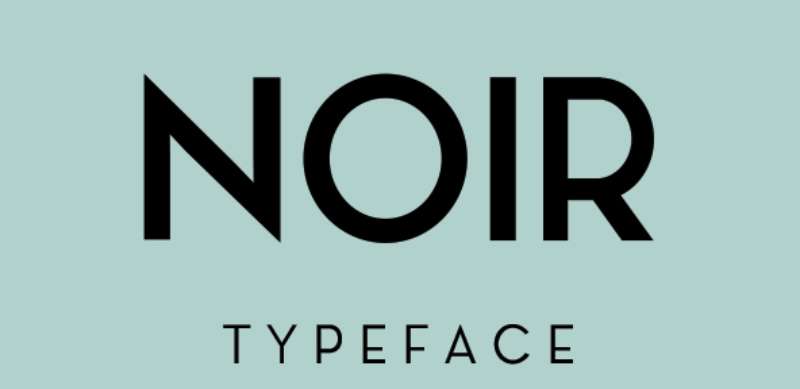
The Noir sans-serif font family includes twelve typefaces inspired by the twentieth century’s geometric design.
Other fonts you can use to capture McDonald’s look
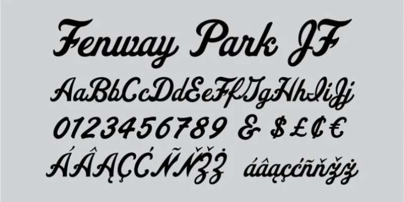
If neither of the options caught your eye, consider checking out the following fonts:
- Fenway Font
- Crux Font
- Beatles Font
- Creeper Font
- or you can look for something in the Elements library. They have tons of fonts there.
What font does McDonald’s use in its logo? Our final thoughts
Few logos are as widely popular as that of McDonald’s. This makes it an excellent source of inspiration for entrepreneurs and designers alike. If you want your company to succeed, you need to settle on the right font for both your logo and your website.
The font McDonald’s uses is called McLawsuit. However, you can’t use it yourself as it is protected by copyright. But that doesn’t mean you’re out of options. You can instead turn to other similar fonts we highlighted in this article. Even if you don’t end up using them, you’ll at least learn what makes some types of fonts more successful than others.
If you enjoyed reading this article about what font McDonald’s uses, you should read these as well:
- The Reddit font: What font does Reddit use? (Answered)
- Burger King vs KFC vs McDonald’s Print Advertising
- Restaurant Logo Designs: Tips, Best Practices, and Inspiration