5 Tips to Quickly Improve Your Website Accessibility in 2020
Many web designers and developers are just starting to understand the importance of web accessibility. After a long time being more of a niche focus, this important aspect of website design has emerged at the forefront of design thinking in recent years.
If you’re just starting to learn about website accessibility, don’t feel bad. Because even the world’s biggest brands often haven’t been paying attention to it. In fact, in 2019 a blind man sued Domino’s because their website wasn’t compatible with screen reading software. And, rightfully, he won!
Websites are meant to be accessible to everyone. Especially for a disabled person. And, as a web designer, it’s your job to make sure the websites you craft are able to serve all audiences.
In this day and age, having even a basic understanding of website accessibility is important for all web designers and developers. Keep reading and we’ll help you get started.
What Is Website Accessibility?
WCAG and ADA are two terms you’ll come across when learning about website accessibility. They stand for Web Content Accessibility Guidelines (WCAG) and Americans with Disabilities Act (ADA). These guidelines are created as standards for website design to make them accessible to people with disabilities.
When making a website more accessible you need to pay close attention to many aspects of your design. Including the code of the website, the colors you use in the website design, font sizes, compatibility with older browsers, and more.
Making a website compliant with web accessibility standards is now crucial, whether you’re a big corporate brand or a small business website.
Why Is It Important?
The first case of the web accessibility ADA lawsuit happened in 2017 and it went all the way to the federal court. All because a website wasn’t compatible with a screen reading software.
Imagine how frustrating it can be for a visually impaired person to not to be able to order a product they need from a website. Especially at a time like a pandemic when online shopping is the only way to shop safely.
Making your website accessible to people with disabilities is not just about avoiding the lawsuits, it’s also about better serving your customers.
Here are a few quick tips to test and improve your website’s accessibility.
1. Test Your Website
The first step to making your website accessible is to run a website audit to see which areas of the design need to be improved.
Even if you’ve used clean code and followed standard web design guidelines, your website could still be missing some important elements. Like media alt-tags that help describe the images and visuals when using screen reading software.
Running a web accessibility test will help you find these missing elements so you can get started on improving your website.
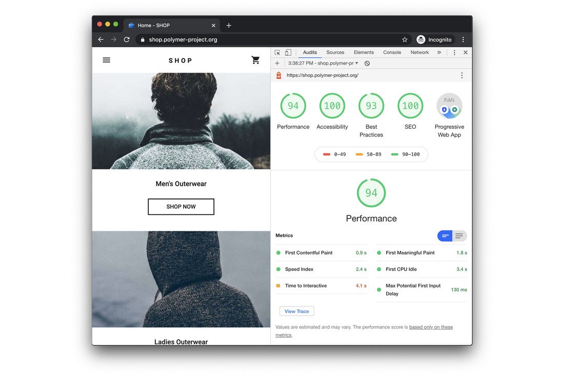
A good place to start is to use the Google Lighthouse tool, which lets you run a website audit for free. Among many other aspects, it checks for website accessibility as well. You can also use the WAVE tool, or the aCe accessibility tool which are built just for testing websites for accessibility.
2. Use a Web Accessibility Solution
If you have a business that targets a wider range of audiences, it’s best to find a better solution to test your website than just relying on free online tools.
Plus, you’ll also want to ensure compliance over time, as the requirements and recommendations change and evolve.
Also, once you’ve recognized the areas that need to improve on the website, you’ll have to hire web designers, UX designers, and developers to implement the changes. A more affordable, faster, and easier way to approach this is to use a web accessibility tool like accessiBe.
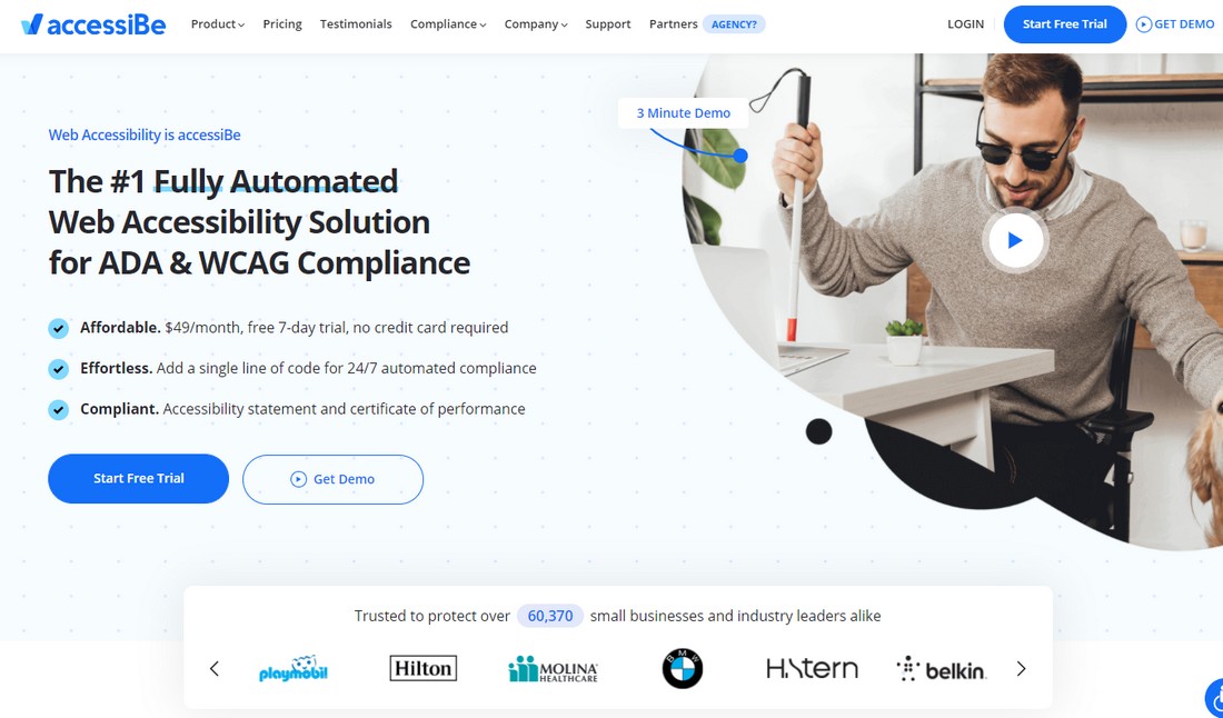
accessiBe can integrate with your website to automatically scan and optimize your design for web accessibility. It uses a powerful AI (artificial intelligence) to improve your website content for screen reader software, optimize keyboard navigation, and adjust many other user experience design elements.
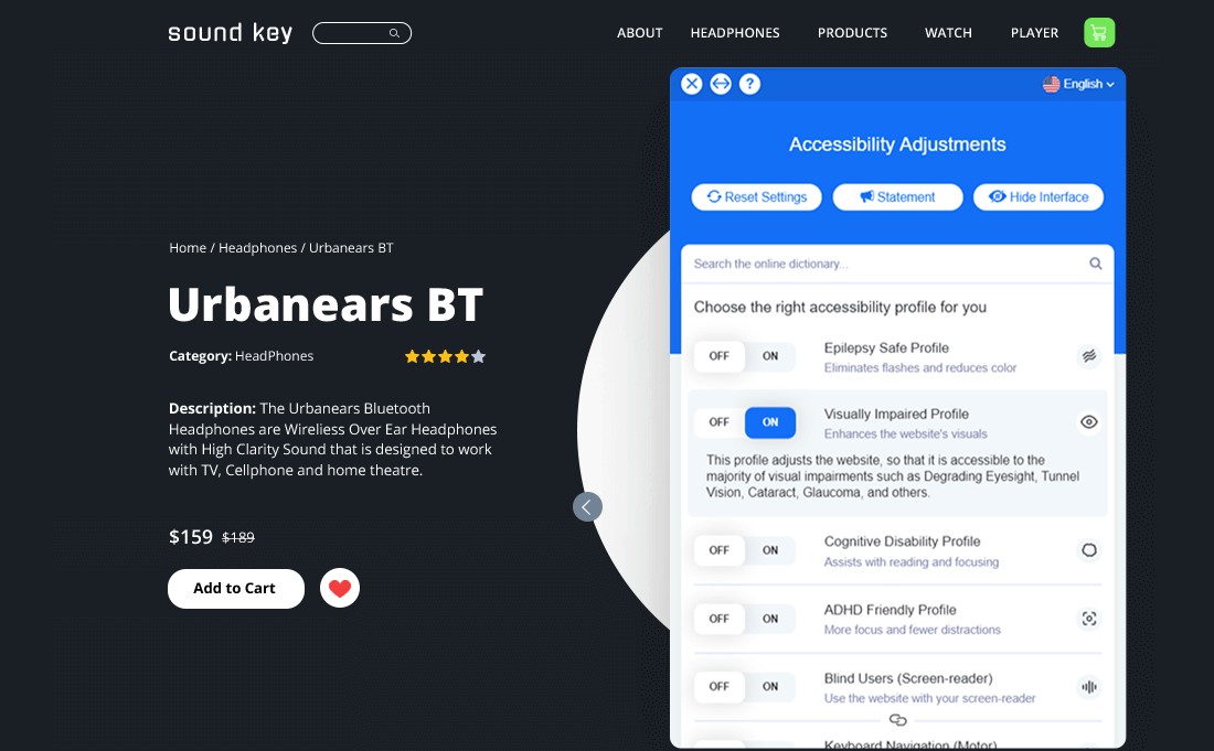
If you’re a freelance web designer or an agency, using a service like accessiBe is a great way to make your websites more accessible quickly and easily.
3. Optimize Website UX
The role of a user experience designer is often overlooked by many brands and businesses when making websites until they get hit by a wave of lawsuits.
Even web designers should have some understanding of user experience design (UXD) in order to make sure the website content is optimized to provide a better experience.
Some of the most important areas to focus on are:
- Navigation: Clear navigation is a crucial part of a website. Be mindful when using new types of navigation like hamburger menus and mega menus
- Text: Find the ideal font and the font size that makes your text readable on all platforms, devices, and browsers
- Forms: Make sure to add labels to each field to make forms more accessible
- Buttons and Links: Avoid using images for buttons. And make links with clear text, colors, and URLs
4. Choose Color Blind-Friendly Visuals
Visual impairment and color blindness are two of the most common disabilities in the world. But designers often forget to make their website content accessible to such people.
It’s something you should always consider when choosing visuals for your website design. Everything from the contrast of the background and the content to the colors used in the images should be carefully selected to make them accessible to different types of visual impairments.
For example, some websites use color as a way to highlight the importance of buttons and links. For a color-blind person, those buttons will mean completely different things.
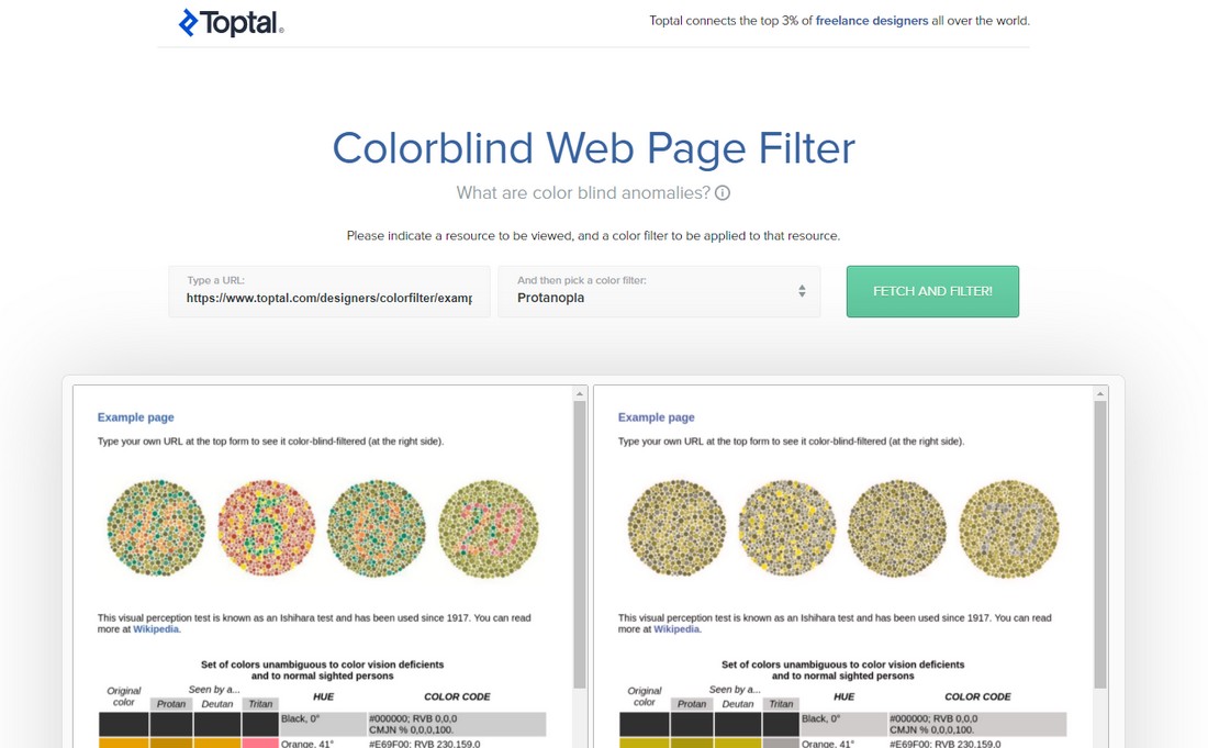
The Colorblind Web Page Filter is a simple free tool you can use to preview your web pages to see how people with color blindness see your content. There are also other tools you can use to optimize content for the color blind.
5. Use a Content Management System
The flexibility of your website also plays a role in web accessibility. With a more flexible website, it’s much easier to make the necessary changes to improve website accessibility. Using a content management system (CMS) is a great way to achieve that goal.
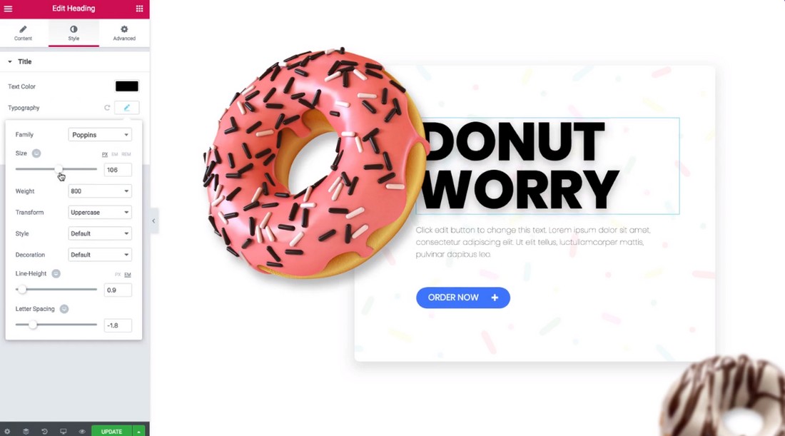
For example, CMS software such as WordPress allows you to easily customize your website however you like. With the help of page builder plugins like Elementor, you’ll be able to optimize your design for web accessibility without even writing a single line of code.
If it’s possible, use a CMS to build your website. It’ll save you a lot of money otherwise spent on web development agencies.
In Conclusion
By making your website accessible to more audiences you’ll not only make your product or service available to more people, but you’ll also get a competitive advantage against your competitors. And, you’ll save a lot of headache by avoiding the potential lawsuits as well.