Brochure Design Ideas & Inspiration for 2021
Almost every designer has created a brochure at some point. And there’s a strong possibility you’ll be asked to design another! Whether it’s for a client or to promote your own business, there’s an art to designing a brochure.
And then there’s an added challenge: brochure design isn’t just for print anymore. Digital brochures are just as popular as the hard-copy versions. It’s quite common for clients to request a printed brochure with a digital shareable file of the same design.
Don’t sweat this design challenge though. We’ve put together some classic and modern tips so you can create a brochure design that looks great, and is easy to read.
Common Brochure Shapes and Sizes
The first step in creating a brochure design is to consider shape, size, medium, and folds. All these tactile properties of brochure printing contribute to the style of design you choose and how combining text, images and other elements comes together.
When it comes to creating brochures, common options include:
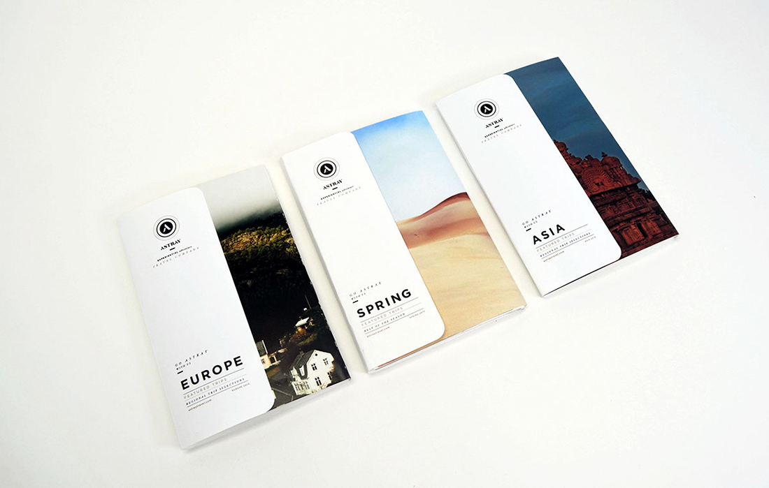
- Tri-fold: Three panels on the front and back, stacked vertically or horizontally printed on common paper sizes such as 8.5 inches by 11 inches (or A4) or 11 inches by 17 inches (or A3).
- Half-fold: This style works best for a mini-booklet style with a front, back and inside spread.
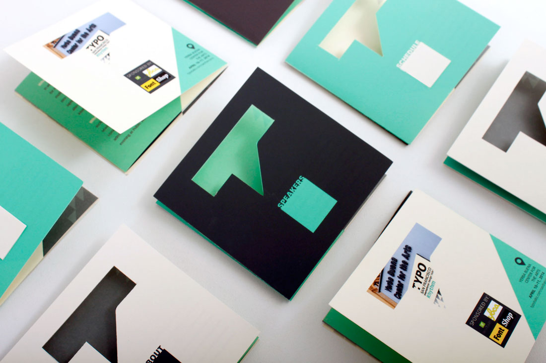
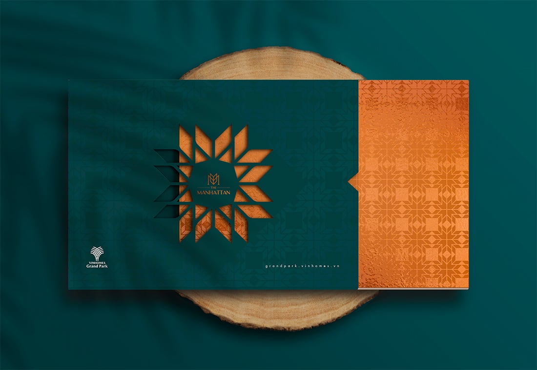
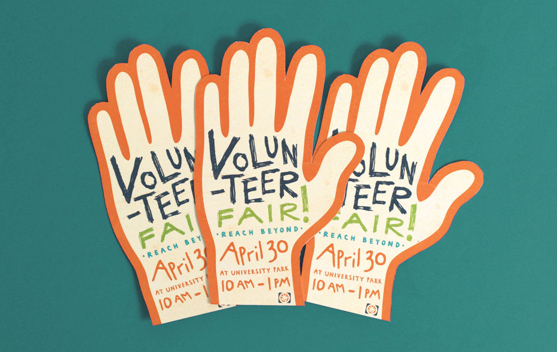
- Die-cut: Brochures with cut out panels, shapes and styles are often printed on thick stock and come in almost any size. They are characterized by multiple cut elements so that at least some part of the brochure isn’t rectangular.
- Multi-page: The more pages a brochure has, the more likely it is to become a booklet. These are almost always in a standard size (8.5 by 11 or A4) and include some binding.
- Square: The shape has become popular thanks to usage online and square designs often include a custom paper size. It can be a little more expensive, but quite attractive.
Make sure to take into consideration print versus digital publishing. It is common that brochures live in both physical and online spaces. While some brochure styles don’t need adjustments other than converting a file to PDF, some print jobs don’t render well digitally. (Tri-fold brochures can look especially strange.)
When it comes to shifting a print brochure to digital, consider making each page or fold of the brochure a separate page in the digital version. Order them in the way content should be read. This will make the brochure easier to read regardless of format.
Creative Brochure Design Inspiration
What’s great about designing a brochure is that you can get creative with effects and textures.
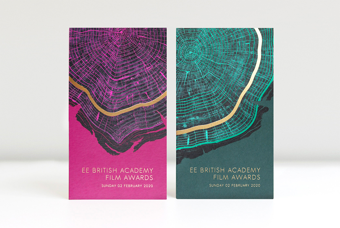
- Foil: Shiny lettering or feature for a certain portion of the design
- Spot UV: A special gloss or matte finish on part of the design
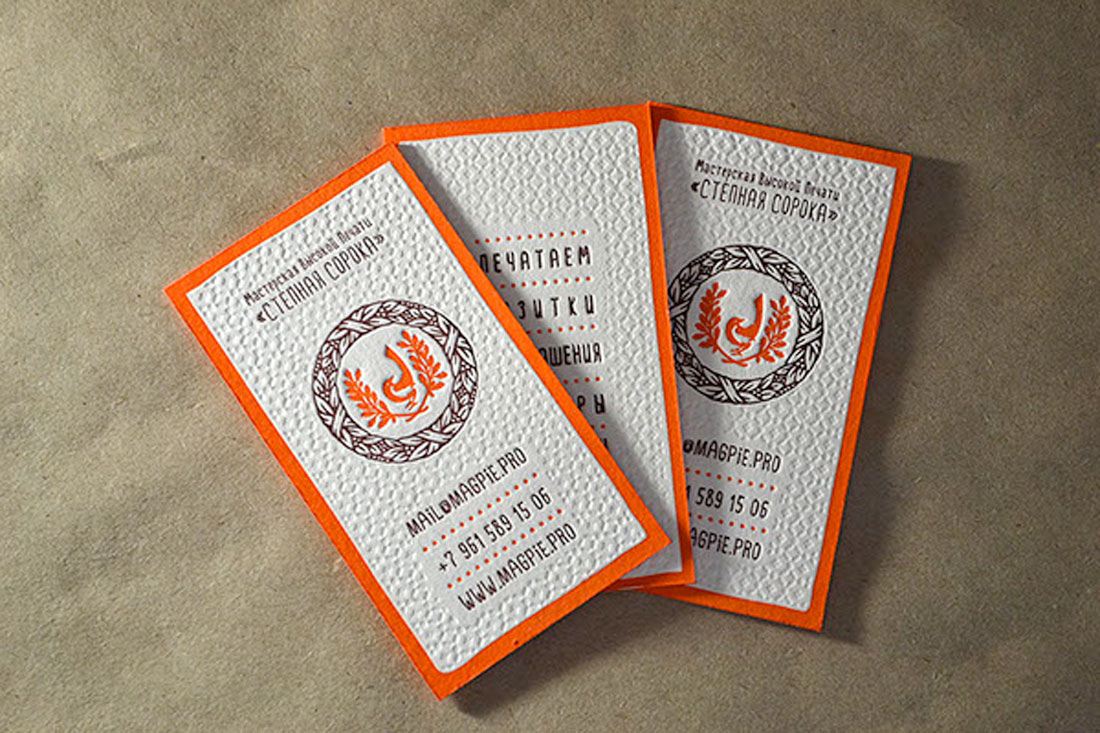
- Letterpress: Printing that makes an imprint on certain parts of the design, such as the brochure above)
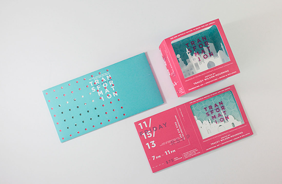
- Folds: Bi- and tri-folds aren’t the only option, interesting fold patterns can encourage user engagement
- Paper: Paper types with different textures can set the tone of a project
- Die Cuts: Cutting out parts of the design so something else shows through creates a send of mystery
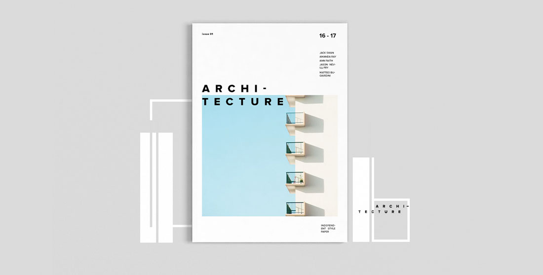
Modern, Trendy Styles
Some trends in brochure design include using high-color options, plenty of sleek typography and simple images. Many of the same things that are popular in other areas of design apply to brochures as well.
Modern, trendy brochure design techniques that always look great include:
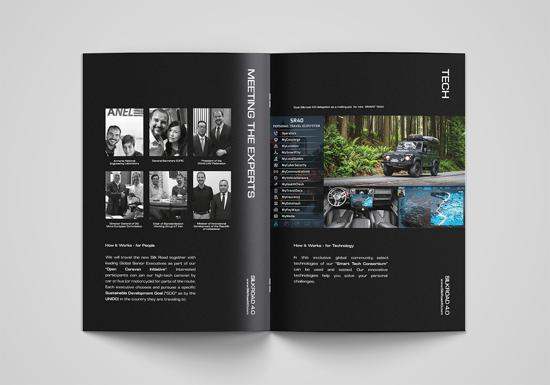
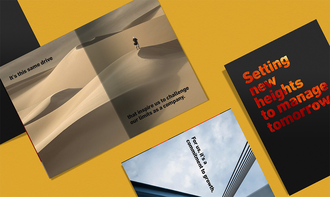
- Creative use of whitespace, that’s not actually white, such as the Silkroad brochure (above) that’s printed on black
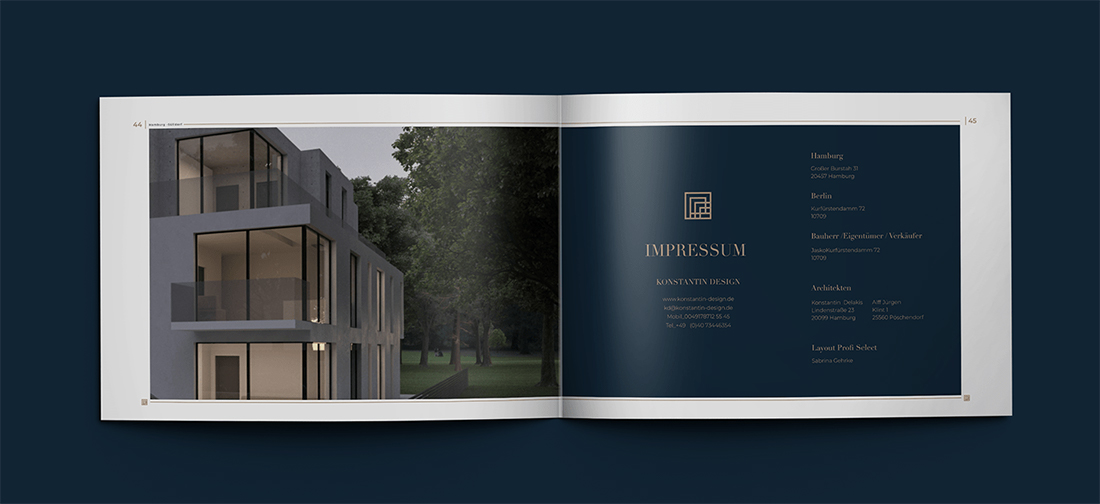
- Elegant design themes that mix simple typography and great imagery with a few stunning effects, such as the Real Estate brochure (above)
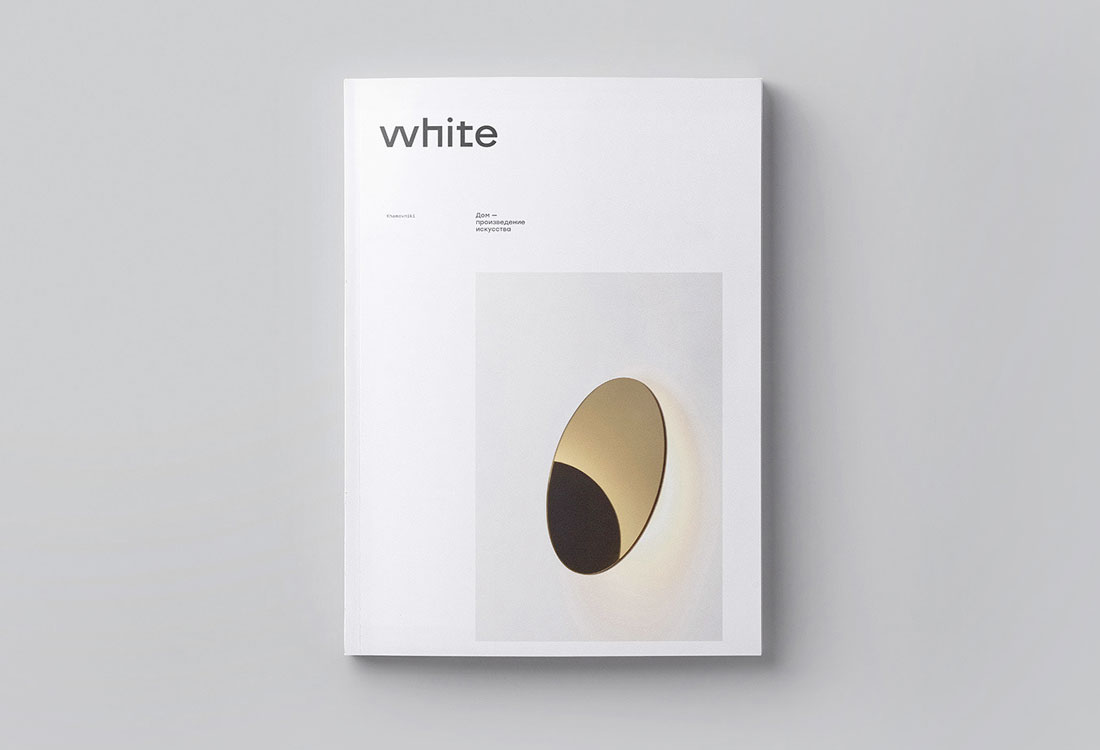
- Minimal aesthetics with plenty of white space, such as White (above)
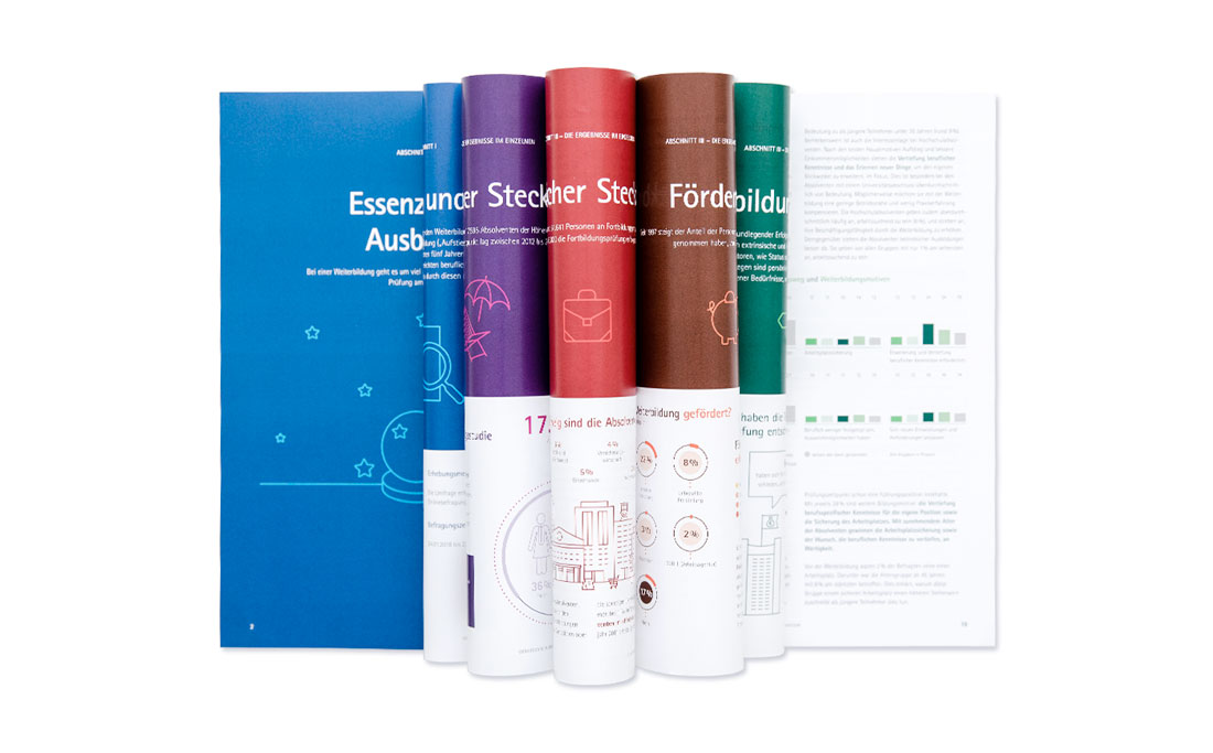
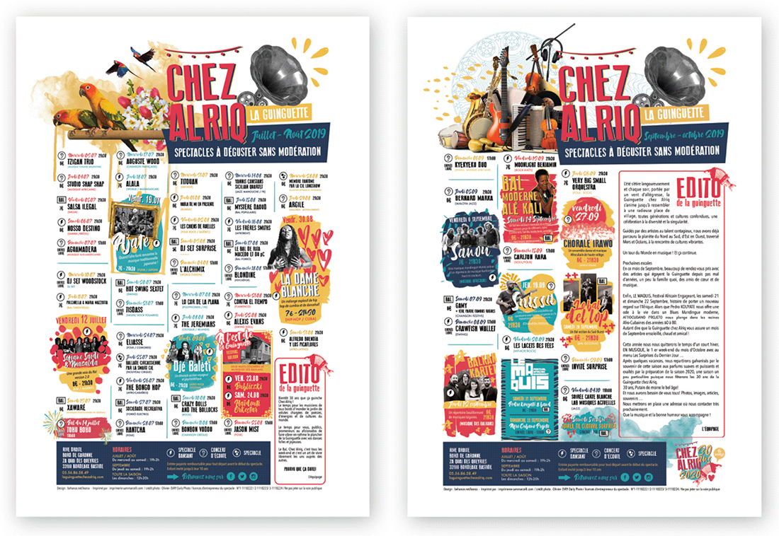
- High-color designs, including color blocking on alternating folds, pages or panels, like DIHK (above)
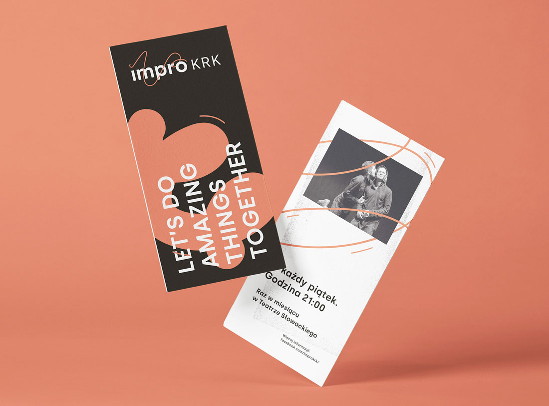
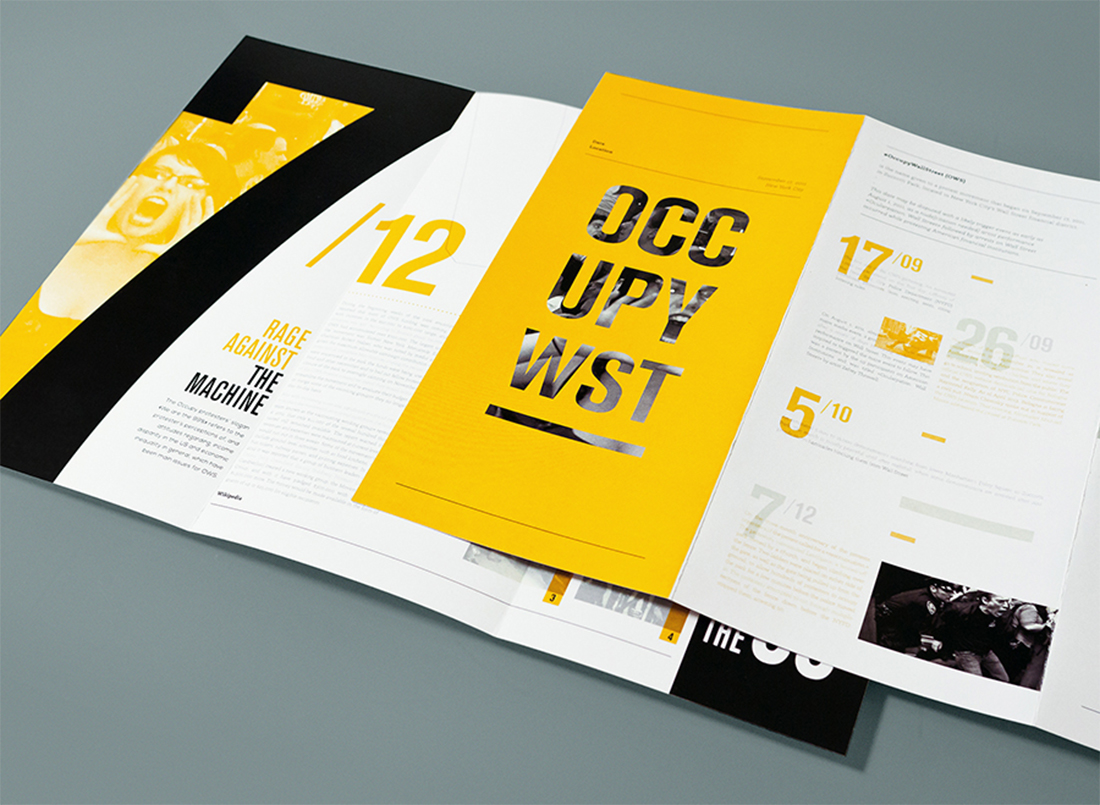
- Use of oversized typography, that makes lettering a key element of the design, such Hamat Property Company (above)
Bold Color Choices
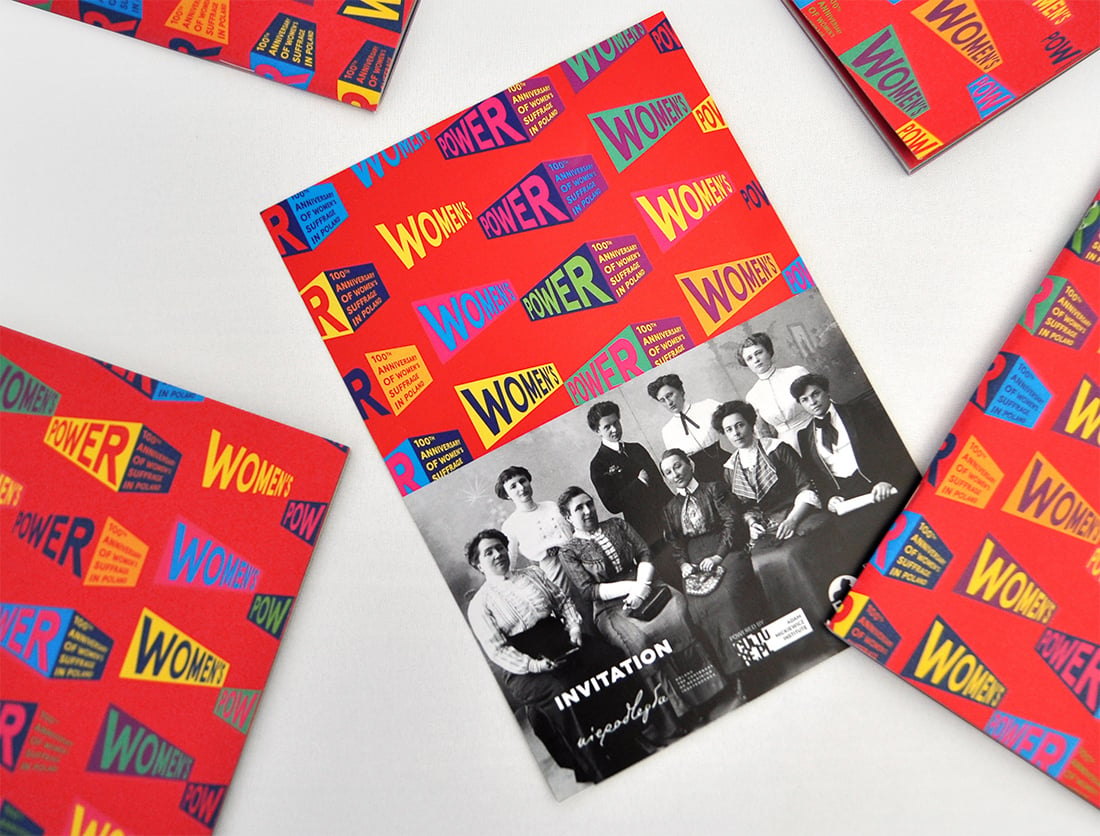
Color can play an important role in brochure design. It can also be complicated.
When it comes to bold color and bleeds, it takes just the right mix and printing to get a stellar outcome. Take particular care with folds and mixes to ensure that your design comes out right every time.
When it comes to actual color, neons and bright hues are popular styles. They can fun, engaging, and stand out. The goal of bold color choices in brochure design is to draw an audience to the printed product and keep them looking at it once it is picked up.
Portfolio as a Brochure
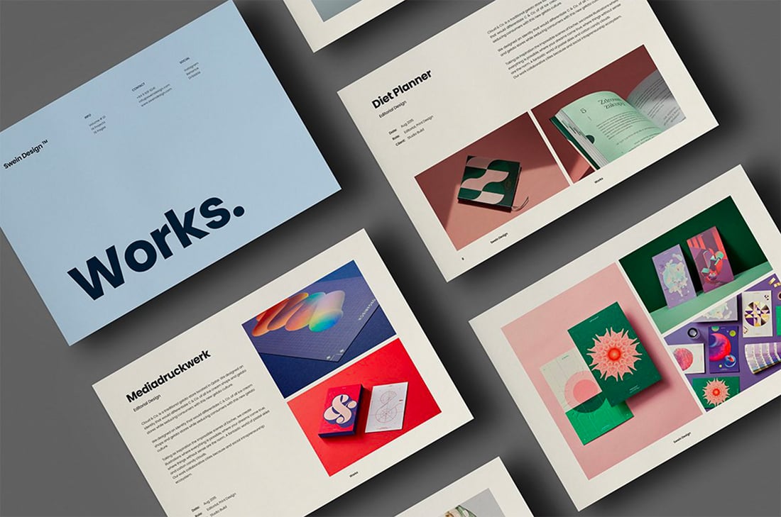
If you want to make an impact, consider turning your portfolio or website into a printed brochure.
There are different ways to do it – type foundries have been doing it for decades – but your main goal should be to create just the right impression. Showcase work and pieces that look great in a printed format. This tangible item can be a great leave-behind for networking events or job interviews.
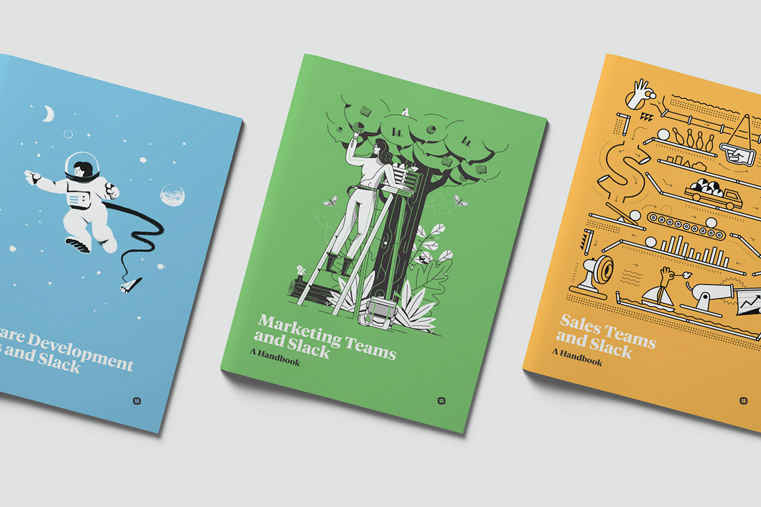
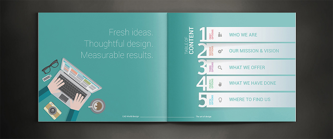
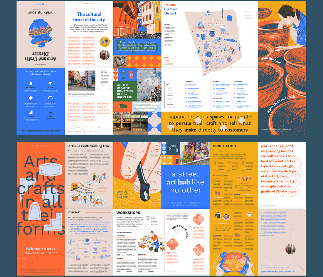
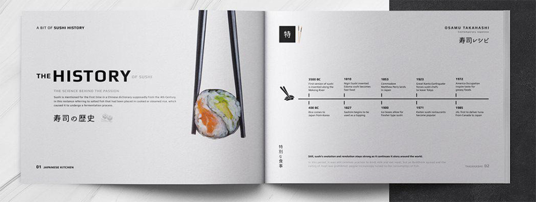
Infographics with Flow
Infographics are a great brochure option because they can help explain what your messaging is about. Infographics are also highly visual and engaging.
There are two routes to take:
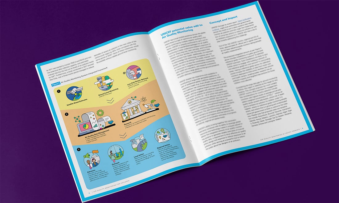
- Detail, in-depth graphics, like the first two examples above)
- Simple, graphics and images to convey meaning, such as the third example above
All are equally effective and can provide energy and understanding to content. Brochures can contain infographics that stand on their own or as a part of an overall design scheme.
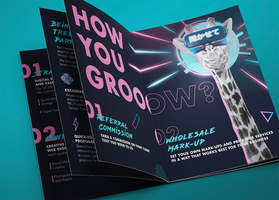
Highly Visual, Image-Based Designs
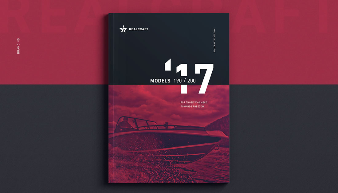
When it comes to creating a brochure design, highly visual elements with images and color are trending. (These styles are especially popular for brochure designs that will only be shared digitally.)
High color, high image designs can work great and be quite impactful in print also. Just make sure to check with your printer to ensure that colors, images, and bleeds will work well with the paper and printing selections you have made and adjust if needed.
When it comes to brochure designs with a lot of color and imagery, look for visual elements that are easy to understand at the size displayed. Images shouldn’t be overly complicated and communicate a single message. (Note the Realcraft example above, which uses a lot of color and imagery, but the image is of a single element.)
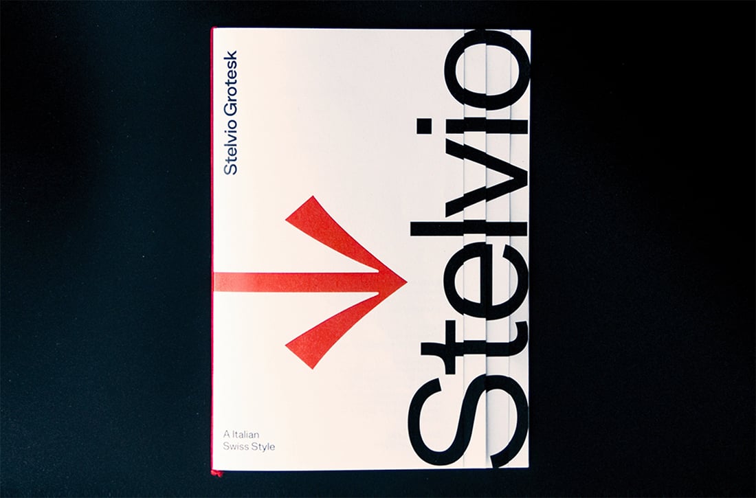
Typography-Driven Brochure Design Ideas
A great way to handle a brochure design without a lot of images or other “designed” art elements is with big type. Fun oversized lettering can make a lot of impact and help users know exactly what the brochure is all about.
Get creative with type choices and the way you create words. Interesting word breaks for long words (such as on syllable per line), titling, color, and different alignments can add a lot of visual draw to lettering.
When choosing to design a brochure featuring only lettering, take care to include plenty of white space and a defined type hierarchy so that the eye travels easily through content.
Minimal Design is Great for Printing
When it comes to printed brochures, less is more.
Minimal design styles are popular with brochures because there’s less to worry about when it comes to printing and quality control. Avoid reverse type and you don’t have to worry about the readability of light text on dark backgrounds. Go for a white background or canvas and there’s less ink to worry about smear.
Minimal styles give you a little more choice with paper stock as well. You can actually use lighter weight paper when you don’t have as much happening with the overall print job.
Finally, minimal design styles are classic and modern. They never seem to go out of style.
Conclusion
Ready to get started? We’ve got even more tips to help you create a great brochure design. Or, if you’re short on time, consider starting with a brochure design template!