Design Trend: Zig-Zag Patterns and Alignments (Where Is the Grid?)
Smaller images, animation, and plenty of wild patterns are what you’ll find in this website design trend that’s popping up all over the place.
Without a clear thing to call it, you’ll know this trend when you see it thanks to zig-zag patterns and alignments for photos and the seeming lack of a grid.
Here, we’ll dive into this design trend and look at some ways you can use it and examples that really showcase how nice these designs can look.
What is the Zig-Zag Pattern Design Trend?
This design trend is all over the place – literally!
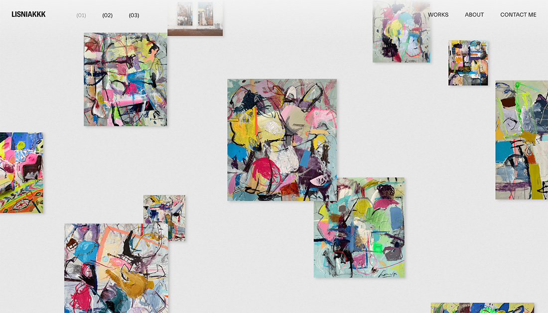
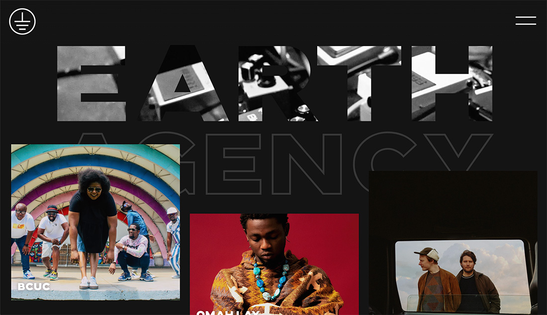
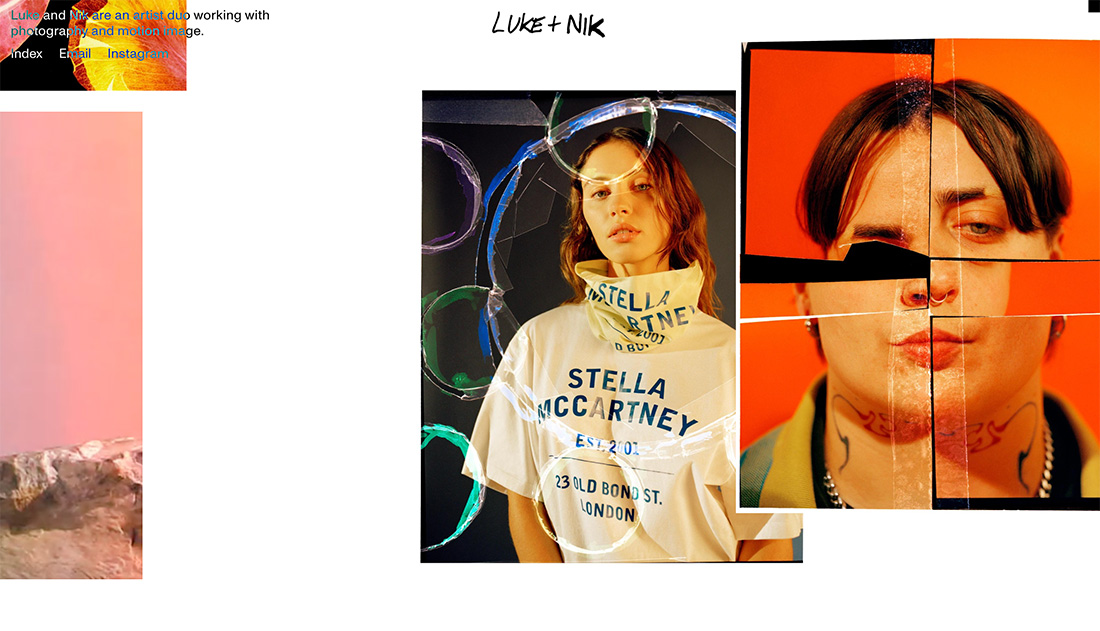
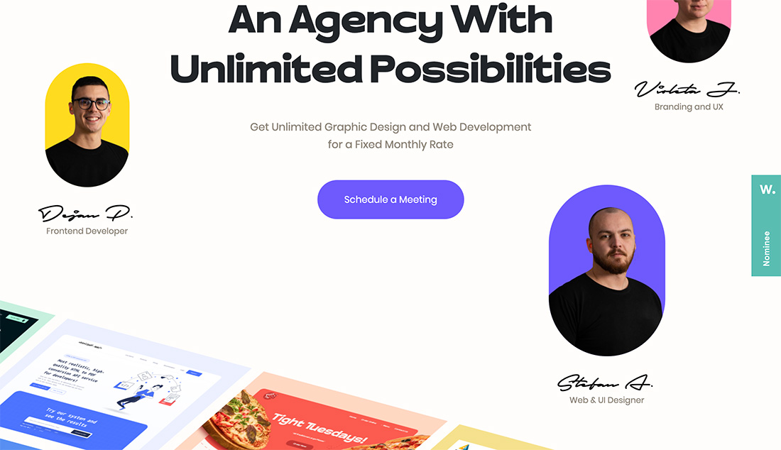
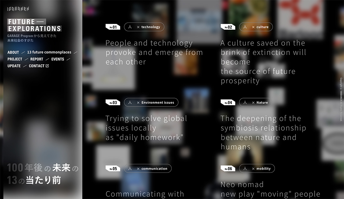
Designers are stacking design elements in almost random patterns on the homepage. You may find photos of different shapes and sizes, animations that move in unusual ways, backgrounds that are busy, or almost any other combination of photos that seem to defy a grid.
What works about this design trend is that it breaks the monotony of huge hero images and video displays that are quite common.
For the most part, designers are using this trend to showcase some pretty nifty animations as well. (So you should definitely consider clicking through all the examples in this article.)
Characteristics of the Design Trend
Zig-zag patterns, although they seem to break almost every design rule, are dynamic and visually striking patterns. They can add a sense of movement, energy, and playfulness to projects.
You’ll definitely know this type of design element when you see it. The primary characteristic is multiple elements grouped together, but in a way that seems to have no logical pattern or grid.
There are plenty of other things you might see in combination with this design trend as well.
- Use zig-zag lines and shapes that can be applied to backgrounds, borders, or elements within the design.
- Integrating zig-zag patterns with animation or interactive elements to make it engaging and memorable. They might be patterns as dividers between sections or as background elements to guide the eye.
- Zig-zag elements can extend to fonts or text treatments to add a unique touch to headings, logos, and other typographic elements. Be careful, though to ensure there’s readability and avoid excessive use within body text.
- Buttons, icons, and sliders, can be stacked in unusual and zig-zag patterns to add a touch of modernity and creativity to the user experience.
- Zig-zag elements will direct attention to key information.
- Movement and dynamism can make this trend come to life and help ensure that users know what to do with the design.
Tips for Using This Design Trend Well
This is not the easiest design trend to execute well. Using the zig-zag pattern and alignment design trend effectively requires careful consideration and a thoughtful approach, so that you don’t end up with a disorganized jumble of elements on the screen.
Consider these tips if you are planning a project using this style.
- Create Purpose and Context: Zig-zag patterns work well for projects that require a sense of energy, movement, and excitement.
- Establish Balance: While zig-zag patterns can be visually striking, excessive use may overwhelm the viewer and diminish their impact. Use zig-zags sparingly and strategically to avoid creating a cluttered or chaotic design. Strike a balance between zig-zag elements and negative space to maintain visual clarity.
- Create Interest with Contrast and Color: Choose colors that create a strong contrast with the background and other design elements. This will enhance the visibility and impact of the zig-zag pattern. This is why you often see this style on black or white backgrounds.
- Guide the Eye: Use these patterns strategically to guide the eye toward essential elements of the design, such as a call-to-action button or a focal point. Zig-zags can create a strong visual flow.
- Pay Attention to Readability with Typography: Reserve zig-zag fonts or text treatments for large text elements with only a few words and use them sparingly.
- Keep It Simple: Avoid using too many competing patterns or shapes. Strive for an intuitive and user-friendly design.
5 Examples We Love
We actually love this design trend when it is done well. It can be versatile and especially nice for a portfolio site. Here are five examples for a little extra design inspiration.
Swindled
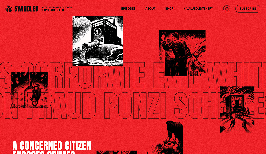
This design is different from many of the others in this article thanks to a red background and transparent images, but the zig-zag pattern is still distinct. Each image has a different size and shape and the animation is actually in the background text element here.
Good Fake
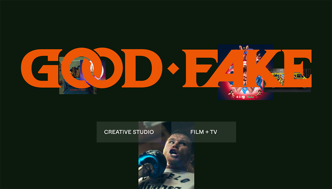
Layers of images between the background layer and text element are an animated display of this trend in action. If you watch it move long enough, you might be able to find the pattern, but we could not.
Mocha Cafe
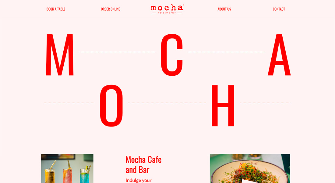
While you can see a grid with the text of Mocha Cafe, it is not on a traditional baseline, creating a zig-zag effect. This is probably the most challenging use of the trend and works best with a single, simple word (as seen here).
Ground Media
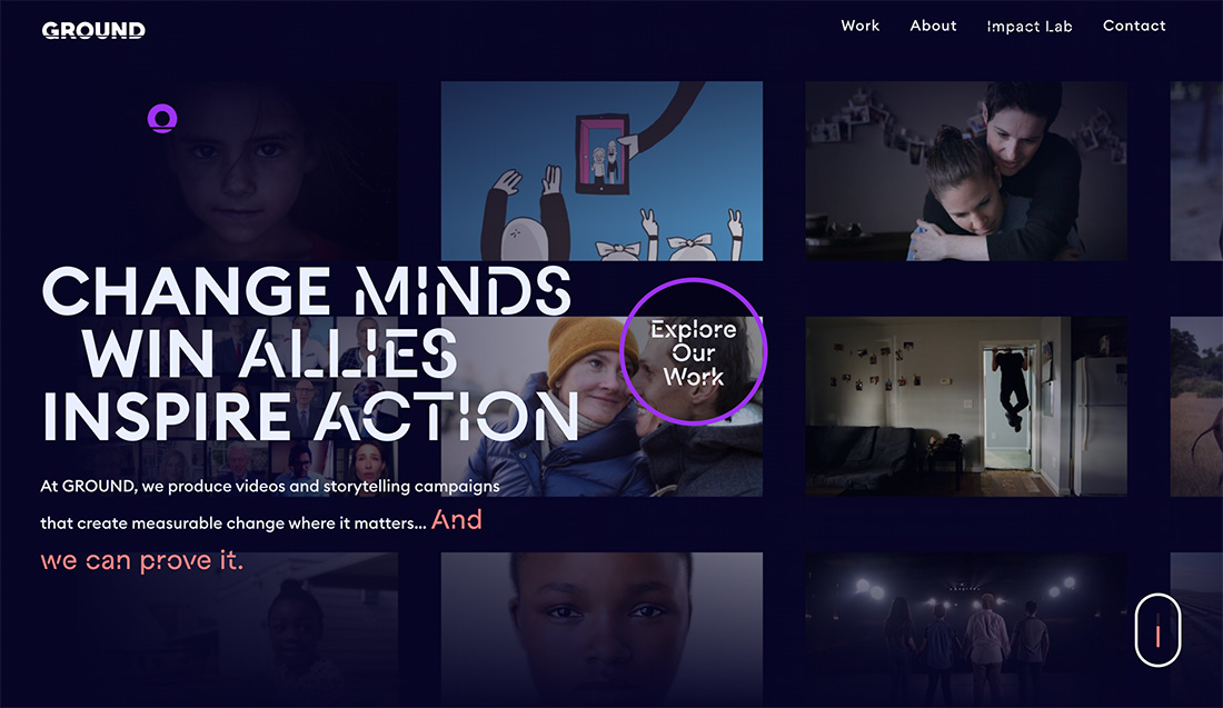
A wholly different approach with a grid you can see and one you can’t in this design. The background photos are placed in a grid, but then the animation zigs and zags on the screen. It’s a fun twist on the design trend.
Swiss Deluxe Hotels
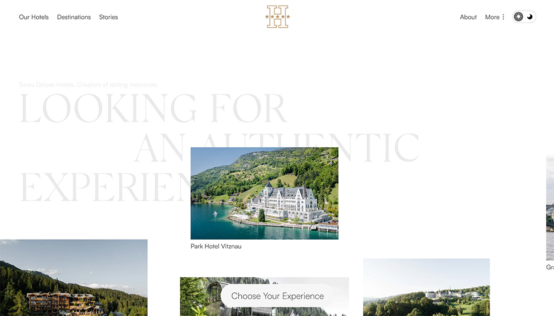
Like the previous example, this use of the trend also features images in a large-scale animation. What’s different is that the animation feels more consistent but the images all seem to zig zag off the grid.
Conclusion
The zig-zag design trend is one that can create stunning visuals and a lot of interactivity but can be challenging to deploy well. You need a well-planned design and just the right elements to tie everything together.
It’s always difficult to work off-grid, so start with a small grid that allows for an off-grid look and feel, but is organized well!