The Best Kindergarten Websites You Can Find Online
Educational firms and preschool institutions nowadays need a strong online presence. In such a way, they can spread awareness of their educational services, and attract more clients. If this is the case with you, we recommend you look at the best kindergarten websites for inspiration.
Each of the websites below will provide you with ideas on the layout, colors, and elements of your website. This way, you will be there for your clients 24/7.
Let’s check them out:
Best Kindergarten Website Design Examples
NY Kids Club
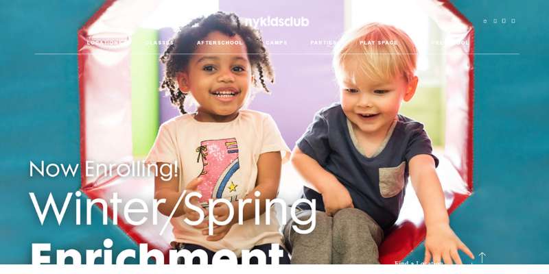
This website creates the perfect first impression among visitors. It greets them with a full-width hero image and a slider to scroll through the gallery. All images are high-quality and relatable.
Furthermore, this website makes it easy to search for information with a powerful search button. Thanks to the asymmetrical alignment, it also looks modern and interesting. Next to images, some videos promote the brand and inspire clients to click on the CTA button suitable for their location. The hero image on this preschool website causes a great first impression.
Mother’s Pride
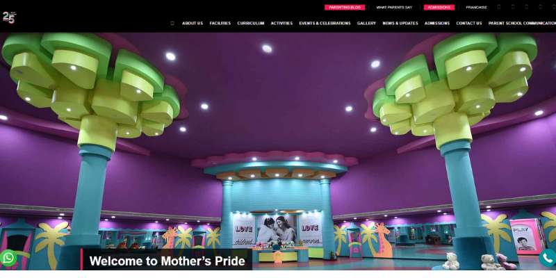
Mother’s Pride is a very clean, modern, and fresh website. We once again see large hero images on the front page, but this time paired with chunks of relevant text for the visitors.
The website also features a nifty success indicator and customer reviews. Clients also visit it to learn about events and activities. There is also a dedicated blog section where you can read parenting tips, success stories, news, etc.
International Grammar School Sydney
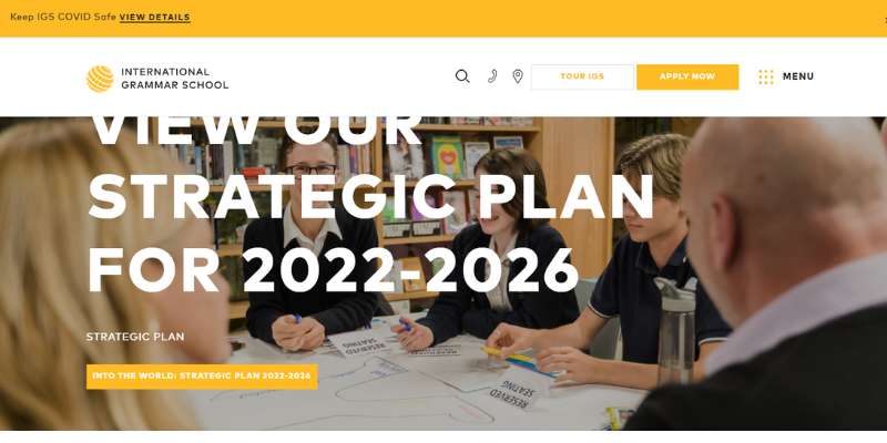
IGSS certainly has a very innovative online presence. In such a way, they promote their non-denominational secular coeducational learning services. We like how sophisticated and well-designed their homepage is. This is the perfect example that web design can be both beautiful and practical.
A feature to consider is the off-canvas menu that leads visitors directly to the level of education they need. They use amazing elements for preschool and kindergarten, such as fun images and catchy headlines. A sticky menu on the side will enable you to book a tour on the website at any moment.
Bright Horizons
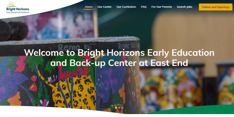
This lively and charming preschool & kindergarten website certainly deserves a place on this list. The integrated hero video is a real winner, as it warms the heart of every visitor. All elements on this website are lively and informative.
The website was designed with usability in mind. Visitors not only relate to it but also navigate with ease and enjoy smartly structured content. Next to the service page, there are pages for job seekers, an introduction to the team, and much more. Last but not least, there are striking CTAs to ensure visitors take the desired action.
Moorlands
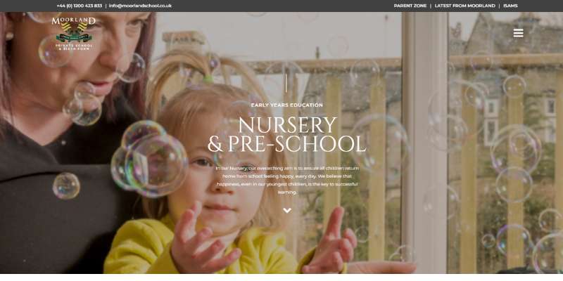
Moorlands is a well-known nurturing establishment for preschool children. More than anything else, it promotes health and high-quality education.
Their website will surprise you with a seamless interactive background. You will also like their creative taglines and off-canvas menus. Social media icons are also available, but the homepage still looks clean and fresh.
What we like the most about the Moorland website is how it combines several layout styles with parallax effects. Thanks to this, navigation is seamless and easy, and you get instant access to all pages you need.
Przedskole
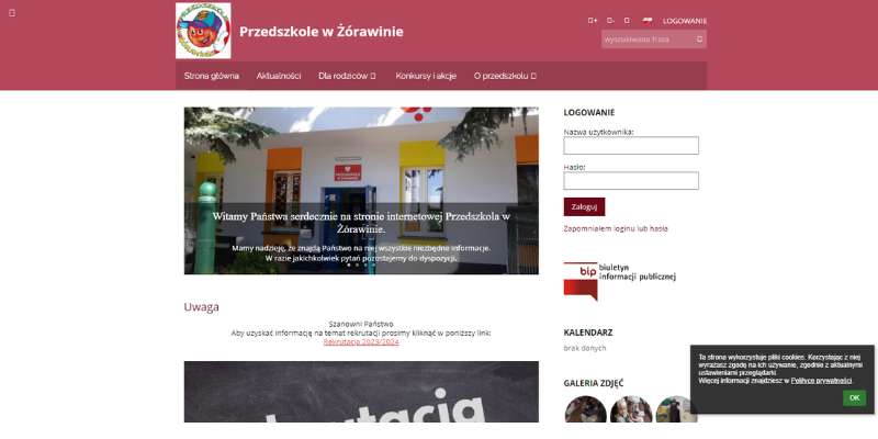
We recommend all preschool institutions check these free educational websites. They’ve implemented the perfect design for learning centers. Their content is packed with hero headlines and descriptive CTAs.
The website also offers engaging video content. There is even an exceptional slider that showcases the entire school environment.
Better yet, the site is integrated with Google Maps to ensure visitors see content tailored to their region.
Monkton
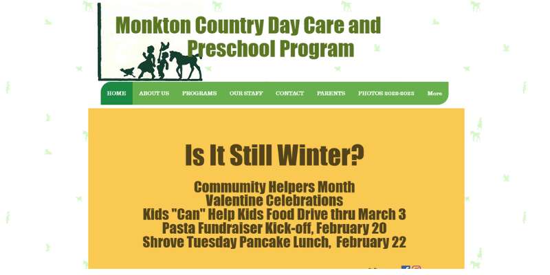
Let us present you with another super-creative website. Monkton has an outstanding approach to spreading education awareness. For this purpose, it uses carefully selected features that captivate attention.
For instance, there is the homepage hero scene with beautiful imagery and GSAP animations. The transition from one page to the other is seamless, and users have no problem locating the contact information.
MV School
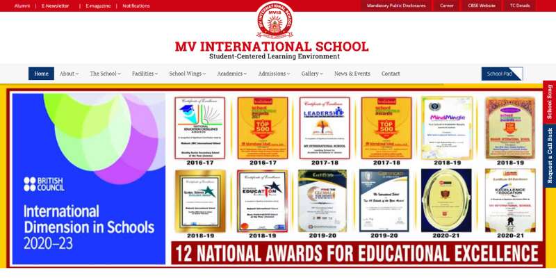
This modern website also offers breathtaking GSAP effects and high-performance animations. Each time you hover over an element you see a cool animation. In such a way, the site entertains young learners while providing them with resources.
The integrations are also quite impressive. This website connects to video platforms, Instagram feeds, social media, and more.
My Little School NYC
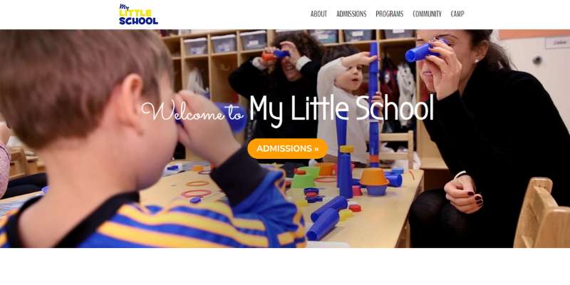
Here comes another brilliant example of how useful GSAP animations can be. A fun effect like this is welcome on every professional website, and educational websites are no exception.
The beautiful images are displayed on a masonry layout, paired with stylish icons for every admission program. My Little School also added an introduction video where they speak of their mission and connect to their visitors.
Starfall
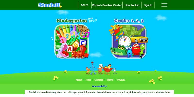
Starfall is the favorite preschool website of many young learners. It supports them to improve their math and literacy skills with educational games and interactive games. The site offers also printables, stories, and many other fun resources.
The key advantage of this website is that it is friendly enough to be used by kids themselves. The design is fully tailored to young visitors and comes with fun songs, colorful graphics, and fun brain teasers. Not that many educational websites are that optimized to use by younger kids.
Twinkling Stars Preschool
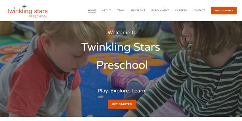
Twinkling Stars Preschool is a very minimalist educational website for preschoolers. There is a striking hero header with a CTA and an image, and content is delivered with parallax effects. The animations ensure important chunks of text stand out, without visitors even realizing it.
Twinkling Stars goes the extra mile to ensure credibility. They showcase positive customer testimonials on every page. While browsing through their content, you will be able to see the logo and the main menu all along.
Euro Kids India
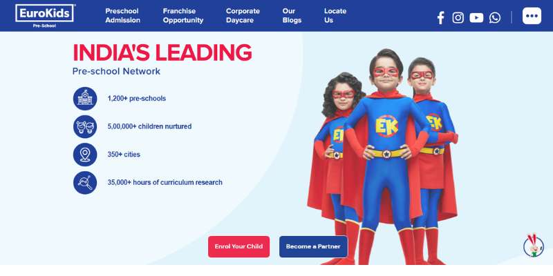
The promise Euro Kids makes for its visitors is a fun and engaging learning environment. The site is very stylish and creative and shows us interesting insights on how to use color.
The colors are bright and vibrant so that the learning experience is more fun. The homepage focuses on the key learning services and certifications the organization won over the years.
Columbus Pre-School
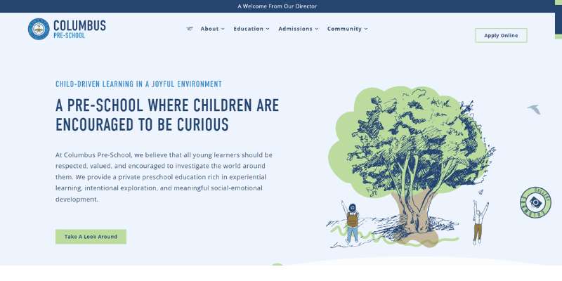
If you want a modern-looking homepage that showcases all useful tools, check the Columbus website. The cool video background prepares visitors for all they will discover. By all, we mean fun learning games, online coloring pages, engaging videos, and science experiments.
The site has loads of content, which makes it challenging to keep the design appealing. They dealt with this issue with special thumbnails for the most important sections. Examples include admission, team, or contact information.
The website also features a beautiful gallery where you can familiarize yourself with the premises and the team.
Flamingo Island Preschool
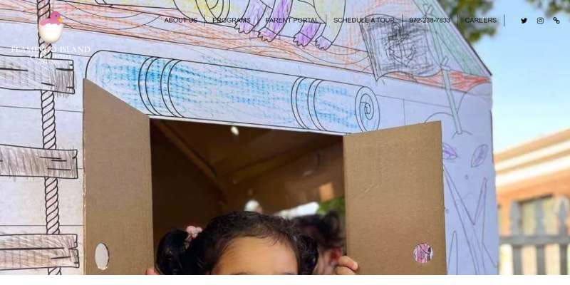
Flamingo Island will assist you with your website project in many different ways. For starters, there is cutting-edge video background of playing children. Next, there is a hero header that leads you to any section or page on their website. Both features help retain attention and keep visitors engaged.
All of the content for young learners is paired with images and visual effects. Another unique feature is the video testimonials of satisfied parents who’ve used their services. This website will teach you how to convey your passion in the best way possible.
Whittle School & Studios
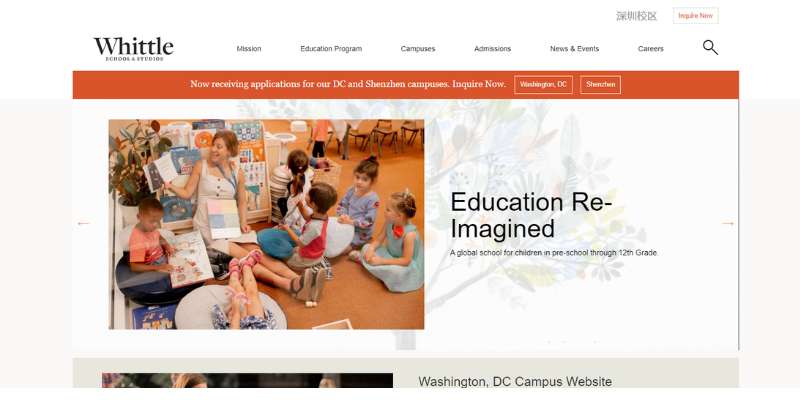
Whittle School & Services also deserves a mention among the best educational websites. The magazine layout is inspiring enough, but there is another feature that deserves more attention. This is the flawless categorization of content.
It doesn’t matter if you are looking for a job or some fun games for your child. In both cases, there will be a helpful sticky menu that will take you there. Plus, Whittle offers lots of free content and publications available to its visitors.
Thales Academy
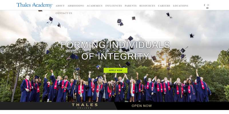
Thales Academy is a North Carolina college preparatory network. It will give you some awesome ideas on how to use color accents on neutral backgrounds.
Anchor Academy
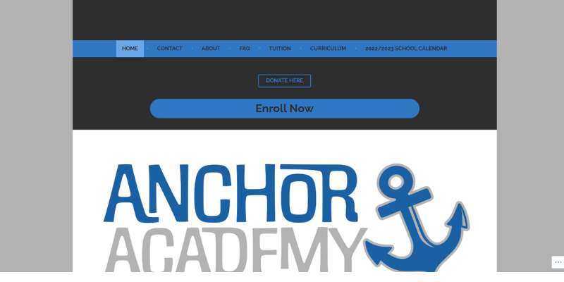
Anchor Academy belongs to the educational websites that invest in first impressions. Their magnificent homepage speaks tones about their mission, tradition, and quality of service. All of this, while not mentioning any of these topics.
What makes this website stylish are the GSAP animations, classy fonts, and clean visual hierarchy. Navigation is quick and trouble-free, and the content is very well organized. This is the perfect example of how the website of best-in-class establishments should look like.
Milo’s House
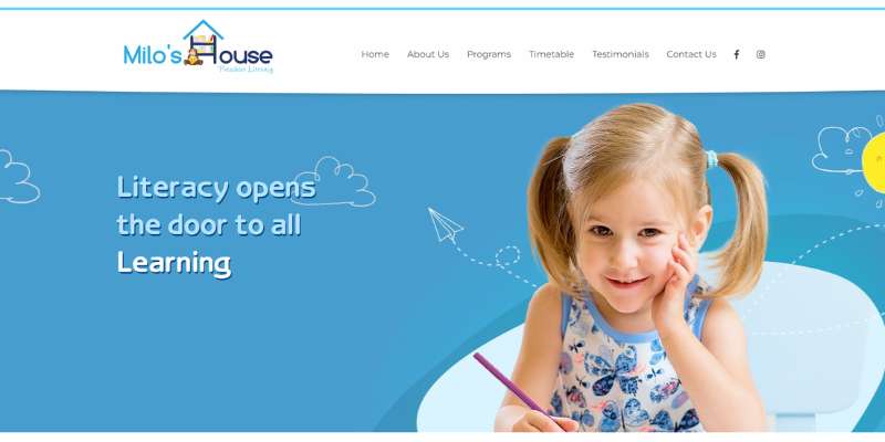
Milo’s House website is much simpler than what we’d expect for interactive games. There is a stunning headline and a corresponding image, but the content is well hidden beyond the home page.
Designers applied card design to divide the programs and the sections. Milo’s House also has one of the most appealing testimonials session on this list.
South Rowan Academy

South Rowan is the place to look for a more attractive website layout. The designers used exclusively warm colors, as these bring excitement, joy, and energy. Opposed to the palette, images are mostly monochrome and feature kids enjoying a fun activity.
These designers also did an amazing job driving attention with ample use of white spaces. Their CTAs are crisp and effective, and the content is very well categorized. Lastly, the website uses parallax scrolling and awesome hover effects. Such effects make it look modern and professional.
PBS Kids
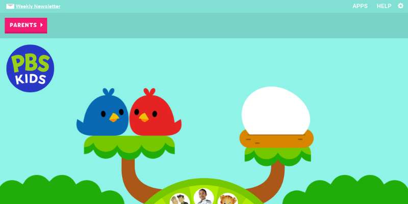
PBS Kids offers free educational websites for children of all ages. There are many different math games, science experiments, language arts programs, and more. To enable kids to learn, these websites feature relevant PBS Kids TV shows. Using those on your website may require special permits, but you can certainly consider video integration as an option.
La Petite Academy
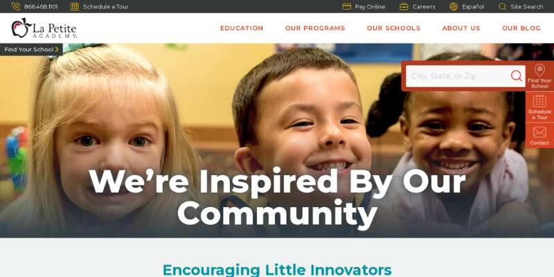
This website will show you that colorful doesn’t always mean kitsch. You can use all the colors you want and still preserve the elegant design. Check this website to see how it is done.
Shining Stars
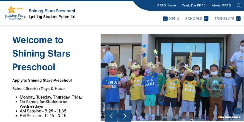
The most impressive element of this website is its beautiful imagery and educational videos. Teachers created this website to engage young learners in art, handwork, and music.
Childtime
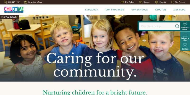
Childtime is a very captivating kindergarten website. They use vibrant pictures and bright colors and offer many fun activities. Children will not only improve their math skills but also learn about personality and passion. The Childtime programs prepare them for the world they grow up in.
JumpStart
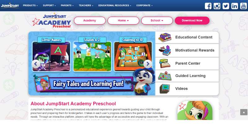
The JumpStart Academy is a popular preschool institute. It provides children with the necessary resources to prepare for school. Their website makes learning fun, and also enables kids to play games and have fun. The feature we particularly recommend is mobile optimization. These pages render perfectly on any device.
First Foundations Preschool
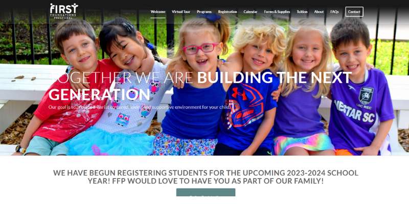
First Foundation’s website also offers education programs for children older than three years of age. They create the perfect online environment with bright colors and hero headings.
FAQ about designing a kindergarten website
What kind of information should be included on a kindergarten website?
Important information for a kindergarten website should contain the school’s mission and values, curriculum and programs, enrollment and registration information, staff profiles, and contact information.
Furthermore, any kindergarten-related policies or processes should be clearly mentioned on the website.
How can I create a user-friendly design for a kindergarten website?
Use clear and succinct text, intuitive navigation, and a visually appealing layout to develop a user-friendly design for a kindergarten website.
Employ a color palette and typography that complements the school’s logo and creates a warm and inviting environment. Make sure that key information is easily available and that the website is usable by all users.
What are some effective ways to showcase kindergarten programs and activities on a website?
Use high-quality photographs and videos that convey the spirit of the school to display kindergarten programs and activities on a website.
Employ descriptive text to provide further information about each program or activity, such as its goals and objectives, as well as any distinguishing qualities or benefits.
To establish social proof and legitimacy, consider sharing case studies or testimonials from current or previous students.
How can I optimize a kindergarten website for search engines?
Use relevant keywords in page names, meta descriptions, and content to optimize a kindergarten website for search engines.
Employ headings and subheadings to establish a logical structure that search engines can understand. Use descriptive filenames and alt tags to optimize photos and other media for SEO.
How can I ensure that a kindergarten website is accessible and inclusive for all users?
Choose a responsive design that adapts to different screen sizes and devices to guarantee that a kindergarten website is accessible and inclusive for all users.
Employ clear and succinct wording, and use assistive technologies such as screen readers to make the website easy to navigate.
To ensure that people with impairments can access the material, utilize alt tags for photos and other media.
What are some important considerations for mobile responsiveness on a kindergarten website?
Because many parents and caregivers may use the site via mobile devices, a kindergarten website must be responsive.
Make use of a responsive design to make the website easier to access and utilize on smaller displays. Ensure that critical information is easily accessible and that photos and other media are mobile-friendly.
How can I use visuals like images and videos to enhance the design of a kindergarten website?
Visuals such as photographs and videos can be an effective way to improve the design of a kindergarten website. Utilize high-quality photographs to highlight the school’s facilities, programs, and activities, and films to provide more detailed information on the curriculum and philosophy.
To achieve a consistent appearance and feel, use a consistent visual style and color palette.
What are some effective ways to use social media to promote a kindergarten website?
Social media may be an effective strategy for advertising a kindergarten website and connecting with parents and caregivers.
Utilize social media networks to publish school news, images, and updates, as well as to interact with followers via comments and direct messaging.
Target specific audiences with sponsored advertising to boost visibility.
What are some important legal considerations for a kindergarten website, such as data privacy and consent?
Data privacy and consent, as well as compliance with education and child welfare legislation, may be legal considerations for a kindergarten website.
Be certain that any personal information gathered from parents and caregivers is handled in accordance with applicable laws and regulations.
Outline the website’s privacy rules and data handling practices in clear and plain language.
How can I use parent feedback to improve a kindergarten website?
Parent comments can be an invaluable source of information when it comes to building a kindergarten website.
Surveys or feedback forms can be used to obtain information about the user experience and areas for improvement. Make adjustments to the website’s design, content, or functionality based on this feedback to improve the user experience and better meet the needs of parents and caregivers.
Consider forming a parent advisory committee to provide continuing feedback and improvement suggestions. Make data-driven decisions based on feedback and prioritize changes that will have the biggest impact on user experience and engagement.
Final thoughts on these kindergarten websites
Kindergartens and preschools need a strong online presence, just like any other business. Their websites should convey their message and their values, and be aligned with their style and brand. At the same time, the websites should be informative and resourceful, so they rank higher on Google and other search engines.
Lastly, remember to make the experience of browsing your website fun! Youngsters will play math games and perform science experiments, and they need an environment they will enjoy. This list is full of wonderful examples of how you can achieve this. Get inspired and have fun!
If you enjoyed reading this article about kindergarten websites, you should check out these also:
- Everything You Need to Know about Virtual Reality in Education
- Top 6 Side Hustles for Creative People
- The Best Startup Websites You Can’t Afford To Miss