10 Tips for Perfect Flyer Design
If you aren’t a print project regular, designing the perfect flyer can be somewhat nerve-wracking. But it doesn’t have to be. With a solid content plan and a great designer (that’s you), crafting the perfect flyer that will entice and engage users is simple.
There’s a wonderful feeling to designing something, then having it printed and feeling it in your hands. This is one reason flyer design can be rewarding and a lot of fun.
We’re going to dive into ten tips that walk you through how to create the perfect flyer. From establishing goals, to considering factors like viewing distance and integrating branding.
1. Have A Clear Goal for the Flyer
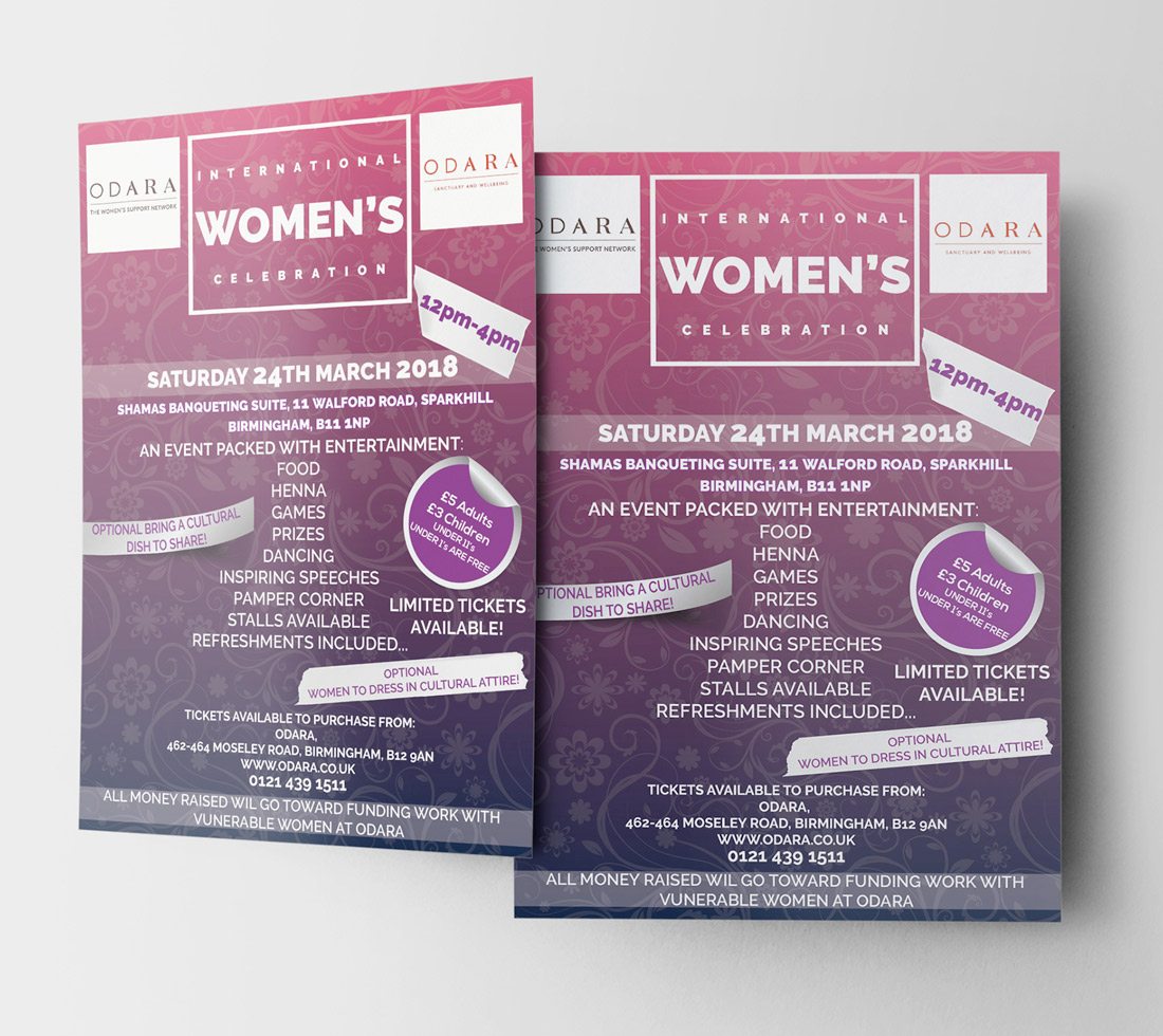
Before you open InDesign, develop a strategy for the flyer design. What are you trying to showcase to users? Where will it be distributed? What kind of budget are you working with?
Only after those questions are answered can you figure out what size and shape the flyer should have. Having a clear goal and strategy will also help you plan how to get vital content into the design in a meaningful way.
The most common mistake when it comes to flyer design is thinking that you can fit everything in. You will likely have to make targeted, strategic decisions about key content. Keep elements that correlate to the goals of the design and for the targeted audience. Dump everything else.
2. Amp Up the Contrast

High contrast visuals are easy to see at a glance and can be attention-grabbing. Unlike a website, where users opt to view it by clicking a link or typing in an address, a flyer needs have a strong pull to get users to gravitate toward it.
Think of flyers or posters or brochures that you have seen from a distance and walked toward because they were interesting. That’s the kind of contrast you need to create to help bring people to the design without prior intent.
3. Put Emphasis on Key Words
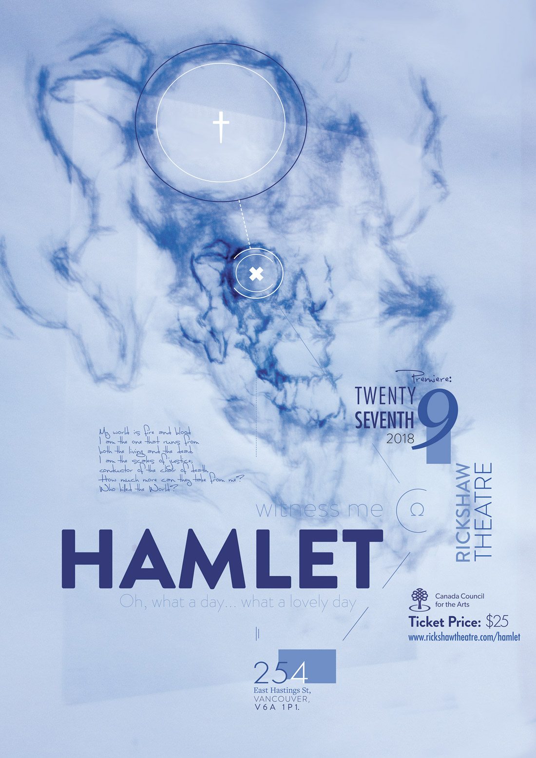
Certain keywords or phrases can help sell the information in the flyer design. Make them bigger, bolder or brighter than other lettering to create distinct emphasis.
What kind of words are attention-grabbing? Consider the following words if they are part of your strategy:
- TDP – time, date, place
- New
- Free
- Easy
- Save
- Now
- Guarantee
- Limited
4. Think About Viewing Distance
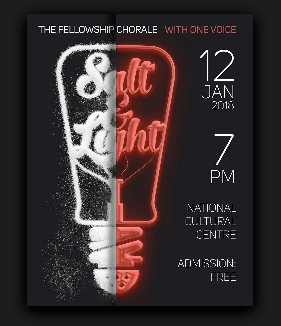
Where will a potential user be when they see the flyer design? Is it a flyer or poster hanging on a window? It is a tri-fold that you will hand out? A postcard that will be picked up or mailed?
Everything in the design should scale appropriately for this use. Type sizes and elements on a poster (wide viewing range) will be a lot larger proportionately to elements on a postcard. This is due to the viewing range, size of printed item and distance from which words will be read. (Anything you hold to look at will likely be closer than anything you don’t actually touch to read.)
Sometimes the best way to judge viewing distance is to print out a test version, hang it up and walk by a few times. Does it grab your attention? Is it easy to read?
5. Include a Call to Action
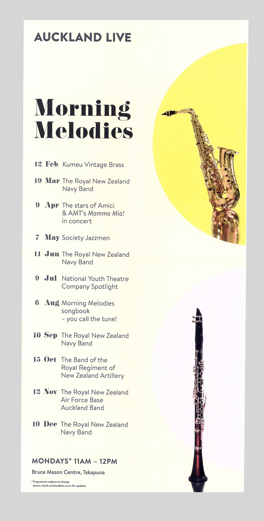
Just because you can’t click it, doesn’t mean a call to action isn’t necessary. Quite the opposite is true. (Why make a flyer if you don’t want people to do something?)
Create a distinct – and easy – actionable item for everyone who sees the flyer. This can be anything from visiting a website to calling a phone number to showing up at a certain place. Make it as easy as possible for users to act. (Shorten URLs and make all instructions clear and concise.)
6. Opt for Full Bleed Flyer
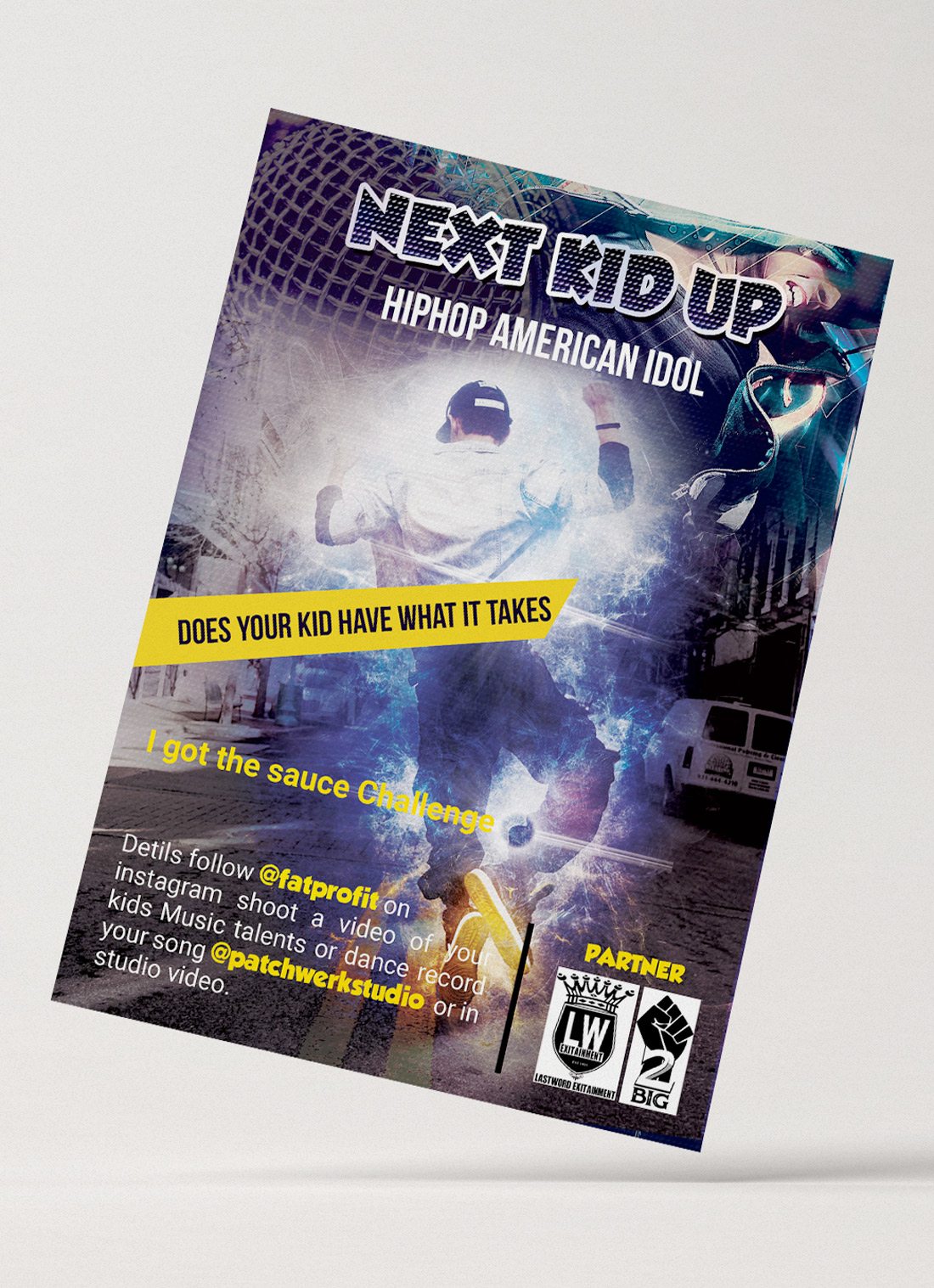
While you won’t be able to print it at your office, full bleed flyer designs have a more polished look and feel. (Full bleed means that the design goes all the way to the edge of printed paper without any border.)
While the entire design doesn’t have to go edge to edge, a design that has this borderless look often stands out from designs that look more like office copies.
But don’t force it. Not all projects have the elements or graphics (or budget) to justify full bleed. This is a decision you should think about early in the process to ensure that you design for the printing process you plan to use.
7. Design Top Down
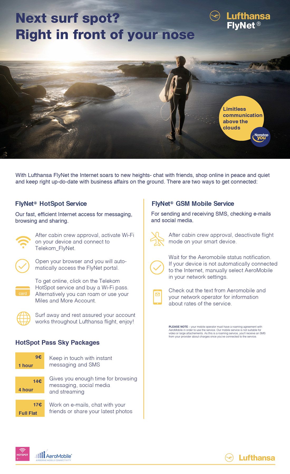
Flyers are read from the top down and the design should reflect that. Start with the most important information at the top of the design and move down the page to the least important information.
The size and scale of text and design elements will likely follow this same hierarchy. Key imagery should as well, with the most striking or impactful images or graphics in the top third of the design.
Pro Tip: Most flyers tend to be vertically oriented while the imagery is often horizontal; use an overlay or shapes to add texture to the bottom of the design that balances images at the top.
Use color and scale to help draw users down the page. It works a lot like the inverted pyramid that journalists use to write news stories, with the most important things at the top and lesser important details to follow.
8. Use High-Quality Imagery
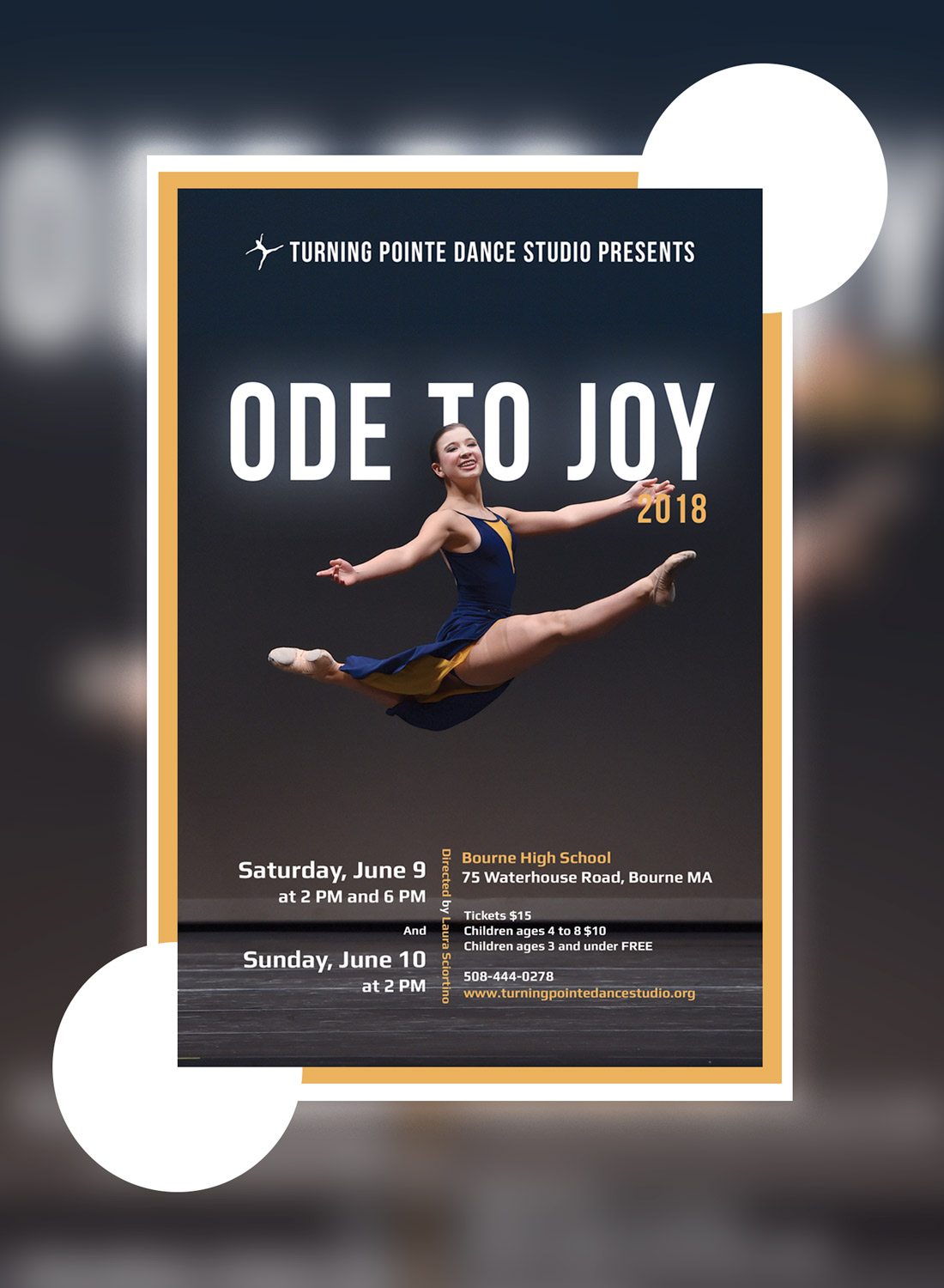
Nothing makes or breaks a design like image quality and composition. A perfect flyer design has a high-quality image that relates to the information on the page.
The image needs to be easy to “read” and understand at a glance and help the user connect to the elements in the flyer design. The image should be of something a person should expect from what the flyer is showcasing – an event or product or sale.
The image should portray an accurate representation and needs to be sharp and clear. Don’t make user guess to figure out what they are looking at. They’ll only get frustrated and look away.
At the same time, make sure to use a high-resolution image. The same specs you use for online or digital images may not apply to printed images. Resolution requirements are often significantly higher to ensure adequate printing. (Don’t skimp on quality or the entire design will suffer.)
9. Integrate Branding
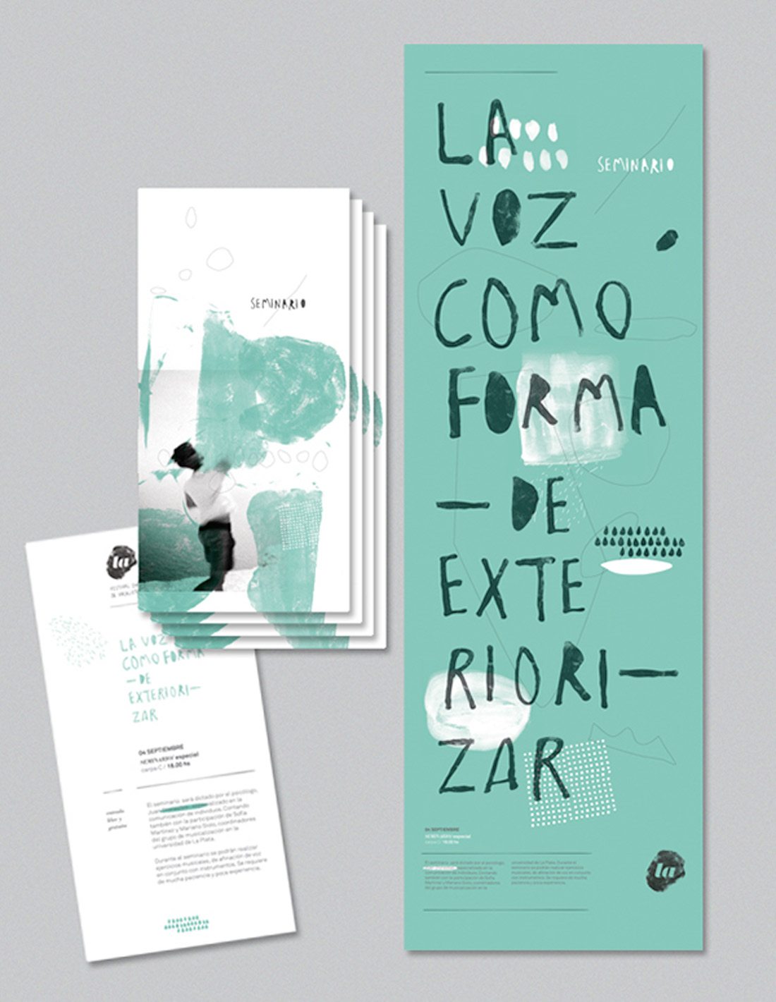
Don’t forget to make the flyer distinctly yours. Incorporate brand visuals, colors, fonts and overall design style to the flyer so that users familiar with your company or product know that the design is from you.
A flyer is just one more element you can use to help establish and maintain brand identity. Don’t forget to maintain that sense of who you are when switching mediums.
10. Use a Printer’s Template
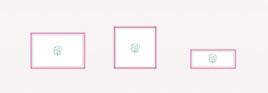
While it’s not always possible to start the design process with a printer or print company in mind, using a printer’s template will help streamline technical considerations later.
A printer’s template will show bleed and trim lines as well as safe areas for printing. Staying within these guidelines will ensure that the printed design appears as desired and that nothing is left out of the final print job inadvertently. While many printers have similar specs by print or page size, they can vary. You’ll save a lot of time, money and headaches by ensuring that your design fits into the print template before submittal.
Conclusion
Still not quite convinced that you are ready to design the perfect flyer? We have a few template designs that you can use for inspiration, or to give you a great starting point. Happy designing!
- 20+ Best Tri-Fold Brochure Templates
- 30+ Best Music & Band Flyer Templates