What 5 Things Make a Good Logo?
A logo is the centerpiece of a strong visual identity for your business. It entices your ideal customers, boosts your memorability, and expresses your brand’s personality. That’s a lot of responsibilities for one image! Indeed, there’s so much pressure involved in creating the perfect logo that many business owners stumble on it. A bad logo can prevent you from aligning your brand with your customers’ values. Poor logo design is also much harder to reproduce on marketing materials. In short, a logo is well worth your time and investment if you want to benefit from its branding potential!
But what makes a good logo? When we look at the world’s most iconic and memorable logos, we see some key characteristics. You can keep these in mind when designing or commissioning your business’s logo. Ready to learn what they are? Let’s get started!
Simplicity
Every list of the world’s top logos includes the Nike swoosh and the Apple logo. These designs are iconic because they’re simple. Interestingly, they have zero visual representations of what their respective businesses actually sell. That’s one reason they’re successful: they express the brand’s core values and evoke certain feelings in the viewer.
Humans process visual information 60,000 times faster than text or numbers. This means that simple logos are often more memorable and eye-catching. A common beginner’s mistake in logo design is to pack too many details into it. Cluttered logos are not only more difficult to process but also harder to recognize.
For example, consider this early iteration of the Amazon logo, circa 1997. It depicts the company’s namesake, but it’s also “busy” visually and probably didn’t look good on pens or packaging.

The modern Amazon logo is much simpler, with a famous “smile” that doubles as an arrow pointing from the “a” to the “z.” This symbolizes Amazon’s vast variety of products, and it’s also friendly and whimsical. Today, the smile is recognizable on its own.

Relevancy
In general, a logo should reflect what your business offers. I know we just talked about Apple’s and Nike’s logos, which don’t depict computers or shoes. However, those are relevant in that they express each company’s ideals.
The swoosh is inspired by Nike’s namesake, the swift, winged goddess of victory in Greek mythology. It also evokes feelings of dynamism and progress, which are important to Nike’s target customers.
The apple was meant to symbolize the personal computer’s accessibility in a time when computers were often big, scary devices. The original rainbow colors Rob Janoff, who designed the Apple logo, added the bite so the fruit wouldn’t look like a cherry. This ended up becoming an inside joke when Janoff learned that a unit of data is called a “byte.”
Indeed, in an interview with Forbes, Janoff advises logo designers to “strive for a wink.” A bit of humor or whimsy helps make your logo more
memorable. As the Apple logo proves, this works even for relatively sophisticated brands. Even if it’s not immediately perceptible, a bit of cleverness makes your logo more engaging and relevant to your audience.
For most businesses, logos should illustrate their core value, if not a literal depiction of their product or service. A logo for a lawn care business may incorporate images of grass or shrubs, but it could also feature symbols of health, speed, or growth. For example:
- An eco-friendly lawn service may depict Planet Earth in its logo
- A business focused on swift service could incorporate dashing lines or arrows into its design
- A daycare service could feature sun rays, flowers, or other positive symbols.
Versatility
Your logo must be able to pull triple-duty, appearing on marketing channels, advertisements, and your business’s storefront. A good logo is recognizable
and enticing no matter if it’s printed in high-resolution or on a tiny lapel pin, blown up on your marquee or scaled down to your Instagram profile pic. Keeping your logo relatively simple can help with this, but you should also aim for versatility.
Amazon’s logo is a good example. Both the “A” and the “smile arrow” can be detached from the logo and used on various print and digital materials.
This may not be feasible with your logo, but there are other ways to help your logo look good wherever it appears. You might consider one version that includes your wordmark and one that doesn’t.
You should also have full-color, black-and-white, and monochromatic versions of your logo. Speaking of which, a good logo is not only versatile but also simple… meaning it shouldn’t have tons of colors, intricate details, or complex patterns or gradients. None of those translate well to screenprinting, social media graphics, flyers, etc. Even Apple eventually gave up its rainbow-hued logo in favor of their sleek monochromatic version.
Legibility
If your logo has any sort of text, it must be easy to read. We know there are thousands if not millions of fantastic fonts out there, but don’t get too excited. You want your logo to be instantly legible. In fact, many of the world’s most popular logos use variations of the same few typefaces: Impact, Myriad Pro, and Helvetica, among others. These fonts are simple yet adaptable enough to work well in most logo designs.
Avoid wild typefaces with highly distorted or intricate letters. Definitely avoid any custom fonts associated with a popular franchise (e.g. the Harry Potter or Star Wars fonts).
Line spacing or kerning (the spacing between characters) also affect legibility. One common mistake is to squeeze words together to make them fit within the logo. This looks like scribbles at first glance and can lead to embarrassing designs. (Google “font fails” but be prepared for some NSFW results!)
Even if your logo doesn’t have any letters, it should still be easy to understand. Any shapes or symbols must be clearly drawn and quickly identifiable. You don’t want people thinking your angel image is actually a butterfly or that your mountains are actually…something NSFW!
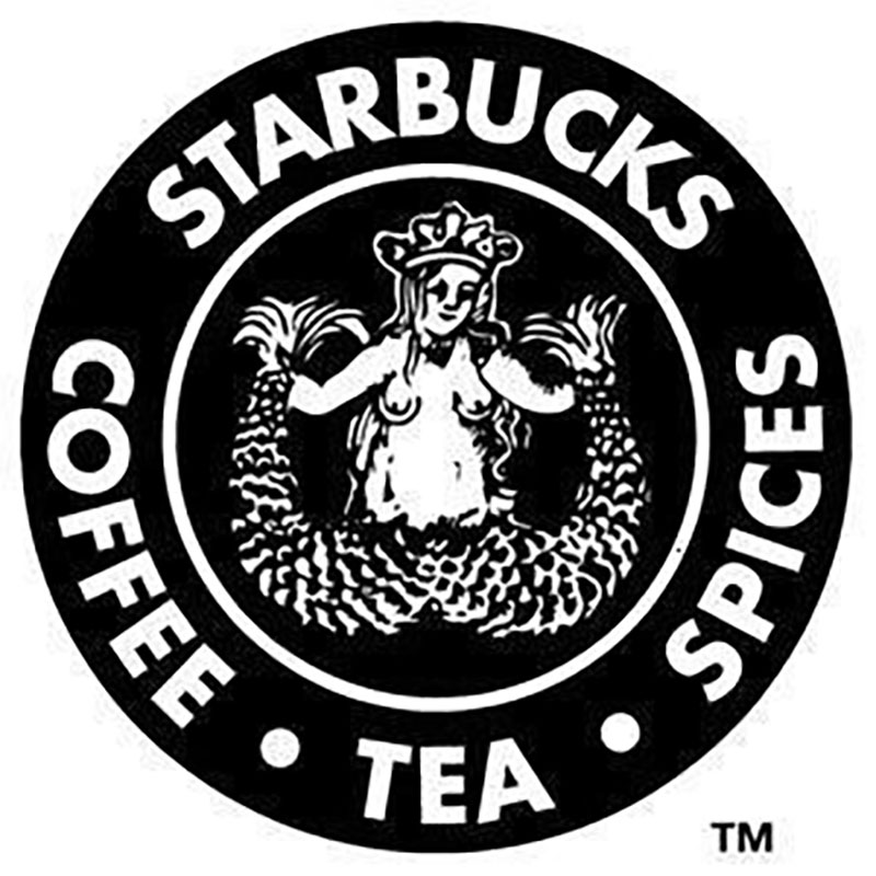
Keep your lines clean and uncluttered as well. Consider the early version of Starbucks’ logo. It’s a nice piece of art, but it’s intricate, intimidating, and not exactly family-friendly.
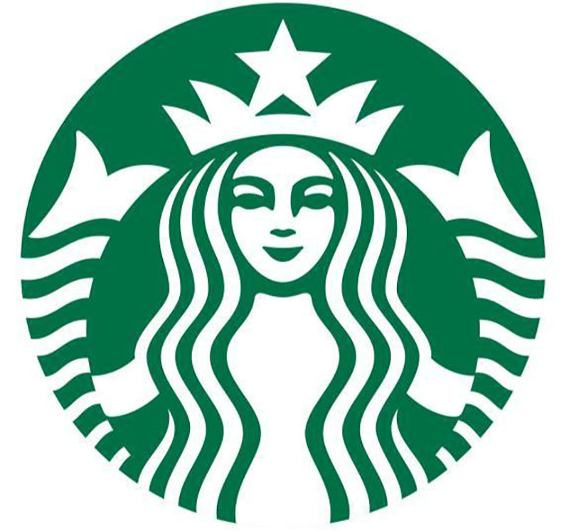
By contrast, here is Starbucks’ current logo. It’s tidier, bolder, and more welcoming.
We all tend to get blinded by our favorite fonts, or we forget that others may not have great eyesight. One solution is to crowdsource your logo through design contests, where multiple designers bring a variety of perspectives to the table. This is a great way to make sure your logo is legible for a range of eyesight ability (and cultural background!)
Memorability
The last key characteristic stems from a combination of the other four. Even if your business doesn’t reach Amazon-level recognizability, you still want it to be memorable. People like predictability. Being consistent with your visual identity helps earn their trust.
And if you’ve done your logo well, it will evoke the right feelings in your customers. When they see your logo, they’ll remember those familiar feelings. That’s why people like to wear Nike swooshes or place Apple logo stickers on their cars. We all like symbols! Your logo should be something that your target customers appreciate and easily recognize.
Wrapping Up
Designing a good logo can be a challenge — but it’s well worth the effort. As the cornerstone of your visual branding, your logo must instantly express your business and entice your ideal customers. Then, you’ll need to use it consistently to build recognizability. That’s why the best logos are versatile
and simple enough to appear anywhere — and make an impact when they do!