The best fonts similar to Brandon Grotesque you can get
An appealing font can do wonders for your design. The better the typeface, the more positive reactions your interface will get, and you won’t even have to invest that much time in it. But how to choose the right font?
Thanks to creative designers and their great ideas, the internet is packed with great fonts. All of them transmit a different message and invoke different feelings when used on screen. The more fonts we explore, the more difficult it gets to choose the most legible or the most accessible typeface for our design.
In 2010, German designer Hannes von Döhren created an impressive font called Brandon Grotesque. The sans-serif typeface comes in many unique weights and styles, all of which look as modern and stylish as the sans fonts. When looking at these fonts similar to Brandon Grotesque, you can see they were inspired by typefaces used in the 1920s.
Brandon Grotesque appeared in a variety of projects in the last decade. It is especially preferred for comedy projects, promotional content, or event leaflets. To help you find the perfect alternative, we’ve listed some of the most similar fonts to Brandon to be found online.
Fonts similar to Brandon Grotesque
Josefin Sans
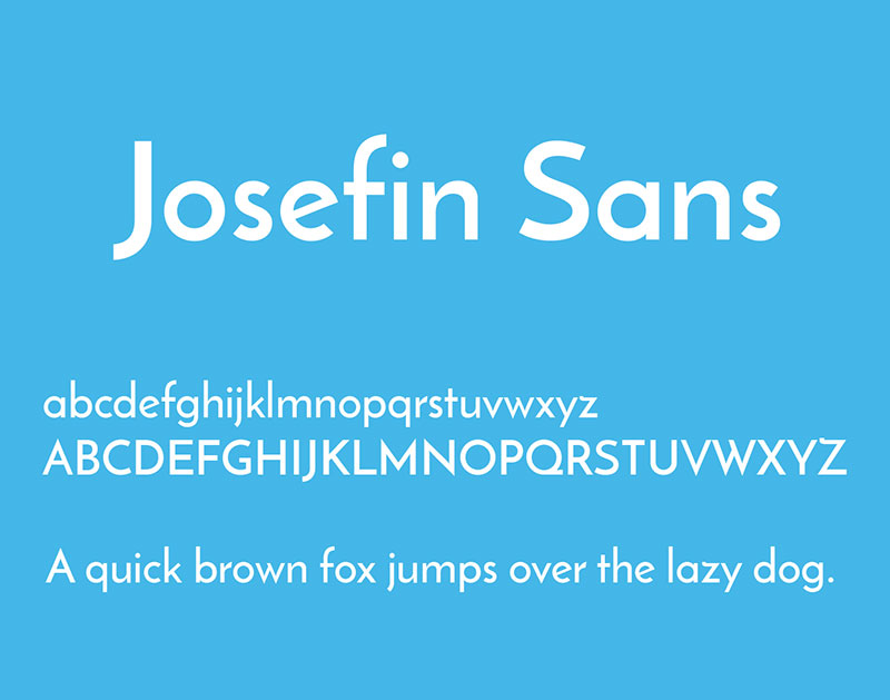
Brandon is well-known for its rounded corners, which makes its replacement fairly difficult. One of the best fonts similar to Brandon Grotesque is Josefin Sans, as it replicates in detail its complete geometric appearance. Between the two, Josefin is probably easier on the eye when on-screen and is therefore used for titles and menus. The larger x-height makes it more readable, but from a styling perspective, the two fonts are almost identical.
Geometric Sans
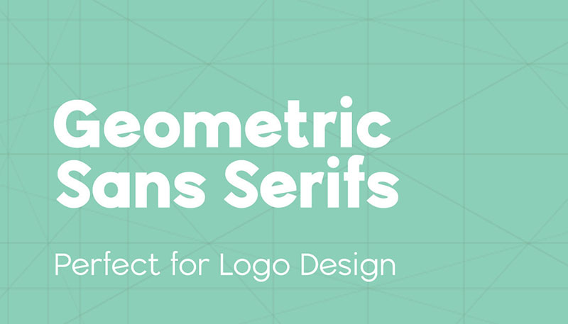
All replicas and fonts similar to Brandon Grotesque work with rectangles, circles, triangles, and other simple geometric forms. Geometric Sans is no exception to this rule.
The font was designed at the beginning of the 20th century. Bauhaus designers used equal widths and minimal contrast and gave the font a contemporary and cohesive screen look.
FF Super Grotesk
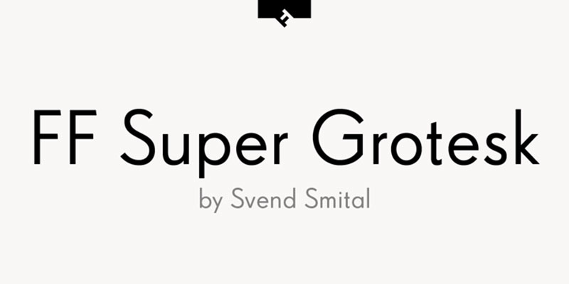
FF Super Grotesk was released by FontFront in 1999. This font is similar to Brandon in many aspects but has unique low x-height and tall ascenders.
Designer SvendSmital created this typeface by exploring the 1930s East German Futura (The Super Grotesk by Arno Drescher). This is why the font has only three different weights.
Cocogoose Classic
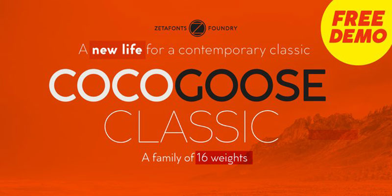
Another stunning example of good typography – Cocogoose Classic – was presented by Cosimo Lorenzo Pancini in 2012. This is one of our favorite fonts similar to Brandon Grotesque. You can’t go wrong with it – this Zetafont member has simply marvelous geometric proportions.
The font is a result of extensive research on gothic typefaces. This is why it works with its slightly rounded corners and low contrasts.
Cocogoose Classic is most famous for its UltraBold weight (even its most regular weight can be described as a heavyweight) and its extreme x-height. Its number-one seller Cocogoose Letterpress is mostly used for the effective display of corporate logos.
Neutraface
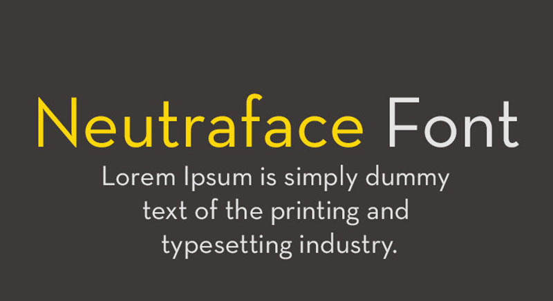
Another great alternative to Brandon is the 2002 Neutraface. Its designer Christian Schwartz did some amazing work, inspired by architect Richard Neutra. Soon enough, House Industries turned this font into the Star of the advertising world, as many famous companies (fast-food chain Wendy’s, for instance) chose the font for their marketing materials. A variation that deserves your attention is Neutra Text – a light version with lower x-heights.
Note: the print world remained faithful to Neutraface over the years, but the web world didn’t play along.
Rosina
Rosina is a distinctive and charming geometric typeface. It combines the sensibility of the 21st century and the captivating styles of the 1920s.
Rosina’s forms are sturdy and visibly inspired by Art Deco architecture. Still, there is something irresistibly futuristic and practical about them.
Despite being so similar to Brandon Grotesque, Rosina is mostly used on posters and within branding campaigns. It offers multiple OpenType features, even 6 different weights, and sensitive punctuation.
Futura
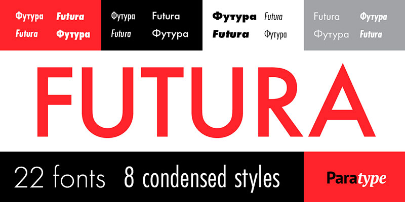
Futura was designed in Germany in 1927, by type master Paul Renner. As you can guess by the name, it has a distinctive futuristic note which makes it very popular in Germany. It was designed with the idea to replace the typical heavy blackletter scripts.
Despite the time that went by, Futura is still very popular in Germany and worldwide. Directors Stanley Kubrick and Wes Anderson describe it as their favorite typeface. It is also the main type of Volkswagen’s advertising material ever since 1960. You will hardly ever find a corner on the web where it is not used.
Arquitecta
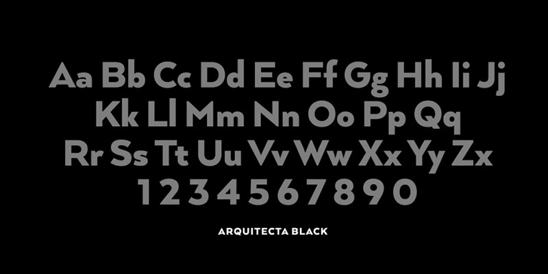
Compared to the other fonts discussed, Arquitecta is a fairly young typeface. The sans-serif font was delivered by the Latinotype foundry in Chile in 2014. Its initial goal was to present the 1920s’ geometric sans in a more humanist way, which is why designers opted for tall ascenders and low x-heights. In total, Arquitecta comes in 8 weights with 8 matching italics and features a double-story a and a double-story g.
Mymoon
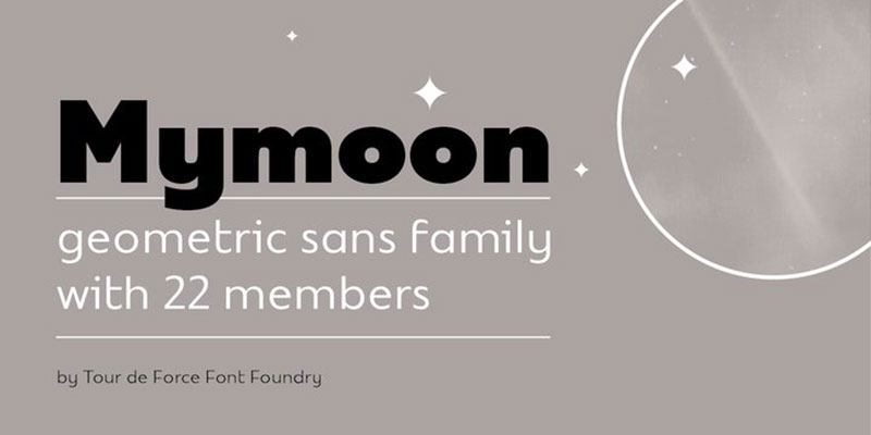
With a total of 22 weights, Mymoon is the most extensive Brandon alternative in the sans serif family. You will adore its neutral impression and neat retro characteristics, which make it a very popular media choice worldwide. The font comes in a variety of weights, all of them well synchronized and very appealing.
A reason to choose it may be its Latin Character Set packed with diverse OT functions, such as Tabler and OldStyle fractions and numerals.
Nobel
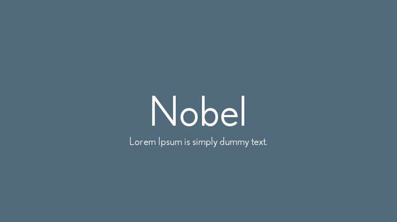
This sans serif typeface was created in 1929 by Sjoerd Henrik de Roos and Dick Dooijes and it was inspired by the slightly younger Futura typeface. A modern recreation followed in 1993 when Fort Bureau described it as the ‘Futura cooked in dirty pots and pans’. You can get it in 6 different weights and italics, or opt for its condensed version.
Remo
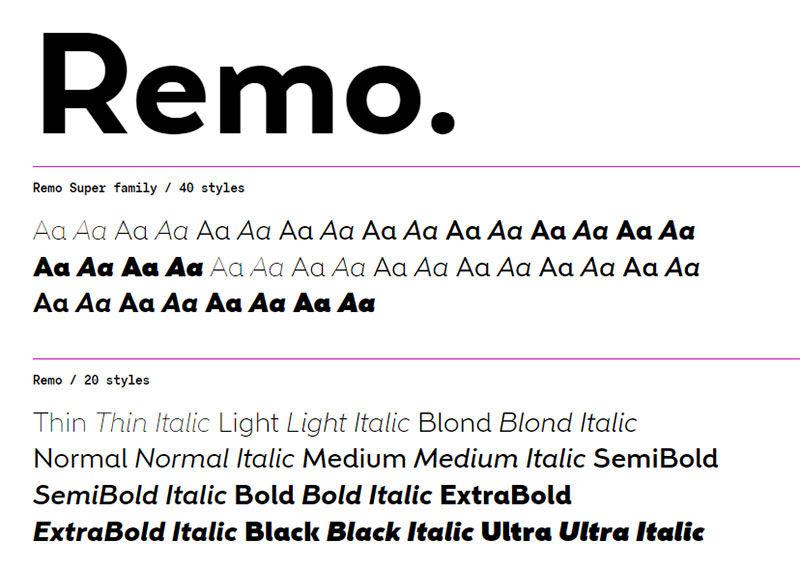
We recommend the Remo geometric typeface to those looking for a more playful Brandon Grotesque. This typeface combines the best features of humanistic sans serifs from the past and works mostly with circles and squares. According to some designers, Remo got as close as possible to reinventing humanistic sans serifs for the needs of the web.
Furthermore, Remo is very precise and low-contrast and is therefore very satisfying for the eye. It plays with forms across its glyph set, provides beautiful oblique endings (c, e, s), fine curves, and strategically reversed strokes (a, d, i). It awakens humorous and warm feelings, which is why everybody finds it delightful.
Halis Rounded
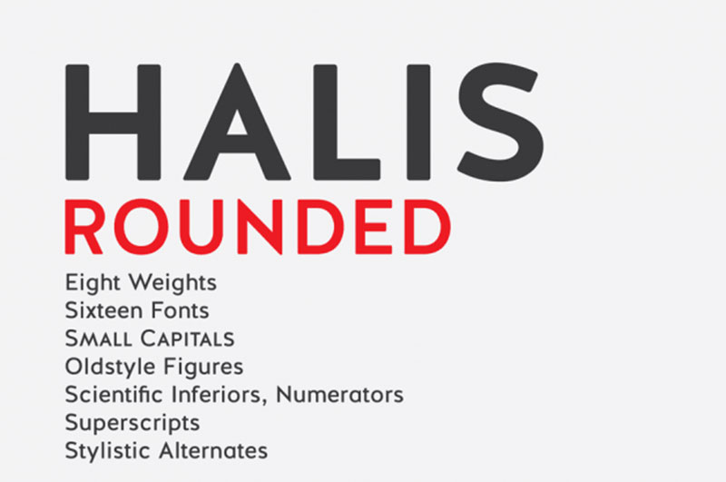
Halis Rounded is another sans serif masterpiece created in 2013 by Turkish designer Ahmed Altun. The designer based it mainly on Halis Grotesque but then decided to enrich it with rounded corners. This is how the typeface became so similar to Brandin Grotesque, even though it still possesses its unique letterforms.
You can get any of its 8 weights: extra light, light, thin, normal, book, medium, bold or black, all available as small caps. What may discourage you is that it doesn’t offer any italic styles.
FF DIN Round
The latest and perhaps most popular addition to the FontFont family is FF DIN Round. This innovative sample of the FF Library is almost as inviting as Brandon Grotesque – it just lacks the industrial simplicity and sterility of its predecessors. It is, without doubt, your best choice for callouts, logos, price tags, corporate identities, or advertising campaigns.
Verlag
Tobias Frere-Jones and Jonathan Hoefler came up with another great Brandon alternative. The Verlag font was designed for the needs of the Guggenheim Museum only, but it didn’t take long for it to become purely commercial. You can recognize it by its compressed widths, regular weights, and a corresponding italic version for each of its styles.
Avenir
The web design world appreciates Avenir mostly for its Univers and Frutiger design. It is also based on Futura (its name is the French word for future) and it preserved its geometric characteristics. What makes it special is its warm, humanist features, as the imperfect t and o tales.
Mr Eaves Modern
For fans of Mrs. Eaves and Mr. Eaves Sans, Mr. Eaves Modern needs no introduction. Designer Zuzana Licko remained faithful to her unique designs and made this geometric typeface even better in 2009.
FF Mark
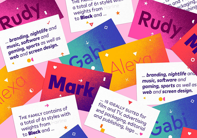
For many designers, FF Mark is the very best alternative to Brandon Grotesque and probably the most iconic sans serif of the new generation. This masterpiece is also signed by Hannes von Döhren, which means that it combines versatile examples of German geometry during the 1920s. You can purchase even 61 different weights and styles, all the way from Hairline to Ultra.
Acrom
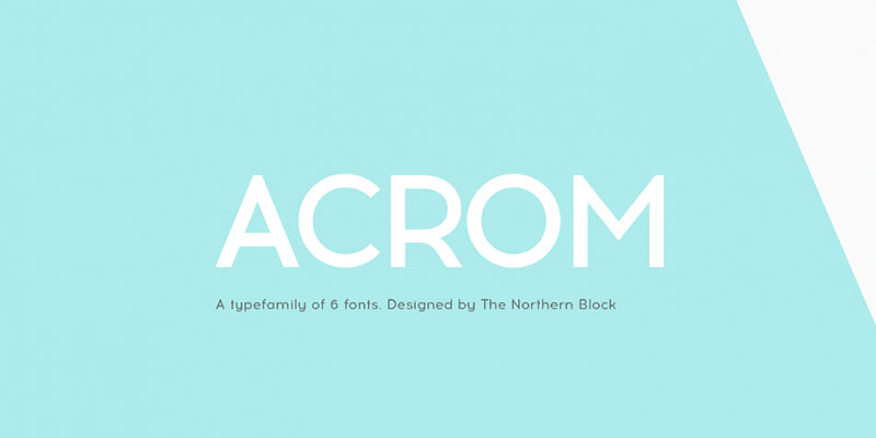
Acrom has been on the market for only 8 years, but it is very popular. The Northern Block release was designed by Mariya V. Pigoulevskaya who gave it many unique humanist characteristics. A great example is its’ curvy and easy-to-identify lowercase k.
Acrom comes in six different weights which unfortunately don’t have matching italic styles.
Transat
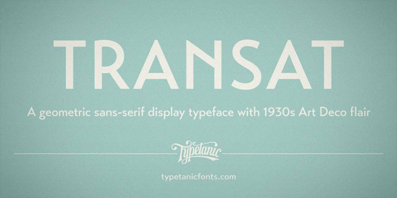
Transat leans again towards the Art Deco design scope, first used in France in the early 90s on ocean liner terminals in Cherbourg and Le Havre. It was even named with this in mind (Transat is short for “Compagnie Générale Transatlantique,” the major ocean liners operator between 1862 and 1974).
MTT Milano
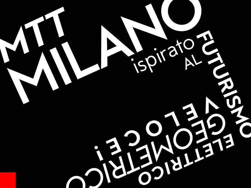
MTT Milano resembles Brandon Grotesque only vaguely and at first sight. Some designers find its unique features to be better than Brandon Grotesque.
For instance, the geometric typeface has a beautiful, sharp-slant lowercase t. The Italian designer Mattia Bonanomi also ensured that users can choose between 5 different weights.
If you enjoyed reading this article on fonts similar to Brandon Grotesque, you should check out this one about fonts similar to Avenir.
We also wrote about a few related subjects like the Roblox font and what font does Roblox use, the best 72 free fonts for logos to create modern and creative designs, fonts similar to Futura, fonts similar to Impact, fonts similar to Calibri, fonts similar to Gotham, and fonts similar to Montserrat.