Fonts That Speak: Typography as a Storytelling Tool in Modern Design
Typography plays a pivotal role in every design and it has the power to make or break a creation or sometimes even an entire business.
While good typography has helped businesses boost revenue bad typography has cost brands millions, mainly as a result of disregard for the psychological effects and the user experience of typography design.
The style and design of the fonts you use are just as important as the wording you choose for the messages in a design. As the German typographer Hans Peter Willberg once said, “typefaces are not only there to be read, you also see them.”
Let’s dive into the world of typography design and explore how it relates to storytelling to figure out how you can leverage it.
Importance of Typography in Storytelling
For centuries, typography has been more of an art form than just text. The history of calligraphy dates all the way back to 200 BCE. In every ancient culture, from China to Greece and Rome, the inscriptionists and writers always put an emphasis on making letters look beautiful.
Even today, great designers go the extra mile to make typography look exceptional and stand out, not just to make text and titles beautiful but also to improve readability and user experience. And it’s especially a key aspect in storytelling.

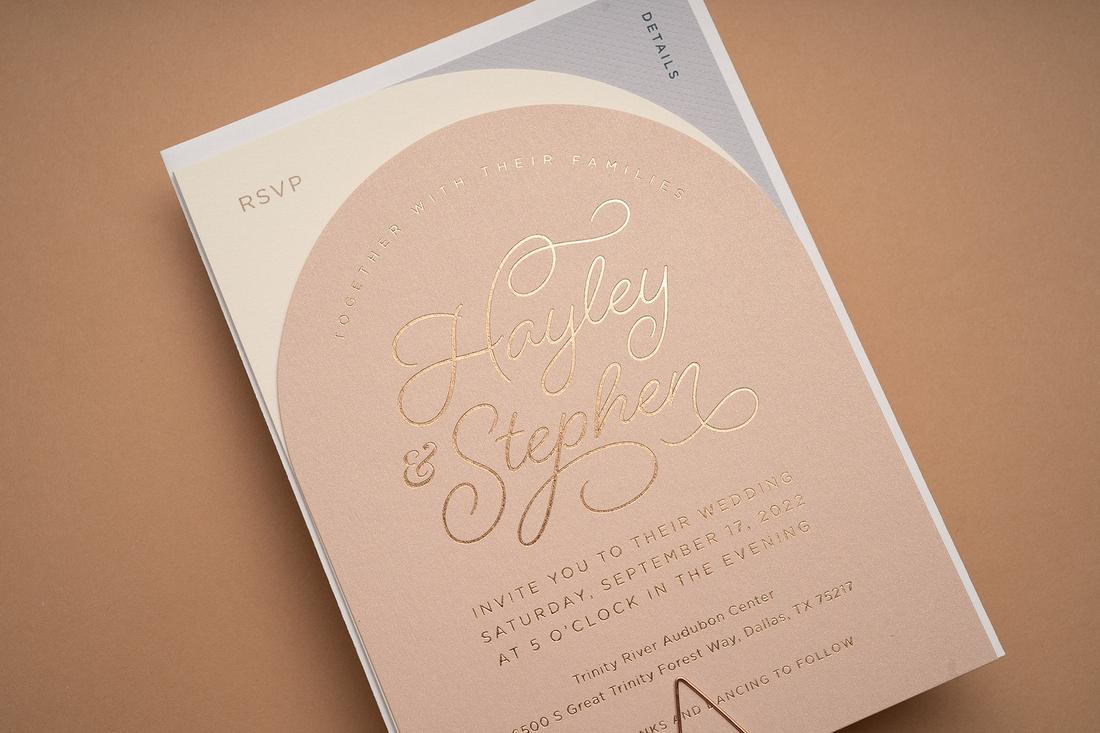
Take a wedding invitation, for example. A handpicked script handwritten or calligraphy-style font goes a long way to make the entire invitation look romantic and create a meaningful connection with the reader.

On the other hand, a bad choice of fonts can completely ruin the entire purpose of the design as well as the reputation of the brand.

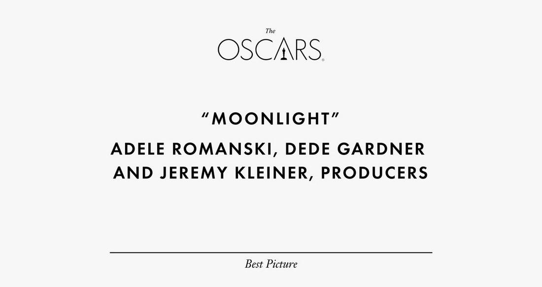
Or it could even ruin an important awards ceremony, like the Oscars 2017.
To tell a great story, you need good copy. A brilliantly worded story can deliver a message much more effectively than a statement. But, you also need the right font to create a meaningful and emotional connection through that story.
How Typography Evokes Emotions
There’s a psychological impact behind the different styles of fonts you use in design. Have you noticed how brands from certain industries always prefer to use serif fonts while businesses in the creative industry stick to sans-serif fonts?
Even when creating designs related to certain topics, you will choose fonts appropriately. For a nature-themed design, you will use a brush font. Or for an urban-themed design, you will prefer a graffiti-style font.

No matter which style of font you use, typography has the ability to evoke emotions. Sometimes, seeing a classic retro-style font in an advertisement will take you back to your childhood. Or a handwritten text will remind you of a note from your mother.

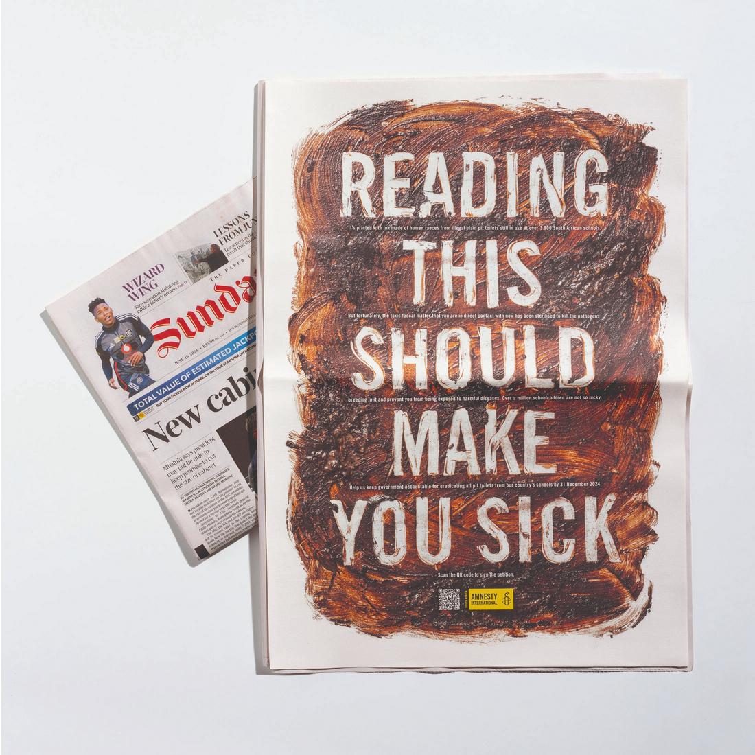
Typography also plays a role in conveying the overall mood of the design. Depending on the context, it could make you hungry, thirsty, happy, sad, or even disgusted at times.
Typography as a Visual Voice
Typography is a defining factor of the visual voice and tone of your brand’s messaging. With the correct font, you can choose to make your message formal or playful.

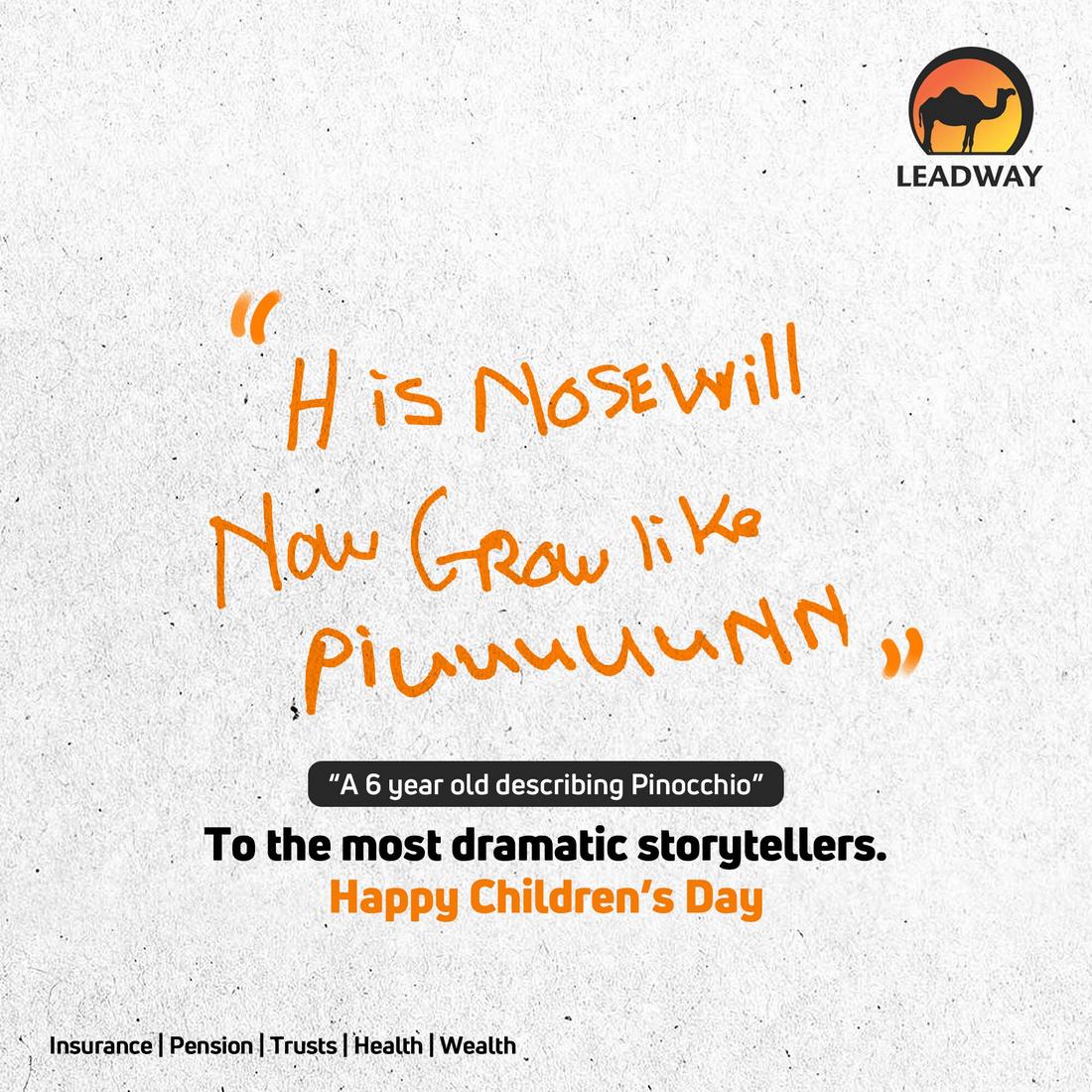
They say a picture is worth a thousand words, but more often than not, you’d be lost without the words. The example above shows the power of the word and the importance of the font choices.

Fonts are often used to give designs a personality. There’s a reason why you almost always see handwritten script fonts in Christmas-themed designs. Or serif fonts in luxury branding designs. It’s all part of creating an overall visual voice and tone for the design.
Guiding Readers on a Journey
Take a closer look at this article you’re reading. You’ll notice how easy it is to scan through this post, thanks to the subheadings we use throughout the article. In the section below, you’ll see how we create another level to this hierarchy with numbered subheadings to make things even simpler for you to read.
Without the subheadings, bullet points, and numbered lists, this article will be a plain wall of text. You will feel overwhelmed and bored to even attempt to read it.
But, through this typography hierarchy, we are able to take you, the reader, on a journey. Sometimes we’ll use bolded text to emphasize key points or italics to bring more attention to things.
The scale, weight, style, and spacing in typography all play a role in reinforcing narratives and guiding the reader by maintaining their attention. That’s the power of typography!
5 Tips for Typographic Storytelling
There are many factors to consider in typographic storytelling. The following are some of the most important things you should consider for creating effective stories.
1. Consistency and Relevance
When choosing a font, always consider its relevancy to the subject matter as well as the brand messaging. Even though sometimes clients come to you with their own list of font choices, it’s your job as the designer to educate them on the importance of typography design.
Creating a relevant and consistent look for typography should be your number one priority.
2. Importance of Font Pairing
Choosing the right font to accompany your main font is another important part of typographic storytelling. It’s with a good combination of fonts for titles and body text you can create good contrast and hierarchy in designs.
Using flexible fonts with multiple font weights and styles is a great way to make sure your designs can shine on every medium and platform.
3. Ensure Readability
Some fonts will look great on digital designs but come out distorted in prints. Other fonts will often look amazing in large sizes but completely unreadable in small text.
Readability is paramount in every design. You should take time to test every font in different sizes and formats to ensure they look great no matter how and where you use them.
4. Print vs Digital
Understanding the differences between the print and digital mediums is crucial to creating typography designs that resonate with the target audience. People interact with these two platforms very differently. Some users will zoom in and out of a digital design to take a closer look while others read the same text on a giant billboard.
Pay close attention to these requirements and details for more effective typographic storytelling.
5. Follow the Trends
Typography continues to evolve with new and unique trends. Whether it’s variable fonts or 3D color fonts, it’s your job to stay up-to-date on the latest trends and adopt them for appropriate projects. These trends will help elevate your storytelling in modern design.
Conclusion
When talking about typography, we can’t forget about emojis. Like it or not, they are now part of storytelling and how we write and express our emotions. Even the Oxford Dictionary has recognized emojis as words.
Much like the calligraphy letters from ancient times, there will come a day in the distant future when researchers will analyze the meaning behind emojis. That will be our proud contribution to the history of typography.
Nevertheless, you can’t ignore the importance of typography and its impact on storytelling, especially as a designer. So, continue to learn and explore new ways to utilize it to your advantage. You can start by reading up on our top typography trends guide.