Design Trend: Creative Scroll Arrows
Scroll arrows are a common design element with many sites using a small icon to help users navigate down the page. It’s nothing new, and it’s been around as a visual indicator for decades.
What’s new is that more designers are experimenting with more creative ways to use these elements to create additional engagement and visual interest. Whether it’s the design of the scroll arrow itself, it’s placement, or animation and visual effects. There’s a lot of creativity at work!
Here’s a look at the creative scroll arrows design trend and ways to make it work in your projects.
What is the Creative Scroll Arrows Design Trend?
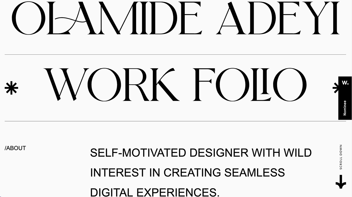
The creative scroll arrows design trend is a fun twist on a common element. Designers are doing a lot more than plopping a little arrow in the bottom center of the home hero area. They are designing animations, colors, shapes, and other elements that tie the arrow to the rest of the design while helping direct users.
There are no rules when it comes to his trend, with arrows being used in all types of ways. In all of the examples here, you should click through to see how each of these designs functions, from hover states to animations to scale and placement.
How to Identify This Design Trend
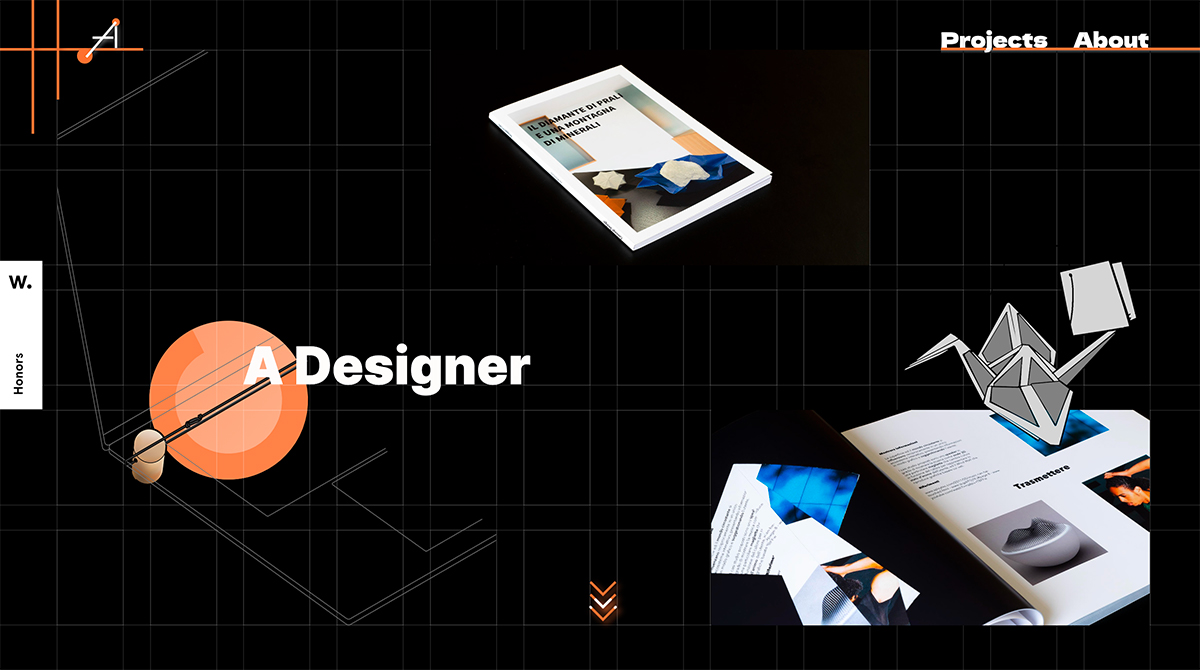
This is one of those trends that’s easy to spot if you are looking. There are a lot of websites that use scroll arrows; here the arrows have a special design flair to them that makes them stand out.
These are scroll arrows that you take notice of due to color, shape, size, animated effects, or placement. Any or all of these things can contribute to the creativity of the design element.
How to Make it Work for You
If you want to use this design trend, let creativity be your guide!
Scroll arrows are a good directional cue for websites that have a large hero header that makes it not so obvious that there’s more to read below it. (That’s why this design element has become so popular.)
You can own the scroll arrow and make it more a part of the design aesthetic by making it part of the design, not just an afterthought.
There’s no golden set of rules here; be creative and create something that works with the overall theme you are trying to show. This element can also be a place to try a new technique, such as an interesting animation or hover state with a high upside and fairly low risk (because most people know to scroll, even without the arrow).
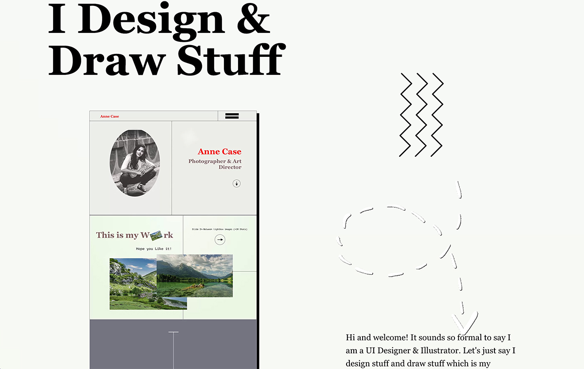
When thinking about how to incorporate your design element here, don’t be afraid to design something that’s way oversized, like the example above. Not how the scroll arrow takes a significant portion of the screen and plays right into the “design and draw” theme. (It also includes a can’t-miss animation.) This is the kind of concept you should strive for.
5 Examples We Love
There are plenty of other examples of this trend in action that are less dramatic but just as impressive. Here are five examples of this website design trend that we love.
Mr. Pops
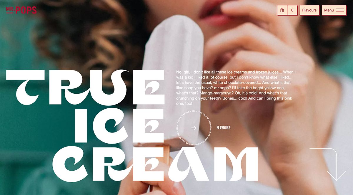
Mr. Pops also uses a bigger scroll arrow with a funky overall style. The curved arrow in the bottom right corner helps you move from the image to text to scroll down the page for more.
A far-right placement is ideal for this type of eye-tracking motion or pattern.
Blue Lagoon
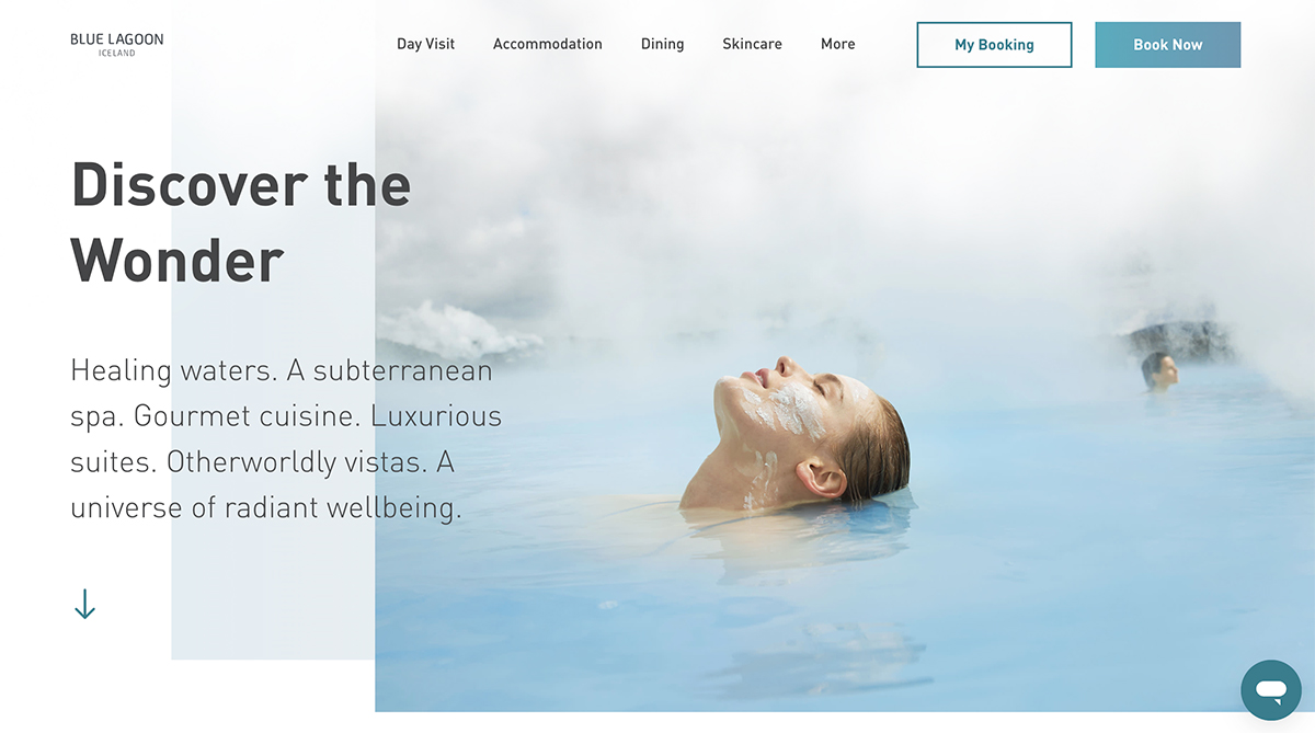
Blue Lagoon takes a more traditional approach to the scroll arrow but with emphasized animation and a less standard placement. What’s nice here is the simplicity of the arrow in concert with the surrounding elements. Note how the headline, subheadline, and arrow all fall along the same left-hand grid.
The color of the arrow matches the rest of the website design and all of the layered elements to the right of the text help lead you back to the left elements. It’s simple and highly engaging.
Light & Wonder
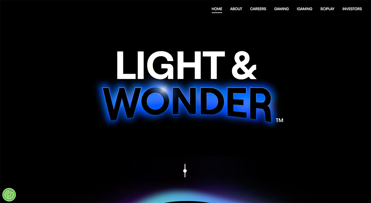
Sometimes a scroll arrow doesn’t include an arrow at all. That’s the case with Light & Wonder, which uses a line with a moving dot to denote the scroll interaction.
While they don’t use a traditional arrow here, there’s no question as to what the user is supposed to do. That’s the key factor in knowing if your scroll arrow design works or not. Is it obvious what action should happen next from the design element? (Even if it has a look and feel that’s not super common?)
Medecins Du Monde
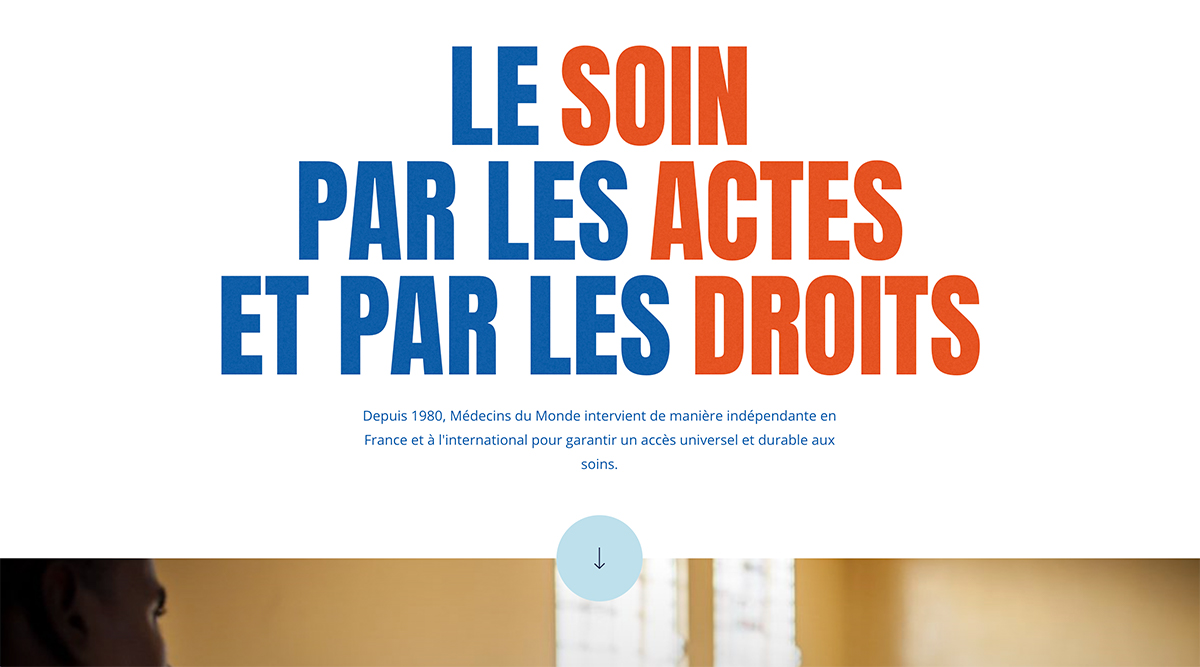
This scroll arrow is obvious and part of an overall theme of directionals in the website design. What’s nice here is that the arrow is placed inside of a larger element with color so that it does not get lost. You’ll likely come across a plethora of sites where there is a scroll arrow, but it almost seems like they are trying to hide it in the design.
Be bold and go for it. If a scroll arrow is part of your design plan, don’t feel like you need to hide it. Own the element and make it work with the rest of the design.
Everest UI School

At first glance, the scroll arrow for Everest UI School doesn’t look spectacular. But as you scroll the arrow in the right sidebar moves with you. There’s always an element of motion and interaction to help guide the user’s path.
It’s interesting and makes you think about what the design intends you to do or how interactions should work. The complex motion and animation pair with the simplicity of the design itself.
Conclusion
Scroll arrows can be a fun and creative design element. The good thing is you can use this for almost any design or project as long as there is an on-page scroll action.
Remember to make the design of the element itself work with the overall aesthetic for a custom feel. Consider interactivity, such as animation or hover states to increase engagement. And if you try it for a while and don’t get great feedback, this is a design tweak that you can continue to make without disrupting the rest of the design.