Web Design on Online Gambling Sites
Gambling has never been more popular with online sites where you can spend and win money at an all-time high. With so much competition and so many different bonuses, offers, and various games, it’s not an easy market to break in. So with that, what are the core web design differences that different casino sites need to have so that a customer will choose one over the other? It comes down to the website’s core design, and in this article, we will go through some of the basics.
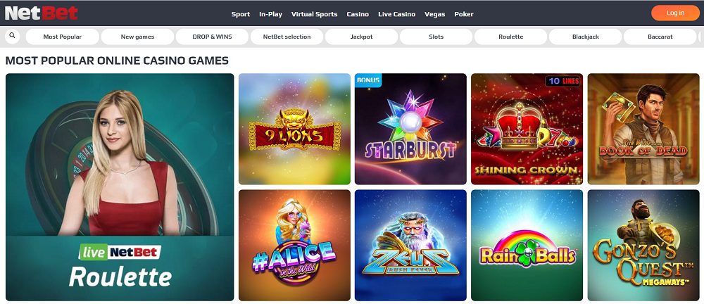
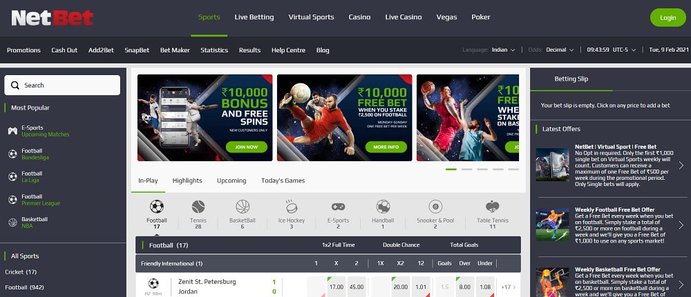
Now we come to the debate that a good looking website, a nice pleasing casino is maybe just a matter of taste, but it comes down to the design of the whole site that can really win over a customer. As the game is getting bigger, more people play, and with that, these companies need to step up their game. They need to fulfill all expectations! Some are better than others, and if you want to look for a good example, you can maybe look at NetBet with a very straightforward design for bonuses and withdrawing money.

What Should Be at the Core Design?
This should be the general idea of the whole brand and its identity. It should be about how it presents itself to first-time customers and keeps old customers. A long-lasting relationship is vital for any successful business model!. It would help if you thought about what customers you want to attract, how they will use the site, how often they will use your site, what emotions they invoke with the tiniest details provided, the sounds and background used, graphics effects, colors etc. All in all, it should leave a never lasting effect in the customers mind, so that any time they think of the product you are selling, the first thought in their mind must be about your brand.
How to Kickstart a Design Concept?
You should ask yourself what your audience should be, what age group, how much money they have, etc. For example, if you want to create a gambling website that is more suited for females, you need to start with nice and eye-pleasing colors. You won’t use male models and male graphics for your girl casino, so maybe if you are doing live roulette gambling, which has become increasingly popular in recent times, you will get a man to host the game.
On another note, if you want to target sports fans, you will design your website differently, including sports info, different blog posts to get to more people, and a more professional design approach. Check out NetBet Sports again for a good reference on what a sports casino site looks like.

You must be very specific about this, as an all approach may be fatal for your business. To be just for everyone has proved a flawed business model, so choosing the same year group, sex, background, maybe even nationality is a great idea.
How Do Users Go Through Your Website
The other factor that you need to consider is navigation. How will users go through your website, and how will they approach it. The site should be easy to navigate to different sections of the site. How to start working on this, well it’s rather simple, just put yourself in the shoes of your user. The ease of navigation would impact on the amount of time users spend on your site.
A good gambling website will allow even those who are not that good with a computer, choose their options easily and start playing. Information needs to be easily accessible and without any walls. So a nice fluid design scheme with eye-pleasing graphics, with nothing too flashy, is a must. Since playing games requires a lot of attention, a User interface with soft colors would be ideal, so that it does not hurt the eyes of players.
Having live support is a great addition and a must-have in today’s time. Especially if you have a lot of games on the site and a lot of users, live people behind the screen will keep your users on-site, and with that, you improve your trustworthiness from the start. And you want that, you want your design to make users into fans, so these people come back to your site.
One more important thing is to make your site accessible from all devices. Be it mobile phones, tablets, any device should work flawlessly with your website, and users should be able to load the site with no issues. Be aware that too many pop ups, aggressive graphics, and sounds will not appeal to your users, so find common ground and design solutions on how to handle the information to the player. Promotions are a big part of this and designing your site with bonuses and chances for players to get back into the game if they lose, it’s very important to keep the players hooked. Highlighting jackpot wins and having a leaderboard of players who win is also a good design choice, so people see in real-time that others are playing and winning.
Another important part is the speed of the site and the server used to host the website. Your website must be available to the customer at a lightening speed, no matter from which location or device they are accessing it. A slow loading website where customers have to wait for a while to see the content of the site like graphics, text etc. would cause the customer to leave the site quickly.
Mobile is the future of the casino game, as people play in small batches, on breaks, commutes between work and home, etc. Even if it’s a mobile version, it still needs to give out the same excitement and glamour as a real casino. One should feel that he is going to win and that the game can be cracked. Money is just around the corner for your new user. So take notes, check out what your competitors are doing, and good luck with designing your casino site.