Authentication UX
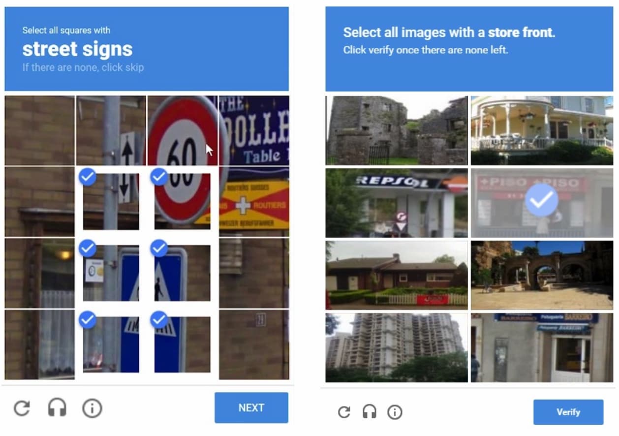
Nobody wakes up in the morning hoping to finally identify crosswalks and fire hydrants that day. Yet every day we prompt users to through hoops and loops to sign up and log in, to set a complex enough password or recover one, to find a way to restore access to locked accounts and logged out sessions.
Of course security matters, yet too often it gets in the way of usability. As Jared Spool said once, “if a product isn’t usable, it’s also not secure.” That’s when people start using private email accounts and put passwords on stick-it-notes because they forget them. As usual, Jared hits the nail at its head here. So what can we do to improve the authentication UX?
1. Don’t Disable Copy-Paste For PasswordsIt appears only reasonable to block copy-paste for password input to avoid brute-force attacks. Yet when we do so, we also block users who copy-paste passwords from password managers and text documents. As a result, they need to retype complex, lengthy, cryptic strings of text, repeatedly.
That’s slow and frustrating. And in her talk on Authentication UX Anti-Patterns, Kelly Robinson explains that this is a common anti-pattern, often causing way more frustration than remedy — and hence best to be avoided.

Also, double check that your password fields include the attribute autocomplete="new-password", so browsers can prompt a secure auto-generated password.
Passwords are problematic. Only 34% of users use a password manager, and everybody else relies on their memory, sticky notes and text files on desktop. Yet good passwords are hard to remember. So users often choose easy-to-guess passwords instead, often including names of their pets and loved ones, their birthdates and their wedding dates. That’s far from secure, of course.
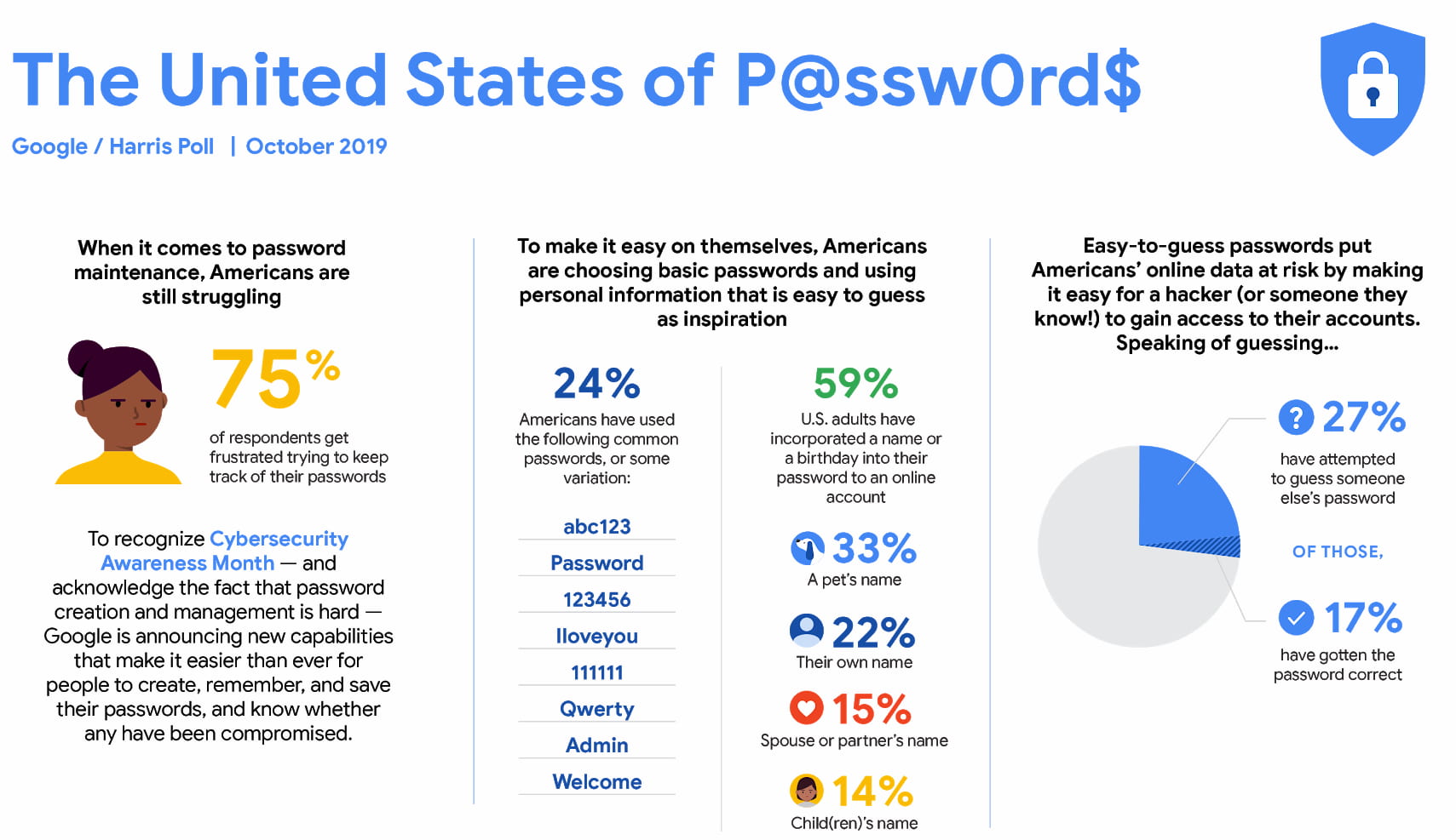
Still, we often forget our passwords, sometimes recovering passwords 4-5 times a week. So no wonder many customers still reuse the same password across multiple accounts, often favouring convenience over data safety. In fact, allowing users to choose their own passwords is a recipe for trouble. To fix that, we can nudge users away from passwords.
Any kind of 2-Factor-Authentication is better than passwords, and ideally with a cookie that users can choose to set on their machine for a longer period of time. Data-senstive sites might want to log out users automatically, but simpler sites might be better off avoiding aggressive log-outs and allowing users to stay logged-in for 30 days.
3. Drop Strict Password RequirementsSince users are very good at twisting and bending password rules (just to forget them shortly after the task is done), what if we change our strategy altogether? What if we do support lengthy and complex passwords with all the special characters should a user opt-in for it, but keep rules relatively friendly?

We then nudge users towards a 2FA-setup, e.g. providing 30% off for the first 2FA-month. The only thing required would be to connect the account with a mobile phone, type in a verification code, or verify with a Touch-ID, and that would be it. Thus, we avoid endless and expensive password resets which are often a cause for abandonment and frustration.
4. Social Sign-In Isn’t For EveryoneThe more sensitive the data stored, the more attention to security users expect from the interface. Login hurdles seem to be accepted as long as they are considered to be “reasonable”. But what’s reasonable to us as designers isn’t necessarily what’s reasonable to our customers.
Social sign-in is a good example of that. Some users love it because it’s so fast, yet others are generally opposed to it due to privacy concerns. Plus, we need to comply with GDPR, CCPA and similar legislation when using them.
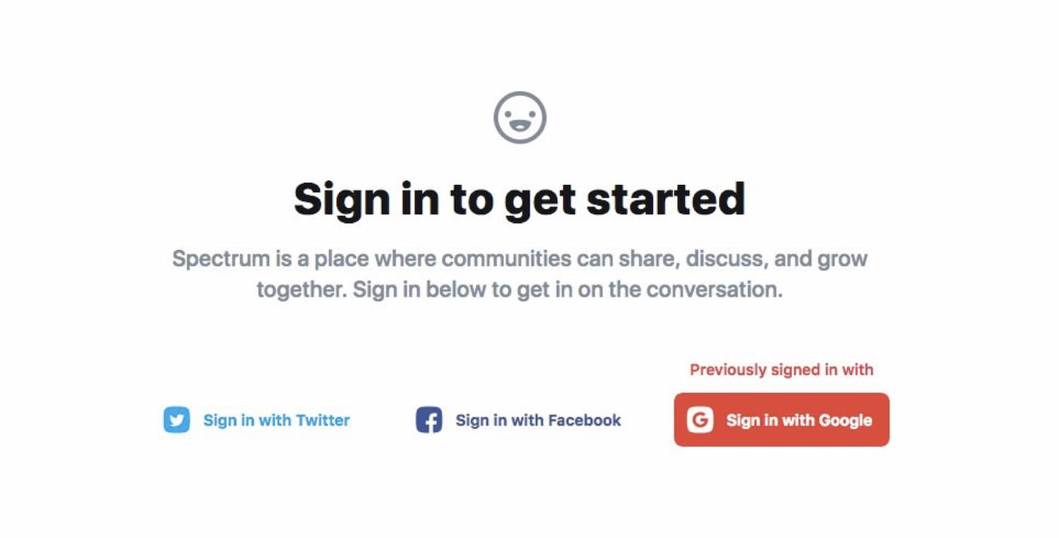
Also, keep in mind that some users forget what they’ve signed up with last time, so it’s a good idea to indicate their previous choice based on their previous log-in (as illustrated above). Social sign-in is simple for people who just want to get things done, but can’t be the only option.
5. Users Need Options For Access RecoveryNothing can be more frustrating than being locked out at just the wrong moment. As designers, we can pave deliberate ways out in our interfaces with access recovery stacks — multiple alternate ways to restore access — and avoid these issues for good.

Surely, magic links will be a part of that stack as they often work flawlessly unless the email isn’t available, or phone isn’t lost. Some people don’t have all their email accounts on the go. So ideally we provide multiple options to guarantee a speedy recovery, and a mix of options works best:
- OTP/2FA via Authenticator app on the phone,
- magic links sent via email,
- backup recovery codes,
- customer support inqury.
It’s not a good idea to send randomly generated passwords via email and requiring a new password set-up when a user finally managed to log in. That’s not secure, and it’s always a hassle. Instead, yet again, nudge users towards a 2FA-setup, so they can recover access by accessing a code from the app installed on their phone, or SMS (which is less secure, however.)
6. Replace Security Questions With 2FAIn an ideal world, security questions — like the ones we are being asked by a bank on the phone to verify our identity — should help us prevent fraud. Essentially, it’s a second layer of protection, but it performs remarkably poorly both in terms of usability and security. Questions about favorite pets, maiden names and first school can easily be discovered by scrolling a Facebook stream long enough.

Knowing that, users sometimes reply to these questions with the very same answer (e.g. their birthday or a location of birth), and sometimes even use the same password that they’ve entered initially. This isn’t really helping anybody. Magic links and push notifications are much more secure and there is no need to memorize the answers as all.
Wrapping UpAuthentication is always a hurdle. Yet when the interface is difficult to deal with, users become remarkably creative in bending the rules to make it work — and forget the password the moment they completed a transaction.
Perhaps we should give our users at least a chance to get to know our website or app before creating too many barriers for them. Ideally, we need a 2FA-setup for everyone, but we need to get there first. And a path there is paved with a seamless, good authentication UX — without complicated rules and restrictions, and preferably the one that users won’t even notice.