Learn to Color Match and Create a Palette Like a Pro (Tips and Tools)
You know it the minute you see it – a design that has so color that’s so impactful you can’t help but look at it.
These designs typically fall into one of two categories. Either it’s a great color palette that you want to find a way to replicate immediately. Or it’s a color palette so bizarre or bad that you can’t figure out why a designer would make that choice!
Since no one wants to fall in the latter category, learning to color match and develop palettes is a vital design skill.
It all starts with color theory but then goes a little further.
Purpose and Value of Great Color Palettes

Color does more than help people see a design. It’s a guide to branding, understanding, and overall design perception.
A choice that seems almost simplistic has a lot of overall meaning and can even alter how people feel about a project or impact their interactions with it.
Think about how some common brands might seem different if they used alternative color choices:
- Would you want to grab a Coca-Cola in a blue bottle? (Or would you think it is a Pepsi?)
- What if Amazon’s yellow smile logo were green?
- Imagine if Google dropped the rainbow logo for a single color? What would it be to communicate the right meaning?
Simple questions with big answers. That’s how important choosing a color palette is for a design project.
Color establishes:
- Brand recognition
- Emotional connection
- Psychological response
- Cultural associations
- Sense of hierarchy and order
- Creates contrast and navigation
Types of Colors Every Palette Needs
There’s a general rule that a design needs two to four colors. While that’s a great theory, it goes beyond that in practice, particularly when it comes to website and digital design.
Consider all the elements that will need some type of color selection that goes into your overall palette.
- Brand colors in logo, which may or may not be the colors for the rest of the design
- Primary color
- Secondary color
- Accent color
- Text color
- Link color
- Hover color for links
- Background color
- Secondary background color
And then there’s the complication of dark mode (or light mode if your default is dark), wherein you need an entire second palette for the second color option that includes everything above.
Website Color Tips and Tricks
While color can be a little different for every application, there are a few specific things to keep in mind when choosing colors for websites or other digital designs.
- Consider using tints for colors to prevent palettes from getting too broad.
- It’s OK to reuse colors.
- Opt for a color set – primary, secondary, accent – with a similar saturation to create visual consistency.
- Don’t feel like website text has to be black. Another dark color or variation of gray on a light background can be very nice.
60-30-10 Rule
The 60-30-10 rule comes from the world of interior design, but it makes a lot of sense for graphic and website designers, too.
The concept is to start with a base of three colors – think of that as primary, secondary, and accent color, and not elements like the background, text color, or links.
Then break down how you use each in the oberall design:
- 60% of the design uses the primary color
- 30% of the design uses the secondary color
- 10% of the design use the accent color
Now don’t get set on exact percentages, but you can use this as a starting point for how to mix and match your palette in a way that establishes visual harmony and balance.
Don’t Forget Accessibility

We can’t mention color palettes and choices without mention of accessibility. Color is a huge part of contrast accessibility and ensuring that people with visual impairments can understand the design with as much ease as possible.
Aim for a AAA color grade for color combinations on your website. This is particularly vital for text versus background color for all elements.
Accessibility goes a lot deeper than just color, but working with colors that are readable for all users is a solid start. One of the places that often gets overlooked when it comes to color palettes and accessibility is dark mode.
You’ll want to create an actual palette here and not just change the background color.
Color Trends to Emulate

Color trends evolve almost constantly. Bold hues are in – maybe because of the growing popularity of dark mode – as well as constant use of minimalism and simple palettes.
We’ve got plenty of information and inspiration for you:
- 50 Best Website Color Schemes of 2021
- 7 New & Modern Color Trends for 2021
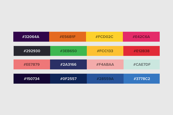
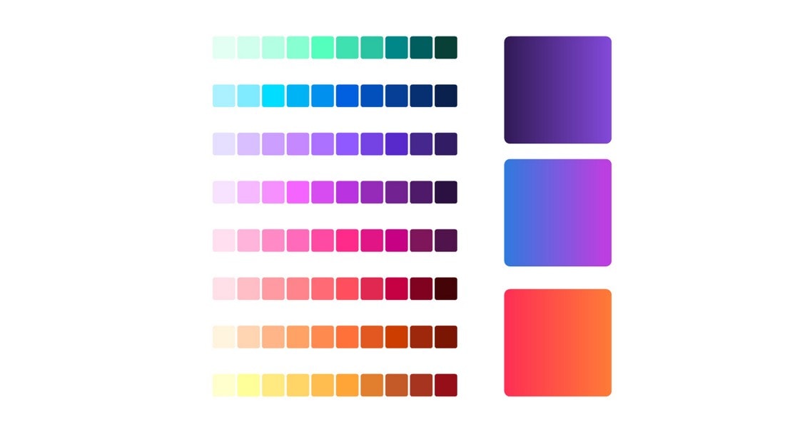
Color Tools You’ll Love
The right tools can make working with color that much easier. Here are seven color tools that will help you create perfect palettes and pass accessibility thresholds.
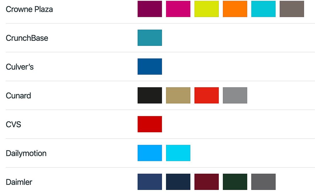
- BrandColors (pictured above): Guide to color palettes from brands you know (and some you don’t)
- Colorshark: Accessibility check for color pairs
- Color Hunter: Create and find color palettes from images (you can upload your own)
- Adobe Color: Use the color wheel and selection rules to create palettes of varying sizes and use them with other Adobe products (you can also extra gradients and check accessibility)
- Cohesive Colors: Start with a color palette and see how it works with different overlays or experiments to make it work just like you want
- Spy Color: Have an idea but not sure what the color is? This tool makes suggestions based on your queries
- HTML Color Codes: The ultimate conversion tool to move from CMYK to RGB or HEX, plus a color picker and more resources
Conclusion
Color can be one of the most important choices you make for any design project. Hopefully, these resources, tips, and tools provide a good starting point.
If you are stumped when it comes to color, less can always be more. Keep your palette simple if there are any concerns that it seems to be overwhelming or too much. And have fun!