Eye-Catching Typography To Get More Leads

Typography has been an ongoing trend in graphic design for the past five years. There are typography and font tools, and even courses on how to use them, all over the internet. The chances are that if you’ve seen a colorful, eyecatching infographic, you’ve also seen a good example of typography. This design approach has become indispensable in both web copy and web design, as it draws attention, sets the tone, and even underscores the overall theme and design of a website.
Typography’s Effects on the Mind
You’ll hardly find a contemporary website these days that doesn’t utilize some form of typography, whether it’s within the site design, banner, or the company logo. But typography is more than just artistic and creative methods of placing text in a graphic. It’s an art form that aids the onlooker in absorbing information better.
Fonts are the core of typography, and the right one can even affect a user’s mindset or impression of a company. There are many ways that fonts can affect the psychology of a user.
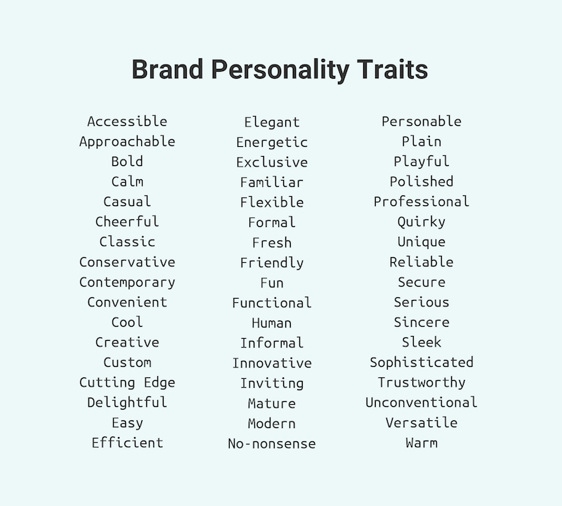
Expresses Brand Personality
You need to determine what identity and personality your company is trying to project on its site visitors and choose the right fonts. Using the right type or class of font becomes a reflection of the brand itself. And this personality is what customers will innately detect from the moment they see the typography on your webpage upon arrival.
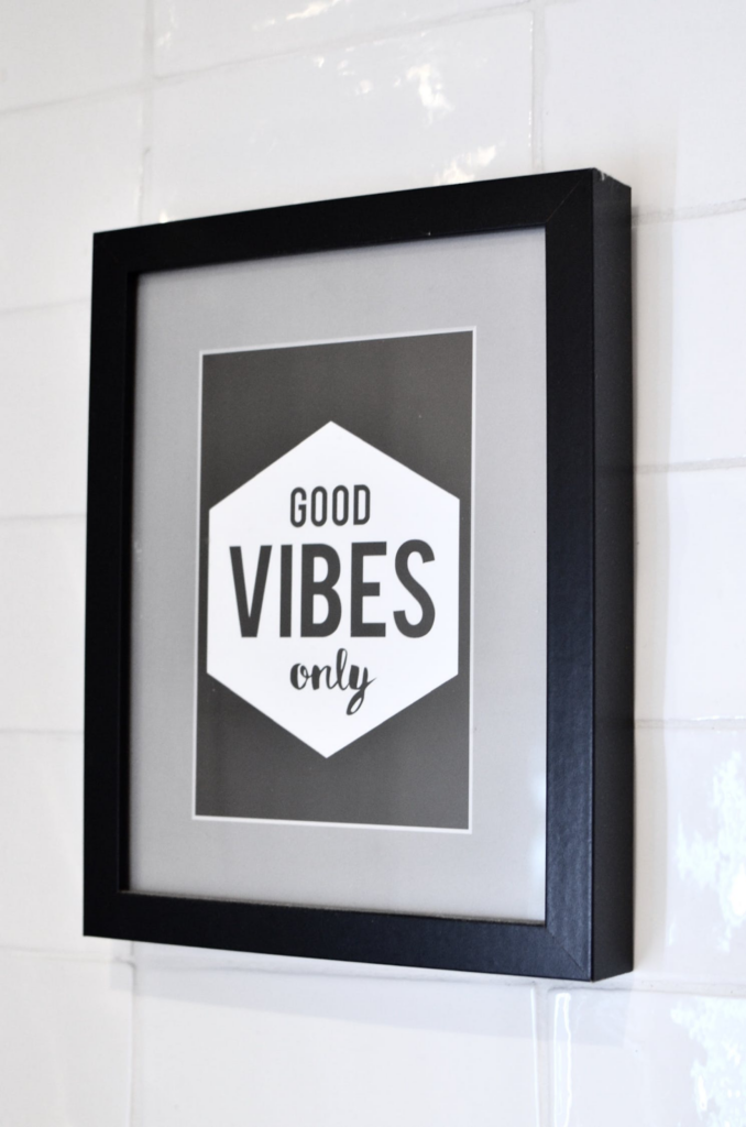
Grabs Attention
Depending on the type of font used, it is also a method to gain the user’s attention. For example, a heavy, slab-type font is ideal for headings and headers as it’s bold, strong, and immediately draws the eye. For example, a site for podcast tools can highlight brand names with different font usage.
Another way is to use a serif font as a header and then a sans-serif font to create a hierarchy between the texts. It distinguishes which area is vital for readers to note in the body text.
Triggers a Visual, Emotional Response
Great typography can make your customers react. Your website’s text may be easier to read because of the typography elements compared to what your competitors do. It makes customers want to stay on your website and read more. They will become leads, which is a step closer to eventually converting them.
Typography also sets the mood for your readers’ emotions. This applies to all industries, whether using fonts in a formal website for lawyers, an elegant site for corporate gifts, or a playful dog walker’s site.
Weaponizing Typography
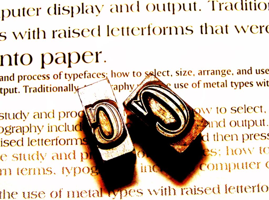
Today, many of the best graphic design software helps designers weaponize typography as a means of growth hacking, assisting websites in gaining more leads and conversions. Like other marketing methods, typography changes with different trends every year, going with what appeals to customers. It may only continue to evolve in the future.
In its most basic sense, typography is defined as the art of appealing to a user’s aesthetics through the appearance and style of the text. Typography applies to any form of text and any usage the text may have. It can apply to a single word, a phrase, a sentence, or even an entire paragraph.
The crucial elements of typography to know are:
- Kerning — It specifically refers to the space between every letter and every word, which makes it legible and clarifies that they are separate words.
- Hierarchy — An easy example of this is considering the differences between subheadings and body text. Headings typically have a different font, weight, and style than the body text, indicating that they are important pieces of information that categorize the rest of the body text below it.
- Alignment — This unifies all the designs on the page, whether it be the images, videos, and other forms of media, with the text.
- Contrast — Similar to hierarchy, contrast creates elements for the reader to focus on. A header might have a bright pastel color to draw attention, while the body text remains plain.
- Line Length and Tracking ??— Tracking specifically refers to how much space there is between letters in the line. This is how long each line of the text becomes. With more spaces between letters and words or more flourishes in the fonts, the line becomes longer.
These elements affect the customer’s or reader’s personality and their perception of your brand. The text is what helps them assign and associate values with your business. This means typography must be used wisely as a weapon for conversion. Below are some tips you can apply:
1. Choose a Font that Visually Reflects your Message and Identity
Remember that 93% of consumers rely heavily on the aesthetic and overall appearance of a product, site, or service before they judge it. Therefore, your choice of typography lends an image to your brand from the moment customers see it.
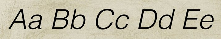
Consider your brand’s personality, values, and target audience. You don’t want to choose a curly, cursive, or informal font for a serious website such as one for medical services. You want elegant, straightforward types like serif and sans serif fonts.
2. Make Wise Usage of Font Contrast
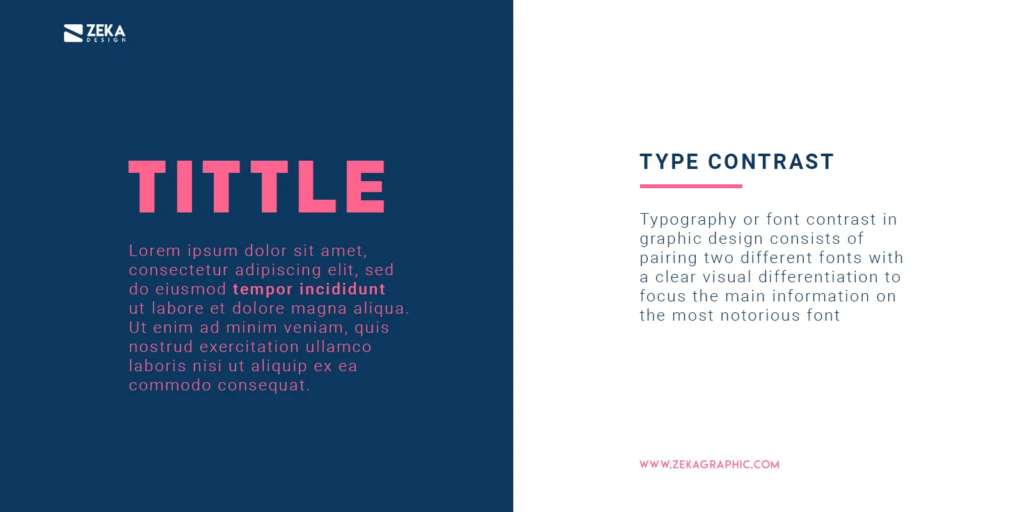
As mentioned in the section above, font contrast refers to how a different font, weight, or color can create a highlight to the overall design. Use this to your advantage by contrasting through white space, color, and dark body text to draw your reader’s eye to crucial areas of the page.
If you have a lot of information on the page, make it more legible and easier to read with a light or white background and dark or black text. Colored types can be used to get attention on headlines.
3. Choose your Main Fonts and Get to Know Them
Every site’s overall design should have no more than two to three fonts. There are major fonts, and they can express different identities.
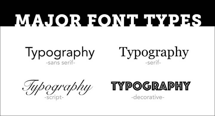
Fonts, for example, are typically categorized as
- Serif (with the decorative lines or serifs at the tips of each letter),
- Sans serif (with clean, modern endpoints),
- Scripts (which mimic human handwriting and are full of curling flourishes),
- Slab (with strong, heavy type), and
- Modern (which are expressive, with chic, stylish cuts).
These different fonts give the brand different characteristics, whether it’s familiar and friendly, sophisticated and elegant, or blunt and straight to the point. Choose the type with the correct representation for your brand.
4. Consider your Font Stress
Font stress refers to the visual change of direction that affects every stroke of the type. Similar to the usage of contrast, font stress will depend on the hierarchy of your website. Some brand names and logos you see sometimes change font styles within the same name.
Quirky details like these can add to the personality of your products and your site. Clever usage of multiple old-type fonts can give a label or a brand a rustic or antique feel. Closely-fitted words in various weights add creativity and interesting depth.
5. Mobile Typography Matters
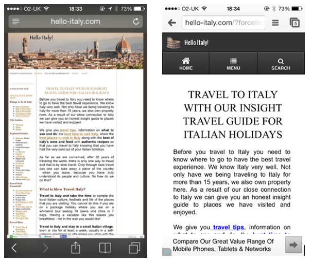
Remember that many users now visit your brand’s site through mobile devices. Just as a developer has to consider the site’s appearance between PC and mobile platforms, the typography should also accurately reflect the brand on both platforms.
Mobile is often smaller and more compact, so there isn’t much room for flourishes, so choose the logos and labels wisely without compromising character. Moreover, legibility is more important on smaller screens.
6. Use Safe Typefaces
What are websafe fonts? These are fonts that you can conceivably expect to appear on every user’s computer or mobile correctly. Some custom fonts won’t appear on a customer’s webpage because they haven’t been installed there. But websafe fonts can display correctly with everything.
Be familiar with the different varieties of websafe fonts and utilize them when possible. This ensures that your website appears as intended on any platform.
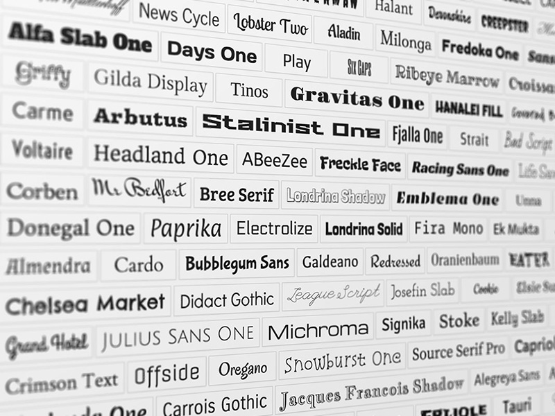
Eight Examples of Modern, Eye-Catching Fonts
Modern typography has come a long way, adapting to the ever-changing needs and moods of the online audience you’re trying to attract. Here are some crucial examples to study.
Moon
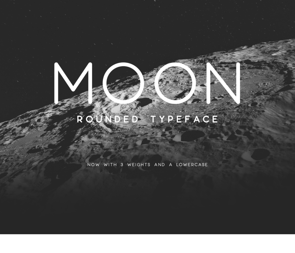
This rounded, sans serif font is wide with circular themes and comes with three different weights. As the name suggests, it’s a modern font that evokes futuristic and fun images. It’s an excellent, legible font for reading and is simple in its appearance that it can be used as a font to underscore more highlighted text.
Grand Hotel
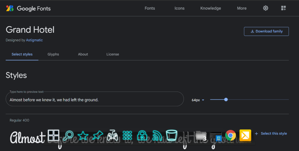
It’s a highly versatile script font that is both elegant and fun. It’s ideal for headers and titles for the menu as it evokes comfort and softness while displaying elegance. Best of all, it’s a websafe font as it can be installed through Google Fonts, making it easily available for display on various platforms.
Playfair Display
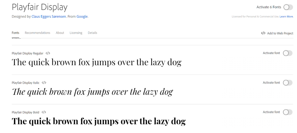
This is another websafe font readily available on Google Fonts and multiple online design tool platforms. It has feminine appeal and pairs well as a header for sans serif fonts. It’s elegant with good height and available in multiple weights, creating an image of a fashion magazine and aesthetically pleasing.
Lato
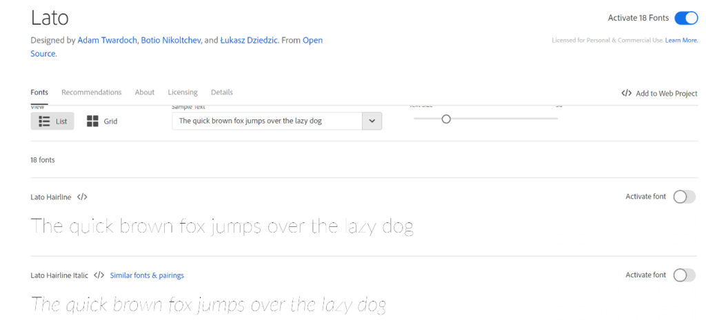
Lato is also websafe and available on Google Fonts. It’s ideal for body text because of its crisp, slim lines and rounded ends. The overall appeal is high professionalism and great readability while remaining modern and friendly. It’s a popular font of choice for corporate or informative websites.
Arvo
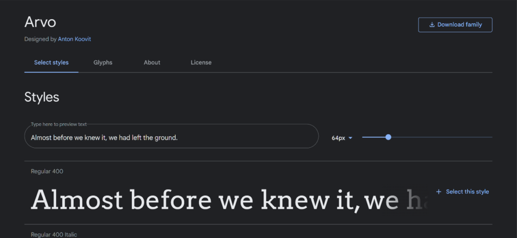
It is a free font named after the Finnish term for “number” or value. It’s reflected in its heavy serif ends that are almost geometric and symmetrical, especially with its capital letters. It’s become popular for areas of emphasis like titles and headings. It’s attention-grabbing and versatile for various approaches but is best used for home or food-related goods. It’s ideal for promo graphics, banner work, and flyers.
Ultra
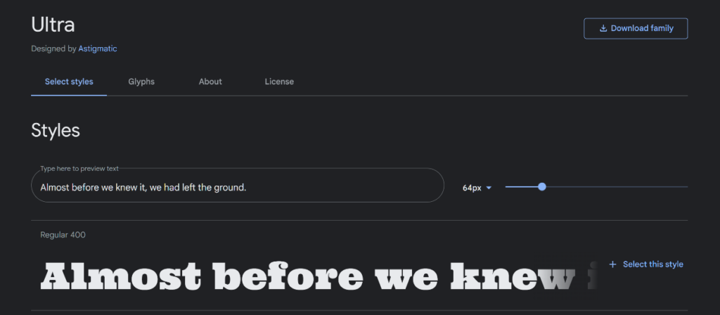
Ultra is an extra-bold, heavy, serif font that has been designed for headlines. It has a semi-retro approach and is great for creating a large headline that is ideally only one to a few words long. Music festivals, major events, and other celebrations benefit from this font as it evokes excitement and activity.
Odachi
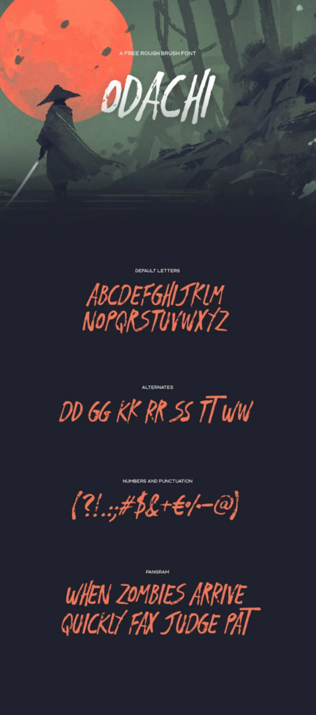
This free font is a “brush” type font that mimics handwriting from a paintbrush. It’s semi-calligraphic in appearance but is in print type rather than script. It’s very visual, easy to use, and is Japanese-calligraphy-inspired. It’s another great title font or can be used for bold texts, lines, and graphics. It can easily be used as a decorative font for shirts, mugs, and other merchandise.
Bite Chocolate
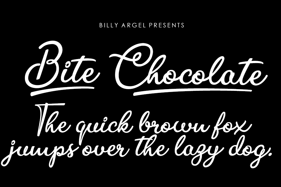
This sweet script-type font shows the familiar swirls people associate with bonbons or chocolate and food swirls. It’s a script with flourishes but still comfortably readable, making it warm and enticing. Though it has gotten the best usage from food production sites and headlines, it’s also useable as a header for per7sonal websites or aesthetic services.
Final Words
Make your text more than just a means to convey information. Turn it into an active, visual part of your design, evoking emotions and positive feelings about your company and brand. Let it become an intrinsic part of your brand identity, and improve customer conversion by the aesthetic appearance alone. You can gain more leads and draw more interest through typography, all before your customer even reads what’s on the page.
Is your typography poised to help you grow? Sound off in the comments below.