What font does Supreme use? Check out the Supreme font
Those who live in New York can easily recognize the brand of clothing, shoes, and skateboards – Supreme. This is from the past millennium setting a trend among youth by offering products that are inspired by the street scene of hip-hop, rock, and extreme sports. Part of their success as a brand is because they know how to maintain a simple but fresh style, and there is no better example of that that the Supreme font.
Since its founding in 1994, Supreme has tried to offer what young people want, and for this audience to understand it, they had to create a logo according to them. They had to design a logo that did not have that corporate appearance that keeps away those who want to enjoy their youth, and the best thing for this purpose was to place the name on a solid background.
Of course, part of Supreme’s success story stems from how they knew how to choose their allies. Aiming at the same consumer niche, the brand has had collaborations with Nike, PlayBoy, North Face, and many other clothing and footwear companies on more than one occasion. Thanks to the popularity they have gained, today it is easy to recognize the Supreme logo font on their products, and the best thing is that it can be used by anyone as it is a basic typeface.
What is the Supreme font?
![]()
Coming from a great brand like Supreme, it would not be unreasonable to think that they commissioned the design of an exclusive typeface for their logo, but the truth is that they decided to use one that has been around for almost a century.
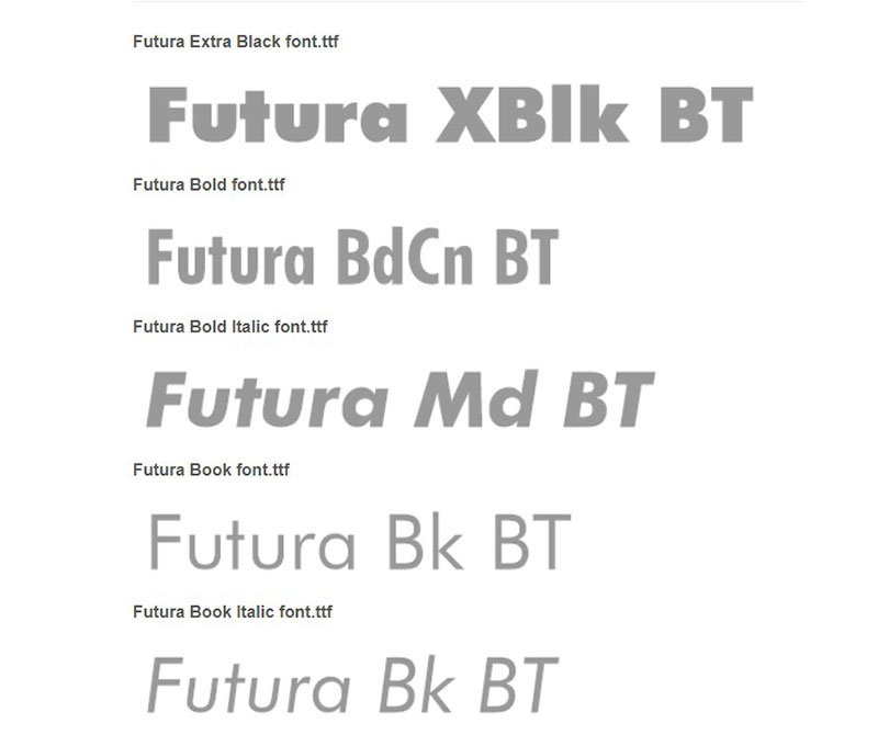
The typeface is the Heavy Oblique variant of Futura, which was created in 1927 by Paul Renner. Since its inception, Futura has been a standard choice for writing prominent titles and texts due to its thick build and simplicity. With the arrival of the internet, its use became more common, being used on many websites because it is excellent on any screen.
Futura is a letter that seems to be directly inspired by the artistic movement of the Bauhaus. However, Renner did it without thinking about the Bauhaus, but about the evolution of design in the world.
Humanity was barely emerging from the dominant Renaissance and Gothic ideas of the 19th century, where designs were exaggerated and compulsive. Renner contributed his idea of what the next step in the global design should be: something minimalist, but with character. His conclusion led him to use the foundations of geometric figures.
Futura redefined the Sans Serif, making all the previous fonts to form the group currently called “Grotesques”.
The font’s current reception
Despite its age, Futura is still a constantly used letter. Its success is due to the wide popularity it achieved in the middle of the last century when it was the favorite choice of newspapers and magazines.
It can still be found in some logos such as Crayola, HP, Volkswagen, Supreme, and many more. That is why saying that it is exclusively the Supreme brand font is not recognizing Futura’s fame and adaptability.
Futura Font – Readability over everything else
When a clear font is needed, Futura is one of the best options. The typography has a simple design free of additional details, with a constant thickness throughout the letter, which makes it easy to read.
Its wide surface allows the application of textures without loss of quality, and its wide range of characters can be used to write anything you want. Lowercase letters have strokes that exceed the average height, which gives them more character.
Thanks to the use of the Roman style as a base, it has been possible to create a basic letter that is easy to manipulate to create striking variations.
Futura Heavy Oblique – Ideal for the brand
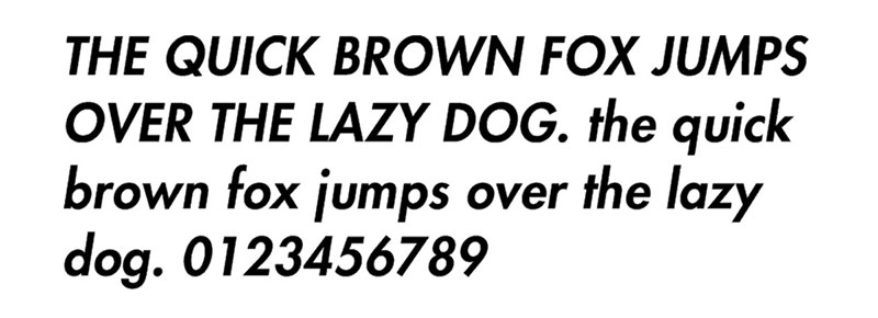
As we mentioned before, the Supreme font is a variation of Futura whose characters have been slightly modified to have thinner strokes, a slight inclination typical of cursive letters, and wider spacing. All this combines to create sharper text ideal for advertising and exhibitions.
Alternatives to the Supreme font
Didact Gothic – A more minimalist option
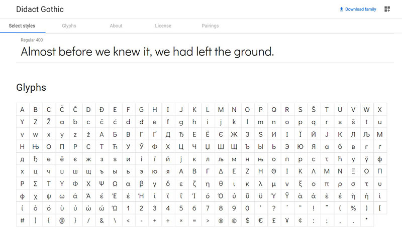
Unlike Futura, Didact Gothic offers a slimmer, firmer appearance, which is perfect for printing because it doesn’t require a lot of ink.
This quality has made it the predominant typeface in classrooms that use the Latin alphabet since it is easy to print them on boards and study guides.
The only problem with Didact Gothic is that it does not have italicized or bold versions, so you will have to settle for the standard layout.
Poppins – For users of the Devanagari alphabet
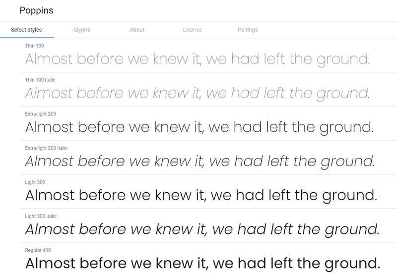
In addition to including the Latin alphabet, Poppins also includes all the characters necessary for the writing of Nepali and some Indian languages, making it a universal option that maintains the original idea of Futura.
The main difference with the Supreme text font is that it has an extremely thin thickness and a smaller width, which creates long letters. Also, all capital letters (including Devanagari) are aligned at the same height.
NunitoSans – You won’t notice the difference
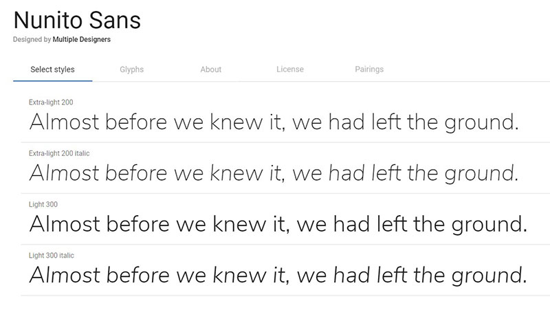
If you are looking for an alternative to the Supreme font with which to write your texts, Nunito Sans may be what you need. It offers the basic Latin characters, and its design is very similar to Poppins in terms of thickness. However, it has some characteristic visual details such as the J.
Hind – The option for user interfaces
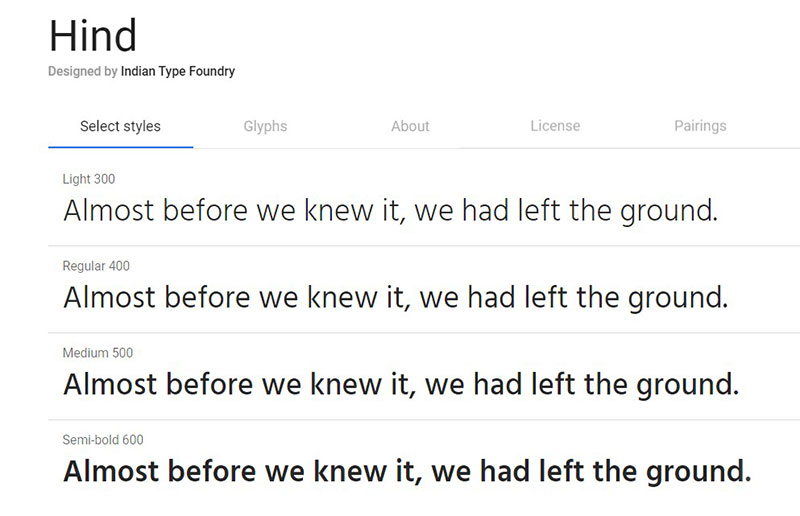
The secret to a useful user interface is that it is readable and not distorted no matter what screen it is used on. For the latter to be possible, the terminations of the letters should be straight, following the pixels’ direction.
Hind just offers this quality. Both its Latin and Devanagari characters appear to have been designed using a grid, as they have perfect horizontal and vertical proportions.
ITC Avant Garde Gothic – Take advantage of horizontal space
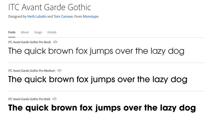
Perhaps part of the appeal of the Supreme typeface is the width of its lettering. With this alternative, you will have even wider characters thanks to the width and the separation between each letter.
Created in 1970 by Tom Carnase and Herb Lubalin, the name of the font is because it was designed to be used in the Avant Garde magazine. Adidas currently uses a basic variant of these characters.
Jost – For accurate calculations
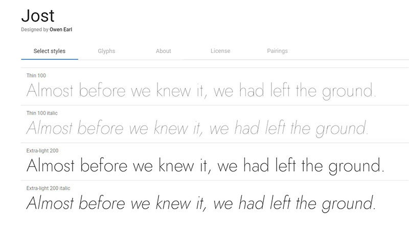
Accounting is an exact mathematics that needs a precise design so that the values can be read properly. To achieve this there is nothing better than Jost’s tabular numbers, which maintain a constant separation between each character.
It also features proportional numbers if you wish, and 9 different thickness styles.
FF Super Grotesk – A new perspective on Futura
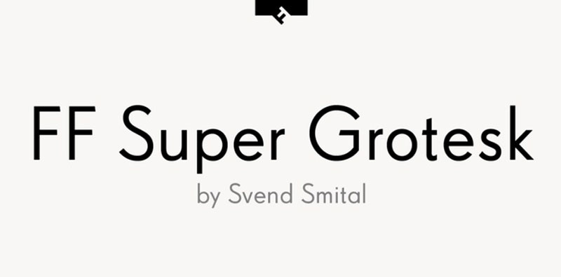
Created by SvendSmital, FF Super Grotesk is a reinvention of the original letter by Arno Drescher, which was also based on Futura, but with changes in the letters’ geometry, making them more symmetrical. Although the character set is very complete, it has the disadvantage of not being free.
Renner* – A worthy successor
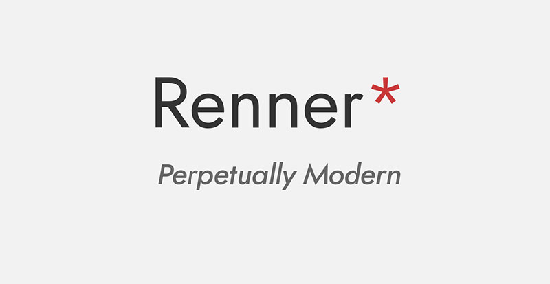
It is easy to make your own Supreme logo if you use a letter similar to that of the company, but it is best to give it your personality to make it unique. The same goes for Renner *, which is a typeface that honors Paul Renner’s creation offering an identical design, but each character has been modernized to adapt to the digital age, which curiously results in a unique letter.
If you enjoyed reading this article about the Supreme font, you should read these as well:
- Fonts similar to Lato to use in your awesome designs
- The most popular newspaper fonts and alternatives you can use
- Fantasy font options to download with a click to your computer