Good old days? Think again: 65 Best and Worst Vintage Advertisement Examples That Will Both Inspire and Annoy You

Ever wondered what was the first advertisements all about and how did it all begin? It all goes back to the 16th and 17th centuries when the first newspapers and magazines were published.
The printed advertisements for books and medicines represented the earliest forms of vintage advertisements featured in simple newspaper listings. Since then modern advertising began to take its final form embracing technology and new innovative ways.
We live in a world that revolves around marketing. How you present your brand, product or service is a big deal when it comes to impressing buyers. Being able to offer an incentive that your audience can’t resist and your competitors can’t manage to achieve is a promise that’s hard to go overlooked. Since the only means of reaching customers is advertising, a careful combination of an effective advertising strategy, being able to convey a valuable message, and being visually appealing is what drives considerable business results.

Your product or service may be the best in the market yet that doesn’t mean much if nobody knows about it. That is why you need to find a way to build a connection with your potential customers in order to create awareness for your product or service and to increase your sales.
There is no question that advertising is the most potent determinant that has the ability to shape consumer behaviors and tendencies but was it always in the form we get exposed to today? Of course not. The components and characteristics of vintage advertisements were quite different and also bizarre compared to today’s modern Superbowl ads.

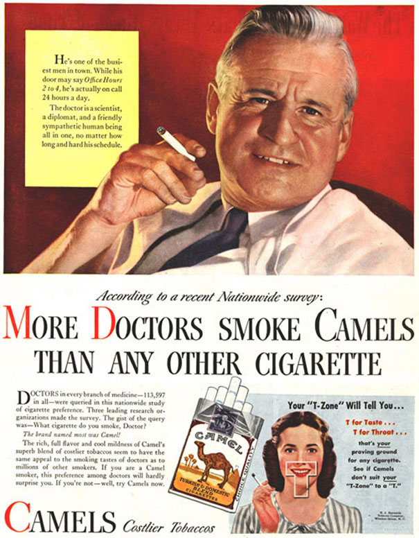
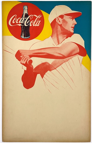
Vintage advertisements were colorful, catchy, yet sometimes offensive and sexist. They are also known for promoting unhealthy habits like smoking by featuring babies in cigarette ads and incentivizing drinking sodas as early as possible, we’re talking about infants sipping Coca-Cola and 7 Up. Other striking signature components of vintage advertisements are having very long, storylike copies, funny slogans, large, bold headlines, and bright colors.
Sure, the clothes and hairstyles were nice and people looked cooler in vintage ads but they were also sexist, racist, and offensive. That is why we’ve handpicked an interesting collection of vintage advertisement examples that worked on our grandparents. It’s true that now we live in a world where you can’t say anything without someone getting offended. But we must warn you, some of these ads are nothing like that. Get ready to see some absurdly offensive ads that you won’t believe were real.
Best and Worst Vintage Advertisement Examples


Techniques and strategies used in the advertising industry came a long way since the 17th-century and advertisements underwent a noticeable evolution over the years. Even though advertising approaches have refined in the digital age, consumers still expect the same sentiments from advertisements today. While their audience craves a sense of emotional connection, and trust, advertisers are trying to build this connection by using vintage advertisement elements. Apart from some controversial and offensive examples, vintage advertisements managed to draw consumers in with techniques that are still useful today. In spite of negative connotations, there is still a lot modern advertisers can learn from vintage advertisements of the past.
These vintage advertisement examples gave us one good resource for design inspiration by setting out the basics of successful visual design. Some simply evoked our curiosity by being politically incorrect, weird, and shockingly offensive; whereas some were just interesting to look at and visually appealing.
Tell us in the comment section your favorite one and the ones that annoyed you the most. Share your opinion on why you think a brand would present itself in such offensive ways, why advertisers think that these would be successful and why buyers fell for them in the first place.