5 web design mistakes that might be preventing you from making sales
If people are coming to your website but not converting, your web design could be to blame. A good design can help people find what they’re looking for and earn their trust, but a bad design can drive them away completely.
It’s worth considering whether some simple web design tweaks could make a difference to your sales numbers. In this article, we’re going to outline some simple design mistakes that could be preventing you from getting the conversions you deserve. Let’s get started.
Your web pages are too cluttered
A messy or cluttered website can lead to confusion, causing people to leave without making a purchase. So, to reach your sales goals, when designing each of your web pages, you should stick to the essentials. This doesn’t mean your website has to be plain or boring, but it’s important that you’re smart about the design elements you include.
Every website needs to have a logo, eye-catching imagery, and a straightforward navigation menu. From there, you might want to include a header and subheader that gives readers an idea of what your page is about, as well as a call to action that moves people towards making a purchase. Be sure that the most important information is displayed, but don’t overcrowd your pages with every detail.
Let’s take a look at a business with a great web design as inspiration.
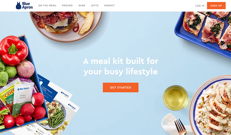
Blue Apron, a meal kit subscription service, has a great web design. As you can see above, it’s clean, simple, and provides the basic information anyone would need to get started. The homepage highlights that they help people with busy lifestyles and the navigation menu has options like their pricing and menu selections. Lastly, there is a bright orange call to action (CTA) button that the user can click to get started. Because the website design is so straightforward, people are more likely to make a purchase.
Be sure to design your website in a way that isn’t too cluttered, like Blue Apron has. You want people to be able to see everything they need on your website without feeling overwhelmed — this will help encourage people to make a purchase.
It’s unclear how to move forward with your business
If someone wants to invest in your products or services but it’s unclear how they can do so, they won’t wait around. Instead, they’ll go to the next website that they’re sure offers what they need. So, you need to put effort into ensuring that it’s easy for people to take the next step. You can do this in several ways. For instance, you could:
- Create a sophisticated search feature that takes people to the products or services they need
- Provide a simple and easy-to-use navigation system
- Place your contact information on every page
Let’s take a look at a few examples of businesses that have designed their websites in a way that makes it easy to convert to provide you with some inspiration.
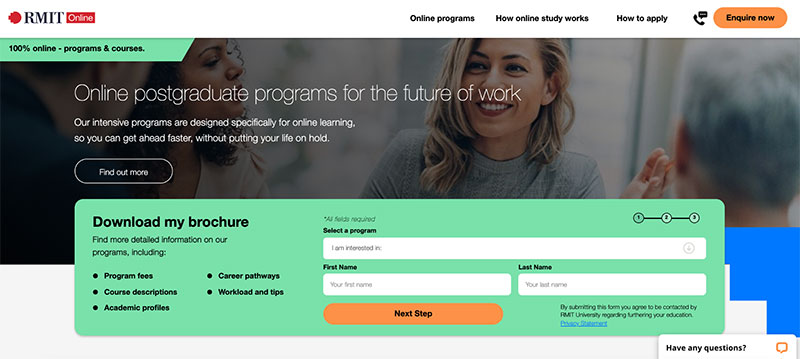
RMIT Online, a higher education institution based in Australia, makes it easy for people to take the next step with their business from their homepage. As you can see in the image above, they have a handy tool to help people download a brochure for the program they’re interested in. This helps users get more information, hopefully making them more likely to want to study at RMIT Online.
Consider providing a similar form on your website that helps people take the next step with their business.This could help them download a brochure, for instance, or take them to the products or services they’re looking for. This can help encourage people to make a purchase, as it makes it incredibly easy for them to access what they require.
Venngage, an online infographic maker, makes it easy for people to take the next step with their business, as well.
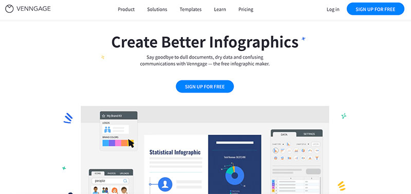
They make it clear that they can help you create better infographics and make your website and documents more engaging — right below their header, there is also a “sign up” CTA that users can click to get started. Because their homepage makes it very clear what users have to do next, they’re more likely to make a purchase.
Use CTAs to direct people to where they need to go to spend money with your business. This will help ensure that your website visitors take the action you want them to take and spend money with you.
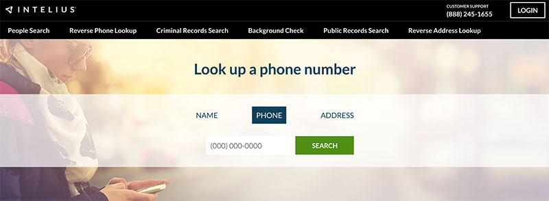
Finally, Intelius, a public information search website, makes it very easy for people to get started with their business, too. For example, on their reverse phone number search page, there is an easy-to-use tool that allows a person to simply plug in a phone number and get the information they need. Because it’s easy, people are more likely to jump straight in and use it.
If you need to gather any information from your customers so they can take the next step with you, ensure that providing it is incredibly easy. If it’s too difficult, they might leave without spending money with you.
Visitors can’t see any reviews from past customers
Social proof is incredibly powerful for boosting your sales. This is because people tend to trust other people like them over other forms of marketing — as a result, you should take advantage of social proof with your web design.
There are a lot of different types of social proof you can display on your website. Consider collecting reviews from your past customers. You could send them a post-purchase email asking for a review, perhaps with a discount as incentivization.
Whether you’re using written testimonials, star reviews, or video reviews, be sure to display them on your homepage and any relevant product or service pages. This will ensure that they’re seen by your audience and can encourage them to purchase from you.
Let’s take a look at a business that uses reviews well as inspiration.
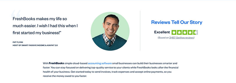
FreshBooks, an online accounting software company, uses reviews on their website well. For instance, on their small business accounting software service page, there is a review from Pat Flynn, a small business owner. He outlines how helpful FreshBooks was. Additionally, there are thousands of star reviews that people can refer to. Combined, these elements can help encourage sales.
Be sure to post reviews on your website’s product and service pages. These can serve as social proof and show website visitors that you provide quality work, encouraging them to make a purchase.
You haven’t placed the most important information above the fold
Consumers don’t like to work hard to find the information they’re looking for. This means that, when designing your website, you need to ensure that the most important information is included above the fold — this means at the top of your web page so nobody has to scroll to see it.
You might want to highlight details like exactly what you provide, your unique selling points (USPs), or information about how to hire your company or buy your services. Think about what people come to your business for. What makes you stand out from the competition? This is the type of information you want to display above the fold.
Let’s take a look at an example of a business that has done a great job of highlighting the most important information on their site as inspiration.
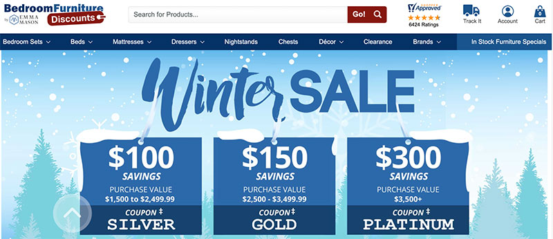
Bedroom Furniture Discounts, a discount furniture store, ensures that they provide their visitors with the most important information they need without having to scroll. As you can see above, they’re having a winter sale, so the company has clearly highlighted how much money people can potentially save when shopping at their store. This is sure to grab people’s attention and make them want to make a purchase, as they’ll be worried about missing out.
If you’re having an impressive sale, make sure it’s the first detail people see when they land on your website! This will get people excited about buying from your business at a discount, which can make them more likely to spend money on your products or services.
You aren’t using engaging imagery to keep people interested
When browsing online, people’s attention spans tend to be very short. This means that you need to do everything you can to keep people’s attention when they land on your website. One of the most effective ways you can do this is with engaging imagery!
You can show off photos of your staff, graphics that show how your products or services work, or pictures of your products in action, for instance. Be sure to display these images throughout your website to ensure that they’re seen by visitors and are engaging.
Let’s take a look at an example of a business that uses engaging imagery well as inspiration.
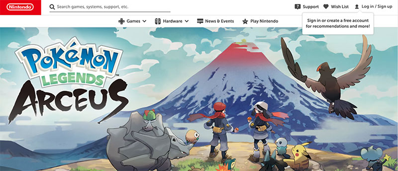
Nintendo, a video game company, has a lot of engaging imagery on their website. Because Nintendo is all about having fun, it’s very important that they get their website images just right. For instance, above, they’re promoting their new Pokemon game in their hero image. Doing this can engage website visitors and get them excited about the new release, which will make them more likely to purchase directly from the brand.
On your website, you can engage people with images of your new products or services. Not only will people be excited to see that you have released something new, but they’ll be more likely to spend money with you.
Summary
Ultimately, your website’s design can make or break a sale, so you want to invest a lot of time in getting it right. In this article, we outlined how you can improve the design of your website with reviews, images, and more.
Take a look at your website and see what work needs to be done! The results might surprise you.
–
Author bio & headshot:
 Adam Steele is the COO at Loganix, an SEO fulfillment partner for agencies and marketers. We build easy-to-use SEO services that help businesses scale. If you liked this article, please check out our SEO guides and templates on the Loganix blog.