Mega Menus Revisited: UX Best Practices in 2025
Navigation is one of the first things users interact with on a website, and when it’s done well, they barely even notice it.
In 2025, mega menus continue to play a big role in navigation design for organizing content-heavy websites, but they’ve evolved.
Today’s mega menus are cleaner, smarter, and more mobile-friendly than ever before. If your site has lots of pages or product categories, a mega menu might just be your best option.
But like any design element, mega menus can hurt the user experience if they’re overdone or poorly implemented.
In this post, we explore the latest best practices for designing mega menus in 2025 and how to keep your navigation clear, accessible, and easy to use.
What Is a Mega Menu?
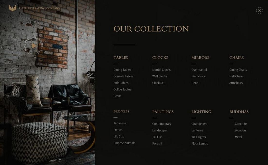
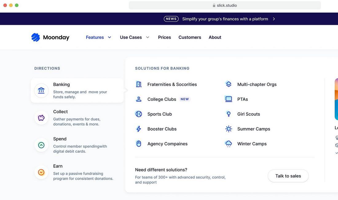
A mega menu is an expanded drop-down menu that shows multiple categories, links, or sections at once.
Instead of a simple vertical list, mega menus spread horizontally and often include icons, images, and columns to organize information visually.
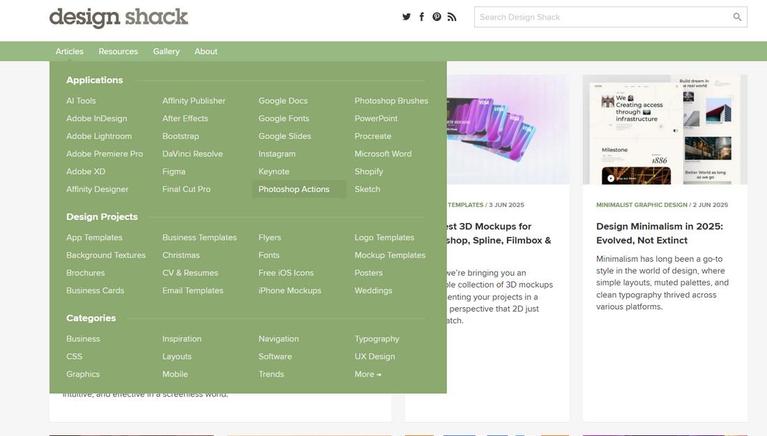
If you hover your mouse over our menu at the top of this website, you’ll see a simple mega-menu in action, where we organized all of our design news and article categories in one place.
Mega menus, when designed well, are a powerful way to streamline navigation and help users find content faster.
Why Mega Menus Still Matter
While minimalist navigation and hamburger menus still have their place, mega menus offer a direct path to content for users who know what they’re looking for.
Today, users expect websites to be fast and intuitive. If they can’t find what they need quickly, they leave. A well-designed mega menu reduces friction by laying out options clearly and visually.
” 61.5% of web designers believe that bad navigation is the main reason visitors abandon a website” – VWO
With better screen resolutions, faster load times, and more desktop browsing in workplace settings, mega menus are not going away.
They’re just getting smarter and more thoughtful in how they’re built.
Top Trends in Mega Menu Design
Let’s take a deeper look at some of the key trends shaping mega menu design today.
Integrated Search Bars
More websites are embedding search functionality directly into their mega menus.
This trend combines two important navigational tools into one area, helping users who want quick access to specific content without scrolling through lists.
Especially useful for e-commerce or knowledge-based platforms, a search bar in the menu allows users to either browse or directly query for what they need, all in one motion.
Personalized Content Recommendations
Mega menus are starting to behave more like smart dashboards. Instead of showing the same static links to every user, websites are using personalization to tailor menu content.
Returning users might see quick links to pages they’ve visited often, recently browsed categories, or even account-specific features.
Sticky and Persistent Navigation
Sticky menus aren’t just for top navigation anymore. Many sites now keep a condensed version of the mega menu available as users scroll.
This approach improves usability on long pages or when switching between content sections.
Persistent nav is especially valuable on sites with lots of deep content, like e-learning platforms or documentation hubs, helping users stay oriented.
Dark Mode Compatibility
With dark mode becoming a standard across apps and websites, mega menus now need to look good in both light and dark themes.
That means avoiding harsh contrast or overly bright accents, and designing components that are readable and visually consistent regardless of theme.
Multi-Column Layouts with Microcopy
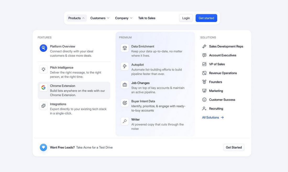
Multi-column mega menus are being enhanced with microscopy, short text snippets, or descriptions beneath each link that explain what the user can expect.
This is especially helpful on sites with ambiguous navigation labels or technical content.
A few words of helpful context can improve clarity and reduce bounce rates by guiding users more effectively.
Menu Animations That Guide, Not Distract
Animation is used more intentionally now. Instead of flashy transitions or pop-ins, designers prefer smooth fades, subtle slides, or collapsible groups that visually guide the user without slowing them down.
These micro-interactions add polish while keeping the experience fast and intuitive.
What Types of Websites Benefit Most from Mega Menus?
Mega menus aren’t ideal for every website, but they shine in certain contexts where large amounts of content need to be organized in a clear, accessible way.
- E-commerce Stores: Online retailers often carry hundreds or even thousands of products. Mega menus allow them to display product categories, featured items, deals, and more in a clean, structured layout.
- Educational Institutions: Universities and colleges typically have sprawling websites with academic programs, admissions info, events, and more. A mega menu helps break all this content down by department or topic, guiding different visitors to the right place.
- News & Media Platforms: News outlets often publish content across dozens of categories such as politics, culture, tech, lifestyle, opinion pieces, etc. A mega menu makes it easier for users to explore content based on interests.
- Government & Nonprofit Sites: These sites often serve multiple user groups and offer various public resources, forms, and legal information. Mega menus help organize this information by user need or service type, improving access to vital resources.
- Large SaaS Platforms: Software-as-a-Service websites with multiple tools, dashboards, help docs, and user roles can use mega menus to centralize navigation. This is particularly useful for onboarding new users, providing quick access to features, and linking to educational content.
- Travel and Booking Sites: Travel websites usually offer flights, hotels, rental cars, tours, guides, and customer service sections. A mega menu helps display all these services in a logical format while also spotlighting seasonal offers or popular destinations.
UX Best Practices for Mega Menus in 2025
Mega menus can be powerful tools when done right, but they can also become overwhelming if not carefully planned.
Follow these best practices for making your mega menu useful, usable, and user-friendly.
1. Use Clear Groupings
Break content into clear categories that follow a logical structure.
For example, group products by type, features by use case, or resources by format. Well-organized groupings help users scan faster and feel confident they’re heading in the right direction.
Use headings that are simple and meaningful, and avoid clever labels that might confuse users.
2. Don’t Overload the User
One of the biggest mistakes is trying to include too much. Users don’t want to read a menu like a sitemap.
Stick to top-level categories and your most important or popular links. Too many options can lead to decision paralysis, so use analytics to help prioritize what matters most to your users.
3. Incorporate Visual Cues
Icons, thumbnails, or subtle background changes can help visually divide the menu into sections and guide the user’s attention. Visuals should serve a purpose, such as helping differentiate product categories or highlighting key actions, not just decorate the space. Always test for clarity and alignment to make sure the visuals don’t distract from navigation.
4. Design for Accessibility
Accessibility is non-negotiable in modern UX. Your mega menu should be fully navigable via keyboard and provide screen reader support.
Avoid using hover-only interactions that exclude touch and keyboard users.
Also, ensure contrast ratios for text and background colors meet WCAG guidelines so that users with low vision can easily read the content.
5. Think Mobile-First
Mega menus don’t always translate well to mobile, so plan for how they’ll adapt.
Use collapsible sections or condensed lists that still offer the same choices but in a vertical, touch-friendly format.
Mobile-first thinking ensures your design works across devices without sacrificing access to important content.
6. Control the Hover Area
Menus that close the moment a user slightly moves their cursor are frustrating. Design wide enough hover zones and consider adding a slight delay before the menu closes.
This gives users time to move their pointer without losing their place, especially on large screens or when the menu is nested deeply.
7. Use Animations Sparingly
Animations can add polish, but should never interfere with function. Subtle fade-ins or smooth slide transitions can make the interface feel modern and refined.
However, long or flashy effects can slow down performance or confuse users, especially on slower devices or in accessibility-focused environments.
8. Write Scannable Link Text
Each link in your mega menu should be clear, concise, and predictable. Avoid jargon or internal terms that won’t mean much to an outside user.
Strong link text helps people scan quickly and decide where to go without needing to guess or read extra details.
9. Consider Contextual Menus
For dynamic platforms or logged-in users, contextual menus that change based on user behavior or role can improve the relevance of the navigation.
For instance, returning customers could see past orders, while new users might get links to start guides or onboarding. Just make sure there’s a fallback menu that works for everyone.
10. Test Often and Iterate
Mega menus can be complex, so it’s important to observe how users interact with them.
Use heatmaps, click tracking, or user testing to see where users hover, click, and drop off.
Small refinements based on real data can dramatically improve usability without needing a full redesign.
Conclusion
In 2025, mega menus are more relevant and necessary than ever before. With so much more information and content being crammed into websites these days, mega menus are a requirement.
However, the way we design mega menus has changed drastically over the years. Whether you’re designing a new site or refreshing an old one, revisiting your mega menu could be the smartest move you make this year.