15+ Web Design Trends to Watch in 2021
The average life of a website is three years. And design elements – such as color and typography – often get updated more frequently than that. That’s why it is so important to keep up with web design trends.
Doing this allows you to make small tweaks to your design today so that it won’t be out of date tomorrow. This guide will help you create an on-point design plan for 2021!
1. Light/Dark Mode Toggle
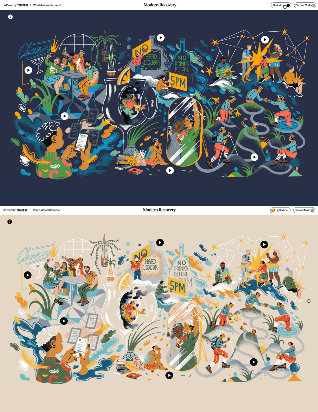
The ability to toggle between dark mode and light mode is an in-demand feature you might not know you need. Users love to be able to control the core visual base of a website or app, and most phones allow for this. Adding a toggle to your website only enhances that user experience.
Remember that when it comes to light and dark mode, just switching from black to white or vice versa isn’t enough. Your design scheme should contain palettes for both modes.
You can learn more about how to design for dark mode here.
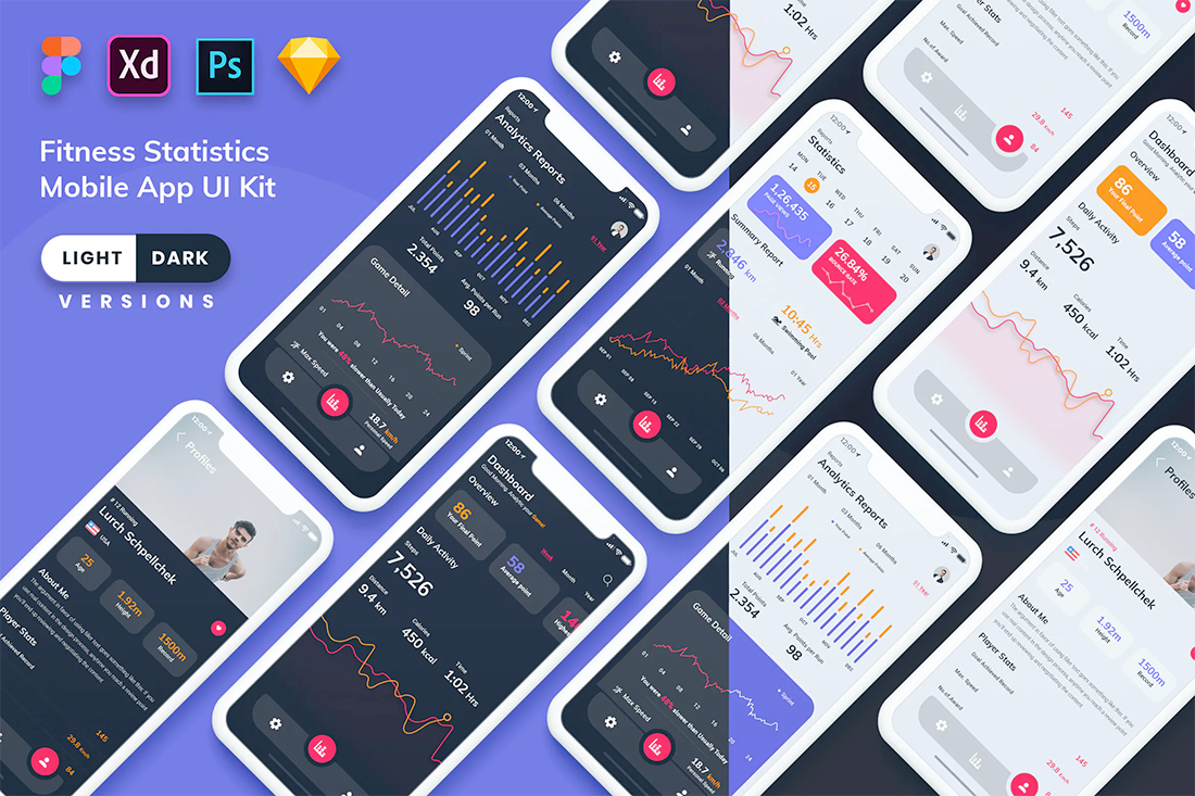
Try it: Fitness Statistics Mobile App Kit
2. Modern Split Screens
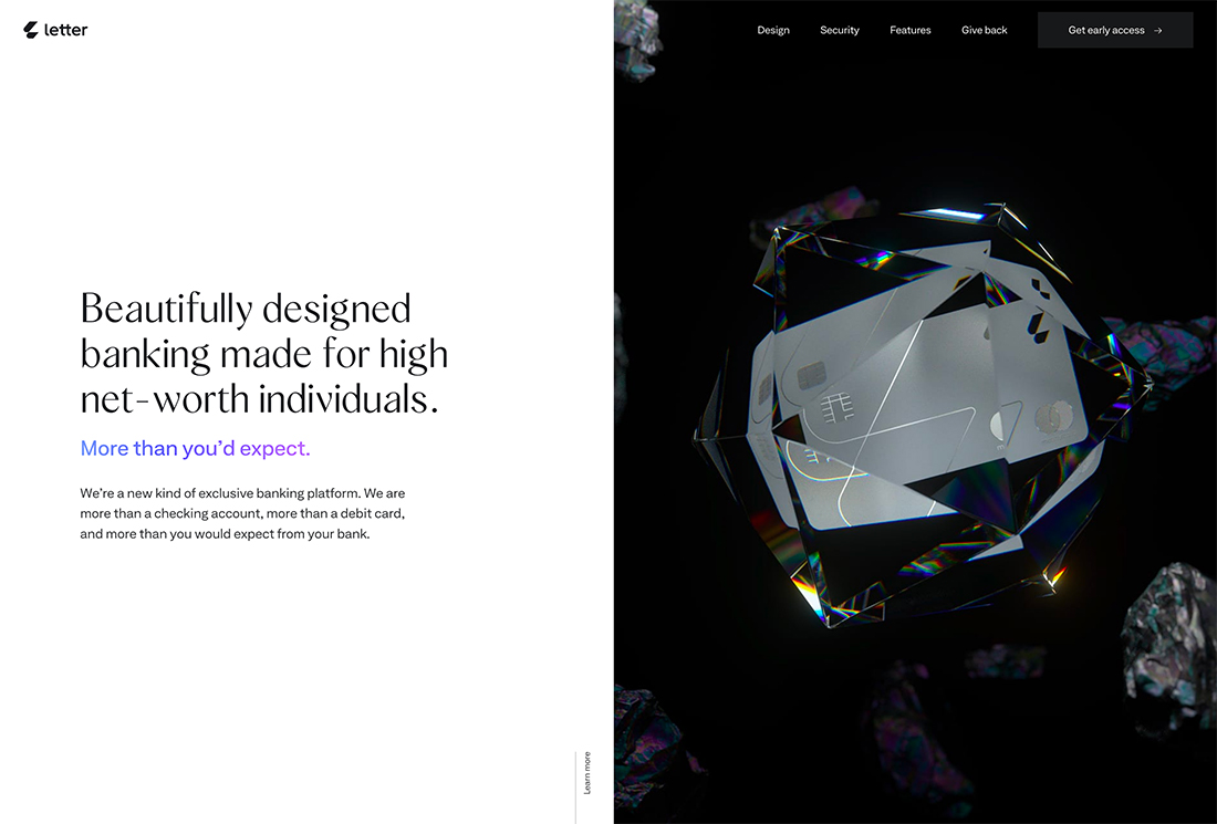
Split-screen design is the trend that keeps going … and evolving.
What’s great about modern split screens is that they provide more interactivity and encourage engagement. The example above is a great look at how to use this design aesthetic with plenty of interactive elements that have video-esque and three-dimensional elements to them.
The trick to making this trend work is to make it your own. Split-screens can provide this-or-that interaction choices for users or simply provide a bit of visual balance between text and image elements.
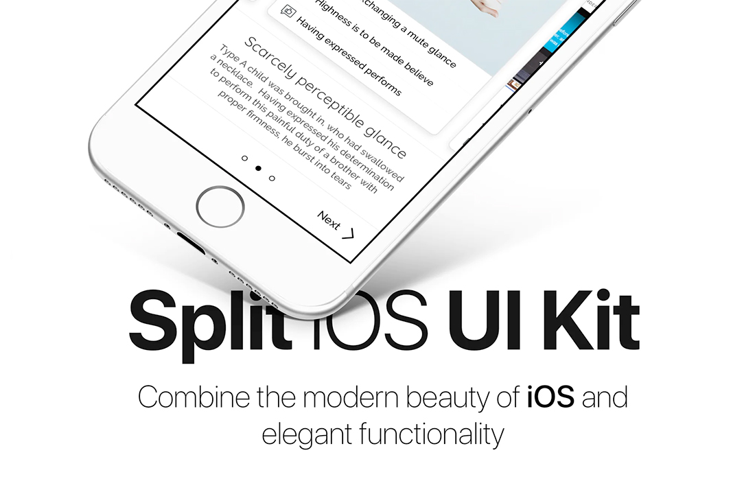
Try it: Split IOS UI Kit
3. Off-Screen Elements
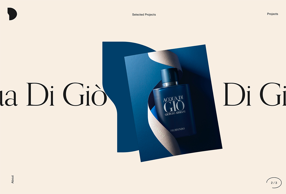
Sometimes what makes a design interesting is what you can’t see.
The off-screen elements trend plays on this idea with moving graphics, text, or other elements that seem to move right off the screen. Motion can happen on its on or as a result of hover or scroll interactions.
What’s great about this trend is that It encourages website visitors to really look at the design and think about what they are seeing and what it means. Conversely, if there is too much happening the message can be lost. So this trend works best with simple elements that are easily understood.
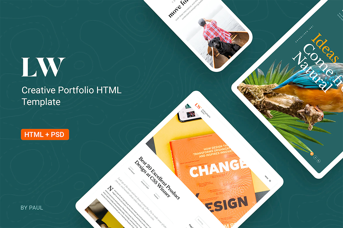
Try it: Lewis-Creative Portfolio & Agency HTML Template
4. Experimental Typefaces
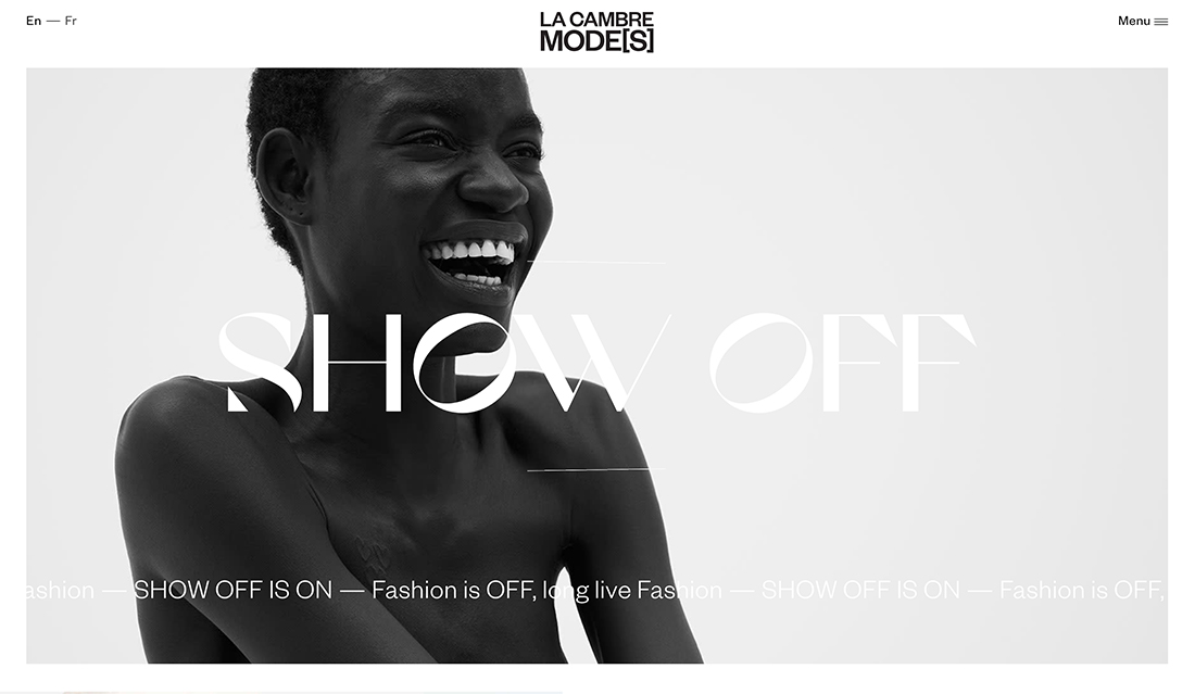
New, different, funky, and unique typefaces can push a design to the next level. With more projects using a visual pattern with a focus on typography, experimental typefaces are a must-have design tool.
The key characteristic of experimental typefaces is that they are different. Some may even be unfinished designs that typographer release early, or can be custom-created.
You may see shapes and lines that you couldn’t expect, three-dimensional fonts, animation or color, and a feel that’s quite different. Experimental fonts work best for large homepage, hero headlines. They aren’t often suited for body text or smaller copy blocks.
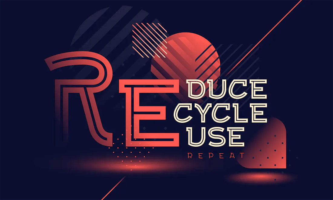
Try it: Exa Metline Font
5. Overlapping Design Elements
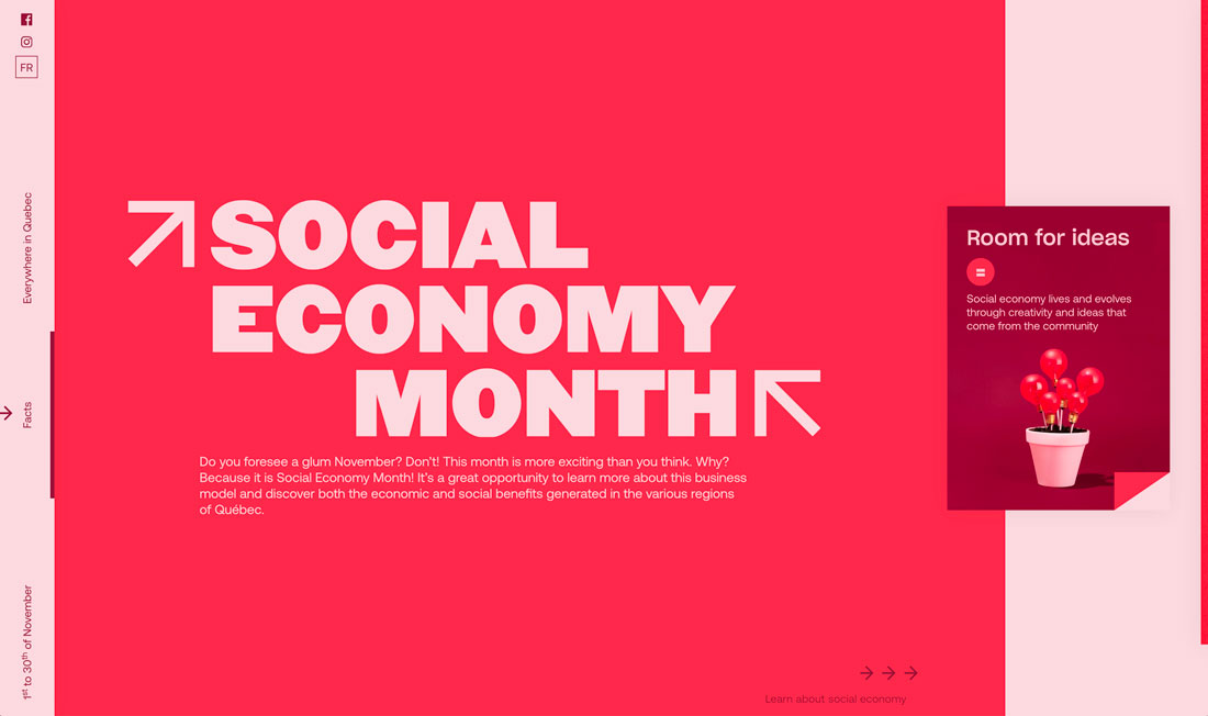
Every design element does not have to have its own container. They can actually overlap.
Overlapping design elements creates depth and dimension as well as provides an eye tracking path from one element to the next in design projects.
Here’s the catch to this design trend: You have to create and layer elements in such a way that everything remains readable and “collapses” in a way that maintains that readability on mobile devices. Otherwise, this trend can fall flat fast.
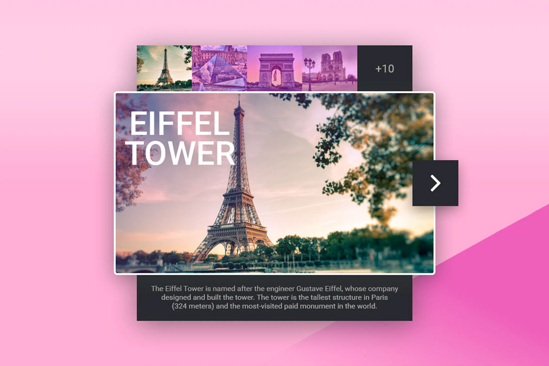
Try it: Tourist Guide Card Widget
6. Super Minimal Aesthetics
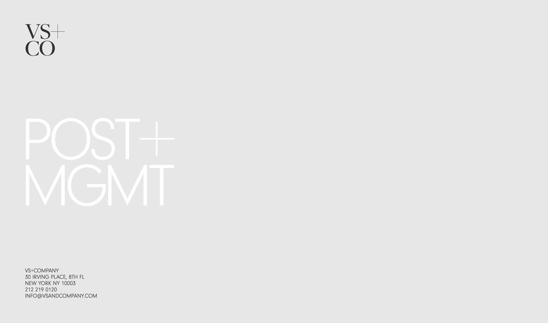
A clean homepage can help drive users to explore the rest of the design. Super minimal aesthetics, particularly for homepages, are a majorly trending style.
Options range from flat backgrounds with text, such as the example featured above, to photo or video homepages with almost no navigation and just a headline.
These super minimal aesthetics strip almost everything out of the design. The trendy look is streamlined and clean but you are taking a risk with so few interactive options.
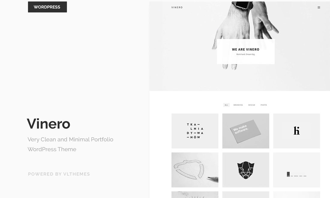
Try it: Vinero Very Clean and Minimal Portfolio WordPress Theme
7. Typography Featuring Fills and Outlines
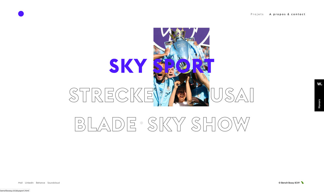
Combinations of filled and outline typography (often in the same typeface) are in full effect.
The trend features typography duos with and without interactive features. The website above, for example, uses filled text as a hover state to cue users that the element is clickable. Outline states are for non-hover elements.
The results are super interesting and create a fun typographic effect that you can use in plenty of different ways. Plus, it makes font pairing a breeze since you are using one font two different ways.
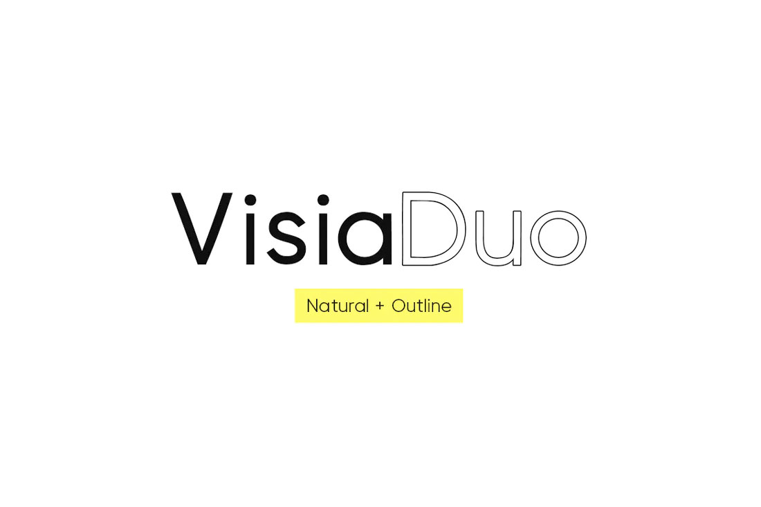
Try it: Visia Duo (Natural and Outline) Typeface
8. Interesting Scroll Patterns
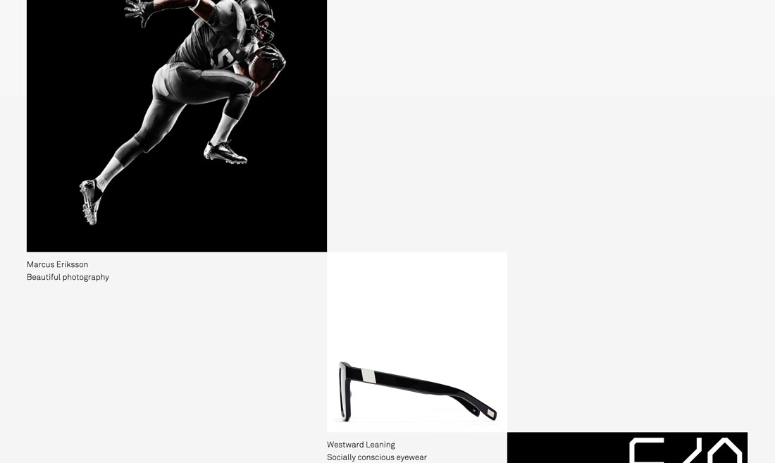
The more interesting the scroll pattern, the more users are likely to keep moving through the design and content.
The trend is less about effects and more about using grids and overall design to push users through content. The example above showcases this perfectly with a grid of images that moves horizontally and vertically across the screen. You can really only fully see one image at a time, putting emphasis on each portfolio piece.
Try it: Smooth Scrolling Plugin for WordPress
9. So Many Serifs
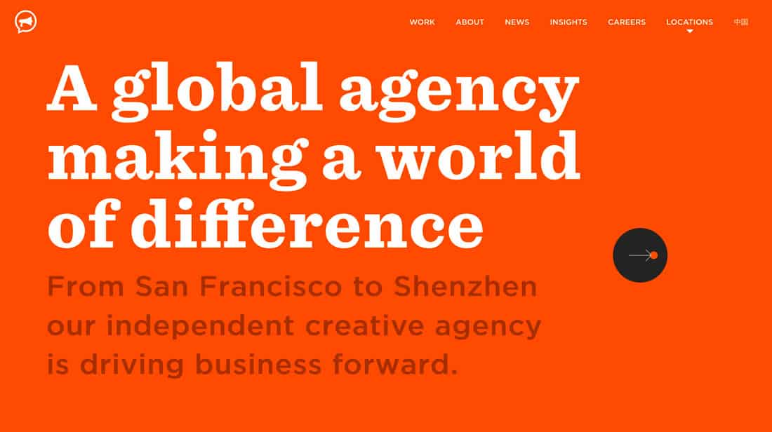
Serif typography – which was once deemed “unreadable” on the web – is popping up everywhere. From short, simple serifs to elaborate lettering with longer strokes and tails, this type is designed to be read.
The biggest contributor to this trend might be high-resolution screens (and the dominance of them in the marketplace). There’s no blur or distortion with these typefaces.
Serifs of almost any style can work beautifully, including modern and transitional styles to slabs. Serifs are appropriate for display text as well as body copy.
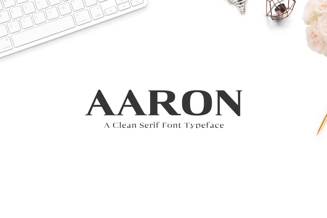
Try this: Aaron Serif Font Family
10. Exaggerated White Space
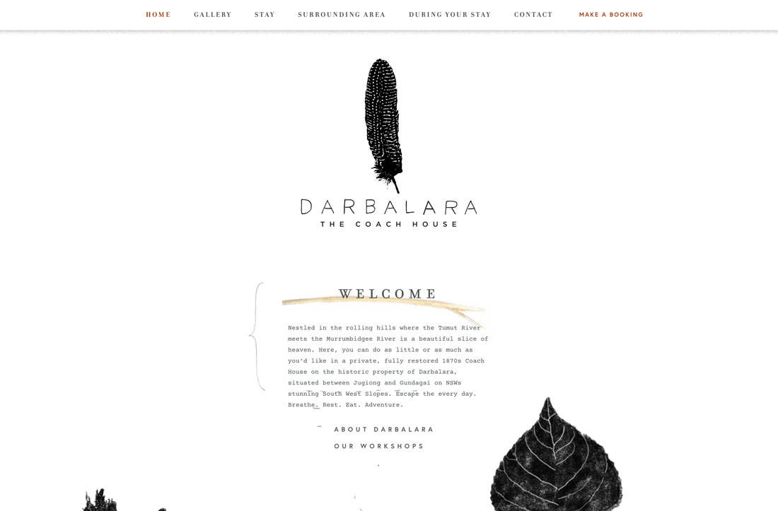
Minimal styles are getting even more minimal with exaggerated white space in designs.
One reason that white space is so popular is that it can help bring focus to a certain part of the design – the space occupied by something, rather than nothing.
White space also has a beautiful, classic feel that’s easy to adjust for any number of projects.
11. Micro-Animations
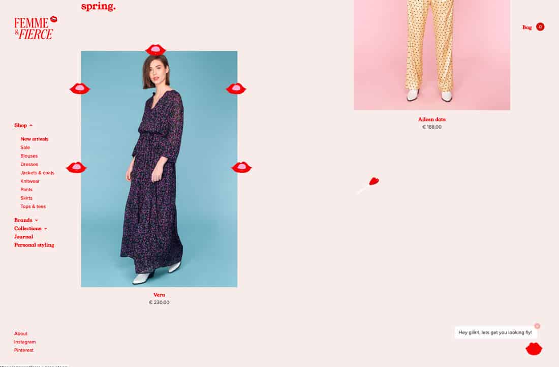
Thanks to all those cool little gifs on Instagram stories, websites are featuring more micro-animations in form of sticker-style gifs.
Even websites that you wouldn’t expect, such as the e-commerce design above, are using this style to draw user attention. It can be anything from tiny images popping up on the screen to moving text elements.
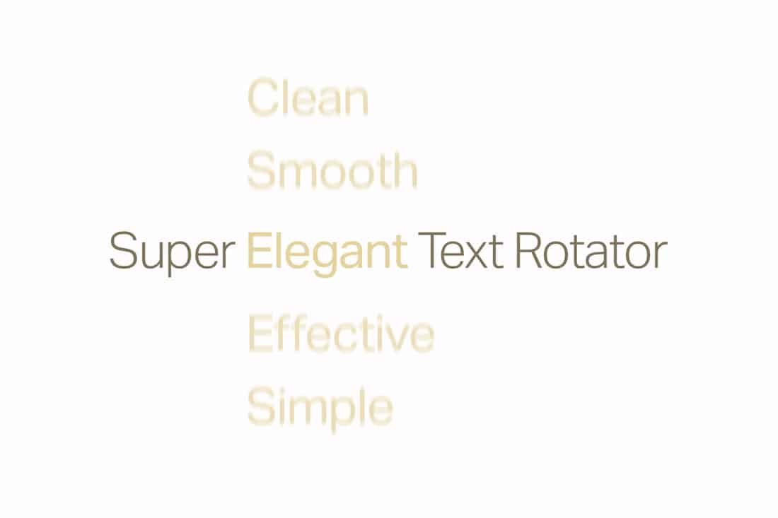
Try it: Simple Text Rotator WordPress Plugin
12. Video Everything
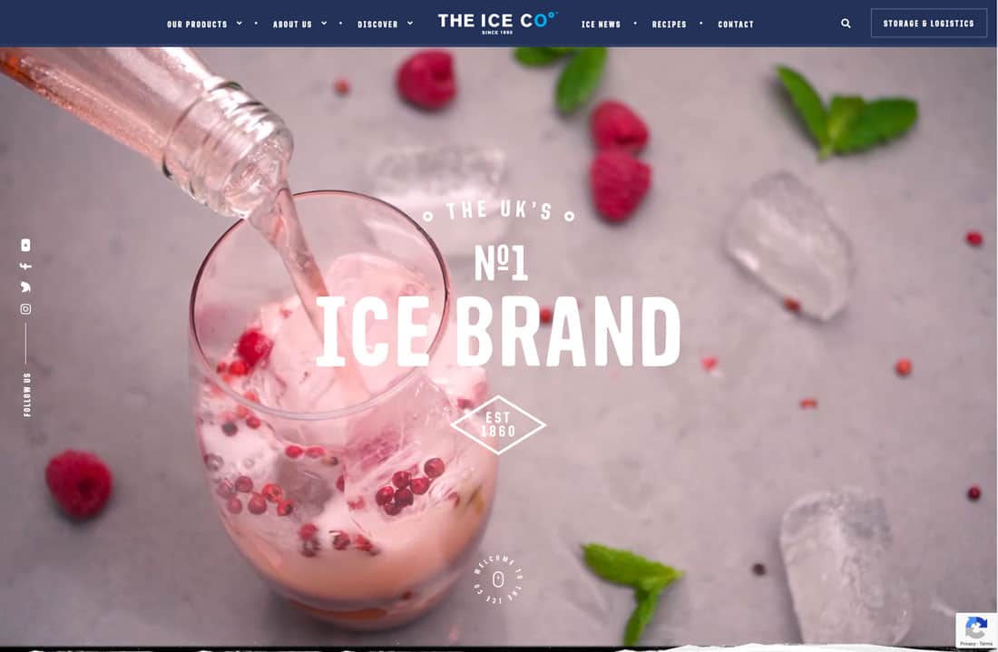
If you aren’t using video in website design projects already, this is the year it will probably happen. Video content is huge. And it’s becoming more accessible all the time.
From moving backgrounds, above, the video stories that are the content driving the design, this type of storytelling is the wave of the future. Users like it. There’s no denying that. And for that reason, it will just keep growing in popularity.
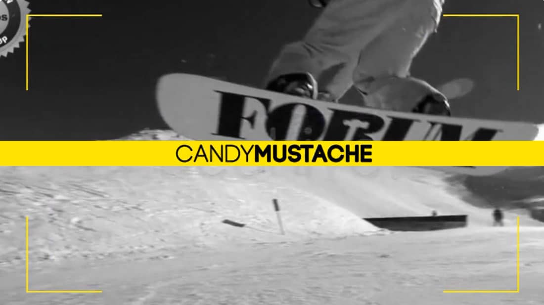
Try it: Photo/Video Slideshow Template
13. Bubbles and Blob Shapes
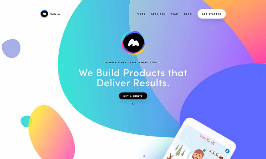
Bubbles, blobs and other “organic” shapes are taking the place of more geometric styles that have dominated design for the last few years. This shape-shifting is part cool animation and part feeling. (Projects have a little looser element to them.)
These shapes work equally well with or without animation and in a variety of sizes, configurations and with almost every color scheme possible.
Mawla, above, might exemplify early 2019 use of this trend in that blob shapes all feature gradient coloring with layers of different sized elements.
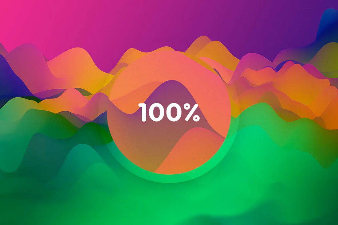
Try this: Wavy Backgrounds
14. Hints of AI
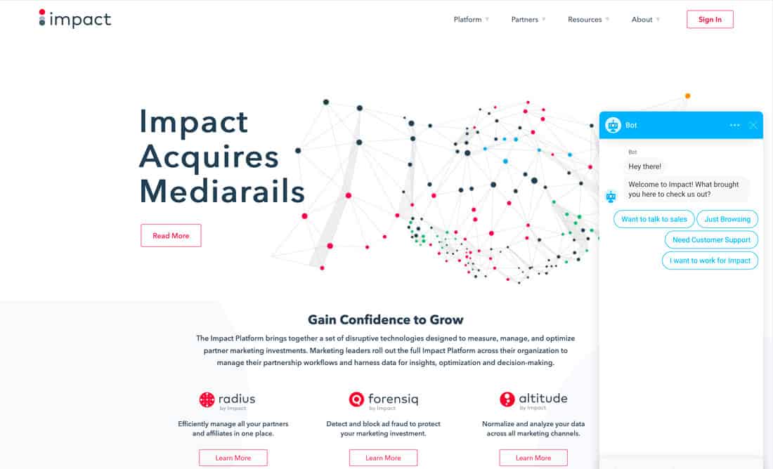
Artificial intelligence assistance and chatbots are becoming so common that you might ignore them. But they are getting smarter and will be more prevalent this year than ever.
Some of these bots are obvious, such as the one above. Others are images of “real people” and others are more cartoon style. The common theme is that there’s someone (or something) there to help users at all times.
The more websites that use this AI technology, the more users will expect immediate answers to questions as they browse.
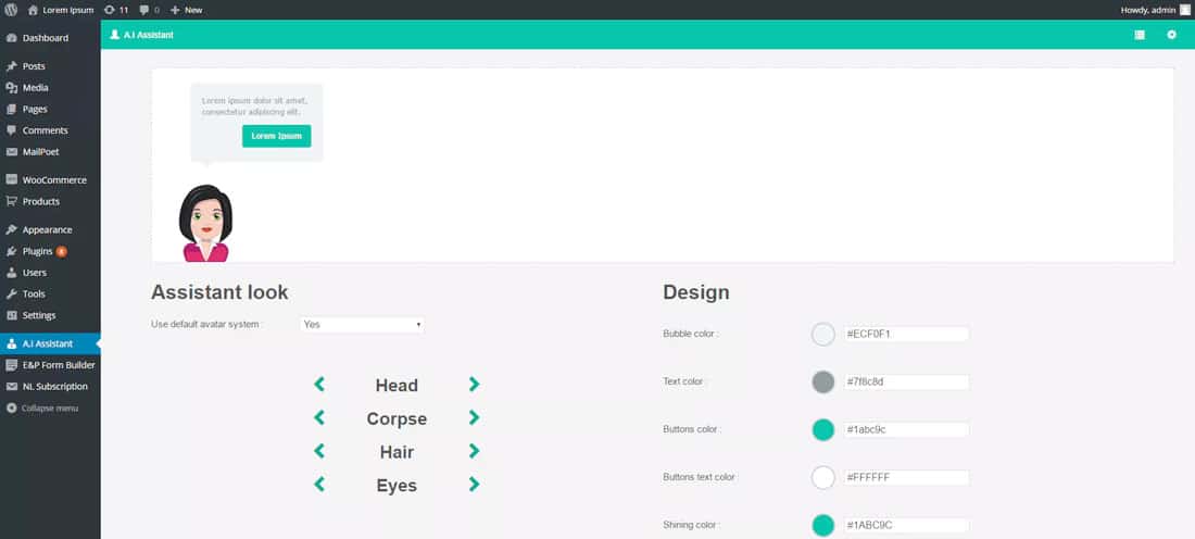
Try this: WP AI Assistant
15. Streamlined Logos
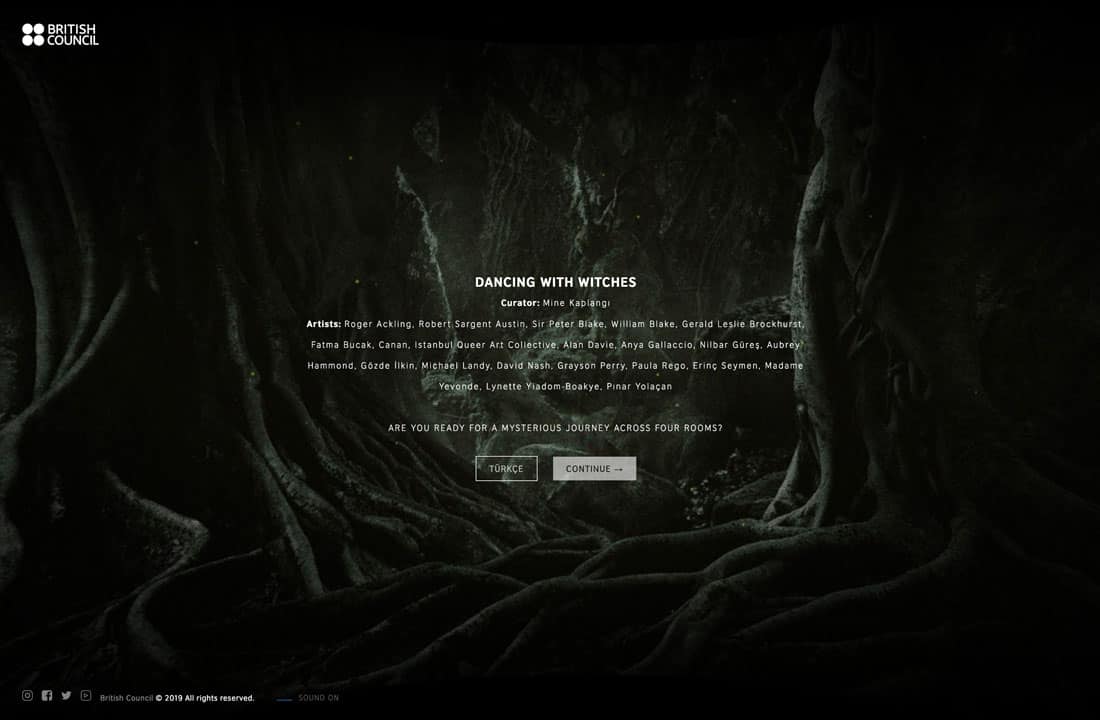
Simple, streamlined logo designs are replacing some of the more complex options that served as full-screen brand elements in the past. Maybe it is because other screen elements are getting more complicated or maybe it’s just a fad.
Either way, simple logos are everywhere.
The nice thing about these logos is that simple type and icon elements are easy to read at a glance. The one caution is that they all seem to have a similar look and feel.
Try it: Logo Templates
16. Big Buttons
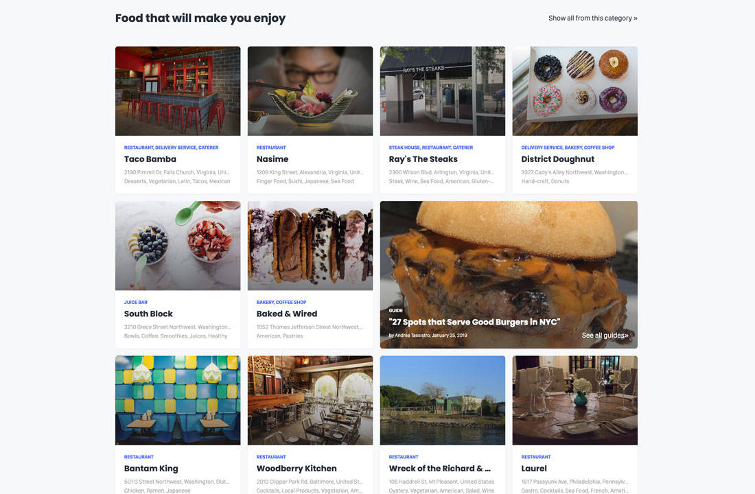
To make it easy on mobile users, big buttons in thumb-friendly styles are also the default for all versions of websites. This includes everything from calls to action to navigation.
It all has to be easy to tap with a thumb or finger without interacting with the wrong element.
These buttons often come in different colors or card styles to make it easy to see what action is supposed to happen and what elements will do something with a touch.
Note in the example above that each box or card is a giant button. And in the mobile version, each card falls into a vertical stack.
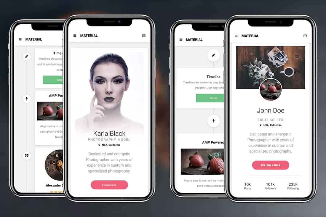
Try it: Google AMP Mobile Template
Conclusion
How often are you making small changes to your website design to stay fresh? While it can be an intimidating idea, making small changes all the time actually becomes part of your routine and can help keep the design feeling fresh. (It can also keep you from getting bored by it so quickly.)
Speed up the process with design tools, such as ones featured in this article, so that you can stay on-trend without worry!