7 Tips for a More Gender-Neutral Design
Are your designs as inclusive as they could be? Do they appeal to all people of all genders equally?
While design theory can put a lot of emphasis on creating personas for better user experience and design journeys, they can sometimes not be as inclusive as you might like. Do you get so involved in the persona that you forget every other type of user that might visit your website?
The first step toward a more gender-neutral web, is recognizing common practices and changing the way we think about some of the things we design with every day.
The key to making it actually work is authenticity. You have to believe in gender-neutral messaging for it to actually resonate with website visitors.
Use Photos with Different Types of People

In the vein of “show, don’t tell,” a gender-neutral design, features photography of all kinds of people, featuring different gender presentations and imaginations.
It starts with a mindset of using “people” in design projects. And is less about using a person that looks like “[insert stereotype here].”
When it comes to more inclusivity with photography and imagery, look to recruiting models from different backgrounds. When you place notices looking for these models, try to use language that is inviting to all types of people interested in what you are doing.
Keep in mind, that there is a flip side to imagery as well. Photos and images need to feel authentic and real. There’s a fine line between inclusivity and almost appearing patronizing. A gender-neutral visual needs to be in line with the brand or brand values of the company using these images.
Pay Attention to Pronouns

It doesn’t take a lot to write gender inclusivity into the text of a design project.
It starts with ditching he/she/him/her pronouns and using the inclusive “they.” This used to be a style no-no but almost all style guides and writing leaders are advocating for the more inclusive option.
Use the terminology when it makes sense. No one is saying that you’ll eradicate gender-specific pronouns; rather, you’ll use them only when assigned properly.
The challenge is that you don’t know what pronoun a person may prefer unless you ask. In this case, use is appropriate. Be careful about assumptions when dealing with real people.
In addition to he/him, and she/her, and they/them, neopronouns (xie/xer) are growing in popularity.
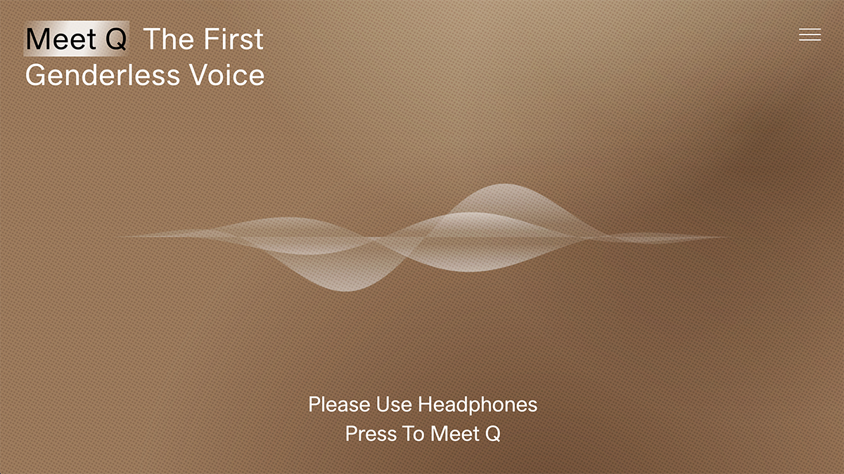
Don’t forget other gender-based elements, such as voice design (example above). A voice can have a distinct “gendered” tone or more neutral variation.
Do You Need Gender in Form Fields?

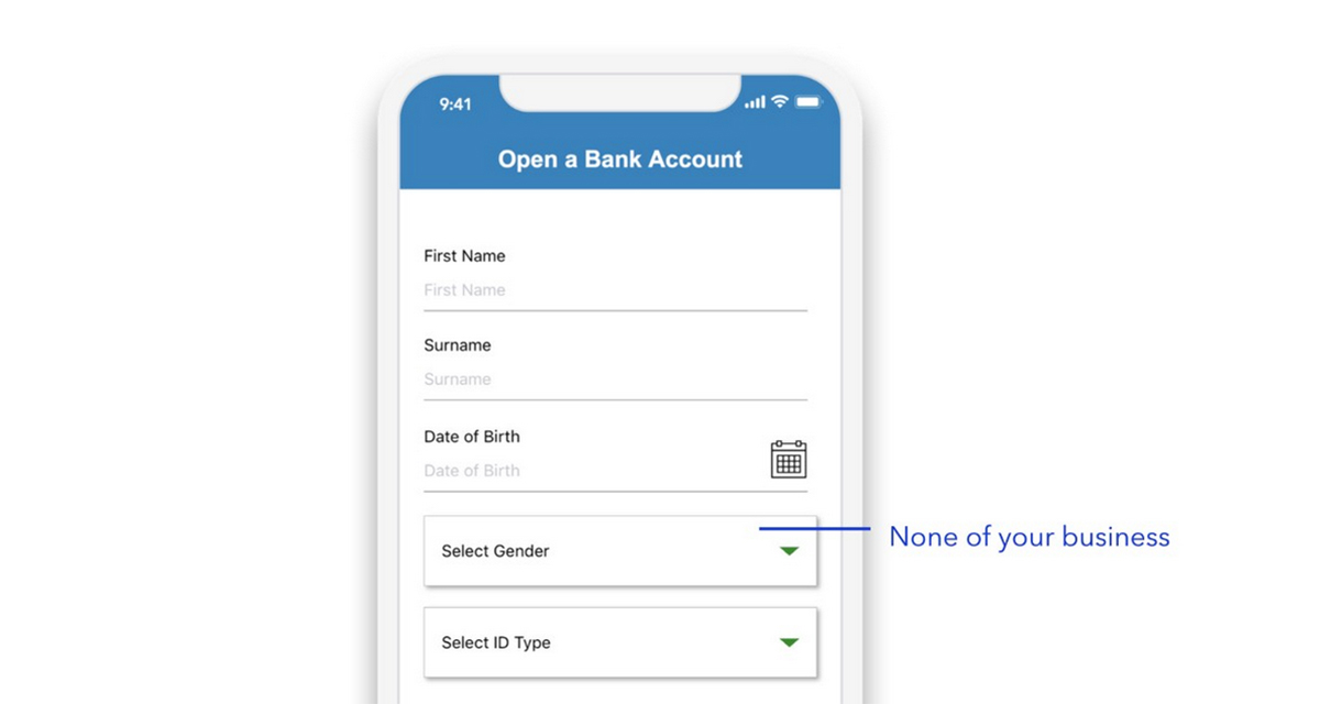
Use of gender in form field and to go things like sign up for a service or place an order is an interesting topic in itself. We’ve noted for quite some time, the best practice to not ask for anything you don’t need in a form.
You’d think that would be applicable here, but you’d be surprised if you started to pay attention to all the things that ask for that information from you.
It’s actually kind of hard to think of an online form where gender is necessary. It’s almost always included for marketing purposes to group the user into a certain sales category.
Think about it like this: Do you need gender for someone who has already self-selected into your form? They have already said they are interested in your product or service. Does gender matter at this point?
Want to really get into this topic? Micah Bennett, a designer for Asana, did a great piece about it for UX Collective. Read it here.
Don’t Get Stuck in Color or Typography Stereotypes

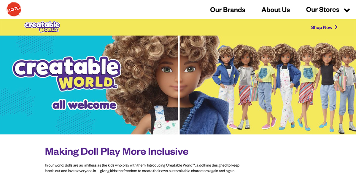
There’s something beautiful about Mattel’s Creatable World doll-building tool. Everything about the toy-builder allows for choice – color, hair, style. What’s most interesting is that this customization allows stereotypes to be broken.
Think in the same manner when it comes to some of the gender-based elements that are standard in design – color and typography.
For a long time, we have thought of certain colors or type styles as having a more feminine or masculine association. Just because that linkage has existed in the past doesn’t mean it is off-limits for your design elements.
When you think less about gender and more about getting the message, service, or product into the hands of interested people, some of these walls come down naturally. And your design may be better because of it.
Think Gender-Neutral in Navigation and Categories

This will be one of the elements that might strike the most conversation (or controversy). Consider more gender-neutral options and language in website navigation and categories.
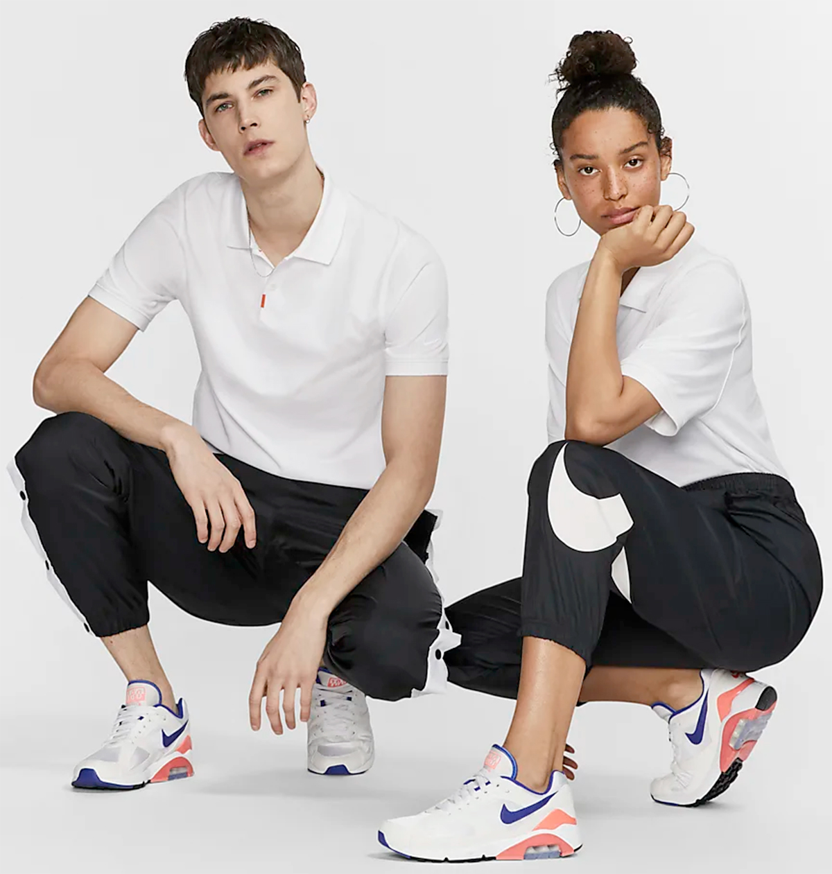
Nike, for example, has added a “unisex” option as a sort criteria for clothing and is promoting gender-neutral clothing options with multiple models in the imagery.
There are a lot of societal norms that can get in the way of this philosophy – particularly when it comes to clothing sales and sizing – but you can chip away and make progress in some areas.
Remember, even if you can’t go completely gender-neutral in these places, use imagery that shows the concept. Put clothing options in all categories and then size appropriately and you’ll have an innately more inclusive search and sort option even if you can’t go all the way with the concept yet.
Drop Human Avatars
Most websites have two default avatars – man and woman – for faceless photos.
A more inclusive option is to drop the human avatar altogether and opt for something else. The example above features animal avatars. Most people don’t say look at that female giraffe or male elephant; that alone creates an element of gender neutrality.
This alternative avatar style can also be fun, lighter, and more engaging depending on your core audience.
Beware of Titles and Honorariums
The final gender consideration is titles. Women have struggled with Ms. or Mrs. for a long time, or the alternative Mr. [Insert Woman’s Name Here].
Gender inclusivity is the exact same thing. While adoption of the Mx. title is becoming more accepted in some places, what need is there really for a courtesy title?
It’s unnecessary and serves very little purpose. Just get rid of it.
Conclusion
Gender-neutral design is a combination of the way things look and the language and choices you make. It also needs to be authentic to feel right and resonate with people who interact with the design.
Gender-neutrality is becoming more of a design concern as conversations about gender identity and fluidity become a great part of public discourse. It’s your choice as to how this plays out in your projects.