Black And White Is the New Black: 25 Eye-Catching Examples of Black and White Design

Does #000000 and #FFFFFF mean anything to you? If you’re a designer, a programmer, or just someone who works in web design they probably do. When beautifully united, a black and white design can turn your artwork into a sophisticated and classy masterpiece.
Before we jump into our top black and white design picks, let’s take a moment to carefully dig out the symbolism behind this timeless color duo.
Black and White Design

Black and white are the opposite shades that embody many connotations that we all get accustomed to over the years. Black is often associated with darkness, night, and seriousness while the color white represents light, purity, and innocence.

Speaking of light and dark, here’s a random fun fact: ever heard of the term “eigengrau”? Eigengrau can be translated as “intrinsic gray” or “almost black” but not quite. Even though black represents the absence of light, the human eye can not perceive true blackness. Instead, we see eigengrau whether our eyes are closed or open in the perfect darkness.

In color psychology, black and white colors have many different associations. Black often refers to aggression, fear, and sorrow, whereas white usually symbolizes cleanliness, safety, and even new beginnings. But this doesn’t mean that the elegant color black always evokes something negative and depressing and white holds quite the opposite. It’s just the way they are used in our everyday lives and the way that they are embraced by different cultures.
For example, in many cultures, people tend to wear black at funerals. But this longstanding tradition does not apply to every culture in the world. Contrary to popular belief this historic tradition is mainly peculiar to Western cultures and dates back to the Roman Empire. It is believed that Romans were the trendsetters of wearing black garments when they lose a loved one.
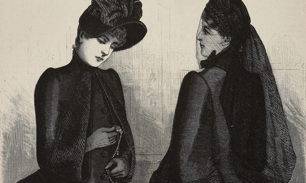
However, in Asian and Middle Eastern cultures the official color of mourning isn’t black at all. White is worn at funerals because it symbolizes rebirth in Asian culture. In South Africa, red isn’t the color of passion but sorrow. In Egypt, as one might easily guess gold and yellow are quite common even in funerals. In Thailand, people wear purple, and in Iran, blue is the go-to color if you’re heading to a funeral.

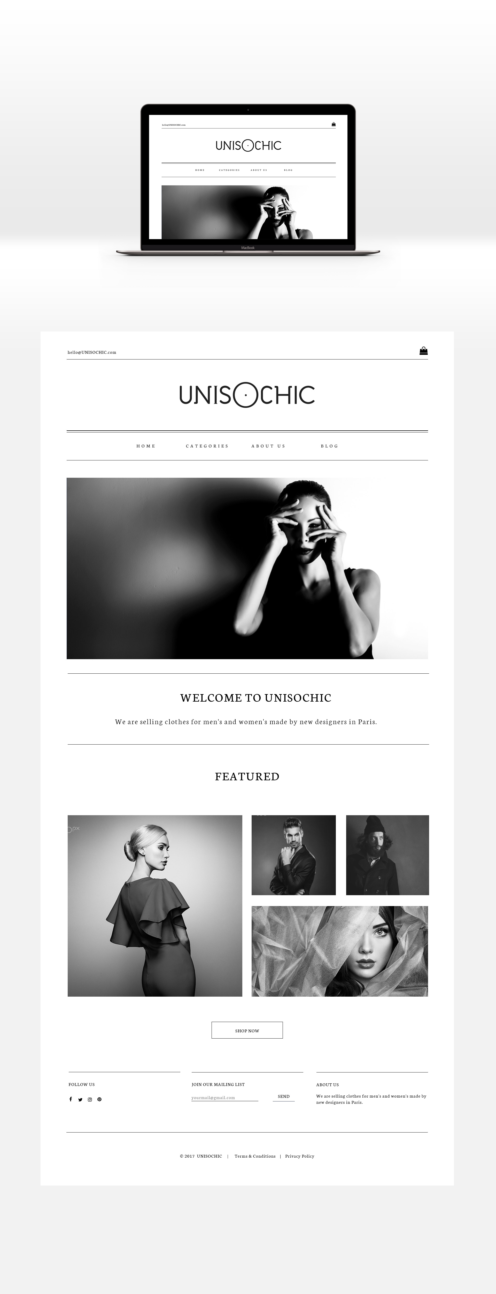
While these color connations vary and can go on forever, the one thing that is acceptable in every culture is that black and white is a killer duo. Black and white contrast so well with each other that this combination is embraced by almost every branch of art. From filmmakers and fashion designers to graphic designers and photographers, the black and white design remains to be the number one choice when it comes to keeping things minimalistic yet charming.

Whether you’re looking for an effect to create an enchanting dichotomy or just had enough of radiant colors, using black and white design can create a striking impact of boldness. You may think the absence of color results in unremarkable outcomes in a graphic design world ablaze with color, but polar opposites hold a vast potential if balanced right.
In graphic design, the black and white color combination is especially used if there is a text or image that needs to be the center of attention. The intensity and depth of these hues give designers the ability to focus on the message without having too many colors involved while creating maximum contrast.
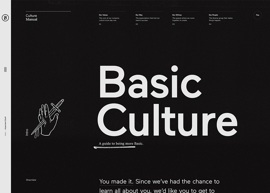
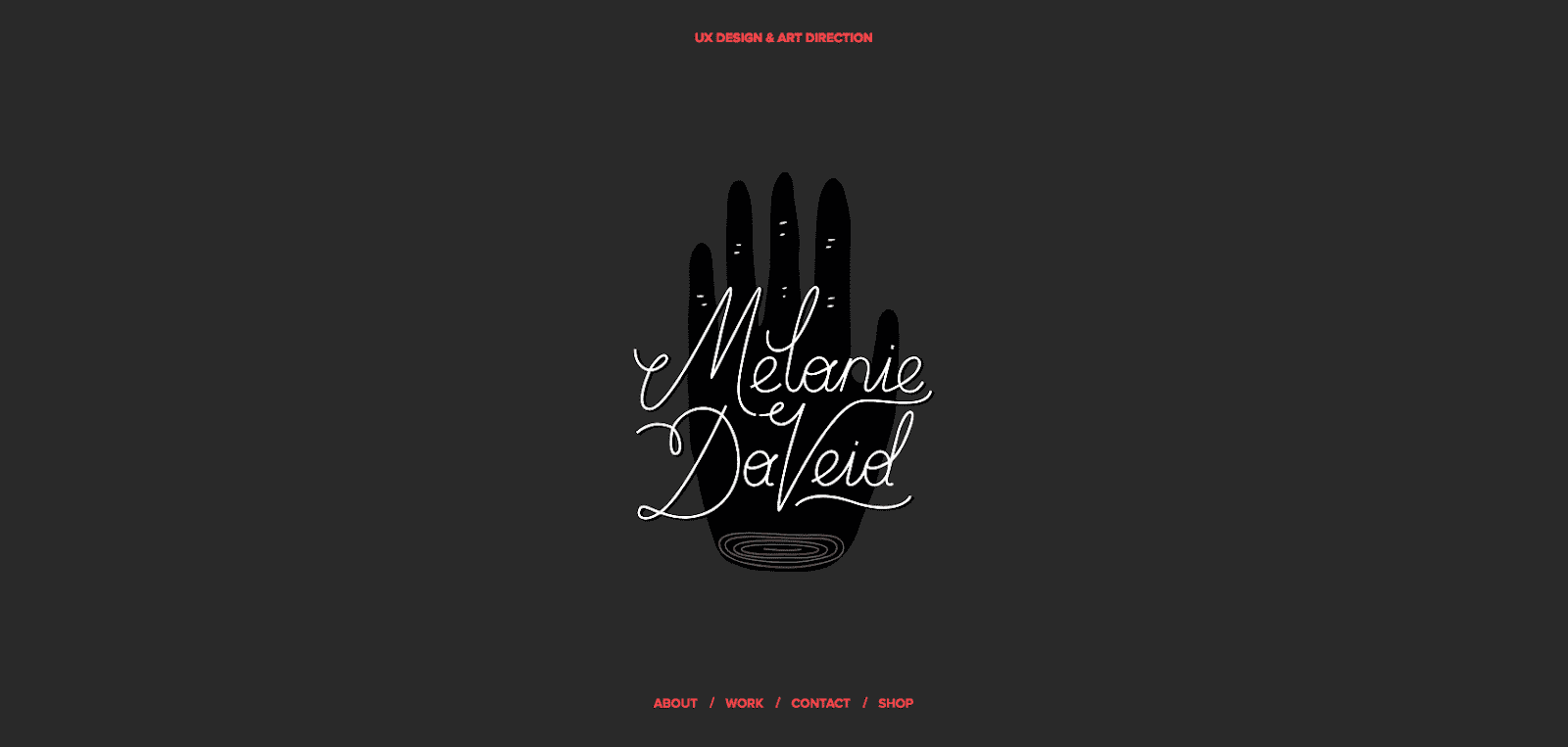
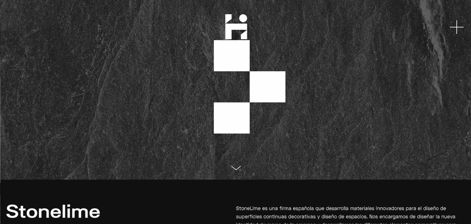
Without further ado, let’s leave the color aside and take a look at the stunning examples of black and white designs that never goes out of fashion.
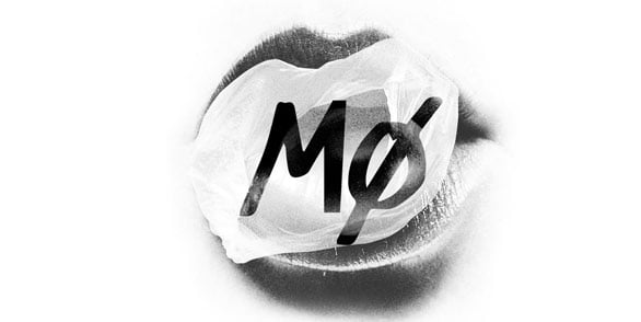
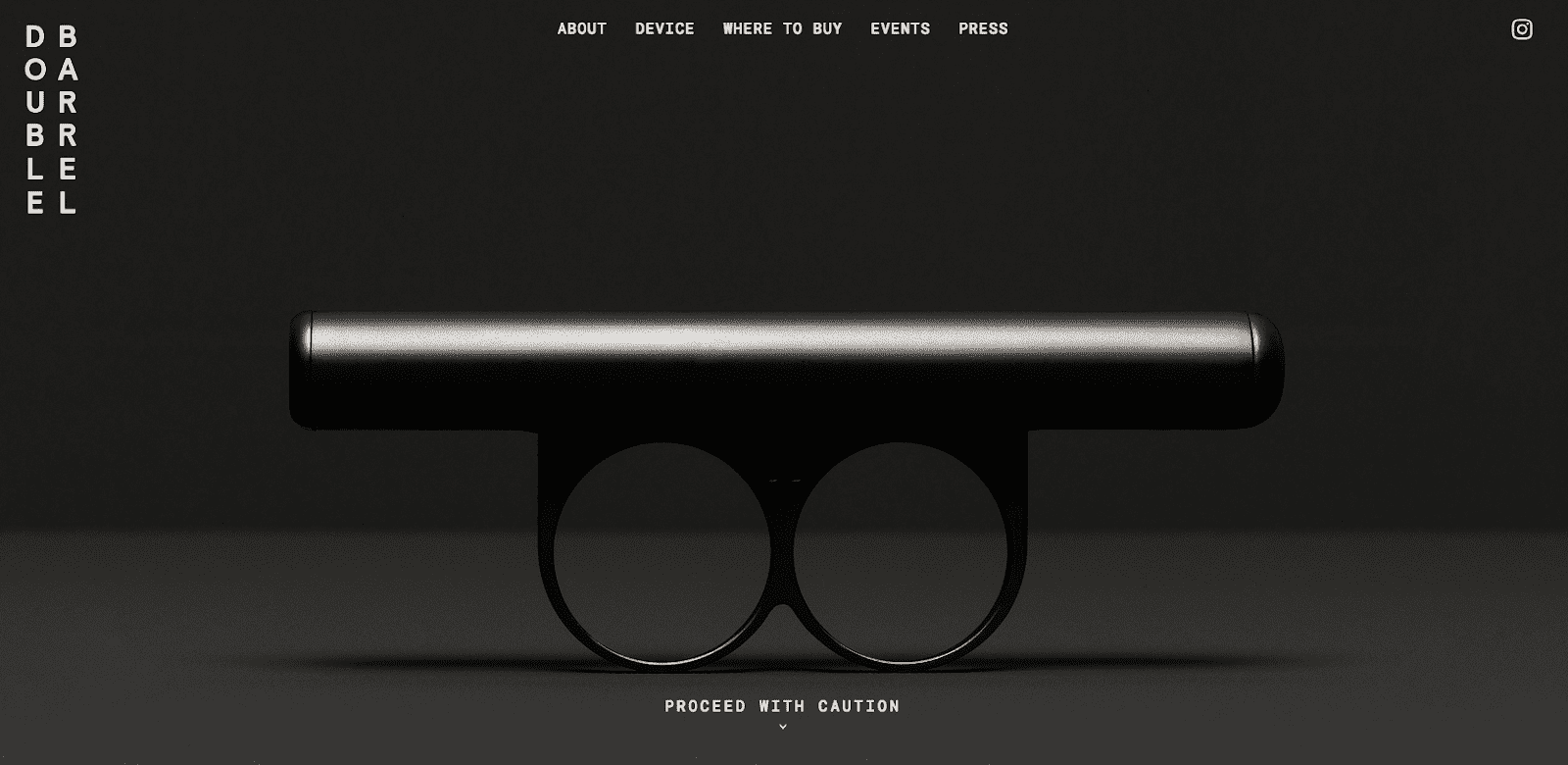
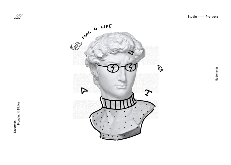
25 Powerful Black and White Design Examples












Wrapping Up
We can’t argue that different vibrant colors enhance the design. But this doesn’t mean that you can’t create a powerful impression by using only black and white. With the right application, the duality of black and white design is more than enough to leave a strong impression.
Not a fan of color? Share your thoughts in the comments below and tell us about your favorite examples of black-and-white design.
Do you like traditional and vintage-inspired designs but had enough of monochrome style? For our readers seeking to see captivating vintage colors rather than black and white, we compiled some great examples of vintage color palettes to inspire you.