10 Bad Examples of Typography (& What to Learn From Them)
Finding the perfect font pair, adjusting font spacing, creating contrast, and improving readability is a process that takes time and experience. Unfortunately, many choose to skip this process by randomly using fonts that just “look good”, which leads to disastrous typography designs.
Today, we take a look at some of those bad typography examples to see what we can learn from them.
Good typography design is crucial to the success of every design. And with these examples, you will be able to learn how to avoid making such costly mistakes in your design projects.
1. Overusing Fonts

(source: Reddit)
With so many different styles of fonts available at your fingertips and at affordable prices, it can be tempting to use a few of those in your design projects.
You could use one font for the titles, another one for sub-headings, another for paragraphs, and a completely different font for call to actions.
Or, you could be like Amazon and use multiple fonts in the same title.
What You Can Learn From This
Even if you’re designing something for children, using too many fonts is not a good approach to creating a typography design. It destroys the readability and the aesthetics of the overall design.
Find a good font pair and stick to it. And, if you have to, use one other font but don’t use more than 3 fonts in a design project.
2. Neglecting Readability

(Source: Fast Company)
One of the best examples of bad typography was seen at the Oscars 2017. A terribly designed card that was given to an announcer caused quite an embarrassing moment that will forever be remembered in history.
The culprit behind this mixup was poor readability. The winner of the award was not shown on the card with clear typography, which confused the announcer and caused quite a controversy.
What You Can Learn From This
Even the best and the most reputable designers make mistakes. In this case, the designers who worked on the Oscars might have lost quite a lot of business. However, the biggest lesson you should take from this is — Don’t neglect the importance of readability.
3. Inconsistent Typography

(Source: Awwwards)
The widely accepted standard in typography design is to create titles that are bigger than subheadings and paragraph text. It’s actually common knowledge. However, there are designers who still get this concept confused.
In this example, you can clearly see the difference between the heading and the subheading. The problem is the font size. The title is way bigger than the subheading and it will strain your eyes when changing focus between the two text blocks.
What You Can Learn From This
Creating consistent, easy-to-read typography is more important than designing unique-looking and stylish typography.
4. Terrible Font Pairing

(Source: Fontjoy)
Whether it’s a website, poster, flyer, or even a wedding invitation, you need to find the right font pair for the headings and paragraphs. These two fonts need to work harmoniously to offer better readability and a smooth user experience.
And if you want to know what happens when you choose the font pair randomly, just take a look at this example.
What You Can Learn From This
Disregarding the importance of correct font pairing can lead to terrible outcomes. It will ruin readability and negatively affect both the designer and the client’s reputation.
5. Misaligned Text
(Source: Awwwards)
You can’t simply place text blocks anywhere you want in a design. Even the most reputable and experienced designers follow basic guidelines to create good typography designs.
Those guidelines were not followed in this example. It almost seems like the designer did not care about readability at all and paid no attention to properly aligning the text blocks.
What You Can Learn From This
Text alignment is key to creating good and readable typography. It also helps organize and avoid chaotic-looking text (like you see in the example).
6. Low Contrast Text

(Source: Awwwards)
In most designs, you will need to highlight parts of the text, especially for creating call to actions. This is achieved by creating a clear contrast between the text elements.
But, not everyone gets this right. In this example, you can see what happens when you don’t consider the contrast between typography, background, and call to action elements.
What You Can Learn From This
Without contrast, text becomes much harder to read and it strongly affects readability. Use colors, font size, and font weights to create a clear contrast between elements and highlight text even better.
7. Letter-Spacing (Kerning) Issues

(Source: Reddit)
Kerning, or the spacing between the letter pairs is another important aspect to be mindful about when choosing fonts. Some fonts are intentionally designed with irregular kerning to create unique typography designs but they are not suitable for every project.
When kerning is not adjusted properly, it impacts readability and creates text that’s simply too hard to read and understand. This real-life example shows how much of an impact it can have on readability.
What You Can Learn From This
Designing good typography is more than just about great fonts and weights, there are many other important elements, like Kerning and tracking, that you need to be aware of when creating typography designs that work.
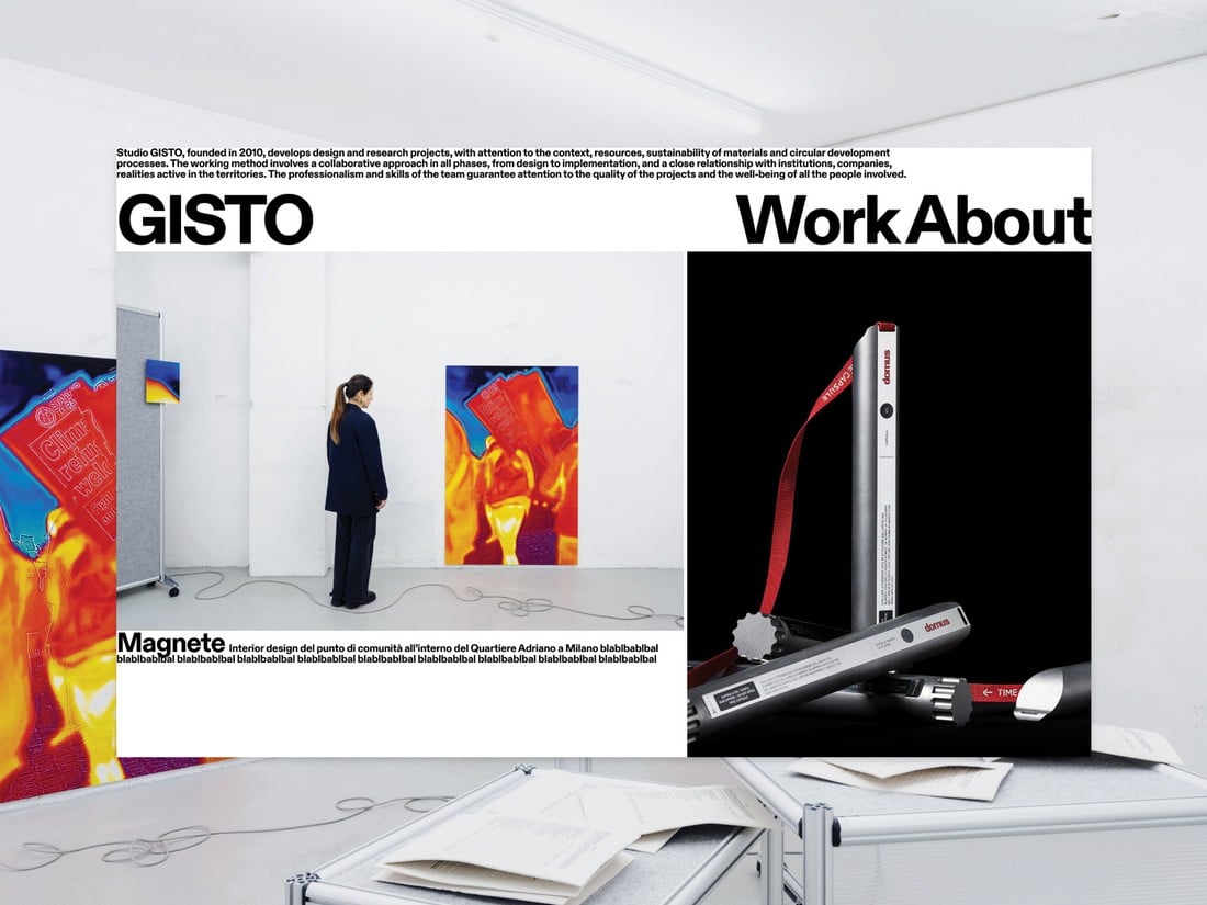
8. Messy Text Blocks

(Source: Awwwards)
Stuffing too much text into a single page can often create a messy, overcrowded look. Sure, it might make your design look unique, but it’s not for a good reason. This example is proof that stuffing too many text elements all across the design is even worse.
What You Can Learn From This
Use of proper alignment, layout, and font settings is a must for creating readable text. Don’t think your design project can be an exception.
9. Ignoring Context

(Source: Awwwards)
Using a playful font for a design about a serious topic will probably send the wrong message. Like this website for a school for cooks and beauticians.
What You Can Learn From This
Just because you’ve found a cool-looking font does not mean you can use it in every design. You also need to consider the purpose of the design, the target audience, and where it’s being used.
10. Compatibility Issues

(Source: Awwwards)
The text that you design for a desktop website may not look the same on mobile devices. Some fonts and typography designs will also have compatibility issues with different browsers.
This example shows what happens when you don’t consider these compatibility factors. This website not only has an animation effect that makes text difficult to read but it also turns the text into a vertical layout when viewing on mobile devices.
What You Can Learn From This
Always test for compatibility issues, especially when designing text and typography for websites and apps.
Conclusion
With the help of these lessons and examples, hopefully, you will be able to avoid making these same mistakes in the future.
Be sure to check out our Typography category to learn more about concepts, strategies, and techniques related to typography design.