Great looking political website design to inspire you
icleartRevolutionize your campaign with eye-catching political website design examples – discover the top sites for inspiration and success! From bold graphics to user-friendly navigation, find your winning strategy today.
Let’s dive in!
As digital marketing has grown, more and more companies are considering it for business expansion. The importance of such a strategy and marketing initiatives through a campaign website is also recognized by charities and non-profit organizations.
This post will be a great source of inspiration for anyone interested in politics or for political candidates trying to promote their political campaigns and increase their web presence. It will also be helpful if you are starting a politics blog.
This collection will introduce you to a range of political website design that may act as both an inspiration and a jumping-off point for your political website.
Field-First
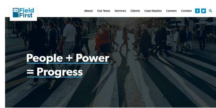
Progressive consulting company Field-First is dedicated to advancing movements, enacting laws, and winning elections. The homepage has a straightforward design, but the subtle motion it incorporates makes it seem endearing.
Labour
The center-left political party in the United Kingdom is called Labour. Its website design is impressive, with clear calls to action, a sticky menu, and a video background, among other things.
Jumaane Williams for New York
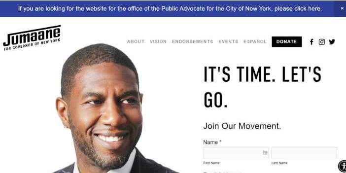
This is the webpage for a politician that ran for office in the Public Advocate race in a special election in April 2019. It is a cutting-edge website with a clean design that exemplifies what Jumaane is all about. Additionally, it has a strong call-to-action button that enables users to engage with the website.
Young Americans for Liberty
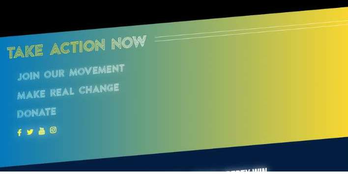
On American college campuses, this is the biggest, busiest, and fastest-growing pro-liberty non-profit. This website has a professional yet simple design. It features big headlines and clear CTAs.
Cheri Bustos
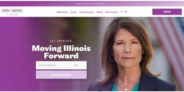
There are two opportunities to join Cheri Bustos’ email newsletter when you visit her website. Along with links to volunteer opportunities and voter registration, a link to “Priorities” reveals her position on many subjects. The site’s use of purple in its design sends a message of reliability.
Win the Era
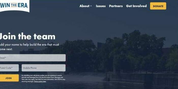
A community called Win the Era is committed to nurturing new political campaigns that unite people in favor of audacious, just, and long-lasting answers.
The political website is quite modern and organized. It contains a website with all the information you require about the neighborhood and allows user interaction.
LR3 Consulting & Public Relations
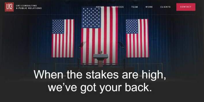
This organization provides public relations and political advice. The one-page layout of the website just incorporates the necessary web features. It makes advantage of a sticky header to keep the menu available.
Biden Harries
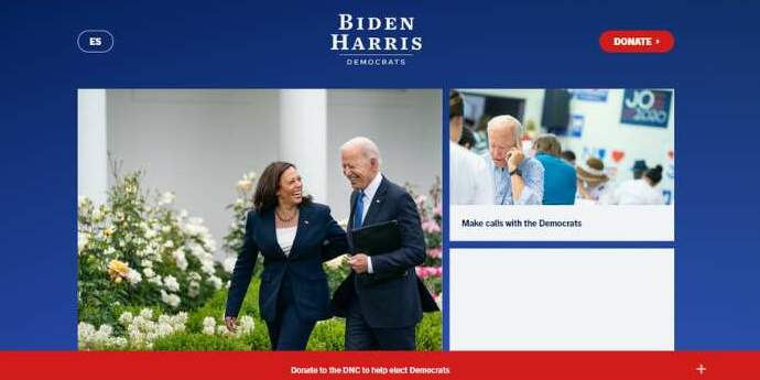
The website greets visitors with a vivid and vibrant design and a pleasing color palette. Its large, distinct headlines improve the appearance of the website. Other noteworthy features include video integration, sticky headers, compelling CTAs, etc.
I Know Politics
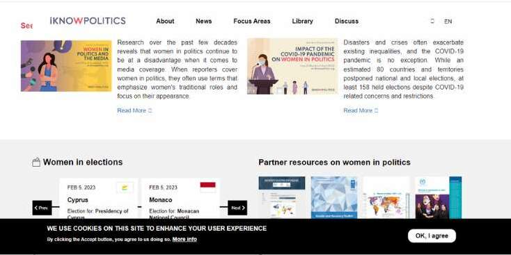
One of the top recent political websites to adore for inspiration is I Know Politics. Its objective is to promote women’s involvement and influence in politics. It has an eye-catching homepage, and the site components have a contemporary appearance.
Canine Companions for Independence
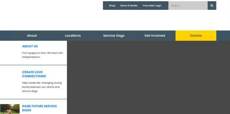
People with disabilities benefit from Canine Companies for Independence’s (CCI) highly trained assistance canines and continuing care.
You should try to direct the visitor’s eyes to a picture of your major emphasis in the same way that this non-profit website does with its homepage’s main appeal.
In this scenario, the major component of your hero image serves as your main cause and should be the center of attention.
Doug Jones
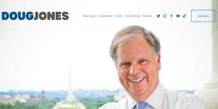
The political campaign website for Doug Jones was designed to encourage users to donate to the cause. It uses political hues like red and blue. He is portrayed on the website as being for people. All over the website, there are photographs of him interacting with voters.
Herschel Walker
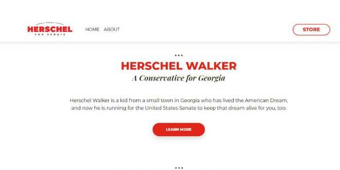
Herschel Walker is a politician who previously played professional football. The tagline “Run, Right, Win” on Herschel Walker’s political campaign website creates a personal connection to his past. Additionally, a sticky button on the website makes it simple to donate to his cause. Site visitors to political websites like the convenience!
Politico
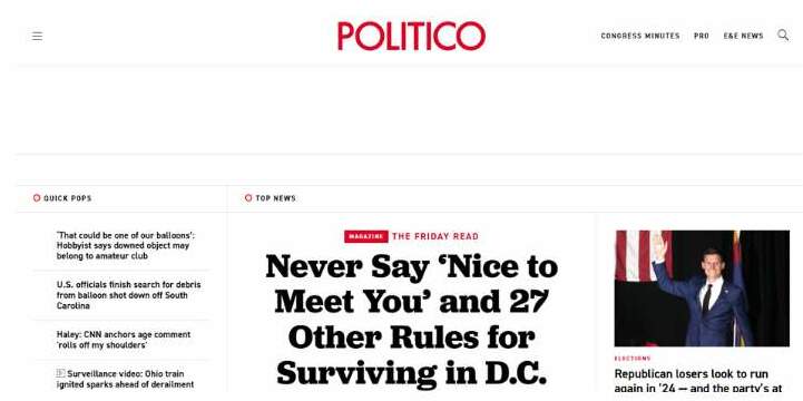
Politico is an American publication that offers political commentary and reports on international political campaigns and policies. The website has a seamless, clean, and elegant magazine layout. It stresses visual hierarchy and makes good use of geography.
PICCK
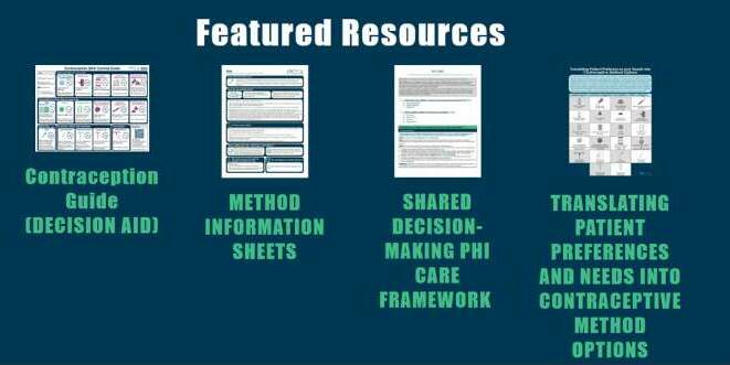
This program aims to inform caregivers of the advantages and disadvantages of the various contraceptive methods. They keep adding useful resources to their political website.
The attention is pulled to a person in PICCK’s hero image, the main text is emphasized, and a call-to-action button gains further prominence as the only clickable element that doesn’t need scrolling.
Sean Fraser
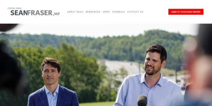
This website does a great job of relating Sean Fraser’s political campaigns to his private life on a human level. This is accomplished by using a large hero image with a link that leads to a biography page.
Women Political Leaders
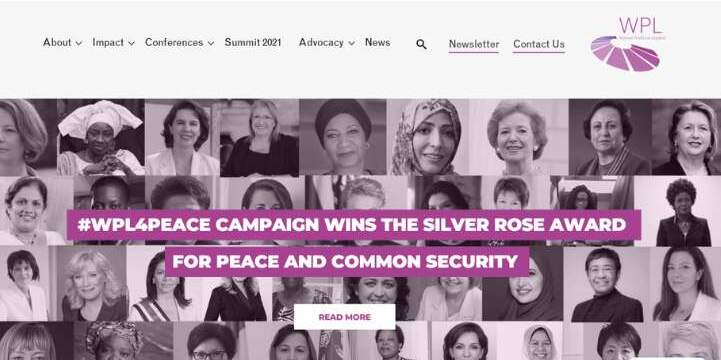
A global network of female politicians called Women Political Leaders was founded to increase the representation of women in political leadership roles.
The split-screen layout of the hero scene is shared by other significant areas of this network, including the news and conferences. They highlight a feminine vibe by using the color pink.
Voterly
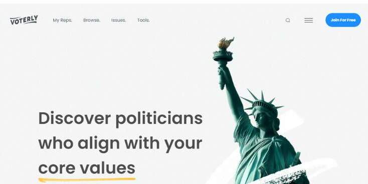
Voterly’s goal is to boost civic participation and voter turnout. It promotes political transparency by making political information available.
Users may simply locate the politicians they desire thanks to the search option in the header. The website displays presidential candidates using a card design approach.
Regarding the political websites in this article
This collection is intended to aid you in beginning your political website. We hope you learned from perusing this collection that, depending on the kind of political website you’re aiming to launch, will set your website apart.
The websites in this list are examples of how to effectively express who you are and the message you want to convey to create a successful website.
Your political campaign web design is crucial in helping you accomplish this aim by drawing visitors’ attention to your key messaging and the cause you are supporting. It’s also critical to remember that certain hues can instantly link you to certain political parties or causes.
To build a design that best reflects the unique purpose of your website, you must take into account the main distinctions among various types of political websites. Your political cause’s context will determine the kind of website you create.
Conclusion on political website design
The public face of your campaign is your political website. Your campaign can appear unprofessional and your cause can be called into question with a badly designed website.
A well-made political website, on the other hand, will include all the information people might need about your campaign, your positions on important topics, and how they can help.
It’s useful to have a collection of the top political websites to draw inspiration. The top Politics website designs are showcased in this article for your inspiration.
We sincerely hope that this post has been very helpful if you are looking for graphic design examples and inspiration to develop your next political website.
If you enjoyed reading this article about political websites, you should read these as well:
- Top SEO Benefits of Building a Responsive Website
- Benefits of Virtual Networking for Events
- Choosing The Right Colors And Fonts For Your Brand