What Is Tracking in Typography? + Tips & Examples
One of the key aspects of typography is ‘tracking’ (also known as letter spacing), a term often used interchangeably with kerning and leading, yet distinctly different.
Understanding tracking and how to use it effectively can elevate the quality of your text layouts and designs.
In this article, we will explore the concept of tracking in typography, providing insights, tips, and examples for its practical application.
Understanding Tracking
What is Tracking in Typography
Tracking, in typography, refers to the adjustment of the horizontal spacing between a range of letters or characters in a piece of text. It’s about altering the overall letter spacing uniformly, unlike kerning which adjusts the space between individual letter pairs.
The Purpose of Tracking
The primary purpose of tracking is to improve the readability and visual balance of a text. It can affect the density of the text, the texture of a paragraph, and even the mood and tone the text conveys. Effective tracking ensures that the text is neither too cramped nor too spread out.
When and How to Use Tracking
In Headlines and Titles
Tracking is often used in headlines, titles, or callouts to make them stand out. Increasing the tracking in larger text can create an elegant and premium feel. Conversely, reducing tracking can make the text appear bold and impactful.
In Body Text
For body text, good tracking is crucial for readability. Overly tight tracking can make text feel cluttered and difficult to read, while too loose tracking can make the text appear disjointed.
Tracking vs. Kerning vs. Leading
Many designers often confuse these three terms. It’s important to have a clear understanding of them.
Tracking vs. Kerning
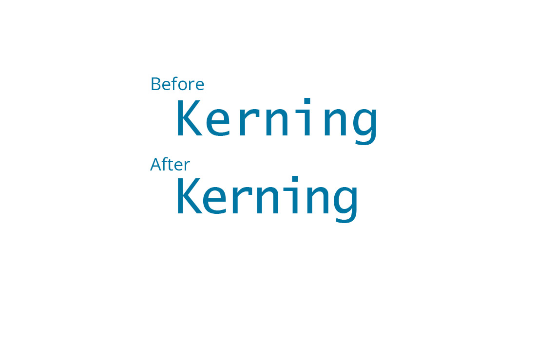
While tracking adjusts the spacing uniformly across a range of characters, kerning is the process of adjusting the space between individual pairs of letters. Kerning is crucial for correcting spacing issues between specific letter combinations.
Tracking vs. Leading

Leading refers to the vertical space between lines of text. Adjusting the leading can impact the readability, particularly in multi-line or paragraph text settings.
Examples of Tracking in Typography
1. Magazine Headlines

In magazine layouts, headlines often have increased tracking to grab attention and convey elegance or sophistication.
2. Movie Posters

Movie posters frequently use tight tracking in titles to create impact and drama, making the text bold and prominent.
3. Instructional Texts

In instructional materials, body text typically has standard tracking to ensure clarity and ease of reading.
4. Logo Design
Many logos adjust tracking to achieve a unique brand look. For instance, tight tracking can make a logo appear strong and cohesive, while increased tracking can give a more airy and premium feel.
Tips for Effective Tracking in Typography
1. Understand Your Typeface
Every typeface has its unique characteristics. Some fonts, especially decorative or script fonts, might require more generous tracking to maintain legibility. In contrast, more conventional fonts like sans-serif might look better with tighter tracking. Familiarize yourself with the typeface’s design to make informed tracking adjustments.
2. Context Matters
The context in which the text is presented plays a significant role in determining appropriate tracking. For formal documents, a more conservative approach to tracking might be suitable. In contrast, creative and display texts such as titles, headings, or logos may allow for more creative liberty with wider tracking.
3. Keep an Eye on Readability
The ultimate goal of tracking is to facilitate readability. It’s essential to preview your text in its intended size and on its final medium, whether print or digital. Ensure that the spacing neither hinders nor distracts from the ease of reading, especially for longer passages.
4. Balance with Other Typographic Elements
Tracking should be considered alongside kerning and leading. These elements collectively influence the text’s appearance and readability. Find a harmonious balance where none of these elements overpower the others.
5. Consider the Length of the Text
For longer bodies of text, tight tracking can make the content feel dense and overwhelming. On the other hand, headlines or short phrases can often benefit from tighter tracking to create a sense of cohesion and emphasis.
6. Audience and Purpose
Tailor your tracking decisions based on your audience and the purpose of your text. Text aimed at children or older adults may require clearer, more spaced-out typography. Similarly, educational or instructional materials should prioritize legibility over stylistic flair.
7. Test on Various Devices and Mediums
With the increasing consumption of digital content across different devices, it’s crucial to test how your tracking adjustments appear on various screens, like smartphones, tablets, and desktop computers.
8. Experiment with Different Levels
Don’t be afraid to experiment with different levels of tracking. Sometimes subtle changes can have a significant impact on the design’s effectiveness. Especially in creative projects, testing different tracking settings can lead to discovering visually engaging layouts.
9. Use Tracking to Create Mood or Tone
Tracking can be used to convey a certain mood or tone. Wider tracking can evoke a feeling of luxury or sophistication, whereas tighter tracking can convey urgency or importance.
10. Align Tracking with Overall Design Concept
Ensure that your tracking choices align with the overall design concept and visual hierarchy of the piece. Consistent use of tracking throughout a project contributes to a cohesive and well-thought-out design.
Conclusion
Tracking is a subtle yet powerful tool in typography that, when used correctly, can greatly enhance the effectiveness and aesthetic quality of your textual content.
Whether you’re designing a poster, a web page, or a corporate report, understanding and applying tracking principles can significantly improve the legibility and visual appeal of your work.
By experimenting with different levels of tracking and observing its impact, you can develop a keen eye for typographic excellence.