Inspiring Examples of Brand-Related Splash Screens in Web Design
You never get a second chance to make a first impression. In the real world, some workarounds may fix the situation and help you make a better general impression, but in the digital world, your prospects are poor.
In most cases, if your website fails to produce a good impression at the outset, people will turn around and never come back. So whatever you are planning for your web presence, it’s vital to take care of the very first seconds of the user experience. It is here that the concept of splash screens comes to the rescue.
A splash screen can assist in various matters, not just in making the first impression pleasant. It can save your audience from the frustration that comes from long loading sequences by replacing those annoying spinners with something more captivating. It can drum up interest and make a dramatic entrance, and it can strengthen the overall branding. The latter is a tiny design trend these days.
Today, we share some prime examples of websites that make use of splash screens highly effectively.

Digital Present
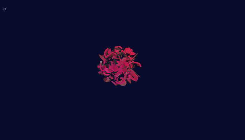
Just take a look at Digital Present. Their creative team has designed an exciting hero area powered by high-end technologies and a splash screen that catalyzes creativity and engages users from the outset.
The introductory animation features a 3D version of their logo that breaks into small pieces and, in this way, reveals the homepage. It gradually flows into the hero area, becoming an integral part of the canvas.
Note, it is not just a separate piece of the website that serves as a preamble. It is an action that creates consistency, entertains visitors, and reinforces the brand identity.
Giacomo Mottin
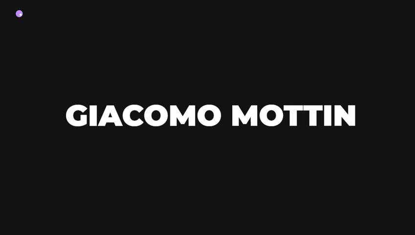
Here, the website opens with a small introduction that tells us about the artist – literally. Two phrases reveal his name and occupation. The solution is simple; I would even say primitive. Nevertheless, it does its job perfectly well. It creates proper anticipation for the content while sticking to a serious, businesslike tone.
Kanarys
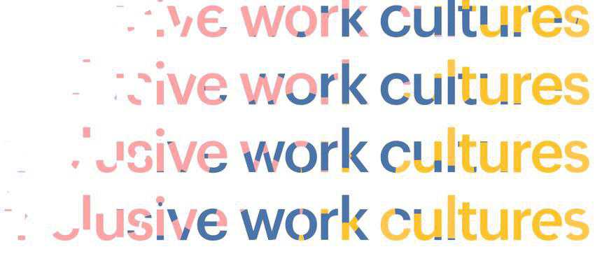
In the previous example, you do not have time to view each frame since everything happens quickly. With this website, you’re welcome to read all of the phrases slowly. The design team behind Kanarys bets on one small sentence: “Inclusive work cultures.” They have duplicated and enlarged it to fill the entire screen.
The key factor of the solution is, of course, animation. They play with color and masking to enrich the routine. It also echoes those elements in the hero area, highlighting the overall brand message.
Corsaires
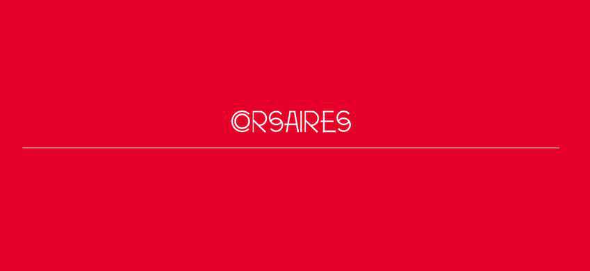
Unlike the two previously-mentioned examples, the creative team of Corsaires prefers to take a more traditional route, which certainly has its own merits. They get straight to the point, showing the name of the agency straight away.
It has been created using the same typeface as the logo so to give a sense of harmony. The solution gets its beauty from the elegant line style typography that allows for a stately and graceful revealing of their name.
Eleven Mirrors
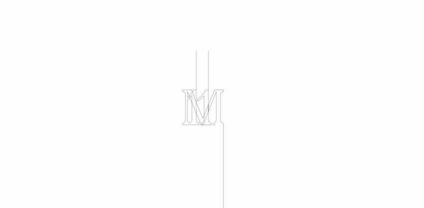
Eleven Mirrors is another website where the splash screen establishes the proper tone from the get-go, thereby strengthening the website’s consistency. The idea is simple yet intelligent.
It shows a small animation that gradually reveals the initials of their name. The subtle line style text adds a hint of sophistication and elegance, whereas a significant amount of whitespace contributes to the businesslike atmosphere.
Alfa Charlie
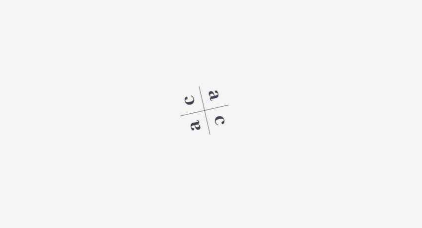
The team behind the portfolio of Alfa Charlie has taken the regular loading spinner to the next level. Instead of using dots that run in a circle, they have skillfully used a compact badge-styled version of their logotype.
The latter can be seen in the hero area, main menu, and transition animations that follow the shifting between the pages. The idea may be seen as a little primitive, but in this case, it maintains the user’s focus on the center of the page, strengthens the brand identity, and improves the structure of the website. Isn’t it brilliant?
Stand Proud
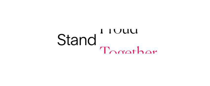
The splash screen of Stand Proud uses a small type-based sequence. Their design team playfully plays with the messaging. They have made the word “Stand” the central detail and altered the second word, changing among “Together,” “Proud,” “Loud,” and “Equal” – thereby forming eye-catching taglines.
In this way, the team supports the goal of the website and hints about the content inside, naturally igniting interest.
VLNC Studio
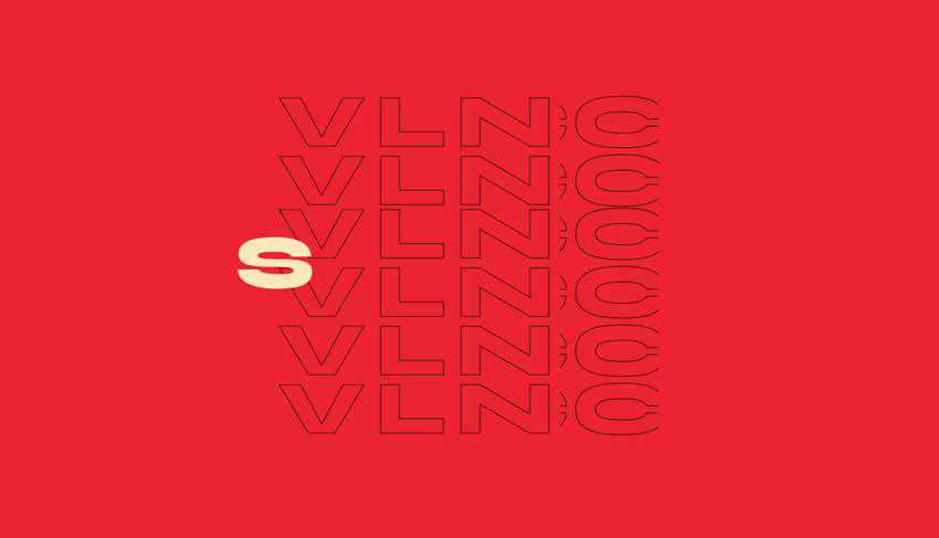
The VLNC Studio team goes for a brief splash screen that blinks before your eyes. It is a relatively short sequence that shows the letters of their name, one by one. They use the same curtain effect on the website and stick to the same typeface and coloring, making it an integral part of the brand.
Make the Right Impression
Brand-related splash screens help introduce the company and elicit trust from the very first moment of the user’s presence on a website. You can go for traditional spinner-based solutions, always popular type-based animations, or even advanced 3D experiments powered by pioneering technologies.
Although, remember not to overdo it. Splash screens last just a few seconds and should help to build anticipation of the appearance of your website. It should support the brand identity, help maintain consistency, and pre-blow the minds of your users, making them want more.