A Tribute to Stranger Things Logo, Theme, and Artworks

Early 1980s, we are in Hawkins, Indiana trying to solve the mystery of the Upside Down. Who could ever watch Stranger Things and not fantasize about being a part of that nerdy gang, right?

This nostalgic, binge-worthy sci-fi series surely was something special. Primarily inspired by the classic 80s horror movies, Stranger Things revived a lot of memories, especially for Stephen Spielberg and Stephen King fans. The show goes deeper in many pop-culture elements and makes fans of A Nightmare on Elm Street and The Ghost Busters appreciate it even more if that’s even possible.

Some members of the gang might seem a little less interested in playing Dungeons & Dragons towards the end of the show because of the hormones however Stranger Things was also a geek haven for D&D fans especially in the first season.

Beyond all this, if there is one stylistically recognizable feature of Stranger Things, it’s the logo. Glowing red letters floating in the darkness as the frame zooms out, and all combined with the spooky theme at the end, Stranger Things!
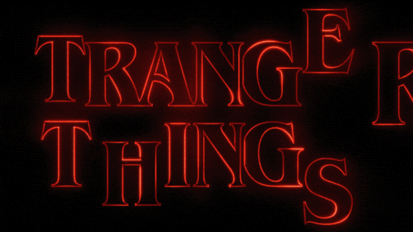
Beyond doubt, it is one of the most iconic TV series logos of all time. More than recognizable in fact some fans even argue that aesthetically the 80s themed title sequence symbolizes the hive-mind concept and the collectivism theme in the show.
Dissecting the Stranger Things Logo
The history of the Stranger Things logo dates back to the 1970s. The font was designed by an American type designer and calligrapher, Ed Benguiat, and released by the International Typeface Corporation (ITC) in 1977. It is widely used in popular culture and was specifically chosen by Imaginary Forces, a creative studio whom Duffer Brothers work with.
If you are wondering why this font looks so familiar, it’s because ITC Benguiat is used on the covers of Stephen King novels published in the 1980s. That is exactly why it was chosen to be the font of the Stranger Things logo.

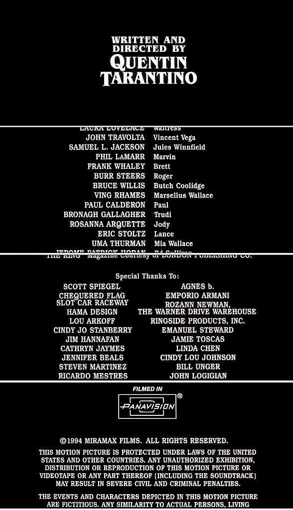
One last fun fact is that it is also used by Quentin Tarantino for the opening and end credits of his movies
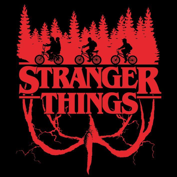
Without further ado, we like to share some of the best Stranger Things logo variations and artworks that will take you deeper into the darkness.
Stranger Things Logo and Artworks


Conclusion
These were some of our favorite Stranger Things logo variations and artworks that make us feel like we are wandering in the unknowns of the Upside Down. Tell us in the comment section, if it weren’t for this epic logo, would Stranger Things give us the chills it usually did when we see a glowing, red neon billboard at night.