10 Famously Bad Examples of Design (& What to Learn From Them)
Even some of the world’s biggest brands and most reputable designers make mistakes. Today, we take a look at some of the famously bad design examples to see what you can learn from them.
They say you should try to learn from your mistakes. But, do you know what’s even better? To learn from other people’s mistakes! And that’s exactly what we’re about to do.
In this list, we showcase some of the popular examples of bad graphic design and web design examples to help you learn from the mistakes that made the world cringe.
1. London 2012 Olympic Games Logo
The London 2012 Olympics logo was one of the most criticized designs ever made. This logo was supposed to form “2012” but at first glance it seemed like lots of different things to people around the world.
Some only saw a bunch of shapes scattered around while others saw swastikas and sexual acts. Iranian government threatened to boycott the Olympic games as they saw the word “Zion” in the logo.
Even the UK citizens weren’t happy about the logo and launched a petition asking to change the logo, which received nearly 50k votes.
What You Can Learn From It
The designers were trying to represent the cool and trendy side of London city through this logo design. But by trying to make it look too radical, they failed to achieve that goal.
While your ideas may be creative and interesting, other people may not see it the same way. Always seek feedback on your designs.
2. Gap Logo
Gap is an iconic brand in America that maintained a solid reputation throughout many decades. The Gap logo played a big role in the brand’s success. The logo is instantly recognized by people around the world.
In 2010, the company decided to replace it with a “more contemporary, modern” logo design, and it instantly backfired. People were unhappy about this new logo and demanded it to be changed. And it cost the company around $100 million dollars.
The new logo only lasted about two weeks before the company reverted back to the old design.
What You Can Learn From It
Changing an already perfect logo design just for the sake of it is always a bad idea. The new Gap logo was too simplistic and generic. Instead of a complete revamp, a subtle refresh is the most suitable approach for improving iconic logo designs.
3. X (formerly Twitter) Logo
After acquiring Twitter in 2022, Elon Musk made some controversial changes to the company. The most criticized one of them all was changing the iconic Twitter bird logo to a bland letter “X”.
This new X logo went through multiple changes within just a few days. It was apparent Elon Musk couldn’t decide on the design for the X logo. After changing the Twitter logo to X he introduced a new version and immediately reverted to the first X logo. And then introduced another new logo again.
Later, Musk announced that the logo would “evolve over time”.
What You Can Learn From It
This happens when you neglect to get proper feedback on your designs and take time to carefully examine the applications of a logo design in different situations. Changing an already iconic logo is always a challenge. Rushing through it is the biggest mistake.
4. Arlington Pediatric Center Logo
When it comes to logo design, perspective is everything. The designer often sees what they want to see in their design, while the audience sees something entirely different. This is a good example of that.
The logo for the Arlington Pediatric Center in the US became a meme on the Internet for obvious reasons. After being ridiculed for the creepy logo, the company created a different logo and it wasn’t an improvement either.
What You Can Learn From It
As we mentioned earlier, it’s always best to get feedback from different sets of eyes on your designs before presenting them to clients. It’s the easiest way to avoid embarrassing designs and jeopardizing your reputation.
5. Ready Player One Movie Poster

Photoshop fails in movie posters are fairly common these days. Even the biggest Hollywood movies end up having terrible posters that get ridiculed on the Internet. The poster for the Steven Spielberg movie, Ready Player One was one of the popular examples that caused quite a controversy.
Dubbed as the long-leg poster, this seemingly Photoshop fail is apparently not a fail at all. Several experts reacted to this poster saying that the character in the poster is accurate and in proportion.
What You Can Learn From It
This is another great example that shows the importance of perspective. Also, keep in mind that if you need experts to defend your design, it’s not a good design at all.
6. X-Men: First Class Movie Posters
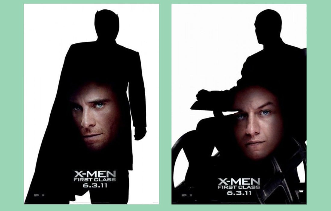
The character posters for the Marvel movie X-Men: First Class were laughably bad that they became a meme of bad design.
These are still recognized as some of the worst and most poorly designed movie posters of all time. We’re not sure who approved these posters to be released publicly and hope they still have a job.
What You Can Learn From It
The most important lesson to learn from this is that learning Photoshop by watching a couple of tutorials on YouTube does not make you a professional designer.
7. Craigslist
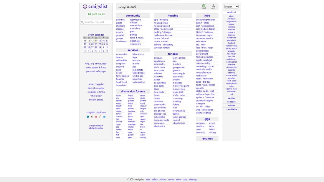
Craigslist is one of the handful of multi-billion-dollar companies with a website that hasn’t changed over two decades. And it always comes on top of every bad website design list. It has the same design and layout as its original version, which was launched back in 1997.
When asked about this, its founder Craig Newmark says that this old-school design “serves people better” because it’s “simple and fast and gets the job done.”
What You Can Learn From It
Simple and effective design just works! Although, despite what the founder says, we feel this site could use a revamp, very soon.
8. Yale School of Art
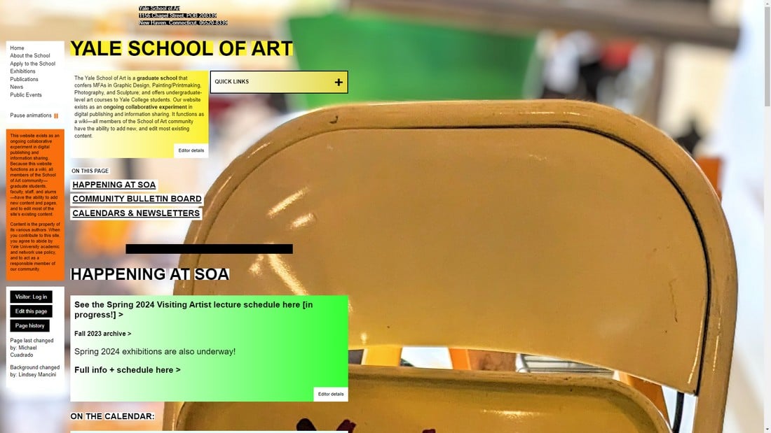
This is not a screenshot of a website from 1999. This is the official website for the Yale School of Art in 2024.
According to the website, this “ website exists as an ongoing collaborative experiment in digital publishing and information sharing.” So, maybe this website design is also an experiment?
What You Can Learn From It
Having a degree in art does not make you a good web designer! Jokes aside we’re baffled by this website design and not sure if this is considered modern art or if it has been hacked by someone and no one has volunteered to fix it.
9. Hacker News
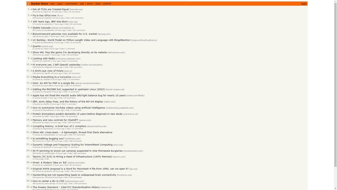
Hacker News is another bad website design that never received a refresh since its initial launch. Despite being one of the most popular news aggregator websites, the site has terrible readability and looks even worse on high-resolution screens.
Similar to Craigslist, Hacker News also seems to follow the “if it ain’t broke, don’t fix it” methodology.
What You Can Learn From It
Readability is one of the most important features of a website that you should always prioritize, even when the site insists on having an outdated design.
10. Berkshire Hathaway
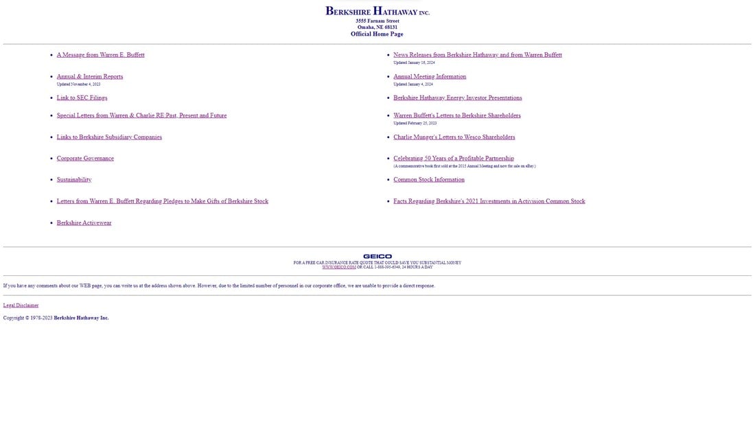
The American multinational conglomerate, Berkshire Hathaway is nearing $1 trillion market value, yet its website has remained the same since the early 1990s.
At the bottom of the website, they encourage users to leave feedback by saying “If you have any comments about our WEB page, you can write us at the address shown above” but it’s not even an email address, it’s a physical address.
What You Can Learn From It
Some designers think this website serves its target audience better, the audience being investors. One blog post tried to justify this website design saying it’s “a masterclass in human-centered design”.
However, the Hacker News developer community strongly disagreed with this post and explained all the bad design elements of the Berkshire Hathaway website in detail. We encourage you to read through this thread. There’s plenty to learn.
Conclusion
This showcase of bad examples of design is not just about having a good laugh, but it’s about learning to avoid mistakes. And it’s a lesson that shows even the most reputable design agencies get things wrong sometimes. We hope you’ll consider those lessons in your next project.