Write Better CSS By Borrowing Ideas From JavaScript Functions
I like to think of writing CSS, like writing functions that describe how your layouts respond to change. When we forget the principles of writing a good function, here’s some of what can happen:
- We lose time.
When we have to worry about side effects, changes take longer. - We create bugs.
My favorite example is an online store where the “Buy” buttons were hidden due to misuse of viewport units. - We build fewer features.
When changes are scary and time-consuming, they often don’t happen.
Let’s look at how we can borrow best practices and ideas from writing good JavaScript functions for writing CSS that is easy to use, free from unwanted side effects, and resilient to change.
Avoiding Unwanted Side EffectsWhen you change something in your system, it shouldn’t change something else by surprise. That’s as true for CSS as it is for JavaScript functions.
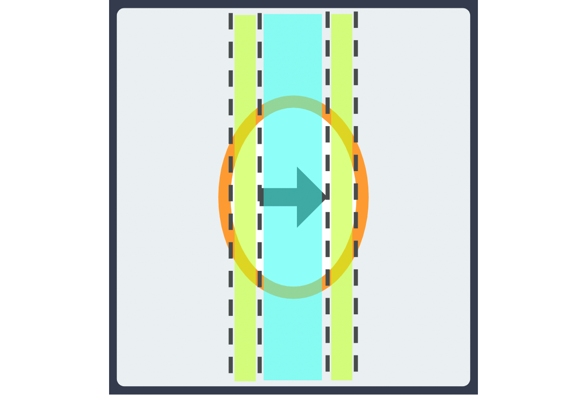
Let’s look at this arrow icon in a circle as an example:
It looks fine, but let’s say we want a narrower arrow icon:
Now the containing circle is squished! This is an example of an unwanted side effect. Using a narrower arrow ruins the shape of the circle.
If we inspect the element in DevTools, we can see that the shape of the containing circle depends on the size of the inner icon and the padding around the icon.
Ideally, the interior icon shouldn’t change the shape of the containing circle. Here’s a demo of how to fix the squished icon:

The CSS sets max-width: 900px on the container, and each card gets a little breathing room with padding: 5vw. This may look fine on the surface, but there’s a problem: the container has an upper bound while the padding doesn’t. As the screen gets wider, the content gets crushed.
See the Pen Example of padding crushing content [forked] by Yaphi.
Possible solutions include:
- Using viewport or container breakpoints to keep the padding under control,
- Using the CSS
min()function to set an upper bound on the padding, or - Using fixed units, such as pixels, that won’t grow indefinitely with the window.
What these solutions have in common is that they account for what happens when the viewport width changes. Similarly, we can avoid many CSS problems by considering the layout as output and anticipating what could happen when the inputs change.
Ahmad Shadeed has a great name for this technique: Defensive CSS. The idea is that we can “future-proof” styles by thinking about them as inputs that output a UI and anticipating situations that would diminish the output’s usability.
ConclusionCoding a layout isn’t about laying things out on a page but describing how they respond to change. For that reason, it’s risky to treat CSS like constants rather than functions.
Fortunately, the same ideas that help us write good functions can help us write good CSS, namely:
- Avoid unwanted side effects.
- Use the right parameters.
- Consider how inputs change outputs.
What ties these ideas together is a question I hope you’ll ask yourself the next time you write CSS, How should this layout respond to change?
Further Reading On SmashingMag
- How To Create Dynamic Donut Charts With TailwindCSS And React, Paul Scanlon
- How To Build A Magazine Layout With CSS Grid Areas, Jennifer Brehm
- Level Up Your CSS Skills With The :has() Selector, Stephanie Eckles
- Lesser-Known And Underused CSS Features In 2022, Adrian Bece