30 Creative Examples of Symmetry in Logo Design
A great example of a logo using symmetry is McDonalds with its golden arches. When symmetry is used in logo design, it’s a powerful way of shaping the image and perception that the target audience will have of the brand in question.
Put simply, a symmetrical logo is a logo in which the left side is identical with the right. However, there are different levels of symmetry used in logo design in order to communicate certain ideas and meanings. For example, Target and British Petroleum both use rotational symmetry in their logo.
Symmetrical logos are often associated with balance, craftsmanship, and engineering so it’s no wonder that car companies such as Volkswagen or Honda rely on symmetry in their logo to emphasize these messages in their marketing.
Interestingly enough, you can also use asymmetrical design to achieve logo symmetry. The best example of this is the Nintendo Switch logo which doesn’t use symmetry at all. This goes to show that while symmetry matters, there’s more to good logo design than symmetry.
In this roundup, we’ll take a look at some of the best symmetrical logo design samples from across the web. Use them as an inspiration to create your own symmetrical logo.
You might also like to check out our showcase of Beautiful & Elegant Logo Monograms, Corporate Logo Redesigns That Work or Flat Logo Designs.
Nowhere Together Symmetrical Logo by Gert van Duinen
Geometric Logo by Pixasquare
Lined Lion by Breno Bitencourt
Line Badges by Adrian Pelletier
Macau Innovation Culture Association Logo by Tramy Lui
Geometric Pizza Logo by Last Spark
Allways Macrame Logo by Breno Bitencourt
Minimal Geometric Logo Collection by Eightonesix Studios
JR logo by Jennifer Reeves
Geometric Letter G Logo by Empativo
Unused Hand Mark by Damian Orellana
Logo Circle Trinity Geometric Linear Style by Sentavio
Bumble Burgh Events Co. Logo by Viola Hill Studio
Hexagon Mandala Logo Template by 83Oranges
Kraeftens Bekaempelse Logo by Plan Design
Abstract Polygon Color Gradient Logo by Ivan Artnivora
Mini Mandala Badge by Jantine Zandbergen
Abstract Lion King Logo by Ivan Artnivora
Cherry Blossom Healing Arts Logo by Studio Antheia
Hearts Flower! by Nour Oumousse
Ice Cold Brewery Logo by Supamario

Sun Glyph Logo by Blancetnoire

Interior Anthology Logo by Design Buddy
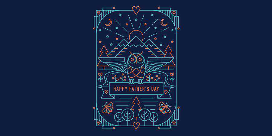
Symmetrical Owl by Amber O’Brien
SpadeDealer Logo by Julius Seniunas
Owl Sound Logo by Shtef Sokolovich
Shop Wise Logo by Yoon Design
Muhtarov Logo by Ru Ferret
Henland Logo by Ru Ferret
Capricorn Bakery Logo by Shtef Sokolovich
SN/Sonar Logo by Sumesh
AA Monogram by Vlado Paunović
Symmetry is the fundamental part of nature and it makes everything more pleasant to look at. As such, it’s no wonder that symmetrical logos are extremely popular. Not only are symmetrical logos more pleasant to look at, but they are also easier to design when you think about the basic design principles.