Fonts similar to Gill Sans that you need to try
One of the best-known humanist sans serifs Gill Sans was named after its designer Eric Gill. In 1926, Gill tried to commercialize the work Edward Johnston did on the London Underground signs. His product is a modern sans serif with a classic feeling. If you can’t remember how it looks, think of the Penguin Book covers and their minimal design.
Uppercase letters were inspired by Roman capitals. On the other hand, lowercase letters are more traditional and old-style. That being said, Gill Sans is nothing like its contemporary geometric sans serifs, but rather a category of its own with improved quality. The font doesn’t feature Futura’s simple circles and squares, Helvetica’s clean and industrial looks, nor Univers’s 19th-century lettering.
If you like what you read so far, we compiled a list of humanist fonts similar to Gill Sans which you can use to create quality designs.
Fonts similar to Gill Sans
P22 Underground
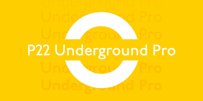
P22 Underground also used Johnston’s famous Underground font for inspiration. It was designed in 1916 and it had a very unusual collection of titling versions and petite caps for its age. Another important perk is the variety of weights to work with.
ITC Johnston
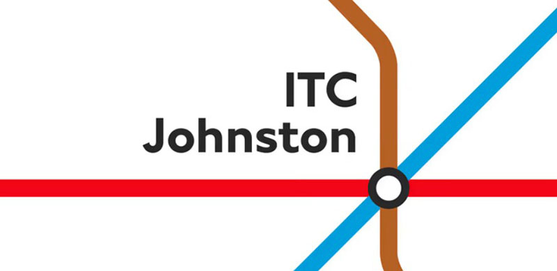
ITC Johnston is the actual font Edward Johnston designed for the London Underground Railway in 1916. It is best known for its diamond-shaped dots on the letters ‘I’ and ‘j’.
Tschichold
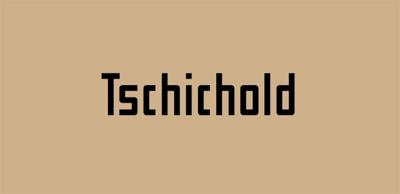
Tschichold was also named after its designer Han Tschichold. It was the main operating typeface of the pioneer photo-typesetting machine Uhertype. Looking at this 1925 Gill Sans alternative, you can easily notice how influenced its designer was by the work of Eric Gill. Whatever his reasons were, he practically created a more modern humanist Gill Sans patented by Uhertype.
Prenton RP
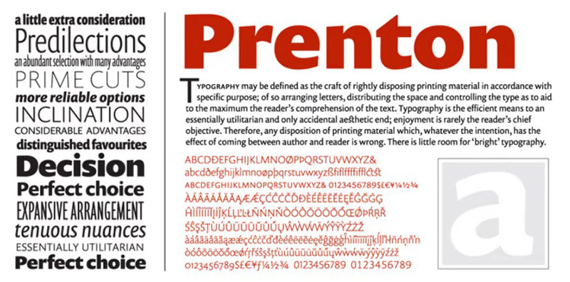
This elegant Gill Sans alternative has won multiple awards for its visual identity. Since it offers even 21 weights, this meticulous sans serif should be applied foremost in intricate and playful text settings.
Roy Preston thought of everything: petite caps, ligatures, figure sets, and fraction styles. They are all packed in ten professional OpenType Pro packages. To make matters even better, there is a Condensed and an Ultra Condensed version for each package. You will for sure find at least one you can use to create complex typographic layouts.
Mallory
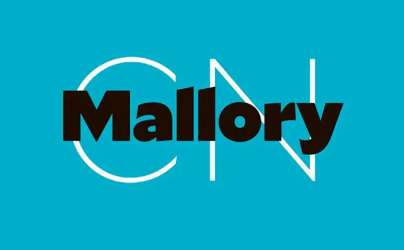
Mallory is the first independent sans serif created by Tobias Frere-Jones. For the purpose of this design, brought together the best features of American and British typefaces. Astonishingly, this font is modern and gothic at the same time.
Next to its eight weights and italics, Mallory also offers a MicroPlus optical size. This is a very handy feature for those designing low-resolution screens.
Mundo Sans
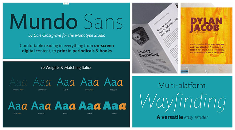
Mundo Sans designers left nothing to chance. Their compact suite of seven weights and matching italics for all of them offer solutions for every designer out there. The weights vary from extra light and delicate to forthright and robust. The italics, on the other hand, come with calligraphic overtones and beautiful cursive forms. Check the graceful and curvy baseline of its ‘z’ character or its ‘s’ downstroke – you will soon discover this is not a traditional sans serif.
Gerbera
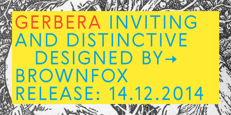
Gerbera’s terminals remind us of Gill Sans, but this font features more geometric than humanist letterforms. Russian designers Gayanesh Bagdasaryan and Vyacheslav Kirilenko presented this five-weight-font in 2014. Unfortunately, italics are not available.
ITC Adderville
ITC Adderville probably has the strongest visual impact of all fonts similar to Gill Sans. The designer shared his tricks: the strokes have skewed baseline contact and rounded ends, so when you look at them, they remind you of dancing feet. The lowercase stems are more related to their serif buds, but only as much as to suggest where this font stems from. Last but not least, there are many unique elements such as stroke terminators, bold dots, and a stylish reticulated lowercase ‘g’. Thanks to them, this font is way more playful than any of its competitors.
FF Yoga Sans
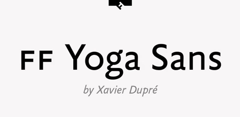
Yoga Sans was released through FontFont in 2009. Designer Xavier Dupré worked out four compact weights (Regular, Bold, Italic, and Bold Italic). They can all work miracles in the packaging and advertising world, but also on books, logos, and creative web designs.
FF Yoga Sans brings value also because of its quality typographical support. You can even use alternate symbols, subscript characters, fractions, and case-sensitive forms.
Brandon Grotesque
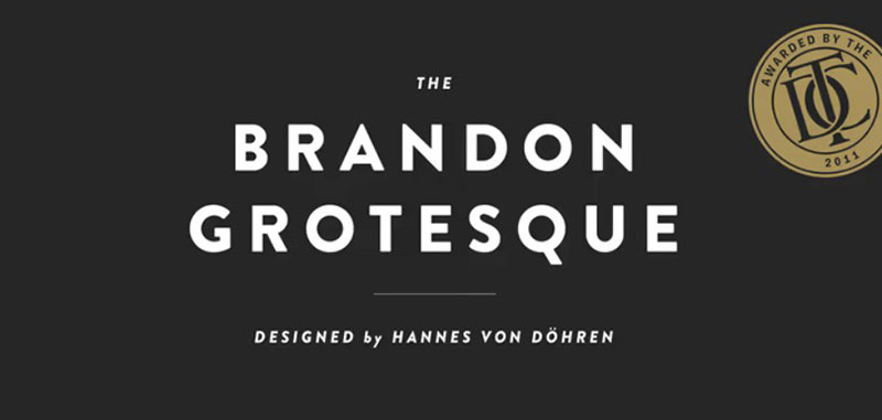
Hannes von Döhren’s Brandon Grotesque is another Gill Sans alternative that deserves your attention. It differs from Gill Sans in one crucial aspect: its geometric skeleton typical for the 1920s. That being said, each of its six weights may be more legible than Gill Sans, so please compare them carefully.
Despite its geometric skeleton, Brandon Grotesque has a warm and friendly touch. It is both functional and appealing, and well suited for long texts in elegant settings.
Agenda
Agenda is a contemporary sans serif inspired by Edward Johnston’s humanist features. Its italics are so progressive that you can use them as main individual styles. When you bring all variants together, Greg Thompson’s Agenda lets you work with even fifty-two different styles and versions. Get creative!
Bliss
Despite being a subtle and humanist sans, Bliss is capable of highly complex typography. It is also very legible, which makes it perfect for any type of corporate design. Better yet – Cyrillic and Greek scripts are also included.
Mr. Eaves
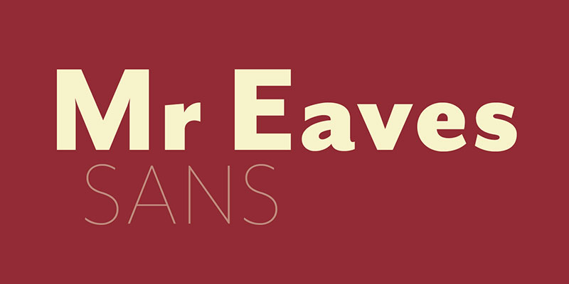
Mr. Eaves is yet another Émigré classic that closed the versatility gaps of its predecessor Mrs. Eaves. Designer Zuzana Licko didn’t stop there: she also presented two additional font families: Mr. Eaves Modern and Mr. Eaves Sans.
Compared to Mrs. Eaves, Mr. Eaves is more playful and creative. It cut off many of the serifs available in Mrs. Eaves, but it kept its color and weight armature, which means you won’t miss anything while using it.
FF Kievit
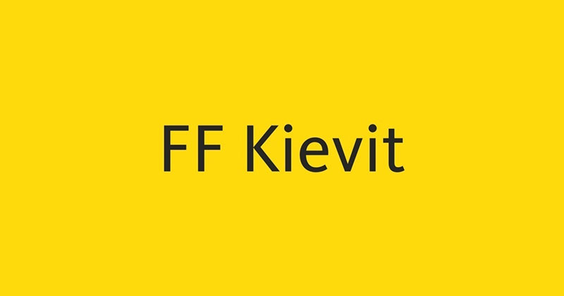
FF Kievit is a modern sans serif, but it has the proportions of traditional, Renaissance-alike fonts (like Granjon or Garamond). Mike Abbink created it in 1995 while he was still studying at California’s Art Center. With sophisticated typography and even nine different weights, FF Kievit became popular very soon. In 2001, it won the prestigious ISTD award. Shortly after that, it got included on ATypI’s list of the decade’s best designs.
Equip
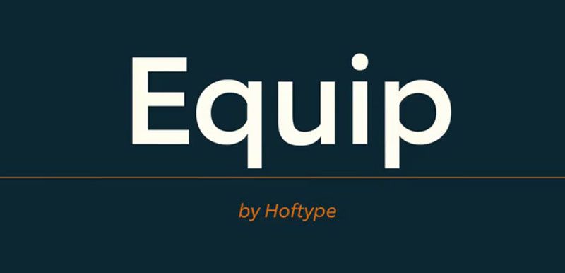
Equip is a superfamily of geometric sans serifs for ambitious typography. If you consider its EquipExtended and EquipCondensed versions, you will be working with even 48 modern styles and forms.
And yet, all these styles were created with a single goal in mind: functionality. Try some of the OpenType features to adjust the low contrasted lines to your design – the result will still be unsentimental and generous. We recommend you use Equip sans serifs for web designs only.
FF Super Grotesk
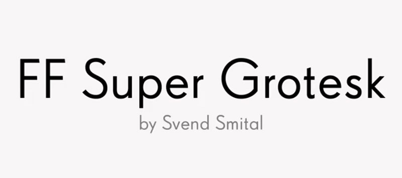
Super Grotesk is a German font family suited for TV and film industry usage. Designer Svend Smital created even six different weights to choose from. They are all packed with state-of-art features, such as subscript characters. Moreover, the figure set is also all-inclusive: there are lining and old-style figures, as well as a tabular and proportional width for each of them. Advanced typographical support is also available.
Trebuchet
We have all met Trebuchet at some point – the iconic sans serif from designer Vincent Connare that makes readability easy on every screen. The same as Gill Sans, Trebuchet draws inspiration from the 1920s and 1930s, which explains its round features and larger x-heights.
Trebuchet is an original Microsoft product created to transmit online messages in a clean, beautiful manner.
FF Milo
Milo is a relatively new, yet favorite sans serif in the advertising and packaging industry. Some of its nine weights (especially the Bold ones) can be found in books and editorials, as well as corporate logos and signatures. Michael Abbink also worked with the newest, most advanced features. You get to use alternate characters, fractions, case-sensitive forms, and even typographical support.
If you enjoyed reading this article on fonts similar to Gill Sans , you should check out this one about fonts similar to Impact.
We also wrote about a few related subjects like the Roblox font and what font does Roblox use, the best 72 free fonts for logos to create modern and creative designs, fonts similar to Futura, fonts similar to Avenir, fonts similar to Calibri, fonts similar to Gotham, and fonts similar to Montserrat.