FabUnit: A Smart Way To Control And Synchronize Typo And Space
What if we were able to implement the sizes of designer’s contribution without hassle? What if we could set custom anchor points to generate a perfectly responsive value, giving us more options as the fluid size approach? What if we had a magic formula that controlled and synchronized the whole project?
It is often the case that I receive two templates from the designer: One for mobile and one for desktop. Lately, I have been asking myself how I could automate the process and optimize the result. How do I implement the specified sizes most effectively? How do I ensure a comfortable tablet view? How can I optimize the output for large screens? How can I react to extreme aspect ratios?

I would like to be able to read the two values of the different sizes (font, spaces, etc.) in pixel and enter them as arguments into a function that does all the work for me. I want to create my own responsive magic formula, my FabUnit.
When I started working on this topic in the spring and launched the FabUnit, I came across this interesting article by Adrian. In the meantime, Ruslan and Brecht have also researched in this direction and presented interesting thoughts.
How Can I Implement The Design Templates Most Effectively?I am tired of writing media queries for every value, and I want to avoid design jumps. The maintenance and the result are not satisfying. So what is the best way to implement the designer’s contribution?

What about fluid sizes? There are handy calculators like Utopia or Min-Max-Calculator.

But for my projects, I usually need more setting options. The tablet view often turns out too small, and I can neither react to larger viewports nor to the aspect ratio.

And it would be nice to have a proportional synchronization across the whole project. I can define global variables with the calculated values, but I also want to be able to generate an interpolated value locally in the components without any effort. I would like to draw my own responsive line. So I need a tool that spits out the perfect value based on several anchor points (screen definitions) and automates the processes for most of my projects. My tool must be fast and easy to use, and the code must be readable and maintainable.

Let’s take a closer look at our previous example:

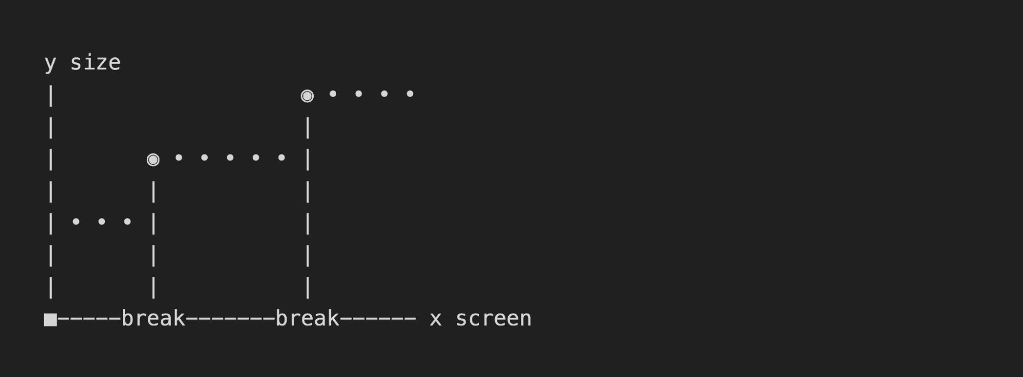
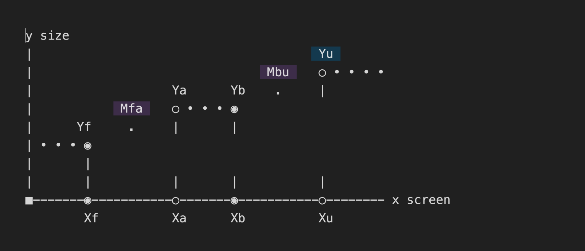
The body font size should be 16px on mobile and 22px on desktop (we will deal with the complete style guide later on). The mobile sizes should start at 375px and continuously adjust to 1024px. Up to 1440px, the sizes are to remain statically at the optimum. After that, the values should scale linearly up to 2000px, after which the max-wrapper takes effect.


This gives us the following constants that apply to the whole project:
Xf    375px        global        screen-min
Xa    1024px        global        screen-opt-start
Xb    1440px        global        screen-opt-end
Xu    2000px        global        screen-max
The body font size should be at least 16px, ideally 22px. The maximum font size at 2000px should be calculated automatically:
Yf    16px        local        size-min
Ya    22px
Yb    22px        local        size-opt
Yu    auto
So, at the end of the day, my function should be able to take two arguments — in this case, 16 and 22.
fab-unit(16, 22);
If you are not interested in the mathematical derivation of the formula, feel free to jump directly to the section “How To Use The FabUnit?”.
So, let’s get started!
Define Main Clamps
First, we need to figure out which main clamps we want to set.
clamp1: clamp(Yf, slope1, Ya)
clamp2: clamp(Yb, slope2, Yu)

Combine And Nest The Clamps
Now we have to combine the two clamps. This might get a little tricky. We have to consider that the two lines, slope1 and slope2, can overwrite each other, depending on how steep they are. Since we know that slope2 should be 45 degrees or 100% (m = 1), we can query whether slope1 is above 1. This way, we can set a different clamp depending on how the lines intersect.

If slope1 is steeper than slope2, we combine the clamps like this:
clamp(Yf, slope1, clamp(Yb, slope2, Yu))
If slope1 is flatter than slope2, we do this calculation:
clamp(clamp(Yf, slope1, Ya), slope2, Yu)
Combined:
steep-slope
  ? clamp(Yf, slope1, clamp(Yb, slope2, Yu))
  : clamp(clamp(Yf, slope1, Ya), slope2, Yu)
Set The Maximum Wrapper Optionally
What if we don’t have a maximum wrapper that freezes the design above a certain width?

First, we need to figure out which main clamps we want to set.
clamp1: clamp(Yf, slope1, Ya)
max: max(Yb, slope2)
If slope1 is steeper than slope2:
clamp(Yf, slope1, max(Yb, slope2))
If slope1 is flatter than slope2:
max(clamp(Yf, slope1, Ya), slope2)
The calculation without wrapper — elastic upwards:
steep-slope
  ? clamp(Yf, slope1, max(Yb, slope2))
  : max(clamp(Yf, slope1, Ya), slope2)
Combined, with optional max wrapper (if screen-max Xu is set):
Xu
  ? steep-slope
    ? clamp(Yf, slope1, clamp(Yb, slope2, Yu))
    : max(clamp(Yf, slope1, Ya), Yu)
  : steep-slope
    ? clamp(Yf, slope1, max(Yb, slope2))
    : max(clamp(Yf, slope1, Ya), slope2)
Thus we have built the basic structure of the formula. Now we dive a little deeper.
Calculate The Missing Values
Let’s see which values we get in as an argument and which we have to calculate now:
steep-slope

  ? clamp(Yf, slope1, clamp(Yb, slope2, Yu))

  : max(clamp(Yf, slope1, Ya), Yu)


steep-slope

Ya = Yb = 22px

Yf = 16px

slope1 = Mfa

slope2 = Mbu

Yu

steep-slope
Check whether the slopeYf → Yais above the slopeYb → Yu(m = 1) :
((Ya - Yf) / (Xa - Xf)) * 100 > 1
Mfa
Linear interpolation, including the calculation of the slopeYf → Ya:
Yf + (Ya - Yf) * (100vw - Xf) / (Xa - Xf)
Mbu
Linear interpolation betweenYbandYu(slope m = 1):
100vw / Xb * Yb
Yu
Calculating the position ofYu:
(Xu / Xb) * Yb
Put All Together
Xu
  ? ((Ya - Yf) / (Xa - Xf)) * 100 > 1
    ? clamp(Yf, Yf + (Ya - Yf) * (100vw - Xf) / (Xa - Xf), clamp(Yb, 100vw / Xb * Yb, (Xu / Xb) * Yb))
    : max(clamp(Yf, Yf + (Ya - Yf) * (100vw - Xf) / (Xa - Xf), Ya), (Xu / Xb) * Yb)
  : ((Ya - Yf) / (Xa - Xf)) * 100 > 1
    ? clamp(Yf, Yf + (Ya - Yf) * (100vw - Xf) / (Xa - Xf), max(Yb, 100vw / Xb * Yb))
    : max(clamp(Yf, Yf + (Ya - Yf) * (100vw - Xf) / (Xa - Xf), Ya), 100vw / Xb * Yb)
We’d better store some calculations in variables:
steep-slope = ((Ya - Yf) / (Xa - Xf)) * 100 > 1
slope1 = Yf + (Ya - Yf) * (100vw - Xf) / (Xa - Xf)
slope2 = 100vw / Xb * Yb
Yu = (Xu / Xb) * Yb

Xu
  ? steep-slope
    ? clamp(Yf, slope1, clamp(Yb, slope2, Yu))
    : max(clamp(Yf, slope1, Ya), Yu)
  : steep-slope
    ? clamp(Yf, slope1, max(Yb, slope2))
    : max(clamp(Yf, slope1, Ya), slope2)
Because we now see how the cat jumps, we treat ourselves to another cookie. In the case of an extremely wide format, e.g. mobile device landscape, we want to scale down the sizes again. It’s more pleasant and readable this way.

So what if we could include the aspect ratio in our calculations? In this example, we want to shrink the sizes when the screen is wider than the aspect ratio of 16:9.
aspect-ratio = 16 / 9
screen-factor = min(100vw, 100vh * aspect-ratio)
In both slope interpolations, we simply replace 100vw with the new screen factor.
slope1 = Yf + (Ya - Yf) * (screen-factor - Xf) / (Xa - Xf)
slope2 = screen-factor / Xb * Yb
So, finally, that’s it. Let’s look at the whole magic formula now.
Formulascreen-factor = min(100vw, 100vh * aspect-ratio)
steep-slope = ((Ya - Yf) / (Xa - Xf)) * 100 > 1
slope1 = Yf + (Ya - Yf) * (screen-factor - Xf) / (Xa - Xf)
slope2 = screen-factor / Xb * Yb
Yu = (Xu / Xb) * Yb
Xu
? steep-slope
? clamp(Yf, slope1, clamp(Yb, slope2, Yu))
: max(clamp(Yf, slope1, Ya), Yu)
: steep-slope
? clamp(Yf, slope1, max(Yb, slope2))
: max(clamp(Yf, slope1, Ya), slope2)

Now we can integrate the formula into our setup. In this article, we’ll look at how to implement it in Sass. The two helper functions ensure that we output the rem values correctly (I will not go into it in detail). Then we set the anchor points and the aspect ratio as constants (respectively, Sass variables). Finally, we replace the coordinate points of our formula with variable names, and the FabUnit is ready for use.
_fab-unit.scss
@use "sass:math";


/* Helper functions */

$rem-base: 10px;

@function strip-units($number) {
  @if (math.is-unitless($number)) {
      @return $number;
    } @else {
      @return math.div($number, $number * 0 + 1);
  }
}

@function rem($size){
  @if (math.compatible($size, 1rem) and not math.is-unitless($size)) {
    @return $size;
  } @else {
    @return math.div(strip-units($size), strip-units($rem-base)) * 1rem;
  }
}


/* Default values fab-unit 🪄 */

$screen-min: 375;
$screen-opt-start: 1024;
$screen-opt-end: 1440;
$screen-max: 2000;  // $screen-opt-end | int > $screen-opt-end | false
$aspect-ratio: math.div(16, 9);  // smaller values for larger aspect ratios


/* Magic function fab-unit 🪄 */

@function fab-unit(
    $size-min,
    $size-opt,
    $screen-min: $screen-min,
    $screen-opt-start: $screen-opt-start,
    $screen-opt-end: $screen-opt-end,
    $screen-max: $screen-max,
    $aspect-ratio: $aspect-ratio
  ) {
  $screen-factor: min(100vw, 100vh  $aspect-ratio);
  $steep-slope: math.div(($size-opt - $size-min), ($screen-opt-start - $screen-min))  100 > 1;
  $slope1: calc(rem($size-min) + ($size-opt - $size-min)  ($screen-factor - rem($screen-min)) / ($screen-opt-start - $screen-min));
  $slope2: calc($screen-factor / $screen-opt-end  $size-opt);
  @if $screen-max {
    $size-max: math.div(rem($screen-max), $screen-opt-end) * $size-opt;
    @if $steep-slope {
      @return clamp(rem($size-min), $slope1, clamp(rem($size-opt), $slope2, $size-max));
    } @else {
      @return clamp(clamp(rem($size-min), $slope1, rem($size-opt)), $slope2, $size-max);
    }
  } @else {
    @if $steep-slope {
      @return clamp(rem($size-min), $slope1, max(rem($size-opt), $slope2));
    } @else {
      @return max(clamp(rem($size-min), $slope1, rem($size-opt)), $slope2);
    }
  }
}
The work is done, now it’s simple. The style guide from our example can be implemented in no time:

We read the related values from the style guide and pass them to the FabUnit as arguments: fab-unit(16, 22).
style.scss
@import "fab-unit";


/* overwrite default values 🪄 */
$screen-max: 1800;


/* Style guide variables fab-unit 🪄 */

$fab-font-size-body: fab-unit(16, 22);
$fab-font-size-body-small: fab-unit(14, 16);

$fab-font-size-h1: fab-unit(60, 160);
$fab-font-size-h2: fab-unit(42, 110);
$fab-font-size-h3: fab-unit(28, 60);

$fab-space-s: fab-unit(20, 30);
$fab-space-m: fab-unit(40, 80);
$fab-space-l: fab-unit(60, 120);
$fab-space-xl: fab-unit(80, 180);


/* fab-unit in action 🪄 */

html {
  font-size: 100% * math.div(strip-units($rem-base), 16);
}

body {
  font-size: $fab-font-size-body;
}

.wrapper {
  max-width: rem($screen-max);
  margin-inline: auto;
  padding: $fab-space-m;
}

h1 {
  font-size: $fab-font-size-h1;
  border-block-end: fab-unit(2, 10) solid plum;
}

…

p {
  margin-block: $fab-space-s;
}

…
/* other use cases for calling fab-unit 🪄 */

.grid {
  display: grid;
  grid-template-columns: repeat(auto-fit, minmax(fab-unit(200, 500), 1fr));
  gap: $fab-space-m;
}

.thing {
  flex: 0 0 fab-unit(20, 30);
  height: fab-unit(20, 36, 660, 800, 1600, 1800);  /* min, opt, … custom anchor points */
}
We are now able to draw the responsive line by calling fab-unit() and specifying just two sizes, the minimum and the optimum. We can control the font sizes, paddings, margins and gaps, heights and widths, and even — if we want to — define grid columns and flex layouts with it. We are also able to move the predefined anchor points locally.

Let’s have a look at the compiled output:
…
font-size: clamp(clamp(1.3rem, 1.3rem + 2 * (min(100vw, 177.7777777778vh) - 37.5rem) / 649, 1.5rem), min(100vw, 177.7777777778vh) / 1440 * 15, 2.0833333333rem);
…
And the computed output:
font-size: 17.3542px
Accessibility Concerns
To ensure good accessibility, I recommend testing in each case whether all sizes are sufficiently zoomable. Arguments with a large difference might not behave as desired. For more information on this topic, you can check the article “Responsive Type and Zoom” by Adrian Roselli.
ConclusionNow we have created a function that does all the work for us. It takes a minimum and an optimum value and spits out a calculation to our CSS property, considering the screen width, aspect ratio, and the specified anchor points — a single formula that drives the entire project. No media queries, no breakpoints, no design jumps.
The FabUnit presented here is based on my own experience and is optimized for most of my projects. I save a lot of time and am satisfied with the result. It may be that you and your team have another approach and therefore have other requirements for a FabUnit. It would be nice if you were now able to create your own FabUnit according to your needs.
I would be happy if my approach inspired you with new ideas. I would be honored if you directly use the npm package of the FabUnit from this article for your projects.
Thank you! 🙏🏻
FAB-UNIT LINKS
- FabUnit CodeSandbox Example
- FabUnit Github
- FabUnit Npm Package
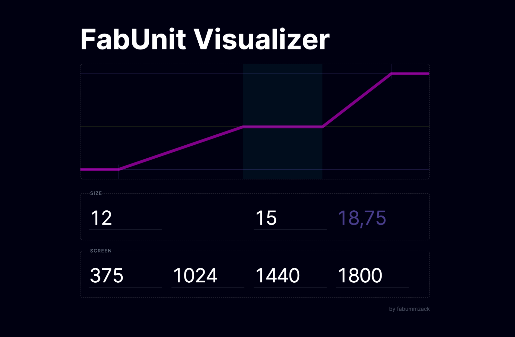
- FabUnit Visualiser
Merci Eli, Roman, Patrik, Fidi.