8 Ways to Improve PPC Landing Page Conversions Using Color Psychology
Creating a compelling website ad copy is just the beginning. To create an effective and long-lasting relationship with your prospects, you need to use the right colors.
85% of shoppers place color as a primary reason for why they buy a particular product. Besides, color increases brand recognition by 80%.
Before I start discussing the options, here are two things to keep in mind:
Use a cloud storage to store all your files: PPC marketers have a lot of files that have to be shared with clients, team members, and peers for discussion or approvals. For example, there are files like the client’s brand logo, content file, and design samples. The entire process has to be hassle-free. Hence, there are different cloud storage options that can help you eliminate the struggles and time taken in the process.
Always A/B test your landing pages: Before you apply the changes across your entire campaign, you should always test the selected color combinations. It is crucial to test what works best for you. Does the color change on your landing page have the expected effect on the conversion rate? If not, is there any other color you would like to experiment with. It’s always best to create a few different color palettes, just in case, for backup.
That’s it! Now, we are ready to start!
Here are the top eight ways to improve your PPC landing page conversions using color psychology.
1. Find Your Primary Color
If you have already created your brand logo, chances are you have already decided on one color. If that color reflects your brand’s personality, you can use the same color on your PPC landing page.
However, if you’re looking to change the color of an existing logo, you can browse through a list of hex code palettes to get some ideas. It contains a collection of official color codes of the world’s most known codes.
If you haven’t decided on your color, you can take this color quiz to determine which colors are right for your company.
Additionally, you can browse through Dribble or Behance to get ideas for your PPC landing page.
If you come across a visually appealing image or design, you can use tools like ColorZilla to analyze the color palettes of the page and paste it into your program.
When you choose colors that reflect your brand value, more specifically, the product you’re advertising, it increases the chances of conversion.
2. Understand The Difference Between Warm and Cool Colors
Both warm and cool colors have a different impact on our visual perception of objects. For example, warm colors such as red, orange, and yellow can ignite a range of emotions such as comfort and warmth. Cool colors such as blue, green, and purple can provide a sense of calmness and relaxation.
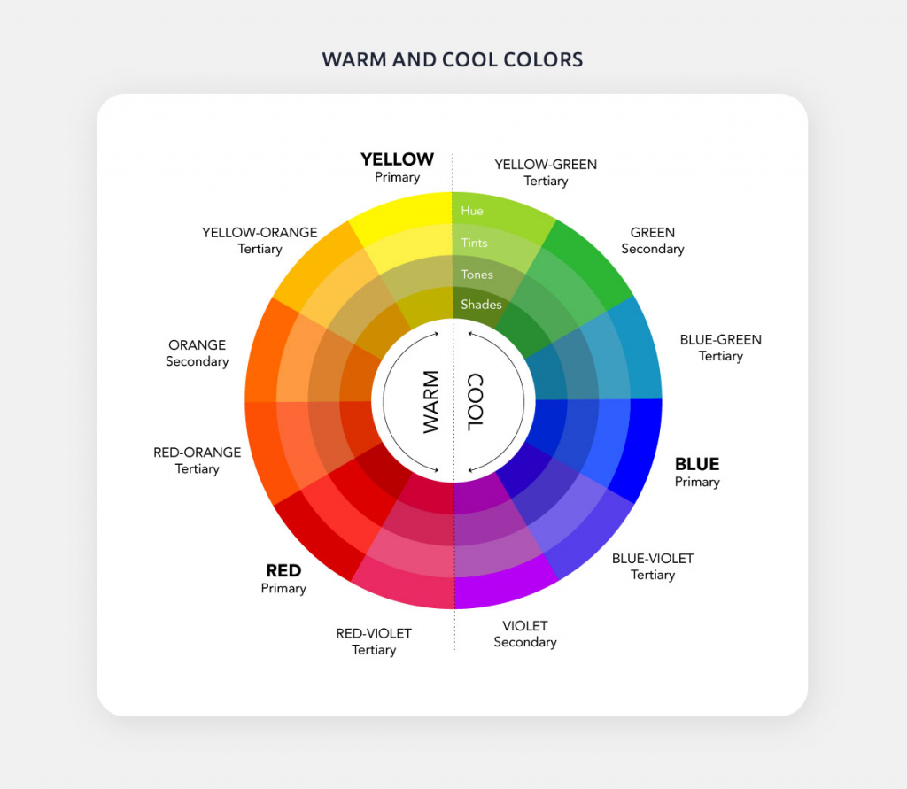
To make your page stand out, you can also use a combination of warm and cool colors, along with various shades and tones. Remember, the general rule of thumb is to use 80% of one color (either warm or cool) and 20% of the other.
For example, if your landing page is composed mostly of cool colors, you can use a warm tone in the CTA button to make it more eye-catching and effective.
3. Discern The Common Psychological Effects of Universal Colors
Each color has a different psychological effect on the human mind. Using the right color, along with the appropriate text, can help you instantly boost the PPC landing page conversion rate.
Here are some common psychological effects of the universal colors.
White
- Purity.
- Innocence.
- Cleanliness.
- Sense of space.
Black
- Authority.
- Power.
- Strength.
- Evil.
- Intelligence.
Gray
- Neutral.
- Timeless.
- Practical.
Brown
- Reliability.
- Stability.
- Warmth.
- Comfort.
- Security.
- Natural.
- Organic.
The colors you choose on your landing page must align with your brand’s value and personality. This will not only help you boost the conversion rate, but it will also enable you to build trust with your audience.
4. Use Different Colors For Different Age and Gender
If you’re targeting a specific age group, then you need to choose the colors carefully to drive conversions.
Red, blue, and yellow are the three primary colors. Mix all of them, and you will get secondary colors, i.e., orange, green, and purple.
As per DesignMantic, teenagers (less than 19 years of age) are drawn more towards high-contrast colors, with darker tones and bright hues. While men prefer charcoal black, denim blue, and splashed white, women prefer jade black, crimson red, and tangerine orange.
Young adults (between the ages of 20 and 30) are more attracted to lighter tones. While men prefer Carolina blue, quartz silver, and hickory brown, women prefer sand gold, cherry red, and eggplant purple.
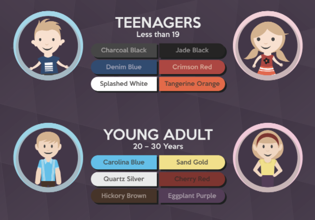
As we age, the color spectrum gets lighter with pinks and teal drawing more attention.
Men between the ages of 30 and 40 years prefer oxford blue, powder blue, and earl grey while women prefer dull magenta, emerald green, and heather purple.
Middle-aged men between the ages of 40 and 55 years prefer pebble black, misty grey, and smokey teal, while women prefer apricot pink, pine green, and Pantone plum.
Senior citizens (55 years and above) men prefer suave mauve, pale beige, and snow blue while women prefer frosty lime, crepe pink, and candle white.
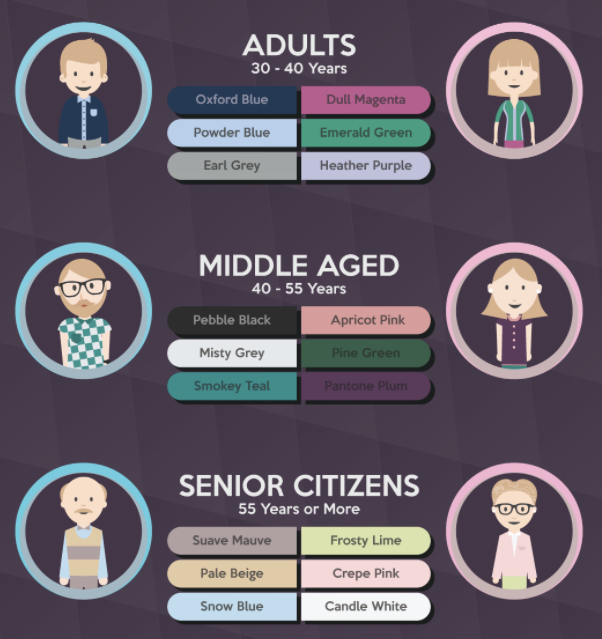
Depending on what age group you’re targeting via paid ads, use a good mix and match of different colors on your PPC landing page to increase the chances of conversion.
5. Use Universal Colors For Your Advantage
Colors such as blue, pink, yellow, orange, and purple are universal. No matter where you live or what language you speak, these colors have some effect on you.
Yellow
The color yellow is a symbol of happiness and warmth in almost all cultures. Besides, this is the color that the human eye processes first. The color is associated with optimism, enlightenment, and creativity.
Blue
Blue symbolizes trust, integrity, and communication. However, there are various shades of blue, and each has a different meaning.
- Dark Blue: Symbolizes trust, dignity, intelligence, and authority.
- Bright Blue: Symbolizes cleanliness, strength, dependability, and coolness.
- Light Blue: Symbolizes peace, serenity, ethereal, spiritual, and infinity.
Brands like Tiffany & Co. use the blue color in their branding.
Orange
The orange color symbolizes playfulness and social interaction. It also adds a sense of comfort and warmth. However, using too much orange on a single page will make it too frivolous.
Brands like Nickelodeon use the orange color in their branding.
Pink
The color pink is associated with femininity and love. If you’re serving a female audience, using pink color on your landing page can help you boost conversions.
Brands like Victoria Secret use pink as their primary color.
Purple
The purple color symbolizes quality, luxury, and royalty. It is associated with high-end products and expensive properties.
Brands like Asprey London and Cadbury use purple for their branding.
The color you choose must reflect your brand’s value and personality.
6. Don’t Ignore Industry Favored Colors
Every industry has its own preferred colors. For example, most food companies have red color on their landing pages, while luxury product brands have purple spread throughout their website.
The most prominent color in the automobile industry is silver. It provides a sense of luxury and high-quality craftsmanship. Other popular colors in the auto sector are blue and red. Blue symbolizes reliability, while red is associated with masculinity. If you’re into the auto sector, use a good combination of silver, blue, and red on your landing page to increase the chances of conversion.
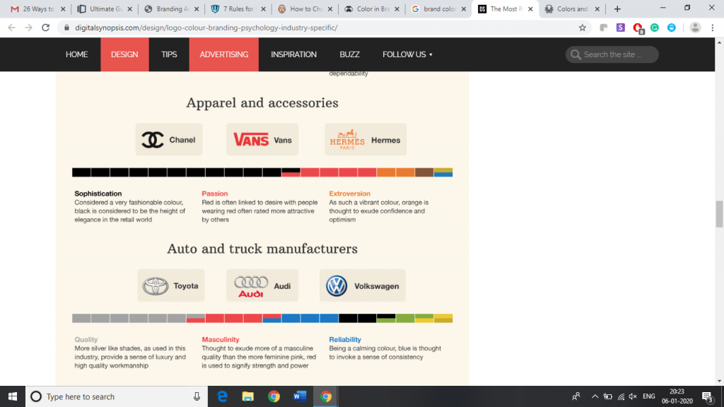
Most top fashion brands use black in their branding. Colors like dark blue and chocolate brown will help you be more influential and persuasive.
People buying home improvement products are influenced by blue, orange, and red. Blue promotes relaxation. Orange evokes a sense of fun and excitement, while red raises the heart rate.
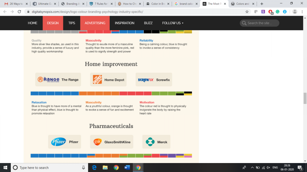
A little market research about your industry will help you find the most preferred colors. Using these colors in your landing page will help you boost trust with your visitors and increase the likelihood of conversion.
7 – Choose a Contrasting CTA Color
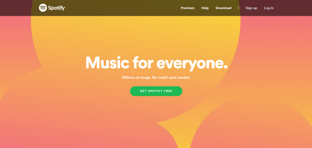
Contrasting color on the landing page will help you draw the visitor’s attention to a CTA button.
Contrasting button colors not only increases processing fluency, but it also influences the visitor into clicking. This increases the chances of conversion.
Here is an example from Spotify that shows contrasting CTA color. The CTA button is easy to locate and invites action.
8. Limit The Numbers of Colors On a Page
Using too many colors can distract and confuse your visitors and will reduce the chances of conversions.
It’s recommended to use a maximum of three colors on one page. There’s also a 60/30/10 rule that can come in handy when designing your PPC landing page.
The 60/30/10 rule recommends using 60% of one color, 30% of the other, and 10% of the third one on one page. This will help you keep your visitors engaged while highlighting the important elements of the page.
Landing Page Examples
Until now, we saw various ways to improve PPC landing page conversions using color psychology. Let’s have a look at some of the practical examples of these theories.
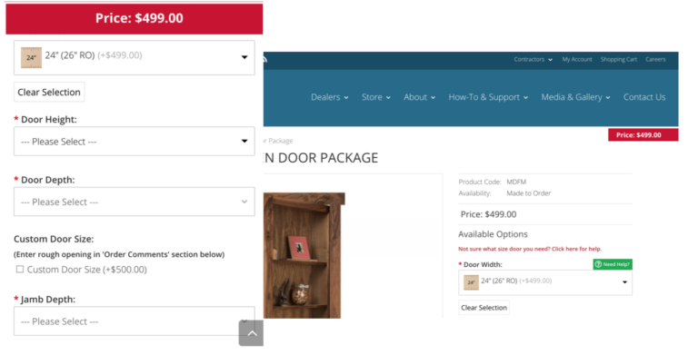
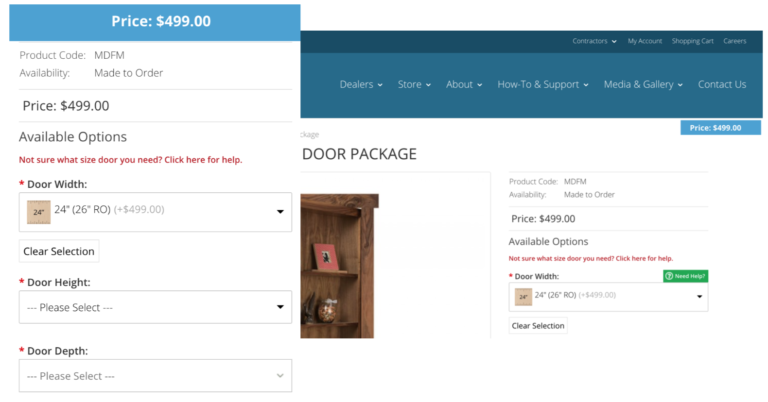
An ecommerce company that sells high-end doors for homes gained $21,000 more revenue by changing the color to blue from red in the pricing calculator page. They also noticed a 12% decrease in the bounce rate and a 10.29% increase in average order value.
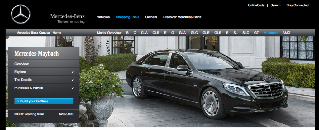
Mercedes-Benz uses black color on its website to demonstrate professionalism, power, and luxury.
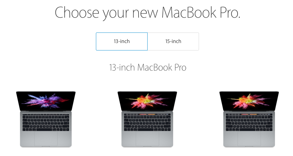
Apple uses white color on their landing page to demonstrate innocence, purity, cleanliness, and peace. It also helps them to communicate modernity.
Final Thoughts
Colors play a vital role in the buying process. Right colors can help you boost the conversion rate while the wrong ones can leave a negative impression on your potential customers.
It’s important to understand what impact each color on your landing page will have on your prospects. Also, it is crucial to test the combination of various colors on your landing page to figure out what works best for you.
Photo by Robert Katzki on Unsplash