Design Trend: Happy, Optimistic Designs
The last few years have been rough for almost everyone. No matter where you live or what you do, most everyone in the world has felt the stress and pressure resulting from a worldwide health pandemic.
To combat these feelings of misery and malignancy, designers are using happy, optimistic design elements to help create more engaging websites. It’s just the emotional boost we all need when browsing, shopping, or simply looking for information.
Here’s a look at helpful design elements to use with this trend in mind with some examples for inspiration.
Smiling Faces
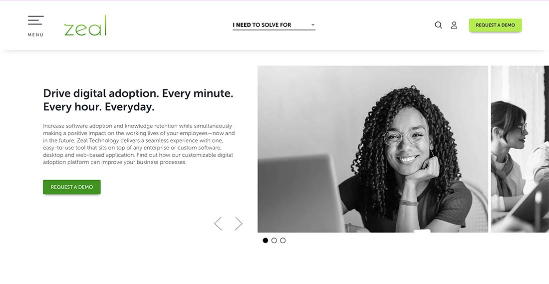
When you see someone smile, you are more likely to feel that same emotion. It’s just a fact of human nature.
While many websites have moved away from the tight faces of people – maybe because we don’t know how to deal with masking in photos – smiling faces are the best way to create human connection and positive emotional engagement.
Think about how you feel when everyone you see is masked. Now think of seeing a person smile. That simple difference changes the way you feel about what’s in front of you.
Bright Color
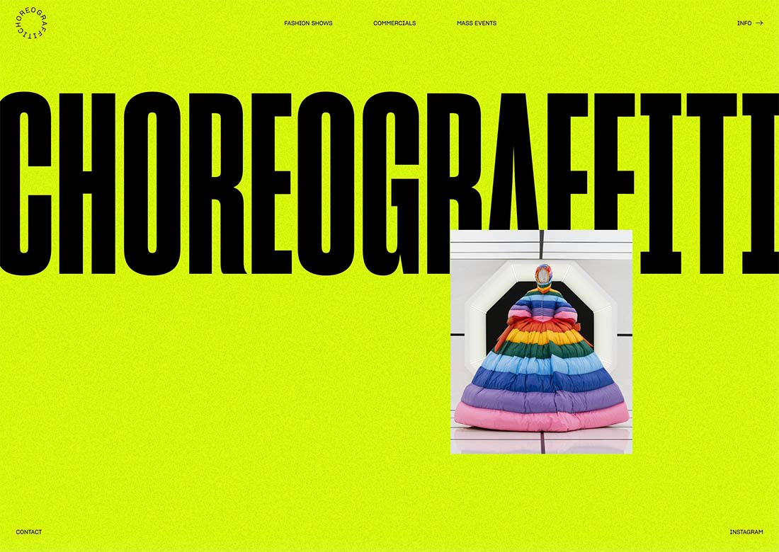
Color has strong emotional connections. Bright, bold colors are often most closely associated with happiness and optimism.
Neons, yellows, and even minimalistic white styles seem fresh and happy. Pair color with complementary elements from this list to maximize the impact.
Remember that when you are relying on elements such as color or typography to set an emotional tone, you often have to pair them with another element conveying the same feeling.
Color alone isn’t always enough, but a secondary point of emphasis can make the design hit just the right note.
Lighter Typefaces
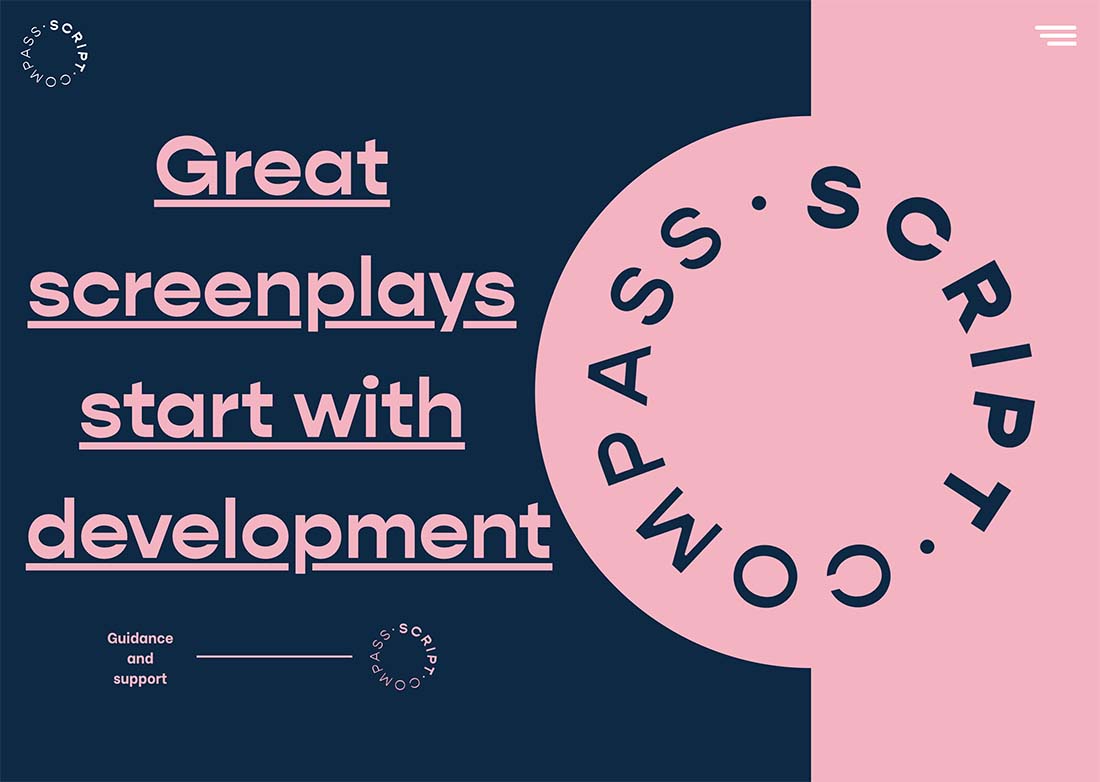
Lighter typefaces can be whimsical, fun, or even a little funky. Light in this regard refers to the emotional feel, not the weight of the font itself.
Novelty and experimental typefaces can be great options to play with when you are trying to convey happiness and positivity through text. It is important that the feeling of the letterforms and words themselves match so that just the right feeling comes through.
As with color, pair lighter typefaces with other elements – maybe bits of imagery – to help draw a strong connection to the emotion you want users to feel when they look at the design.
Engaging Activity
A website design that is easy to engage with and is fun at the same time (also noted with games in the next example) can make users feel good about a design.
Positive engagement will create a sense of satisfaction and happiness.
What’s important here is a solid user experience so that every aspect of the design and intended interactions and delightful and easy to understand. If too much instruction is required the mood can shift quickly from happiness to frustration.
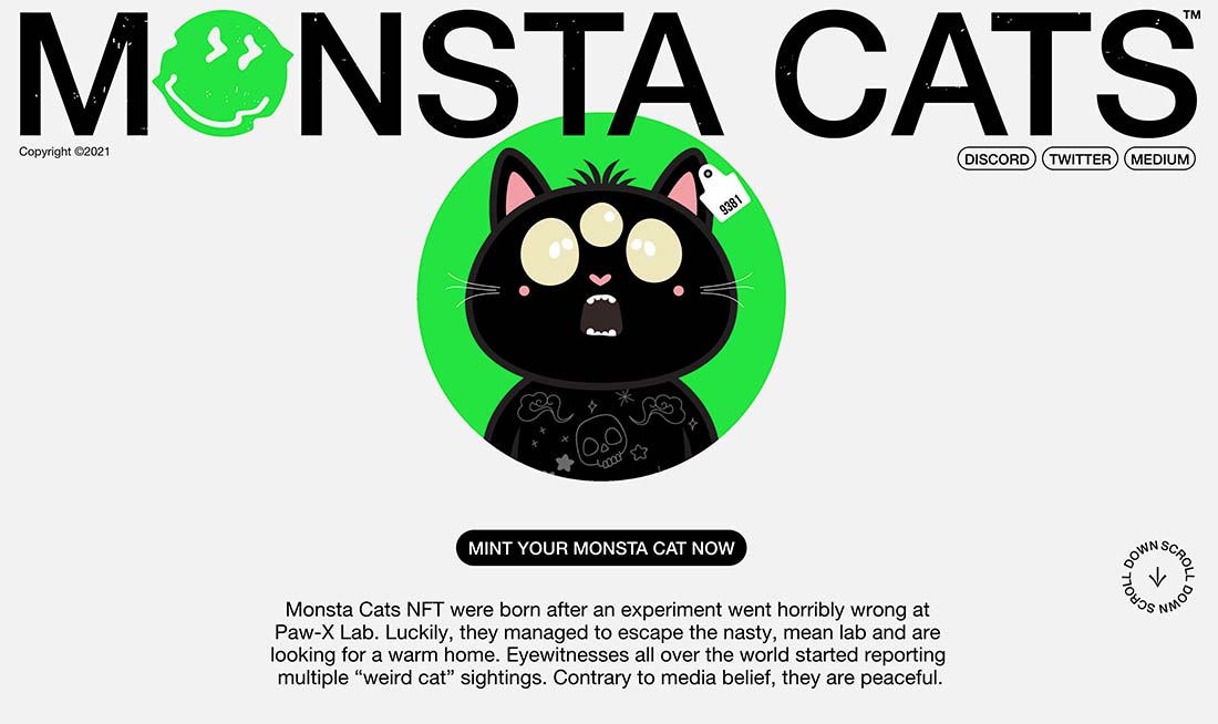
Cartoons or Games
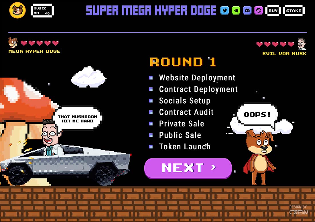
If you don’t have a smiling face to work with, the next best thing might be an illustrated cartoon or game to set an optimistic tone.
This is a two-part design element with a drawn character that seems fun, happy, and optimistic with a potentially engaging user experience that creates success and delight on the part of the user.
UX Unicorns
Everyone loves finding a little unicorn in a design. A unicorn is an unexpected element in the design that adds an element of surprise and delight.
These come in the form of hover states, animations, hidden design elements deeper in pages, and a number of other ways that could be inside knowledge for loyal visitors or fans.
Take unicorns a step further with a gamification element to really engage users.
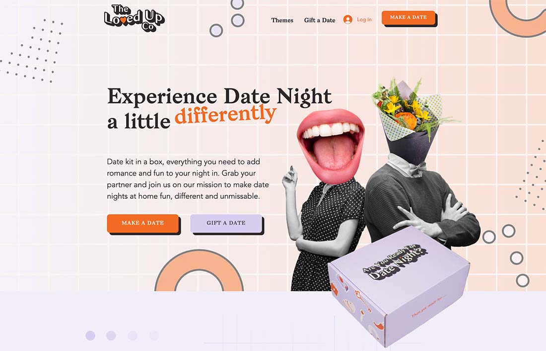
Fun Language and Messaging
If you want users to feel a sense of happiness and optimism you have to use positive language to start that conversation.
Every text element in the design contributes to the overall emotional context of the design.
Fun language, rhythmic writing, and interesting microcopy all help set an emotionally fulfilling scene for the design.
The trick is ensuring that text elements pair with visual elements, making this a technique that won’t necessarily work in isolation. It needs to be part of the overall design plan.
Flow and Function
Highly usable websites with easy navigation and flow, as well as simple functionality, are a standard for happy and optimistic users. It doesn’t matter how fun or happy the design looks; if it is hard to use, the emotional state of the user will shift quickly.
Strong calls to action, simple navigation, and fun imagery should work together here. Consider the desired action of each web user and try to help them find success quickly with as few clicks as possible to keep positive emotions as long as possible.
Being Helpful, Not Creepy
Users feel good when they get to interact with websites that “just get them.” These personalized experiences can be one of your strongest tools for creating happiness and optimism. But there is a catch – you have to do it without crossing the line into creepy territory.
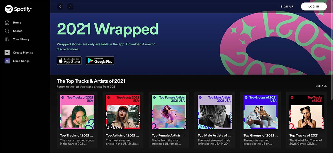
Using data and information can be tricky. A brand that has mastered it is Spotify. The annual “Wrapped” list is a fan favorite. (I smile when I peruse mine.) What keeps it from being creepy is the idea that only you see the information unless you choose to share it. Think of the very different emotions you might feel if Spotify shared your top songs of the year with all of your friends.
Conclusion
A happy, optimistic design never hurts anyone. Research by the Nielsen Norman Group back in 2002 noted that “designs that engage and empower users increase their enjoyment and encourage them to explore websites in-depth.”
In addition to looking good, usability and function are key elements of establishing happiness for users. Put the two together and you have a winning combination.
And the benefit is this: When people are happy—when they have pleasant interactions with the design—they are more likely to take a desired, positive action. That’s a win for everyone.