9 Website Design Tips for Different Generations (Yes, It Matters!)
It’s a no-brainer for most designers that you plan a project based on a certain target audience. It might be for people who like soda or buy video games or have an affinity for athletic shoes.
But another consideration can often be overlooked – designing for different generational segments. Age can impact how people use websites, apps, and mobile devices. Generational differences can affect your design scheme, accessibility plan, and even the language and colors in the design.
If you haven’t thought about these differences, now is the time to start. With wider website audiences all the time, designing for different generations can help your project be more successful for more people.
Avoid Small Font Sizes
Small text sizes can be difficult for all users but are even more difficult to read for seniors or youngsters.
When it comes to thinking about the design for different generations, font and size matters. The good news is that common user experience standards and guidelines take this into account for all users.
Establish a type hierarchy that starts with body text that’s at least 16px. You can even bump to 18 for good measure or go exceptionally high for projects that the audience falls into the pre-teen and younger category. (Small children, in particular, can benefit from oversized lettering.)
Type size, and spacing, can impact readability and comprehension. Larger sizes with more spacing can slow down readers, helping aid readers.
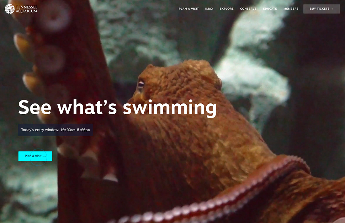
Use Identifiable Buttons
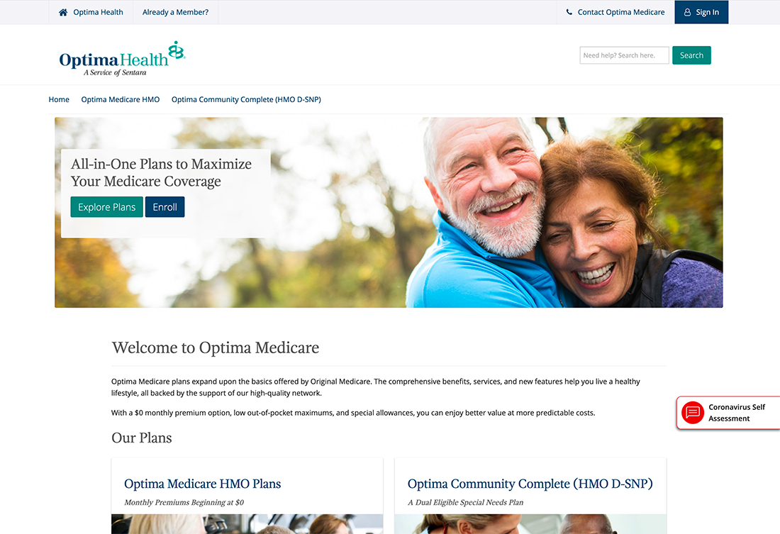
Ghost buttons and other funky click elements might look cool and resonate with teens and 20-somethings, but render useless for older users who have come to expect a defined button for click-or tap-actions.
Well-defined buttons serve different demographics in varying ways.
- Provide a well-known cue to older users who might be less familiar with other styles.
- Provide a learning lesson to young users – such as children using apps – as to what click/tap elements look like and how they function.
A well-defined button has these characteristics:
- Color that is in contrast to the background and much of the rest of the design (this is why red buttons are so popular).
- Solid fill in a box that is large enough to click or tap (at least 44px by 44px).
- Has clear instructions such as “Go,” “Submit,” or “Click here.”
- May include a tactile visual clue such as a drop shadow for depth or hover animation or state to indicate use.
Provide Alternative Solutions

For every user path, there’s someone who doesn’t quite understand or looks at the design and potential solution differently. This what makes alternative solutions so important.
An alternative solution to solving a problem or answering a question starts with an understanding of what users my need or want to do.
Alternative solutions also make it easier for all users to find a solution that they understand. Consider these alternatives (many of which you may already be doing for other reasons):
- Use alt text for images so that they can be understood by audio and screen readers.
- Put common links in multiple locations, such as in the body of the design and footer.
- Make contact information viewable and click- or tappable. This includes an “email us” or “call us” link that provides a direct action as well as providing a phone number or email address spelled out in the design for an easy point of contact.
- Provide the ability to make adjustments to design elements such as the use of dark or light mode or even font size.
- Allow users to skip elements that might not appeal to all audiences such as games ahead of content, video, or sound.
- Registration options should vary – not everyone has or feels safe logging in with a social media account. Provide another method as well.
Write for Comprehension
If you want your design to be understood by all ages and generations, write for comprehension.
- Use plain language and proper grammar.
- Avoid slang, jargon, or heavy pop culture references.
- Be wary of using emojis to convey words.
- Microcopy and instructions should be direct and explain exactly what happens next.
Don’t Stereotype Your Demographic
This might be the most complicated – and loaded – tip in this list. Don’t stereotype your audience or demographic with the design.
That can be difficult because you are trying to design for a certain group of users, but when it comes down to it, the design will appeal to the proper demographic because of the narrative and story, design elements and function, and overall vibe and usefulness of the website or app.
It almost seems too simple, but there are too many projects out that that scream “FOR SENIOR CITIZENS.” If need the product or like the idea, but don’t want to be labeled in this way, would you engage? Steer clear of stereotypes.
Avoid Dark Patterns
Dark patterns are another tricky area. They have become way too common, and present additional usability concerns for the youngest and oldest of users.
The most glaring of dark pattern issues are elements or promos that can’t be closed easily.
That tiny “x” is nearly impossible to click or tap with superior dexterity; imagine if you don’t have it. Or big buttons to add a paid element to a game for toddlers. (How many of you have found a $3.99 charge from your nephew in the App Store?)
Dark patterns frustrate users and make your website less usable. It’s a problem for all demographics and could even be considered predatory.
Use Modern Elements with Instruction
The takeaway so far isn’t that you have to design website elements that are circa 2000, but to think about and take care with overly modern designs. (We love trendy design elements.)
The trick is to add modern elements with instruction and visual cues that help users of all ages understand how to engage with them and ensure proper functionality.
If your target demographic is people looking at assisted living communities, for example, a TikTok style video intro that demands a like to enter the site might not be the most appropriate. But if you use this video with some explanation, it could resonate with the audience. Tell users what to do if their answer isn’t apparently clear.
It comes down to a simple fact: If the design is relevant and easy to use, your audience will find a way to engage with it.
Showcase Inclusive Imagery
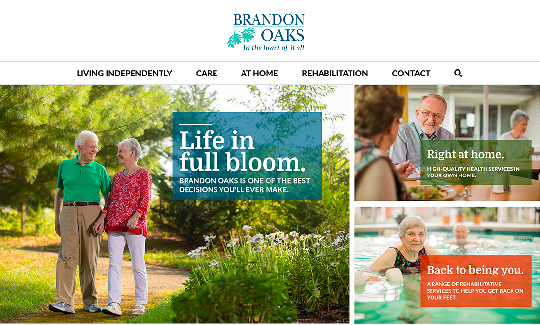
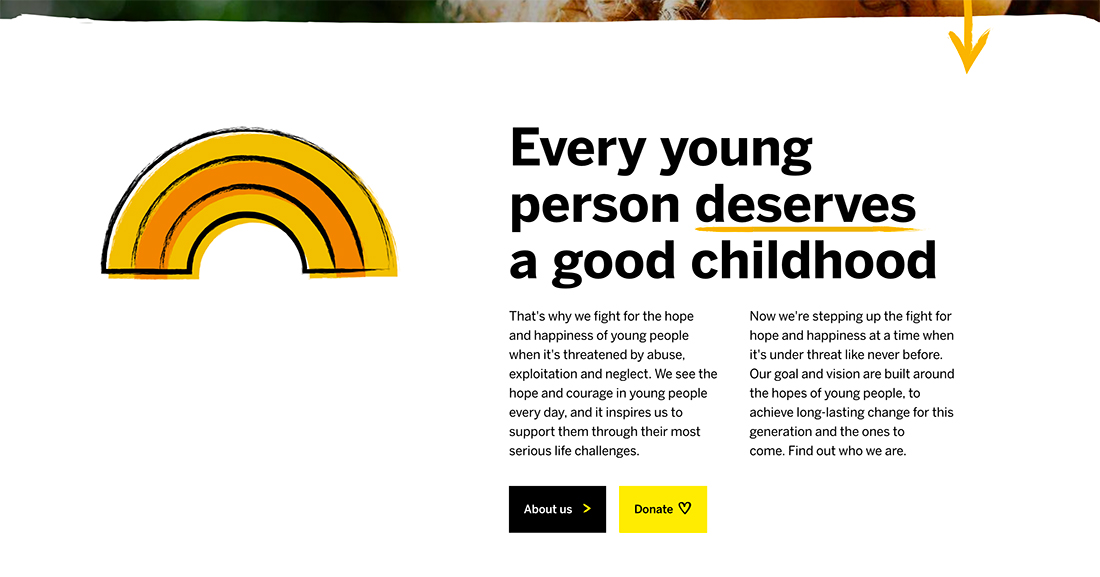
People like to see other people that look like them. Use imagery in the design that shows people in your key audience segment using your product or service or otherwise engaging in some way.
That’s not to say that the only images include this demographic, but it should be well-represented.
Further, make sure to include diversity within the demographic to create an association with the greatest number of people possible.
Follow Accessibility Guidelines
Accessibility guidelines exist for a lot of reasons, but did you know WCAG 2.0 has some specific guidance on how to meet the needs of older users?
The standards apply to everything from text size and layout to using a mouse or keyboard to content organization. If older users are accessing your website or app regularly, this might be the starting point for your project design or redesign.
How WCAG applies to older users: “Although not all the WCAG 2.0 success criteria are listed here, WAI recommends meeting at least all WCAG 2.0 Level A and AA success criteria. Some of the Level AAA success criteria that are particularly important for older people are listed in this section too.
“When implementing WCAG 2.0, developers can use different techniques to meet the success criteria. In some cases, using one technique instead of another can optimize accessibility for certain users. This section lists some of the techniques that can help optimize websites for older people.”
Conclusion
You probably think about how different design elements will impact different user groups all the time. Make sure to include audiences of varying generations in this research.
While many of thing things you are already doing apply to many audiences, it can be helpful to know what additional steps you can take in terms of design for different user groups. It’s obvious that designing a website or an app for a child versus a parent might be very different, but it might not be as obvious that many of the same design elements you use for the youngest audiences may also apply to the oldest as well.