Creating Native Web Components
Native web components have been here for a while, but they still seem like the new kid on the block. Mainly due to the fact that they have a high barrier to entry, notably for beginners, and don’t have most of the features from the more established front-end frameworks. Nonetheless, they can be useful, especially for those who want to create framework-agnostic and reusable components. Today we will build some native web components with Minze, a simple JavaScript framework that makes it a breeze to create native web components.
Let’s get started!
Prior knowledge
This tutorial should be quite easy to follow for anybody familiar with the basics of HTML, CSS and JavaScript. Advanced knowledge in those fields is not required.
Outline
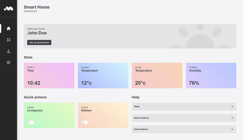
We will be building several web components for a fictive Smart Home dashboard application. You will learn some basic concepts of web components and how to create them with Minze. During this tutorial we will build 3 Components:
- An accordion – for showing and hiding content.
- A switch – that toggles between two states, exacltly like a light-switch.
- A card – a simple encapsulated component that can be fed with content externaly
Following along
You can follow along in any environment by including a CDN link of Minze or by using this Codepen with the preloaded Minze script.
<script src="https://unpkg.com/minze@1.0.3" defer></script>Accordion
Our first component is an accordion. It can be used to toggle content visibility.
1. Creating and registering the component
First, we need to extend from the MinzeElement class to create our component. Then we use the define method of the said component to register it. The component will be automatically registered in dash-case derived from its class name: sh-accordion. Web components should always consist of at least two words to prevent clashing with build-in html-components.
JavaScript
class ShAccordion extends MinzeElement {
  // ...
}

ShAccordion.define()
HTML Element
<sh-accordion>
  <div slot="title">
    Stats
  </div>

  <div slot="content">
    Lorem ipsum dolor sit amet consectetur adipisicing elit. Consequatur, similique!
  </div>
</sh-accordion>
2. Properties & Methods
Next, we define the properties and methods of our component. reactive defines well you guessed it, reactive properties, when they change a template re-render will be triggered. The first argument of the nested array is the name of the property, the second is the initial value. toggleOpen is a method that will toggle the open property between true and false.
class ShAccordion extends MinzeElement {
  reactive = [['open', false]]

  toggleOpen = () => this.open = !this.open
}

ShAccordion.define()
3. HTML
Here we are defining the html property as an arrow function for rendering the encapsulated HTML of the component. The template includes a slot tag that can be filled in when the component is used.
class ShAccordion extends MinzeElement {
  // previous code ...

  html = () => `
    <div class="title">
      <slot name="title"></slot>

      <svg xmlns="http://www.w3.org/2000/svg" width="24" height="24" viewBox="0 0 20 20" fill="currentColor" class="arrow">
        <path fill-rule="evenodd" d="M5.293 7.293a1 1 0 011.414 0L10 10.586l3.293-3.293a1 1 0 111.414 1.414l-4 4a1 1 0 01-1.414 0l-4-4a1 1 0 010-1.414z" clip-rule="evenodd" />
      </svg>
    </div>

    <slot name="content"></slot>
  `
}

ShAccordion.define()
4. CSS
Styling can be added by using the css property. We are using the :host pseudo-class selector to style the component and the ::sloted CSS selector to style the externally inserted content. Note the use of ternary operators to conditionally apply styling based on the state of the open property.
class ShAccordion extends MinzeElement {
  // previous code ...

  css = () => `
    :host {
      background: rgb(228 228 231);
      font-family: sans-serif;
      border-radius: 2px;
      cursor: pointer;
    }

    .title {
      display: flex;
      justify-content: space-between;
      align-items: center;
      font-weight: bold;
      user-select: none;
      padding: 16px;
    }

    .arrow {
      transition: transform 0.2s ease-in-out;
      transform: ${this.open ? 'rotate(180deg)' : 'rotate(0)'};
    }

    ::slotted([slot=content]) {
      display: ${this.open ? 'block' : 'none'};
      padding: 16px;
    }
  `
}

ShAccordion.define()
5. Event listeners
Finally, we are adding a click event listener. The eventListeners property defines one or more event listeners inside the component. We are attaching a click handler to the title. The first argument of the nested array is a CSS selector, the second is the event type and the third is a callback function that runs when the title is clicked.
class ShAccordion extends MinzeElement {
  // previous code ...

  eventListeners = [['.title', 'click', this.toggleOpen]]
}

ShAccordion.define()
Result
Here is the full implementation of the accordion component.
See the Pen
ShAccordion by Sergej Samsonenko (@sergejcodes)
on CodePen.light
Switch
Next up we will build the switch component.
1. Creating and registering the component
First, we need to extend from the MinzeElement class to create our component. Then we use the define method of the said component to register it. The component will be automatically registered in dash-case derived from its class name: sh-switch.
JavaScript
class ShSwitch extends MinzeElement {
  // ...
}

ShSwitch.define()
HTML Element
<sh-switch></sh-switch>2. Properties & Methods
Next, we need to define the properties and methods for our component. reactive defines reactive properties, when they change a template re-render will be triggered. The first argument of the nested array is the name of the property, the second is the initial value. toggleActive is a method that toggles the active property between true and false.
class ShSwitch extends MinzeElement {
  reactive = [['active', false]]

  toggleActive = () => this.active = !this.active
}

ShSwitch.define()
3. HTML
Here we are defining the html property as an arrow function that holds the template of the component.
class ShSwitch extends MinzeElement {
  // previous code ...

  html = () => `
    <div class="indicator"></div>
  `
}

ShSwitch.define()
4. CSS
Now we are adding styling. We are using the :host pseudo-class selector to style the component. Note the use of ternary operators to conditionally apply styles based on the state of the active property.
class ShSwitch extends MinzeElement {
  // previous code ...

  css = () => `
    :host {
      width: 48px;
      height: 25px;
      display: flex;
      background: rgb(255 255 255);
      border: 1px solid rgb(228 228 231);
      border-radius: 9999px;
      cursor: pointer;
      transition: all 0.2s ease-in-out;
      padding: 2px;
    }

    .indicator {
      width: 20px;
      height: 20px;
      background: ${this.active ? 'rgb(161, 161, 170)' : 'rgb(228 228 231)'};
      border-radius: 9999px;
      position: relative;
      transform: translateX(${this.active ? 'calc(100% + 2px)' : '0'});
      transition: all 0.2s ease-in-out;
    }
  `
}

ShSwitch.define()
5. Event listeners
Finally, we are adding event listeners. The eventListeners property can define multiple event listeners inside the component. We are attaching a click handler to the element. The first argument of the nested array is a CSS selector, the second is the event type and the third is a callback function.
class ShSwitch extends MinzeElement {
  // previous code ...

  eventListeners = [[this, 'click', this.toggleActive]]
}

ShSwitch.define()
Result
Below is the full implementation of the switch component.
See the Pen
ShToggle by Sergej Samsonenko (@sergejcodes)
on CodePen.light
Card
Our last element will be a card component.
1. Creating and registering the component
First, we need to extend from the MinzeElement class to create our component. Then we use the define method of the said component to register it. The component will be automatically registered in dash-case derived from its class name: sh-card.
JavaScript
class ShCard extends MinzeElement {
  // ...
}

ShCard.define()
HTML Element
<sh-card
  top-line="Outside"
  headline="Temperature"
  value="12°c"
  background="linear-gradient(220.64deg, #C8F5FF 0%, #B4B4FF 100%)"
></sh-card>
2. Attributes
Next, we need to define the attributes that can be added to the component.
class ShCard extends MinzeElement {
  attrs = ['top-line', 'headline', 'value', 'background']
}

ShCard.define()
3. HTML
Here we are defining the html property as an arrow function that holds the template of the component.
class ShCard extends MinzeElement {
  // previous code ...

  html = () => `
    <div class="top-line">${this.topLine ?? ''}</div>
    <div class="headline">${this.headline ?? ''}</div>

    <slot>
      <div class="value">${this.value ?? ''}</div>
    </slot>
  `
}

ShCard.define()
4. CSS
Adding styling for multiple nested elements inside the component. We are using the :host pseudo-class selector to style the `sh-card` element.
class ShCard extends MinzeElement {
  // previous code ...

  css = () => `
    :host {
      width: 200px;
      height: 180px;
      display: flex;
      flex-direction: column;
      flex-grow: 1;
      background: ${this.background ?? 'transparent'};
      font-family: sans-serif;
      border-radius: 2px;
      padding: 24px 24px 16px;
    }

    .top-line {
      font-size: 16px;
      margin-bottom: 2px;
    }

    .headline {
      font-size: 20px;
      font-weight: bold;
    }

    .value {
      font-size: 36px;
      font-weight: bold;
      margin-top: auto;
    }

    ::slotted(*) {
      margin-top: auto;
      margin-bottom: 12px;
    }
  `
}

ShCard.define()
Result
Here is the full implementation of the card component.
See the Pen
ShCard by Sergej Samsonenko (@sergejcodes)
on CodePen.light
Conclusion
As you can probably tell by now creating web components isn’t really rocket science. To see even more examples view the demo accompanied to this tutorial: