5 UX Design Tips for Seamless Online Shopping
The COVID-19 pandemic has dramatically changed the lives of people across the globe. As in-person shopping experiences are limited, people are turning to their smartphones, tablets, and computers to buy their essentials.
As we head into the 2020 holiday season, Adobe reports that ecommerce sales are projected to reach as much as $189 billion at 33% YoY growth. Consumers are also expected to do as much as 42% of their shopping from smartphones this holiday season.
This online demand spurred on by the pandemic has brought to the forefront the need for a clean, shopper-friendly user experience (UX) on ecommerce websites.
In this post, we’ll look at five UX design tips directly related to what we’ve learned in the wake of COVID-19 that can mean huge benefits for your ecommerce business.
Partner with Ecommerce Masters!

5 ecommerce UX design tips
Here are five easy ways to improve UX on your ecommerce site:
- Clearly display key information and updates on your site
- Highlight return and shipping policies
- Show related products
- Answer FAQs and write robust product descriptions
- Make your site accessible to a wide audience
1. Clearly display key information and updates on your site
As people begin the process of shopping online, one of the first places they’ll go is a company’s website.
It’s more important now than ever that they’re able to find information on your site that will allow them to quickly make informed decisions — especially in light of COVID-19.
For UX design on ecommerce websites, this translates to having important information listed prominently and clearly.
Key information may include:
- Hours of operation
- Contact info (ideally with multiple ways users can get in touch with you)
- Health and safety precautions your company is taking
- Any other important announcements

With this in mind, it’s a good idea to place an extra emphasis on clarity. Avoid simply dumping all of this information at the very top of the site, or using intrusive popups. Instead, focus on proper website hierarchy, and make sure the most important details are easy for users to locate.
Now is also a great time to evaluate your site’s navigation. Is it intuitive? Are there any points of friction that could be tweaked to make the process of finding products and other information easier?
Pro tip: Making sure the search functionality on your ecommerce site is easy to locate and interact with is hugely important during these times. Often, users will start by typing what they’re looking for into the search bar and proceed from there, so make sure your site is equipped to handle this as well.
2. Highlight return and shipping policies
Especially as we head into the holiday season, ensure your return and shipping policies are communicated clearly to customers. You can emphasize this information by displaying up-to-date estimated shipping costs and return deadlines directly on product pages, rather than only showing this in a separate area of the site.
One approach that helps to keep the user informed about current shipping times is Amazon’s use of “delivery date” on product pages and in the checkout process. Rather than saying that an item will arrive in “2-4 business days,” they display the actual date the item is expected to arrive on the customer’s doorstep.

When users see a window of business days, they’re left having to do a lot of guesswork. They’ll need to make assumptions about processing times and account for weekends and holidays to determine when they’ll receive their order. These blurred lines have the potential to result in customers who may wind up feeling that their expectations were not met.
So instead, be as transparent as possible and provide the info the user truly cares about — when they can expect their order to arrive.
3. Show related products
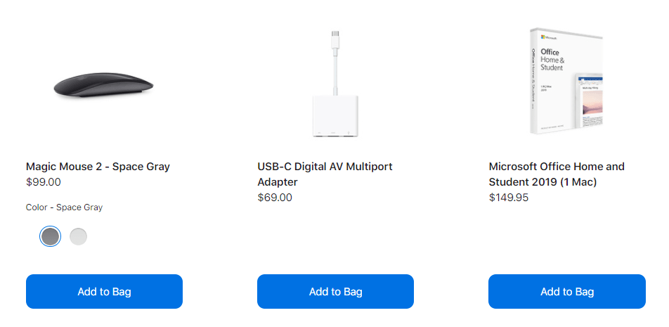
Displaying a section of products related to the one your user has their eye on isn’t only a great opportunity for you to make more sales — it can also help them identify things they might need before they’ve realized it themselves.
For example, if a user is purchasing a laptop, having a section of related products showing spare batteries, cases, and headsets, and providing a way for them to easily add those items to the order can help the user to feel like you understand their needs and want to help make sure they are met.

Showing these related products can be helpful to users at many points during the shopping experience. Try adding them to product pages, the cart, or even during checkout.
4. Answer FAQs and write robust product descriptions
Because shopping online can make users feel less confident about the buying experience, it’s always a good idea to anticipate questions and provide peace of mind when possible.
To help users feel like they’re able to make informed purchases even though they’re unable to see, touch, and ask questions about the product as they would be able to in a brick and mortar store, set them up for success by being as thorough as possible in your product descriptions.
Now’s the time to invest in top-notch product photography, and even consider taking it a step further with informational product videos or augmented reality features.
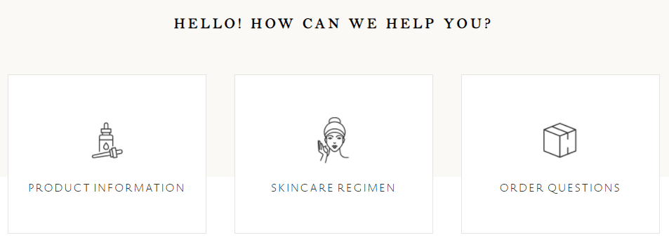
If you find that customers are reaching out with similar questions, consider adding a “frequently asked questions” section so that future users can quickly access those answers without having to reach out.

5. Make your site accessible to a wide audience
COVID-19 has impacted everyone in one way or another, which may cause you to see a slightly different demographic flocking to your site.
With this in mind, now is the perfect time to double-check whether your ecommerce site is in alignment with accessibility standards and is easy to use for everyone.
Even a simple check for these key accessibility indicators can go a long way:
- Is there enough contrast between the text and background, and is the text large enough to read?

- Do informational audio or video files use transcriptions or captions?
- Do form fields use proper labels?
- Are users able to easily correct mistakes during the checkout process?
Check out our handy website accessibility checklist to start evaluating your ecommerce site today.
Bonus: Quick tips for improving your ecommerce site’s UX design!
Here are a few bonus tips to improve UX on your ecommerce website:
- Make sure filter and sort options are robust to allow users to quickly narrow down products and find exactly what they’re looking for.
- Remember users’ carts between sessions so that they’re able to pick up where they left off.
- Don’t force people to register in order to check out. Instead, provide them with options to sign up, log in with their social media profiles, or checkout as a guest.
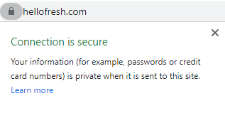
- To create trust, ensure that your site not only looks secure, but also is. Not sure where your site stands? Use our free security checker tool to find out instantly.

Ultimately, it all boils down to providing a great experience for the end user — that’s exactly what UX is all about!
As you look to optimize your site, remember to provide as much information to your users as possible, and focus on making their experience smooth, secure, and positive.
WebFX can help improve your ecommerce UX design!
COVID-19 has dramatically shifted the way stores sell and people buy products.
WebFX offers ecommerce services to help businesses create and maintain an online presence, including ecommerce SEO, ecommerce PPC, ecommerce web design and development, and ecommerce social media advertising.
Contact us today to learn more about how to adapt your business to the changing retail environment.