7 Email Marketing Landing Page Tips to Increase Conversions
You’ve crafted the perfect email to send to your subscribers to get them to convert. You send out the email and wait in anticipation for people to start buying your products. After a few days, though, you check and see that, while a bunch of people clicked on your email, very few converted.
Why is that?
Well, if you don’t have an effective email marketing landing page in place, your email campaigns may not drive the results you desire.
Luckily, we’ve got seven tips to help you create better email landing pages, including:
- Have a clear and descriptive headline
- Focus on what’s most important
- Utilize whitespace
- Use only one call to action (CTA)
- Don’t add distractions
- Keep forms brief
- Don’t overuse visuals
Keep reading to learn more about these email landing page tips, and subscribe to our email newsletter to get more great marketing tips!
Our long list of services help you make waves in your industry and increase metrics that matter most - like sales.Time To Level Up Your Sales

1. Have a clear and descriptive headline
If you want to create effective email landing pages, start by crafting an eye-catching headline. Your headline is one of the first things your audience sees when they click on your call to action (CTA) button in your email.
When you craft your headline, make sure it’s clear and to the point. Don’t waste your time with cryptic or ambiguous headlines. Users will see it and won’t understand why they should convert.
Additionally, you want to strike a balance between being descriptive and concise.
You don’t want to have a heading that’s so long that users forget what your page is about halfway through reading. On the other hand, having too short of a headline may not entice your audience to convert.
Let’s say you created a landing page that’s focused on your webinar for becoming a gaming streamer. You must choose between three headlines for your landing page: Which one do you think is best?
- “Professional Gamer Seminar”
- “Learn All the Inside Tips and Tricks About Being a Professional Streamer and Find Out How You Can Start Your Journey to Professional Gaming”
- Get Insider Tips and Tricks to Streaming from Top-Rated Professional Gamers
If you answered C, you’re correct! This headline is enticing, informative, and gets to the point. By signing up for the webinar, the visitor knows that they’ll get tips and tricks to start their streaming career and that it’s coming from professional gamers.
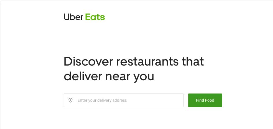
Uber is another great example of using enticing and informative headlines. On this landing page, they use the headline “Discover restaurants that deliver near you.” If they click the “Find Food” CTA, the visitor knows that they’re going to find businesses that deliver in their area.
Crafting a descriptive and clear headline will help keep people engaged on your email marketing landing page.
2. Focus on what’s most important
One of the biggest mistakes companies make with their email landing pages is overloading them. Many companies try to cram in as much information as possible to try and convince leads to convert. Realistically, though, having too much information deters your audience from converting.
If you want to craft landing pages that drive results, you need to focus on providing your audience with the most critical information they need to know.
To help you keep your landing pages concise, take the elevator pitch approach. Imagine that you only have the length of an elevator ride to pitch someone on your product or service. What are the key things you would tell them to convince them to convert?
In this example from HelloFresh, you can see that they stay focused on their service’s most important selling points. They only highlight what their audience needs to know and present the information concisely.
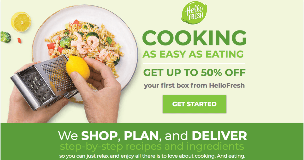
Taking this approach will help ensure that you don’t overload the page with information. Instead, stay focused on the most critical aspects of your campaign so you can deliver information fast.
3. Utilize whitespace
If you want to know how to create an email landing page, start by utilizing whitespace. As we mentioned previously, many companies make the mistake of overloading their landing pages with too many things. A cluttered landing page does not provide an excellent experience for your audience.
To help combat this problem, utilize whitespace. Whitespace is any unused space on your landing page. It doesn’t necessarily have to be the color white, but the space should contain nothing but a color — no images, text, or symbols.
Take a look at this example from Blue Apron.
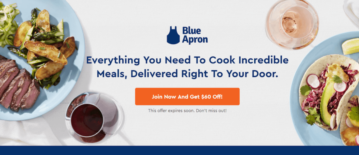
As you can see, the page has visuals and text, but there’s a lot of empty space surrounding those elements. It’s a good use of whitespace that keeps the visitor focused on the page’s crucial information.
By using whitespace on your email marketing landing page, you’ll help your audience stay focused on the critical information from your page.
4. Use only one CTA
A critical component of your email landing page is your CTA button. Your CTA button guides users on how to take the next step and tells them what happens next if they click on the button.
When you craft your email landing page, you only want to use one CTA. If you have more than one CTA, you risk confusing your audience or leaving them with decision paralysis. Ultimately, having one CTA button is best for promoting conversions.
There are, however, some scenarios where you may be able to use more than one CTA. For example, if you’re advertising a product that’s for students and teachers, you may have two separate CTAs — one that addresses the teachers and one that addresses the students.
In this case, you’re still guiding these users to take the same action — the only difference is that the product or service experience is more tailored to the person’s academic status based on the button they click.
Keep in mind, too, that you can use the same CTA button multiple times on your page. If you have a longer landing page, it’s best to integrate your CTA button throughout so users don’t have to scroll back to the top to convert.
When you craft your CTA button, you’ll want to ensure that you make it stand out on the page. Whether you use it one time or three times, your audience should easily spot it on the page.
You’ll also want to ensure that you use descriptive text for your CTA too. Tell your audience precisely what happens if they click on the button. Direct, descriptive text will help you entice more people to click and convert.
5. Don’t add distractions
If you want to know how to create an email landing page that’s successful, focus on eliminating distractions on your landing page. You want your audience to focus on converting.
Some common landing page distractions include:
- Navigation bars
- Social media buttons
- Information about other products/services not related to your ad content
Essentially, you only want to have information about the product or service that you’re advertising on your landing page. Anything outside of that serves as a distraction that prevents leads from converting.
Take this example from SmartAssest. They partnered with Pocket to invite people to figure out how to find a financial advisor.
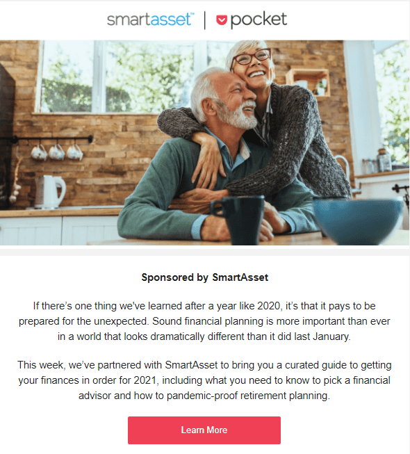
When you click on the link in the email, it takes you to a simple landing page that invites you to fill out a questionnaire to determine your ideal financial planner.
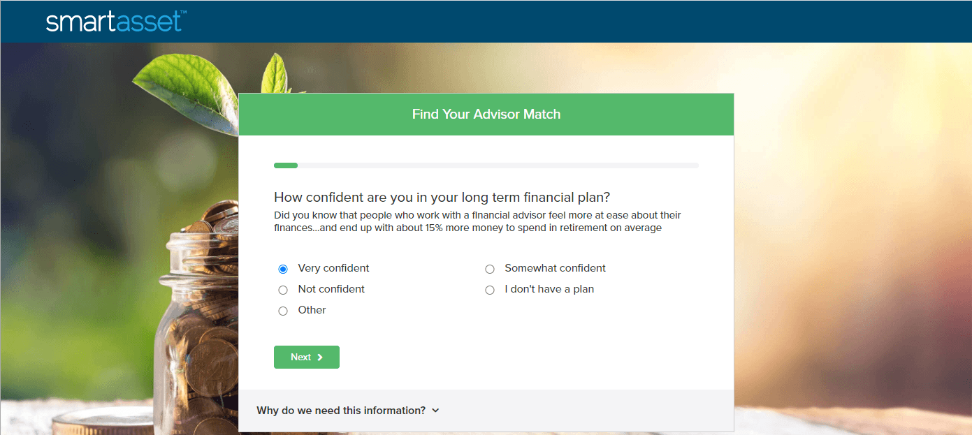
The landing page is simple, clean, and distraction-free. It keeps visitors focused on filling out the questionnaire to find their ideal financial advisor.
If you want your email landing page to drive more conversions, eliminate anything that could distract your audience from completing your goal.
6. Keep forms brief
If you’re using a form on your email landing page, make sure you keep it brief. People don’t want to spend time filling out long forms that ask for irrelevant information. If your forms are too long for your audience, it can discourage them from converting.
So, what’s the ideal form length?
Truthfully, there’s no set length you must follow. It will vary with each landing page, product/service, and company. So, to keep your forms brief, concentrate more on what information you’re asking for rather than how much.
Let’s look at this example from Airbnb.

This landing page form focuses on people who are interested in putting their home up as an Airbnb destination. As you can see from the form, Airbnb simply asks for the location, type of place, and the number of guests it can accommodate.
Imagine if this form asked for the person’s name, gender, email, and phone number. All this excess information isn’t relevant to how much the person can earn from renting their place, so it would discourage users because it would take too long to fill out the form and get an estimate.
So, when you craft your email marketing landing page, focus on asking for the most critical information in your forms. Doing so will ensure you don’t discourage your audience from completing the form while ensuring you get enough information from prospects.
7. Don’t overuse visuals
The last email marketing landing page tip we’ll cover involves the usage of visuals. If you want to get the most from your email landing pages, you need to refrain from using too many visuals. Overloading your landing page with visuals can make it distracting and difficult to follow.
Use visuals sparingly. Many companies will only use one visual on their landing page, like in this example from LinkedIn, while others will use a couple of images throughout their page.
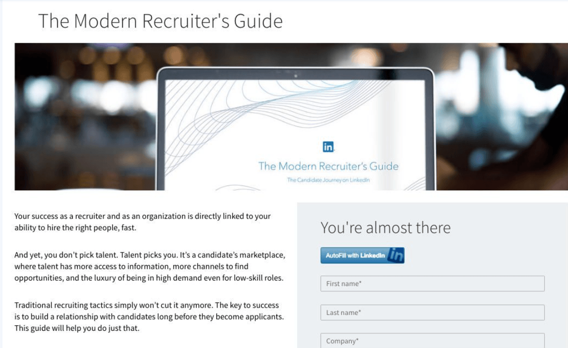
Be mindful about when and where you use visuals, as well as the types of visuals you use. Whether you’re using photos or videos, make sure your visuals fit your landing page’s focus.
If your landing page is focused on your line of luxury dress shoes, don’t just have a picture of a man sitting at a desk. Instead, use visuals that showcase your product and enable your audience to get a closer look at what you offer.
Get help with your email marketing landing page today
Struggling to craft the perfect email landing page? WebFX is here to help.
We have a team of over 250 digital marketing experts that can help you create the best email landing page for your campaign. From design to copywriting, we’ll help you create more engaging landing pages that drive results.
Ready to get started? Contact us online or call us today at 888-601-5359 to learn more about our landing page design services!