9+ tips & examples for your startup pitch deck structure
In this post, we’re going to talk about all the different visual assets you need for a successful startup pitch deck structure.
You only have a few minutes so the startup pitch deck must be eye-catching. Gather everything you have on your hands to compile into the best possible presentation. Think of it as a major project to manage.
You can use multiple ways to create this perfect startup pitch deck structure. Start from scratch and then use great ideas that are either your own or that from a freelancer.
Every successful startup today uses a startup pitch decks to get their funding.
Including high-end visuals is a good way to approach creating pitch decks. This approach does away with information overload, mental clutter and other distractions.
And no, visuals aren’t a fluffy approach to pitching, either. Science backs us up here.
It takes us just a tenth of a second to understand a visual. That’s way quicker than all the minutes it can take for you to verbally explain your company. We love visuals. They work at a subconscious level so it’s fair to call visual pitch decks the next best thing to magic.
Here are some common things to remember while building your startup pitch deck structure.
Start with a Great Logo
A logo creates the right first impression and you want to make sure you use the right one.
That in no way implies you need a highly-paid designer to create a dashing logo. However, you need to put in the required effort, if you’re going to do it alone. That means a lot of time spent thinking about what your business is and who it’s for. The logo should represent what the startup is about and should tie back to the business in some way.
Why is an apparently simple thing like a logo so important?
The important element isn’t the logo itself. What’s important is the attention to detail or attention to design. Attention to design shows how creative you are and how well you thought things through. This also speaks a lot about the way founders approach their business.
A pitch deck with little information and sloppy design tells potential investors that this is how the founders approach all parts of their business. If someone thinks about the minute details of design and presentation they might be easily able to creatively face challenges that come their way—this is what potential investors are thinking.
If you cannot hire a good designer, you can always explore free tools available online. They all have a number of free great-looking templates you can pick from. So, you still get professional design.
It’s possible for you to design great logos using free tools like Picmaker or Canva.
Here are a few tips you can use to design the best logo possible.
- Keep things simple. The lines must be clean. The design must have patterns and shapes
- It should represent something about your startup and be truthful to it
- Your design should have the right shape. Curved logos suggest comfort. Sharp and pointy logos indicate that the business is about something innovative
Use the Right Colors
Each color represents a different emotion. Keep this in mind when choosing colors suitable for your brand.
Like visuals, color carries with it the power to communicate messages without the use of words. A potential investor may perceive your business a certain way based on the colors you use.
For instance, the color red is dominating and adds gravity when it’s used. It ushers an improved sense of awareness as the color is known to increase blood circulation and metabolism. Food chains like McDonald’s use the color liberally.
Don’t simply start by imagining that bold striking colors are the best choice. They’re not a great fit everywhere. Choose primary colors or secondary colors to make your mark.
Bright and bold color choices don’t always look great everywhere.
The three primary colors are as follows: yellow, blue, and red.
To create secondary colors mix them in this order. For the color orange— mix yellow and red, for purple mix red and blue, for green mix yellow and blue.
The neutral colors include black, grey and brown.
Add an Inspiring Video to your startup pitch deck structure
Developing a visual identity is one part of creating a logo. Beyond that, you need to be able to engage people in what your startup does. Make this video downloadable for anyone who wants to watch it later.
People naturally tend to be part of projects that reflect causes they believe in. Your startup pitch deck structure should reflect a cause.
Visual storytelling is great for inspiring your audience by showcasing how your project started and what they can expect from you in the future. Investors are looking for a reward at the end for their efforts and how successfully you’re able to convince them of the viability of your idea determines how successful you are in your funding efforts.
With the introductory video, the first and foremost goal is to hook in your audience and make them spend their time getting to know more about the project. Take time to write the story and highlight the most important bits of the story and how you are planning the expansion. Tell them how you’re going to measure customer succes and how you will pursue a customer success strategy.
For instance, Dot shop with its intro video highlights the fact how shop extensions can benefit business owners and point out to customers that the site is geared towards shopping.
A video in your startup pitch deck structure is a popular option these days. But, know this: videos often can come piggybacking a number of technical issues, like slow load times. The video can also fail to play. You don’t want anything to ruin your pitch deck presentation.
Use Great Product Photos in your Startup Pitch Deck Structure
Ensure you shoot and present your product in a professional light. With a prototype, the photos must be of adequate quality to show different textures, product sizes and other attributes of the product.
Ensure that you use a professional photographer to get this done. Ask them to keep both raw and fully-edited pictures so you can create a large stock of product photos you can use in the future. A camera, a photo editing tool etc. are all business development tools you must have.
Make the pictures look good. Do this by reducing their sizes so they load quickly. A good resolution is 92 dpi. You can try using heic images or jpg images. HEIC images are traditionally considered high quality.
The slides are the supporting material for what you are going to present. Ideally, you want the VCs to pay attention to what you’re saying and to the narrative you’re building and then to the slides(to supplement what they hear). Slides are not the centerpiece but a handy accessory.
For each point you want to make, illustrate the same with a photo.
The photo is often enough of a supporting material to carry your message across.
Simply minimize the amount of text in the presentation. This makes sure that people pay attention to you instead of getting distracted. You can overlay text on pictures. But make sure you use contrasting colors.
Use Clear Charts and Graphics
You need to make every attempt to showcase the numbers for your startup with contrasting colors and choice of typefaces that clearly explain growth metrics and marketing budgets. Collect data from everywhere but present only the most important aspects.
Include explanations around what these charts mean and highlight important numbers like amount of funding, dates, business estimates and more.
A chart or graphic visually highlights key figures around your business. It’s easier for someone to understand the information through a chart than reading a dense paragraph.
Hand out Unique Business Cards
Once you’re done talking about your startup and get feedback, investors expect a good-looking and uniquely designed business card. The business card doesn’t have to be flashy. Keep them simple with a logo, your full name, website, email and contact details. Plus, add a QR code to your site on the business card. You can also create a digital brochure for your business.
Again, if possible hire a professional to create the design and remember not to go overboard with the graphics.
Simplify Text with Icons for your startup pitch deck structure
Icons serve two big purposes. They add personality to your startup pitch deck and deliver information quickly and without the use of words. Icons are like headings and let the audience skim content to find key points. They are used to identify categories and reduce the overall text in the pitch deck.
Icons can be a big part of building your brand identity. You can always use Picmaker to get as many free icons as you want. There are thousands of icons on the platform. So choose ones that are the most apt for your presentation.
Follow These Tips for your Next Startup Pitch Deck structure
Now that you know you need visuals, what are the most important tips to include visuals in your pitch deck?
Ditch Paint
Don’t do your visuals in Paint. No matter how skilled you are, the final output from Paint looks amateurish at best. Paint has no place in a winning proposal.
I will say it again -> Ditch it.
You want a few million dollars in fresh funding and that’s not done by using something you cooked up inside Paint. If you lack professional templates for the presentation or for the graphic, hire a professional designer. Slide decks are one of the most integral marketing collaterals you can invest in today.
The investment in a designer means you’re going to be that much closer to the investment you need. The designer should be able to create something in tune with current marketing trends.
Use visual storytelling in your startup pitch deck structure
You got to ease VCs into your story, the look and feel of the brand.
How?
Use the power of persuasive words, coupled with a powerful presentation to get VCs emotionally excited about your business. You can do that with a story.
Tell a story about the customer problem, the solution and what your startup promises to do. You can even use a personal story. The goal of your startup pitch deck is to present how emotionally connected you are to the idea. Use high-end graphics on the slides to share your story.
Here’s an example from Square.
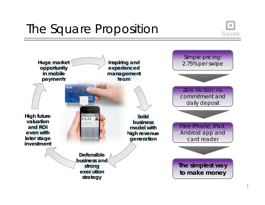
A picture is worth a 1000 words and when you use the right pictures, investors will take your story to heart.
Here’s another example from Leadcrunch.ai’s pitch deck.
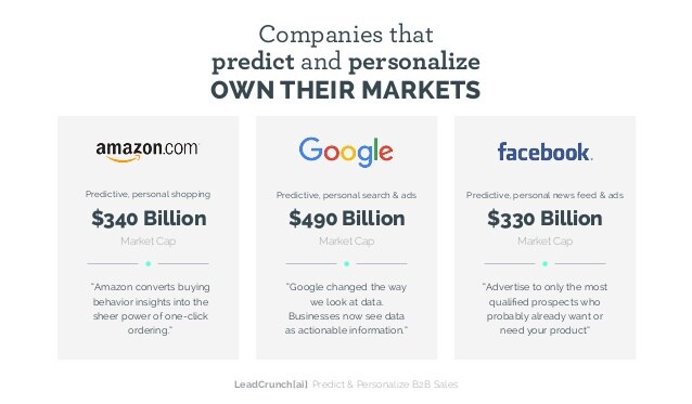
Company logos and the use of bigger font sizes for representing dollar values are the quickest takeaways anyone can get from the slide.
Visuals on your startup pitch deck structure will simplify everything. It will give people relevant information in a quick and engaging manner. You can then create informed conversations about funding.
Visuals should guide your presentations. Don’t use the bullet points to death on your slides. Instead lead with cool graphics on your startup pitch deck.
You’re the narrator of the story told best with colorful charts, graphs and images building towards a complete experience.
VCs don’t want a bunch of ideas that lack a proper beginning or end. Presenting your story with the help of visuals simplifies whatever it is you want to convey.
Talk about the value you generate
Investors are trusting you with massive pots of money. For someone to give you all that money, you should be able to project the value you’re going to create in return for them. Visuals help you show the true value of what you’re presenting to investors.
Instead of proclaiming those numbers, tell investors about the projections with graphs. If you’re a social media startup the graphs should show how you compare against established heavyweights like Facebook, Twitter, or Instagram.
Structure your deck logically
When you create your startup pitch deck structure, do it with logic.
The structure of your startup pitch deck should sync with the core narrative of your business when pitching.
Use an outline to flesh out everything that you’re going to include in the final piece. You can go so far as to create bullet points under each slide name with the chief message you want to convey within that slide.
If your business idea revolves around something like remote jobs, perhaps your slide deck should talk about the issues present with the current work environment. You can also explain with another slide about how your business functions and the revenue your company generates. The logical flow ensures that the investor is able to understand things quite clearly.
Use the 10/20/30 rule
According to Guy Kawasaki, a presentation should top out at 10 slides and 20 minutes and should use a font size bigger than 30 pts.
If you follow the guidelines, the immediate effect you see is that you don’t overload the slides with information. The guidelines force the presenter to use available space correctly. This brings out the most relevant information about the startup.
Graphically represent your data
It’s easy for anyone to type a few bullet points. But, the worst thing you can do is to present your startup pitch deck in textual format. Email marketing conferences like Mailcon teach people tose graphics instead. Use graphics that are both eye-catching and convey information in a ready-to-understand manner. Make use of charts, graphs and plenty of elements to showcase the data instead of simply conveying the whole thing through text.
Square’s startup pitch deck structure for instance uses plenty of visuals, charts and graphs to make their point.

Graphical elements that catch the eye and condense a lot of data into an easy-to-read format are a great way to break up the text while still communicating your key ideas.
Here’s another example from Leadcrunch.ai. They show you the vastness of their records through charts.

Visual elements can be an asset that can be used to grab the attention of interested investors. Use line charts to showcase profits, use bar charts to show how well the business has grown and talk about current growth so that it’s easy for investors to make sense of the growth prospects of your business.
Limit each slide to one topic
Coming to presentations, do this: Use the least possible content on each slide. You certainly do not want to overwhelm investors with too much information .
This is important when your startup pitch deck structure needs to get you money for your idea..
If there’s plenty of text on a screen, does it not look crowded?
Would you want investors to struggle through that mass of text?
I guess not.
Pick a specific theme for each slide and then talk about the problems of the existing work environment and show how modern working spaces are going to solve the problem.
The startup pitch deck structure is for investors, not customers
A crucial difference with a startup pitch deck is that it’s for investors and not customers.
Always keep that in mind.
From the second slide itself LinkedIn gets right to the point in telling the investor audience about how to target profiles with ads (and how they intend to make money).
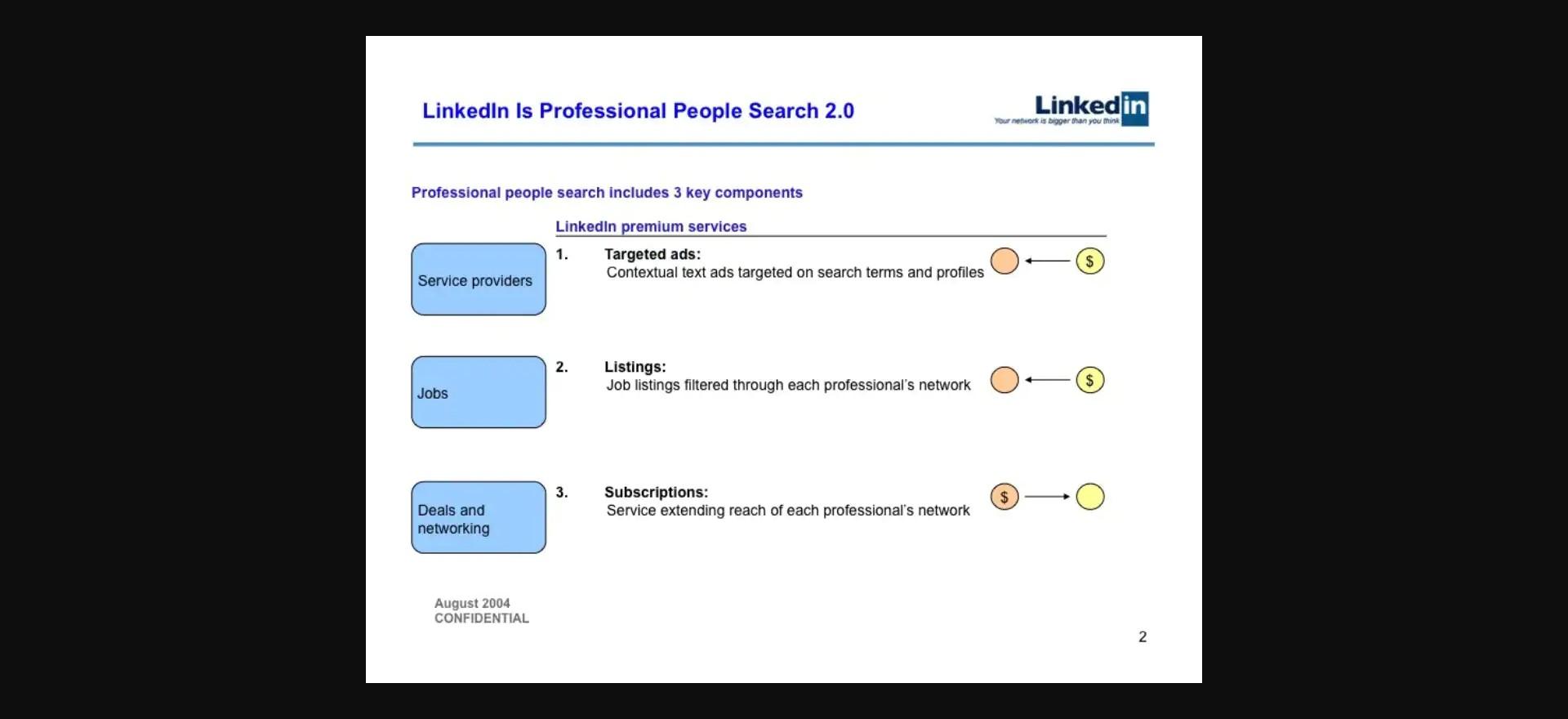
Facebook for business makes its case by showing what percentage of Americans have a Facebook account today thus telling potential investors how they intend to make money and what they offer potential advertisers.

When you tell your story ensure that you tell your story professionally. Each visual element should build to the larger picture you’re projecting.
If you sell apparel (a highly visual product), gentle visual cues are the best thing to include inside your startup pitch deck structure.
Focus on delivering your content in an easy-to-understand, yet professional voice.
When communicating with investors the pitch desk is the best tool to use. There are multiple factors to consider when creating these slide decks. Keep these in mind.
For instance, use the pitch deck to deliver a compelling pitch deck in a passionate language. You can close those deals and get the funding required to take your startup to the next level.
Start with an elevator pitch slide
Start with the biggest and most impactful point you want to deliver. Most leave this point until they make it midway. No, start with the most impactful thing you can say. Boil down the business idea into a few sentences that lets investors in on what you want to do in the quickest time possible.
In simple words, state the problem you want to solve and the remedy you want to present.
Include a demo in your startup pitch deck structure
Nothing gets VCs to invest in you more than seeing the product in action. Photos and screenshots serve this purpose to an extent. But, a live demo which shows the product in action is much better.
Examples of Successful Pitch deck structures
Zuora’s startup pitch deck structure

To clarify the distinction between itself and competitors, Zuora’s deck uses image-heavy backgrounds with little to no text. The sales deck has a presentation communicating the value, vision, and story. The deck captured the marketing trends present at the time in using an image-heavy pitch.
The slide deck states its business model in simple words. For instance one of the slides says that how people purchase has changed and customization and improvement are part of the buying experience. That makes the case for Zora.
Zora ends the slide by saying that all the businesses that survived till today or the ones like Uber and Airbnb are using the subscription based business model.
And makes the case for using a subscription model today.
Facebook for business’s Sales Deck

Facebook’s sales deck appeals to multiple audiences by displaying a number of strategies based on business objectives.
Facebook’s sales deck is over 97 slides long. With each slide, they present data through charts and visuals that make the case for Facebook. Facebook essentially tells advertisers that they’re the number one way people share things online.
Facebook loads you with facts—over 400 million active users, 7 hours spent per month on the channel, number for photo sharing and number 2 for user-generated videos. These are all good reasons for someone to start showing ads on Facebook.
Facebook keeps telling through to the last slide how big they are and why someone should invest with them.
Uber for business’s startup pitch deck structure

Uber used a catchy concept that connected to what was happening already. It’s a revolution in taxi hailing services that solves all problems plaguing the industry.
The startup pitch deck structure shows potential investors how Uber’s cab service is different compared to the existing system.
Then it leads up with key differentiators like optimized service, use of technology, fast response times and luxurious fleet of vehicles.
What I really liked is the slide with the key differentiators that tell you how different the platform is.
Reddit ad’s startup pitch deck structure

Reddit built a startup pitch deck structure that was truly engaging Reddit style. It sported custom memes and images that make you excited and are funny at the same time. In advertising you can be someone like Reddit who’s a solid competition to Google and Facebook.
Reddit’s ad sales deck is quirkiness at its best.
It’s a cat riding a fire-breathing unicorn. And that imagery tells you what Reddit is and who’s it for.
The slides immediately get down to business by telling advertisers that Reddit has over 70 million monthly users. They spend an average 29 minutes on the site everyday and look at 5 billion pages on the site.
Anyone reading this understands that the engagement on the platform is through the roof.
Then they lead it up by telling you about the options you have for advertising on the platform.
Immediately’s startup pitch deck structure

Immediately’s startup pitch deck structure displays a clear and resonating message. The first slide shows how you can do more mobile-based sales with Immediately.
It’s another image heavy pitch deck that says what it wants to say with images. There’s little to no text and images carry out most of the work. They show frustration, excitement and happiness while telling you how users make use of the platform to simplify sales.
The slides make full use of the opportunity to embody all problems sales professionals face and how Immediately can solve them.
Conclusion—What do Investors Look for in a Startup?
Passion and commitment to their startup is what 47% of investors consider the top quality in a team. Investors are more likely to be interested in the attitude of the team as a whole because startup growth trajectory depends on this a lot.
Brevity is the absolute best practice you can rely on when creating a pitch deck. Almost all existent research points to the fact that you need to keep the slides as simple as possible. The slides shouldn’t be overcrowded with either information or images. The team slide should focus on the founders and C-level executives.
Ultimately a winning pitch deck boils down to a few things. A catchy opening slide with a catchy cover image, a story with which to start your sales pitch. Data in the form of graphs, statistics and charts supported by additional relevant information should also be present. Plus, abundant use of images.
Author bio
 Bio: George Mathew is a writer and blogger who has over 9 years of experience creating content online. He now blogs at Kamayobloggers.com a site where he shares cutting-edge marketing insights.
Twitter: twitter.com/george_defo
https://www.linkedin.com/in/george-mathew-b4732622/